


Sharing this amazing project I had the pleasure to work on ⚡️
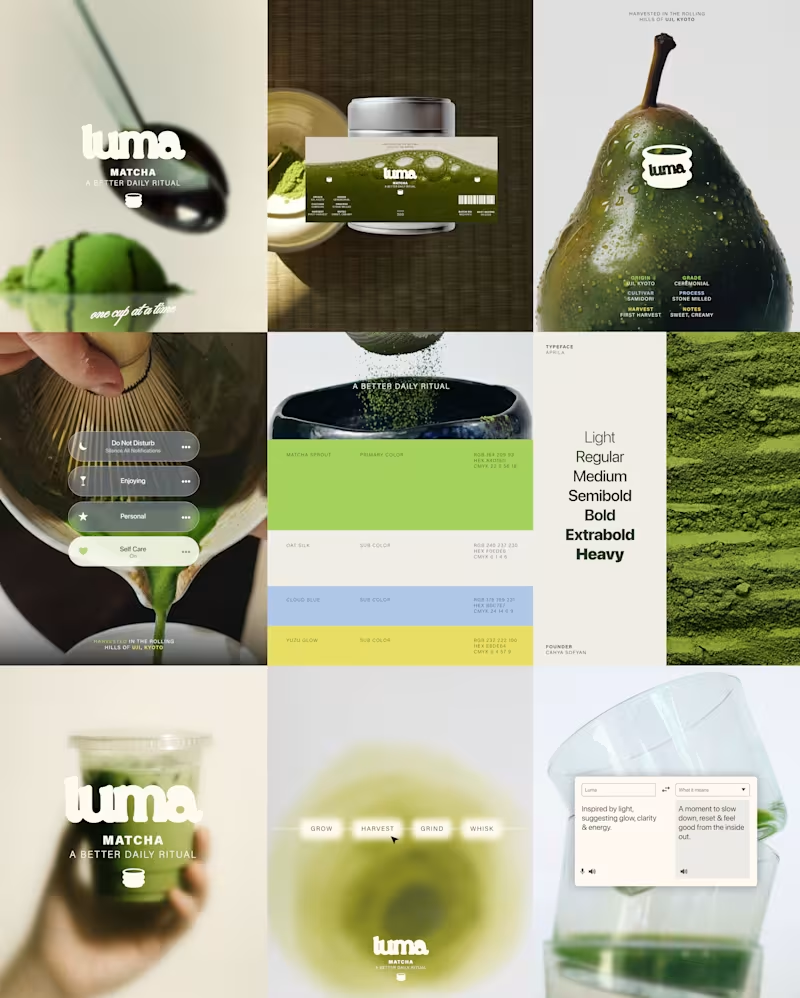
LUMA is a matcha brand built around the ritual of taking a moment for yourself.
The identity combines a fresh, playful color palette with a clean and contemporary visual language, creating a brand that feels vibrant without losing its sense of calm.
The result is a modern matcha identity that brings together natural qualities with a bright, lifestyle-driven aesthetic.
Check the full project on https://www.behance.net/gallery/255763939/LUMA-Matcha-Branding
Tell me your thoughts! 🔥🍵
26
34
1.8K


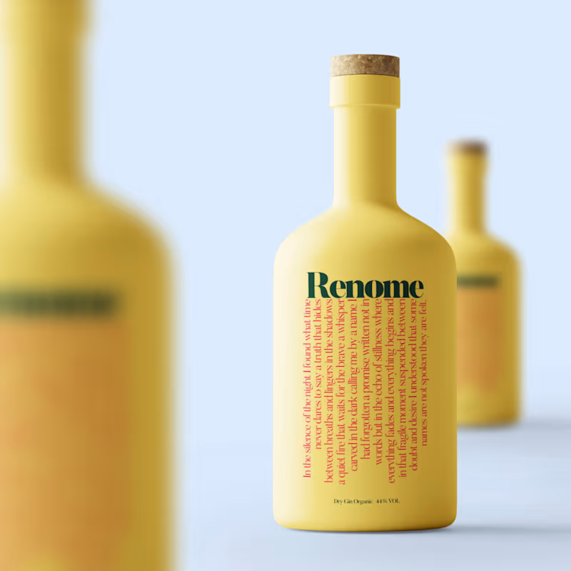
Renome is a tribute to elegance made liquid.
A gin crafted not to shout but to stay in the taste in the aroma in the moment.
Its essence blends botanical precision with a modern visual language designed to stand out on shelves appear premium in photography and create impact in both digital and print.
The identity is built on three pillars
Purity in the lines
Warmth in the palette
Character in every detail
From the bottle silhouette to the typography and the golden-touch accents every element was shaped to feel timeless modern and emotionally present.
A brand created to elevate occasions not interrupt them
crafted with intention clarity and a signature aesthetic that only Nomma delivers.
1
80
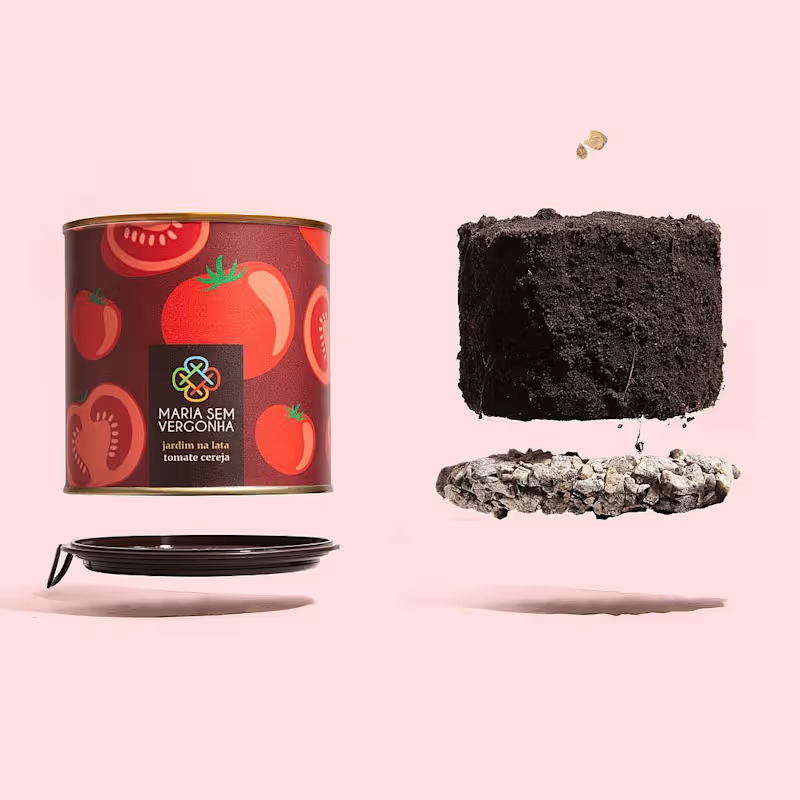
Maria Sem Vergonha — Packaging & Brand Identity
A playful approach to botanical packaging, transforming an everyday gardening product into an unexpected brand experience.
Combining bold graphics, vibrant colours and a distinctive visual identity, the project brings personality and humour to the world of plants.
A creative exploration of how packaging can tell stories, challenge conventions and turn ordinary products into memorable objects.
0
59