
Paulo Oliveira
Brand designer for premium, clean brands
New to Contra
Paulo is ready for their next project!

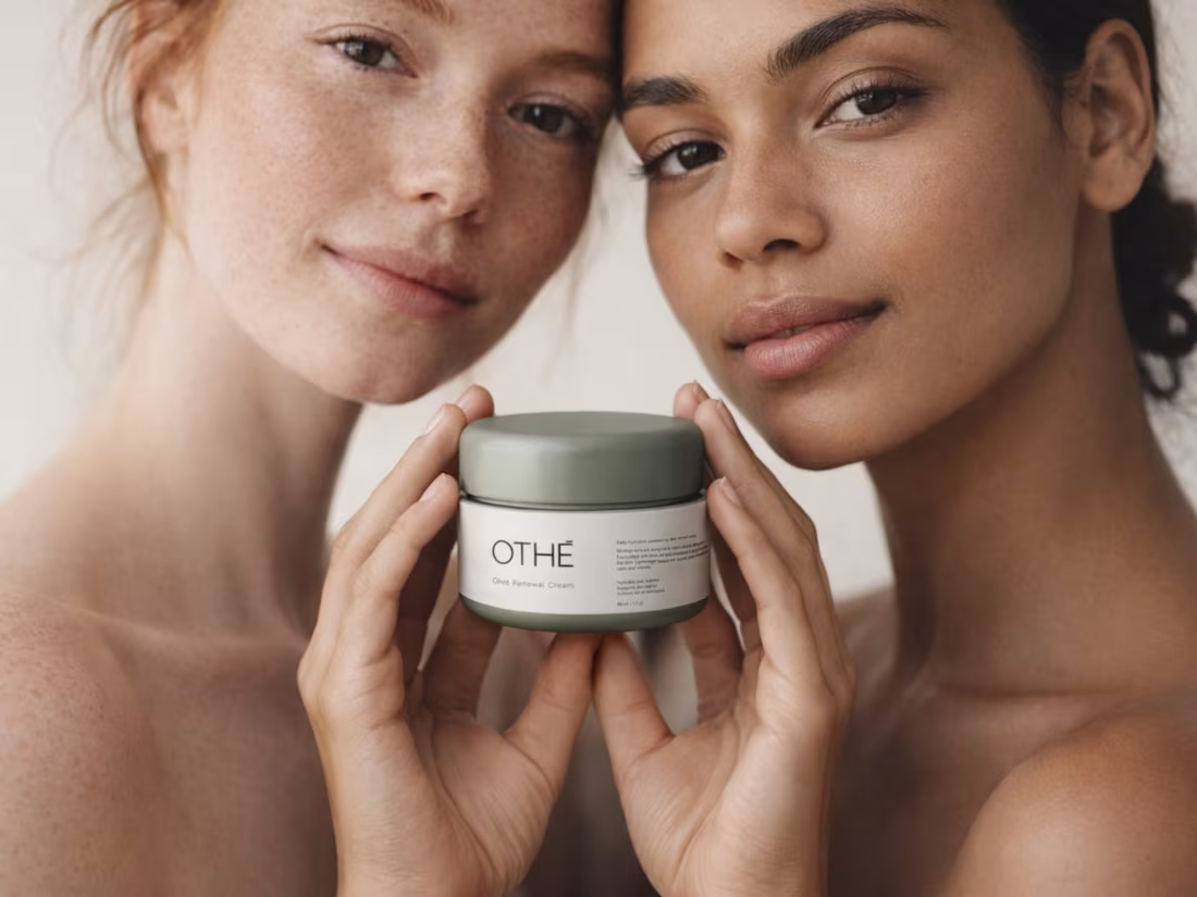
Brand identity and visual direction for OTHÉ, a minimalist skincare concept focused on purity and balance.
The project was developed to create a refined and elegant visual system, combining soft tones, clean typography and a calm editorial aesthetic. The identity was designed to communicate simplicity, trust and product quality across packaging and visual communication.
0
51

Brand identity for JRA Import, a company focused on international trade and logistics. The goal was to create a bold and professional visual system that reflects trust, structure and efficiency. The identity was designed to work consistently across print, digital communication and brand applications, helping position the company with more clarity and confidence.
0
56
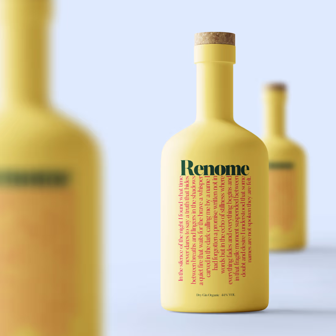
Renome is a tribute to elegance made liquid.
A gin crafted not to shout but to stay in the taste in the aroma in the moment.
Its essence blends botanical precision with a modern visual language designed to stand out on shelves appear premium in photography and create impact in both digital and print.
The identity is built on three pillars
Purity in the lines
Warmth in the palette
Character in every detail
From the bottle silhouette to the typography and the golden-touch accents every element was shaped to feel timeless modern and emotionally present.
A brand created to elevate occasions not interrupt them
crafted with intention clarity and a signature aesthetic that only Nomma delivers.
1
46
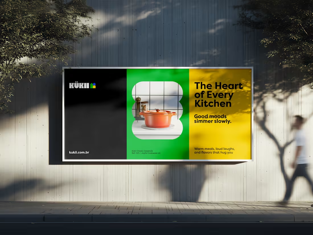
Kükii is a Brazilian kitchenware brand created to elevate everyday life at home.
Inspired by Scandinavian simplicity and the warmth of Brazilian homes, it offers products designed to simplify, enhance and endure daily use.
Each item is thoughtfully designed, responsibly produced and delivered with one clear purpose, to make everyday living more practical and visually refined.
Nomma Creative led the complete brand development, from visual identity and brand system to website design, mobile app concept and advertising strategy.
The project was built to perform across digital environments and stand out at the point of sale through a clear, accessible and design-driven experience.
1
49