Freelance Art Directors in Pineville
Sign Up
Post a job
Sign Up
Log In
Filters
2
Projects
People
Alan Knight
Pineville, USA
Brand-focused Art Director building visual systems
Follow
Message
Brand-focused Art Director building visual systems
0
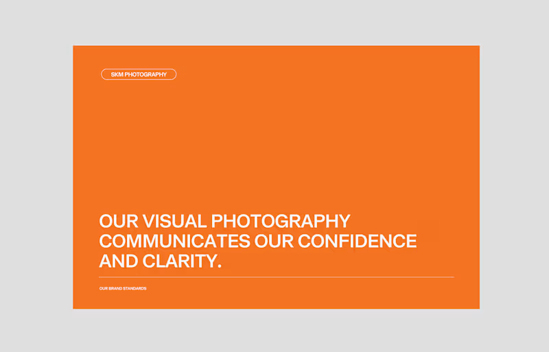
SKM Manufacturers Brand Identity
0
3
0
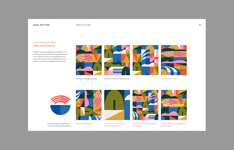
The Bowl at Ballantyne Rebranding
0
0
1
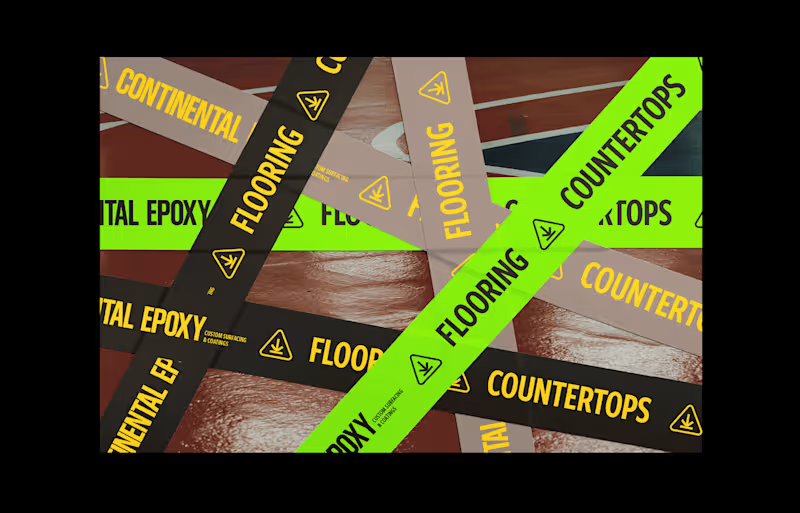
Continental Epoxy Branding
1
1
0
Chicago Pneumatics Brand Enhancement
0
1
Art Director
(10)
Follow
Message
Austin Scott
Charlotte, USA
Break-through campaigns, design, motion graphics
Follow
Message
Break-through campaigns, design, motion graphics
1
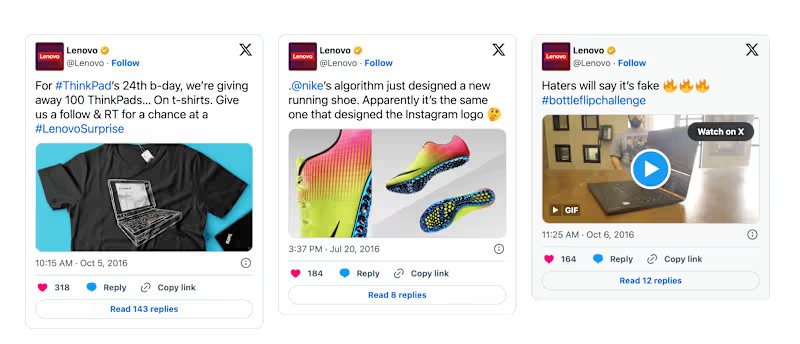
Innovative Social Media Campaign
1
9
1
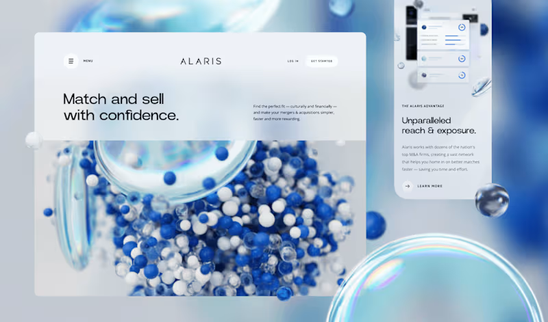
Immersive Website Redesign
1
7
1
Breakthrough Brand Campaign
1
10
View more →
Art Director
(3)
Follow
Message
Thomas Kramer
Charlotte, USA
Attention to detail, unique designs
Follow
Message
Attention to detail, unique designs
0
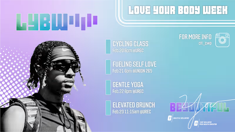
Love Your Body Week
0
0
0
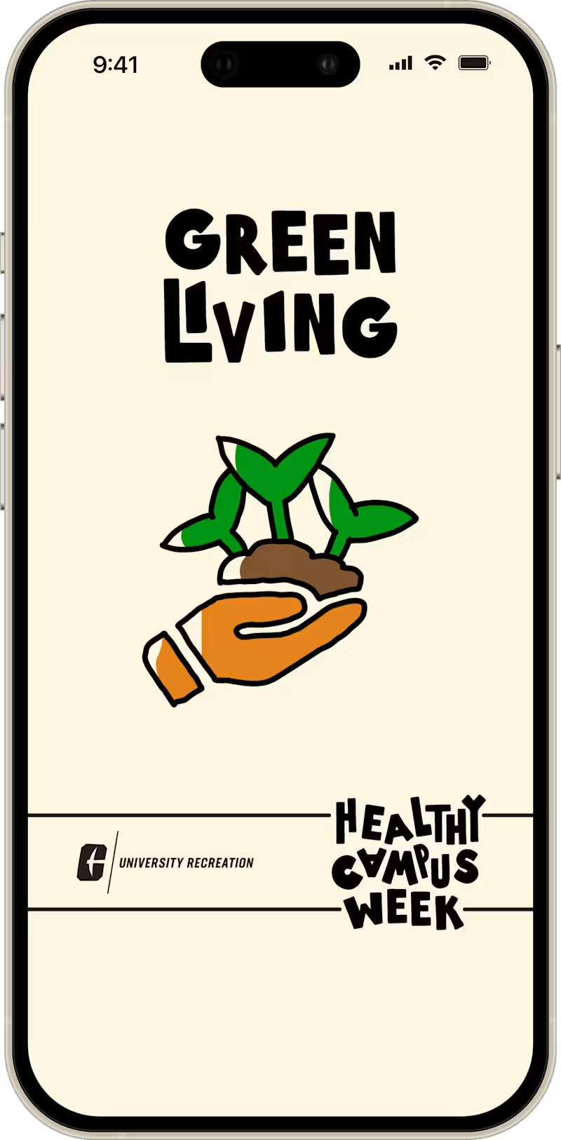
Healthy Campus Week Campaign
0
0
0
Praxis Finance App
0
0
0
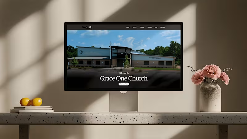
Grace One Church - Website Redesign
0
0
Art Director
(2)
Follow
Message
Olena Zaitseva
Charlotte, USA
Award-winning Brand Designer
Follow
Message
Award-winning Brand Designer
0
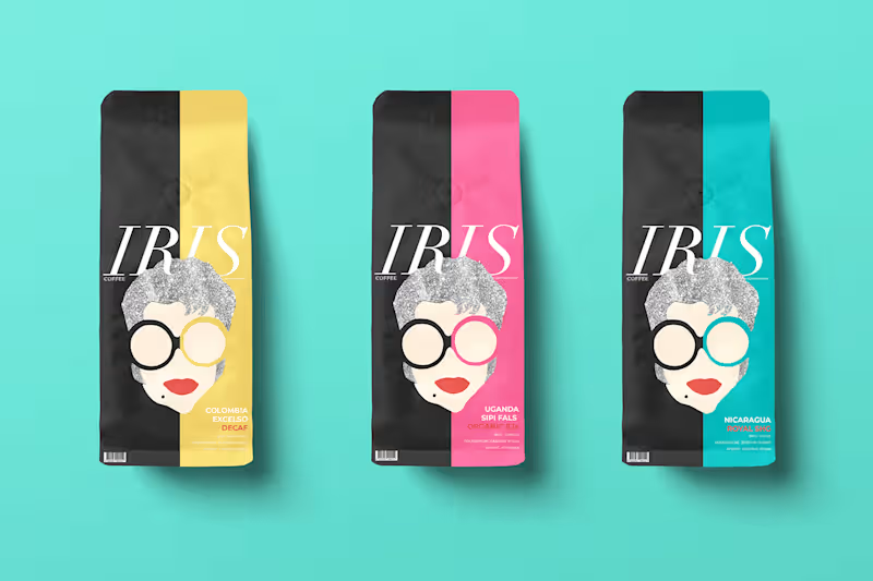
IRIS Coffee: Conceptual Branding & Packaging :: Behance
0
5
0
Personal Branding
0
3
0
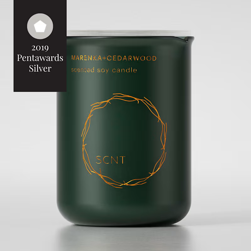
SCNT Selective home perfumery branding and package :: Behance
0
3
0
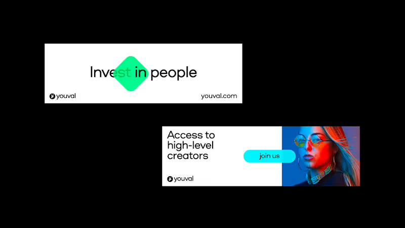
Youval :: Behance
0
4
Art Director
(7)
Follow
Message
Chelsi Architzel
Charlotte, USA
Experienced Brand and Graphic Designer
5.0
Rating
3
Followers
Follow
Message
Experienced Brand and Graphic Designer
1
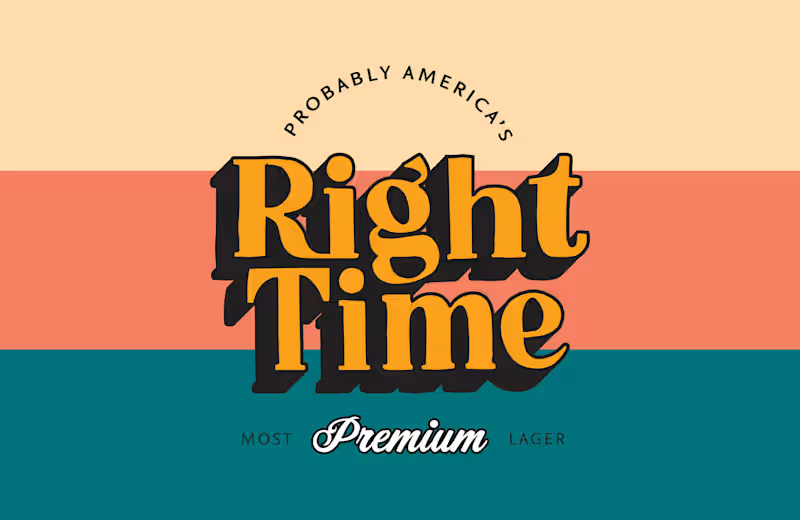
I designed Right Time Classic Lager to feel like a "new classic," leaning into vintage-inspired typography and a warm, tri-color palette to establish an immediate sense of heritage and reliability. The goal was to create a "Most Premium Lager" identity that felt both timeless and approachable, using bold, dimensional lettering to command attention on the shelf.
1
154
2
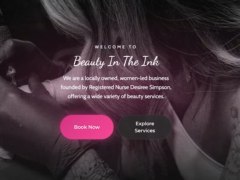
Gave a local business a booking glow-up for the Contra x Base44 "Give It A Glow" challenge 💅 Before: Beauty In The Ink is a real RN-owned med spa, tattoo & piercing studio — but booking sent clients off-site to a flat list of 70+ services with zero guidance. Even simple stuff, like picking the right lash fill, meant guessing between near-identical options. After: A fully branded booking app in Base44 — services organized into clear categories, with a guided flow that asks the right question instead of making clients guess (e.g. "how long since your last fill?" → routes automatically). The automation: An AI assistant handles the FAQ and edge-case questions that would otherwise be a DM or phone call — and knows when not to guess, flagging anything that needs a real consult instead of booking blind. Same great business, just an experience that meets clients where they are. Full before/after 👇 https://www.tella.tv/video/improving-booking-flows-for-beauty-in-the-ink-ec7r #GiveItAGlow (https://www.linkedin.com/search/results/all/?keywords=%23giveitaglow&origin=HASH_TAG_FROM_FEED) @Base44
2
103
2
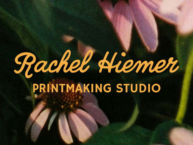
Rachel Hiemer makes prints that feel like the natural world translated into ink, in a way that feels botanical, hand-cut, and quietly alive. 🌿 An artist herself, Rachel knew exactly what her niche was and how to create art for it, but she was lacking a full visual suite that gave her confidence in what she already knew – her namesake ✨was✨ her brand. For this project, I built Rachel's brand identity and narrative around the same natives and wild flowers that Rachel found herself always returning to in her work. The primary logo mark centers on an illustrated echinacea, drawn in her own linocut vocabulary, then refined into something that could live at any size, on any surface. A script wordmark moves smoothly alongside it with the same loose energy as her printed line work, and a set of secondary marks give the brand room to breathe across different contexts and tiled backgrounds. For the color palette, I chose hues that nod to a garden in full bloom: marigold, periwinkle, soft pink, and eucalyptus. I intentially chose colors that feel bright and bold not only by themselves, but belong together the way that wildflowers do. The result was a visual identity for a personal brand that feels grown, not assembled. By using elements from Rachel's own artwork, her brand's logo and identity feels unmistakably hers before you've even read her name. 🎨
2
69
0
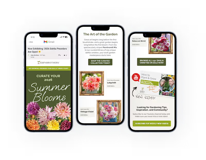
To elevate the Eden Brothers brand when aiming to ramp up marketing in preparation for Spring Dahlia Pre-sales, I moved away from standard e-commerce layouts in favor of a "living gallery" concept. By pairing the brand's established colors, such as a deep moss-green palette with ornate gold frames, I designed both email and social paid creative that transforms something as simple as seasonal flower tubers into a curated masterpiece, drawing the viewer and enticing them to shop now. This visual identity balances the wild, organic beauty of the dahlias with a structured, architectural typeface for a high-end, professional finish.
0
168
Art Director
(1)
Follow
Message
Explore people