The network for creativity
Join 1.25M professional creatives like you
Connect with clients, get discovered, and run your business 100% commission-free
Creatives on Contra have earned over $150M and we are just getting started
Back to feedPost
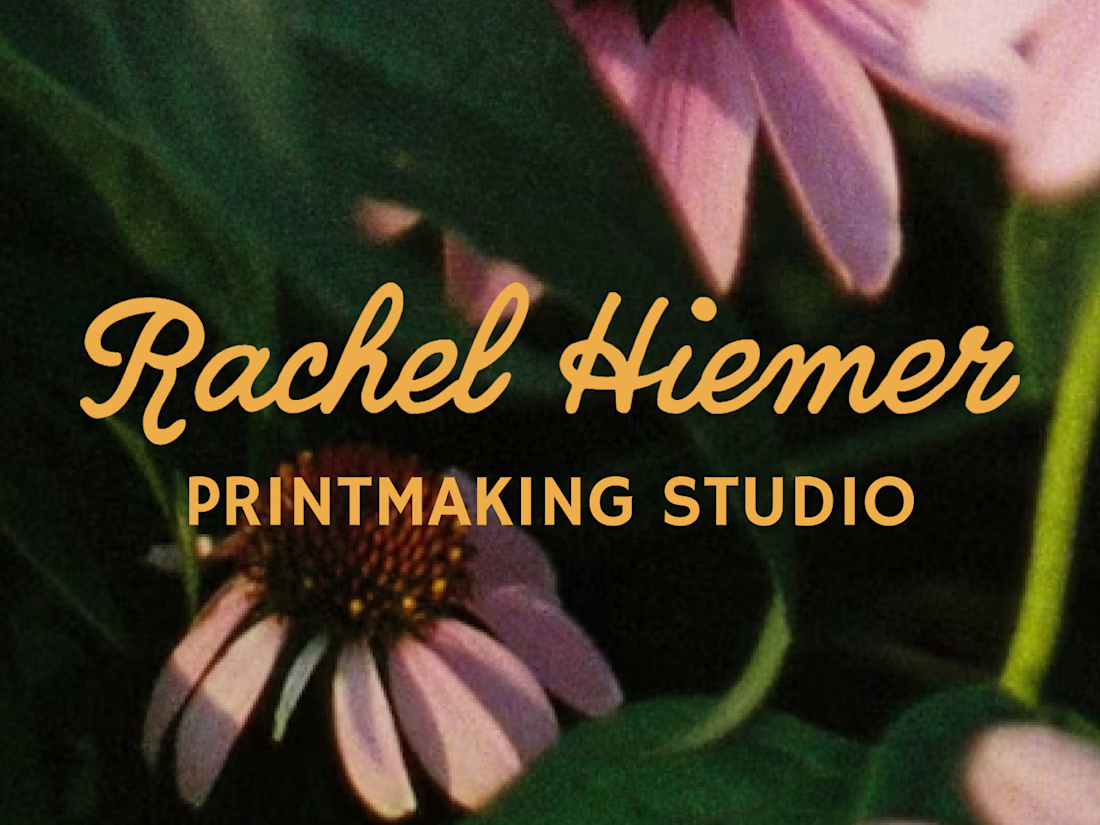
Rachel Hiemer makes prints that feel like the natural world translated into ink, in a way that feels botanical, hand-cut, and quietly alive. 🌿 An artist herself, Rachel knew exactly what her niche was and how to create art for it, but she was lacking a full visual suite that gave her confidence in what she already knew – her namesake ✨was✨ her brand.
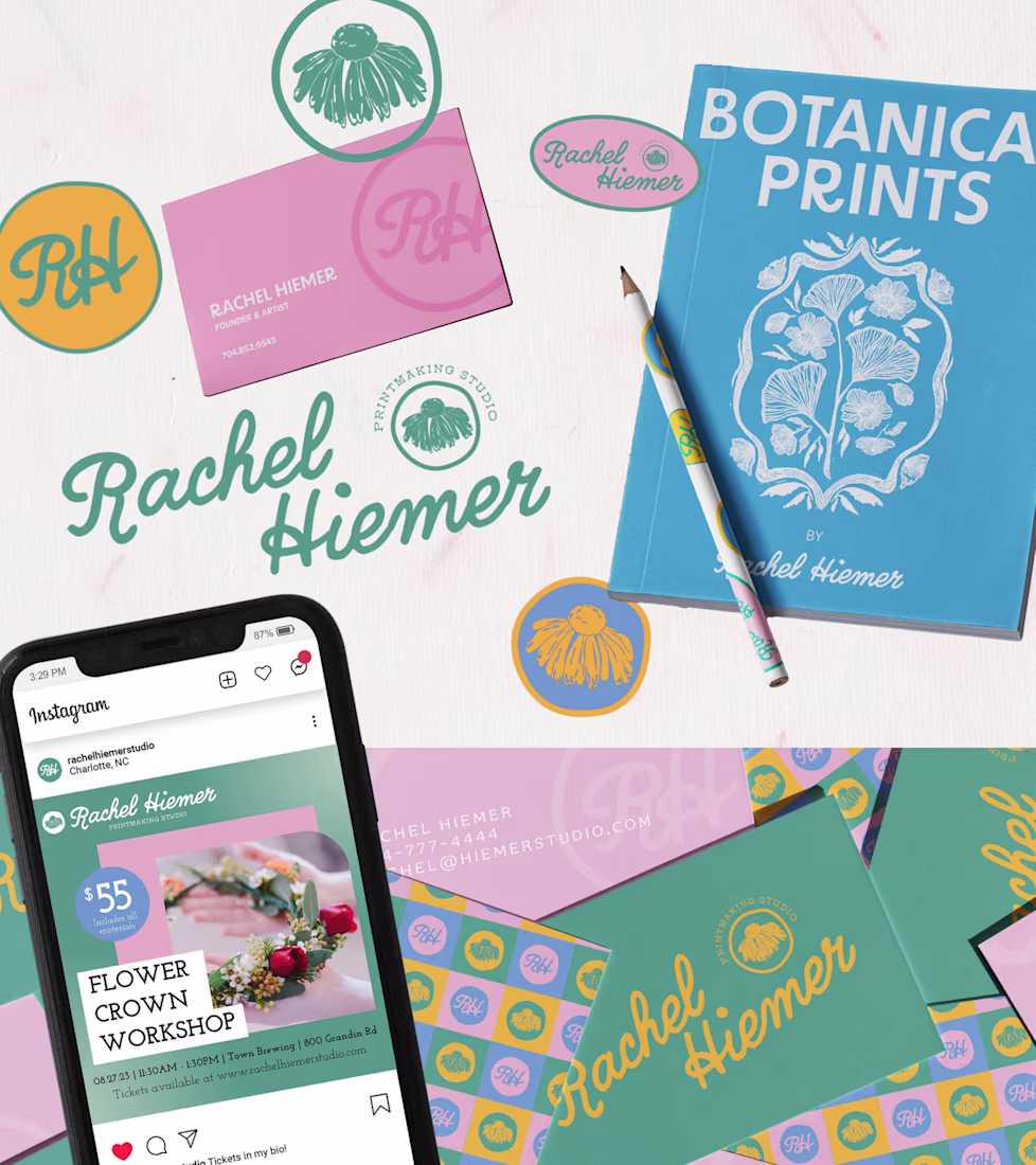
For this project, I built Rachel's brand identity and narrative around the same natives and wild flowers that Rachel found herself always returning to in her work. The primary logo mark centers on an illustrated echinacea, drawn in her own linocut vocabulary, then refined into something that could live at any size, on any surface. A script wordmark moves smoothly alongside it with the same loose energy as her printed line work, and a set of secondary marks give the brand room to breathe across different contexts and tiled backgrounds.
For the color palette, I chose hues that nod to a garden in full bloom: marigold, periwinkle, soft pink, and eucalyptus. I intentially chose colors that feel bright and bold not only by themselves, but belong together the way that wildflowers do.
The result was a visual identity for a personal brand that feels grown, not assembled. By using elements from Rachel's own artwork, her brand's logo and identity feels unmistakably hers before you've even read her name. 🎨
The network for creativity
Join 1.25M professional creatives like you
Connect with clients, get discovered, and run your business 100% commission-free
Creatives on Contra have earned over $150M and we are just getting started
Related posts
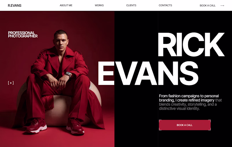
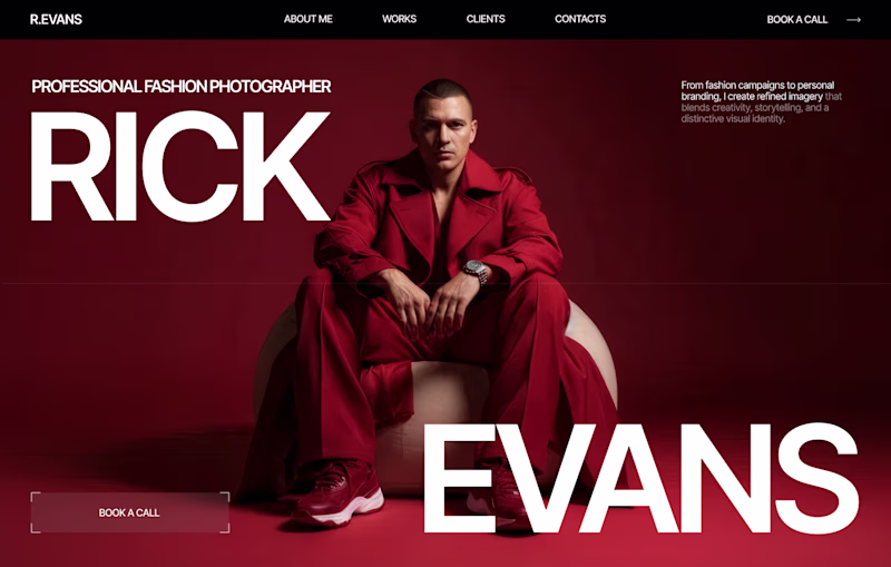
Design Duel ⚡
Two hero concepts. One fashion photographer.
🅰️ Structured split layout 🅱️ Full-screen editorial experience
Which one would you choose for your portfolio? Vote A or B and tell me why.
6 voted
20%
24 voted
80%
30 votes
Closed
I love your designs so much! 😍
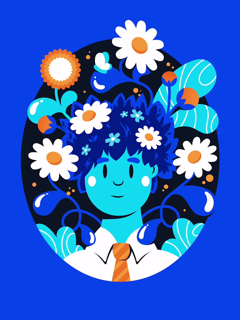
The Boy in Bloom 🌼
It’s hard to believe I haven’t drawn a single thing in four months. Honestly, it felt like a part of me had withered away and died.
Taking that long a pause from something you love is a scary feeling. But today I sat down and got reacquainted with this old friend of mine.
This piece is a reminder to myself. Tend to your life like a garden. Cut away what’s dead. Give yourself some sun and water. The rest takes care of itself. 💙
Hello Founders.
Over the past year, we've been creating logos that genuinely improve customer perception. Not generic marks, but thoughtful logomarks that tell the story you want.
Perception is a major factor in customer decision-making, and it's what we focus on heavily in branding.
Here are some logo lockups we've worked on.
We're open for new logo design and branding projects.
Send a DM or email to ► info@donatus.agency
Good job
Challenges
View allTrending
Claude
Claude has entered the design space. How are you using Claude Design?
Contra University
Learn from expert creatives how to earn more using next-gen AI tools.
fifaworldcup2026
The World Cup is here and the whole world's watching. How are you designing for the world stage?
creativeaiflow
Creative AI workflows are evolving. What tools do you use, and what are their strengths and weaknesses?
freelancerlife
Freelancer life is wins, pivots, and everything in between. What’s yours right now?