
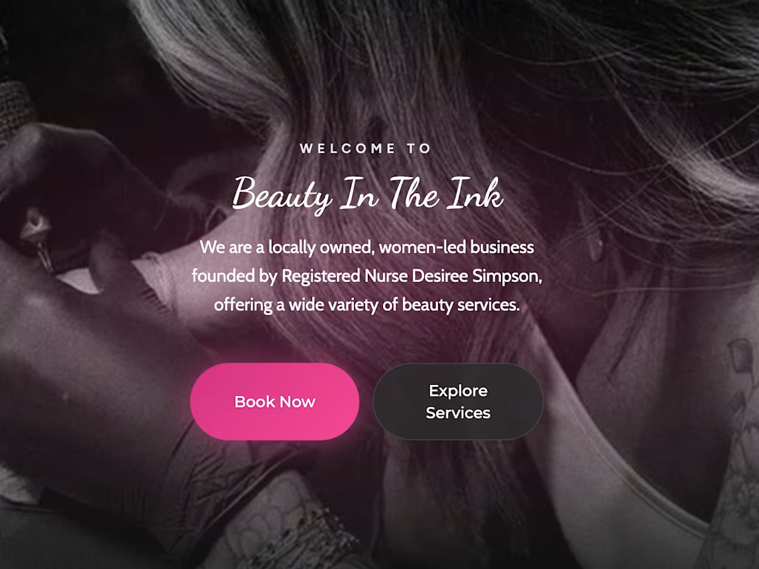
Gave a local business a booking glow-up for the Contra x Base44 "Give It A Glow" challenge 💅
Before: Beauty In The Ink is a real RN-owned med spa, tattoo & piercing studio — but booking sent clients off-site to a flat list of 70+ services with zero guidance. Even simple stuff, like picking the right lash fill, meant guessing between near-identical options.
After: A fully branded booking app in Base44 — services organized into clear categories, with a guided flow that asks the right question instead of making clients guess (e.g. "how long since your last fill?" → routes automatically).
The automation: An AI assistant handles the FAQ and edge-case questions that would otherwise be a DM or phone call — and knows when not to guess, flagging anything that needs a real consult instead of booking blind.
Same great business, just an experience that meets clients where they are.
Full before/after 👇 https://www.tella.tv/video/improving-booking-flows-for-beauty-in-the-ink-ec7r
#GiveItAGlow (https://www.linkedin.com/search/results/all/?keywords=%23giveitaglow&origin=HASH_TAG_FROM_FEED) @Base44
2
83
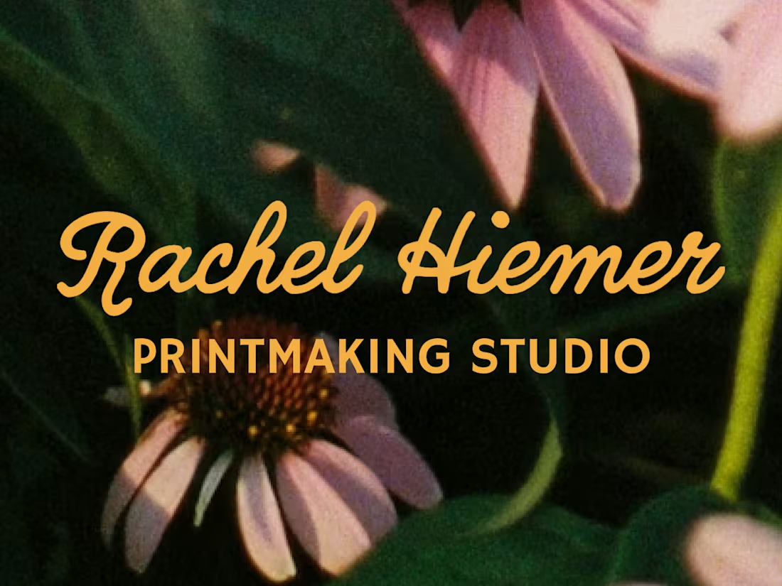
Rachel Hiemer makes prints that feel like the natural world translated into ink, in a way that feels botanical, hand-cut, and quietly alive. 🌿 An artist herself, Rachel knew exactly what her niche was and how to create art for it, but she was lacking a full visual suite that gave her confidence in what she already knew – her namesake ✨was✨ her brand.
For this project, I built Rachel's brand identity and narrative around the same natives and wild flowers that Rachel found herself always returning to in her work. The primary logo mark centers on an illustrated echinacea, drawn in her own linocut vocabulary, then refined into something that could live at any size, on any surface. A script wordmark moves smoothly alongside it with the same loose energy as her printed line work, and a set of secondary marks give the brand room to breathe across different contexts and tiled backgrounds.
For the color palette, I chose hues that nod to a garden in full bloom: marigold, periwinkle, soft pink, and eucalyptus. I intentially chose colors that feel bright and bold not only by themselves, but belong together the way that wildflowers do.
The result was a visual identity for a personal brand that feels grown, not assembled. By using elements from Rachel's own artwork, her brand's logo and identity feels unmistakably hers before you've even read her name. 🎨
2
68
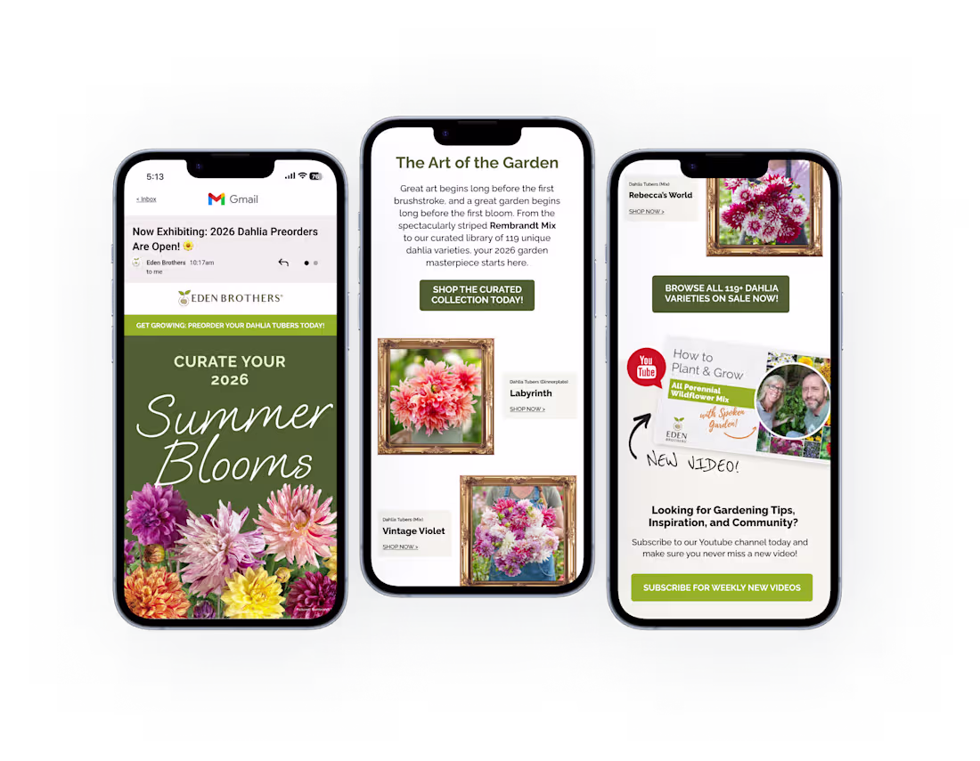
To elevate the Eden Brothers brand when aiming to ramp up marketing in preparation for Spring Dahlia Pre-sales, I moved away from standard e-commerce layouts in favor of a "living gallery" concept. By pairing the brand's established colors, such as a deep moss-green palette with ornate gold frames, I designed both email and social paid creative that transforms something as simple as seasonal flower tubers into a curated masterpiece, drawing the viewer and enticing them to shop now. This visual identity balances the wild, organic beauty of the dahlias with a structured, architectural typeface for a high-end, professional finish.
0
168
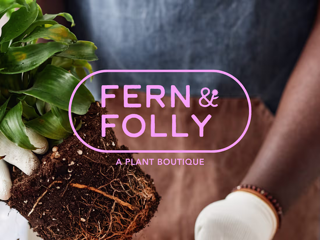
Fern & Folly is the kind of plant shop you walk into and immediately want to live inside. Warmly lit, a little wild, and chock full of things you didn't know you needed. The problem was their branding didn't say any of that.
F&F came to me with a great name, a loyal customer base, and almost no visual identity. My job was to build something that matched the energy already in the room and could scale as the business (and plants!) grew.
I designed Fern & Folly's full identity system around a small set of bold, reusable shapes. Those shapes do everything, everywhere: they live in the logo, the iconography, the surface patterns, the hang tags, the packaging. The whole brand pulls from the same visual vocabulary, so every touchpoint feels like it belongs.
As a result, I built the missing piece for a brand that already has strong roots, making sure that they show up exactly as intended no matter where they're seen. The color palette is distinctive without being too loud, and beautifully alive in the same way the shop is — a little overgrown, in the best way.
2
1
106
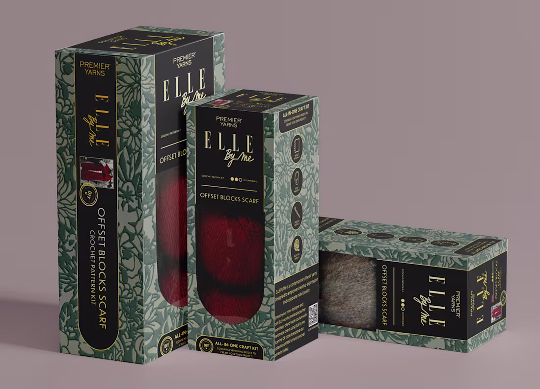
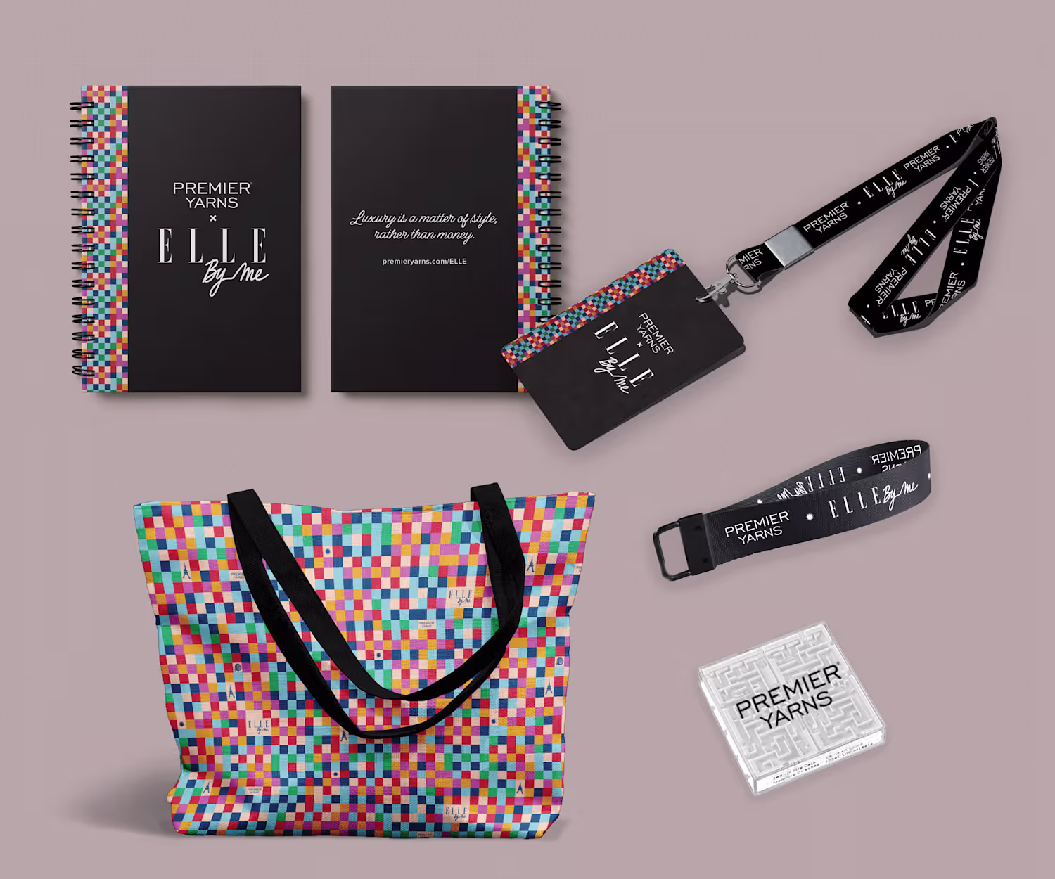
ELLE By Me Wholesale Kit Packaging Design
0
0
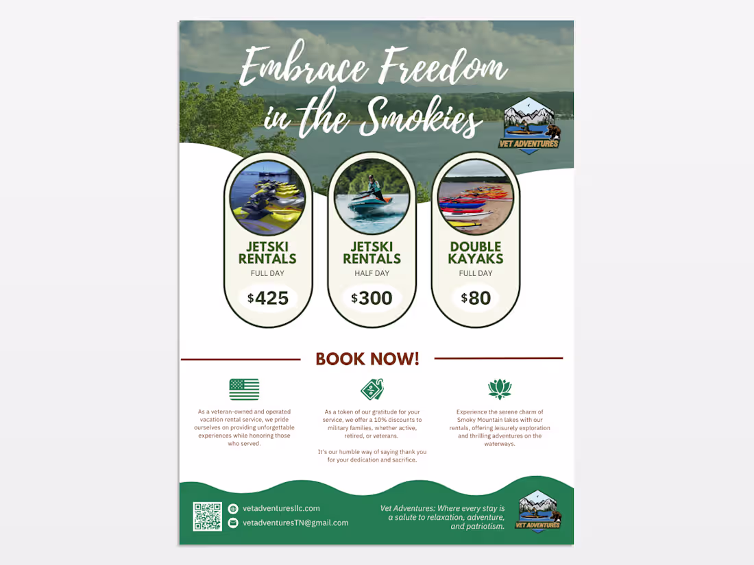
I designed a promotional flyer for Vet Adventures that uses a clean, organic layout to connect veteran families with outdoor recreation in the Smokies. By balancing scenic photography with clear service hierarchies and patriotic messaging, I created an inviting visual system that highlights both the adventure and the mission-driven heart of the business.
0
125
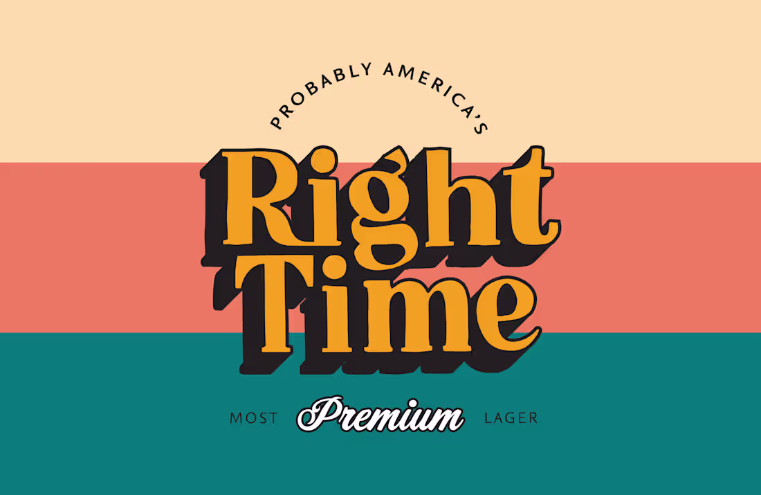
I designed Right Time Classic Lager to feel like a "new classic," leaning into vintage-inspired typography and a warm, tri-color palette to establish an immediate sense of heritage and reliability. The goal was to create a "Most Premium Lager" identity that felt both timeless and approachable, using bold, dimensional lettering to command attention on the shelf.
1
154
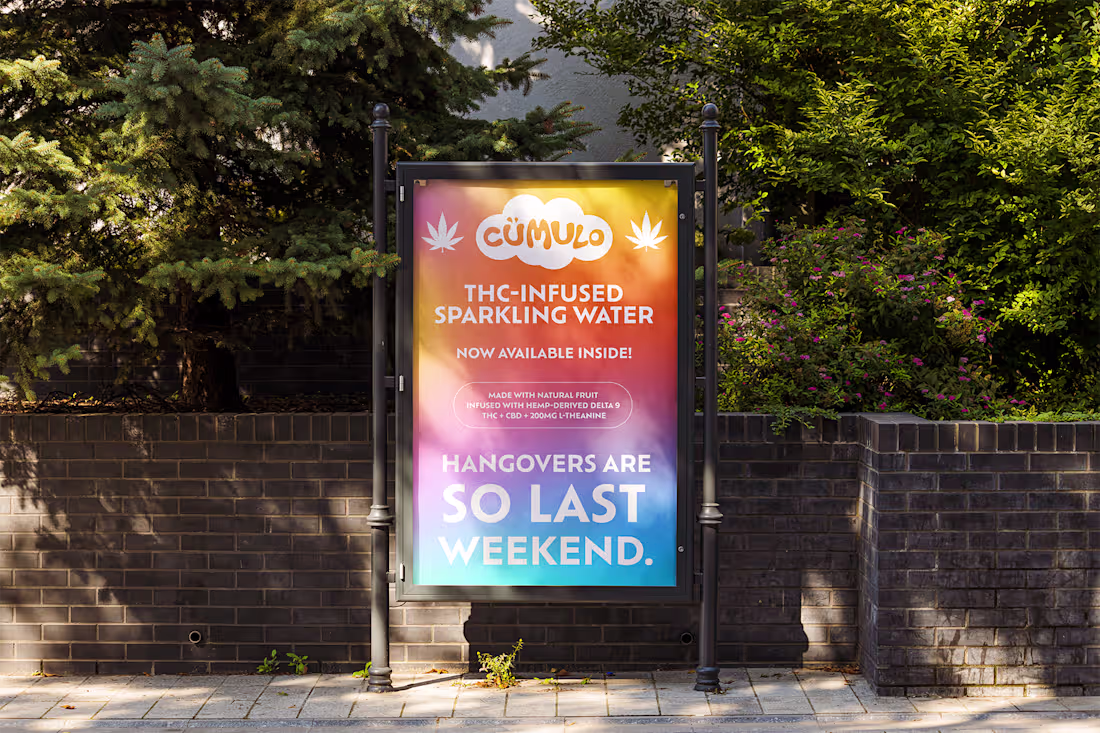
Building a premium cannabis beverage brand that balanced high design with approachability was both a creative and strategic challenge. With cümulo, the goal was create a visual language that captured calm energy, modernity, and quiet confidence while standing apart in an increasingly design-savvy market.
As Lead Designer, I shaped cümulo from concept sketches to product landing on the shelf by developing the brand foundation and guidelines, color palette and font system, packaging system, and out-of-home presence. Each design decision was guided by balance, favoring clarity over clutter and serenity over spectacle. The result was a holistic identity that expressed wellness through simplicity and connected thoughtful design to a sense of lightness and ease.
1
146