Grace One Church - Website Redesign
Thomas Kramer
Grace One Church
Project Overview
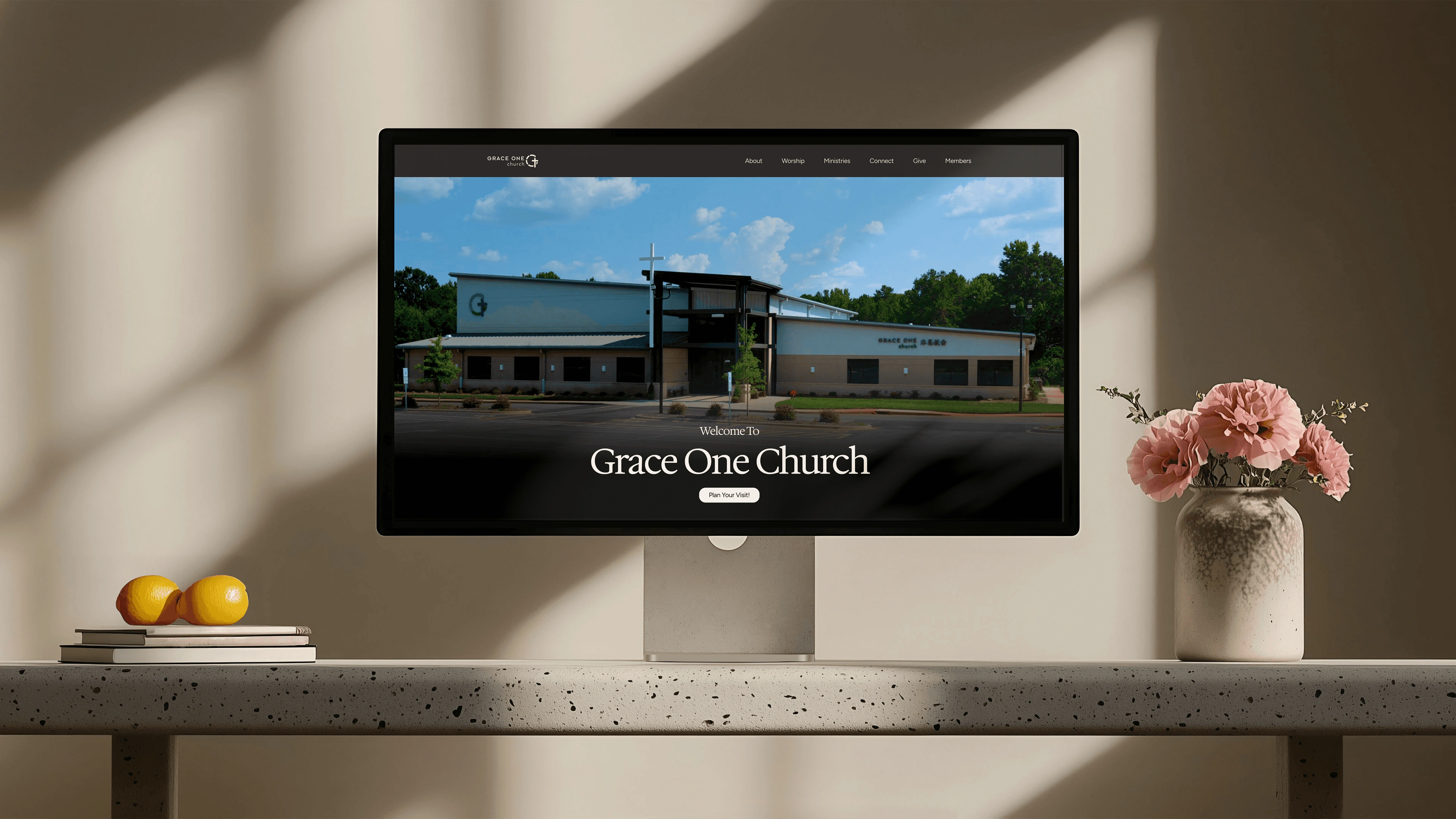
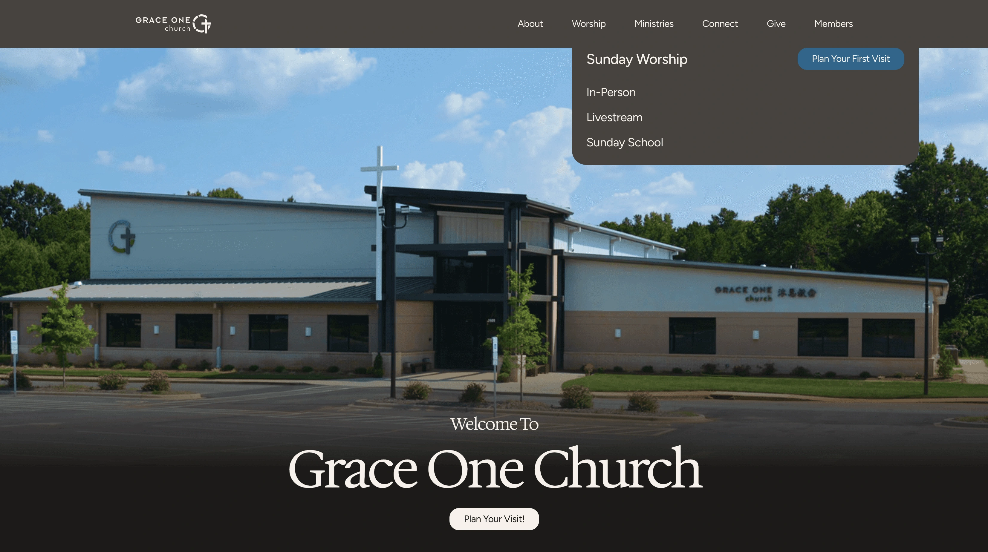
Grace One Church’s English Ministry website was redesigned from an information hub into a visitor‑first experience that clearly communicates who the church is, when and where services gather, and next steps to take. The new site reframes the homepage as a guided narrative so first‑time visitors can quickly discern “Is this for me?”
Problem framing
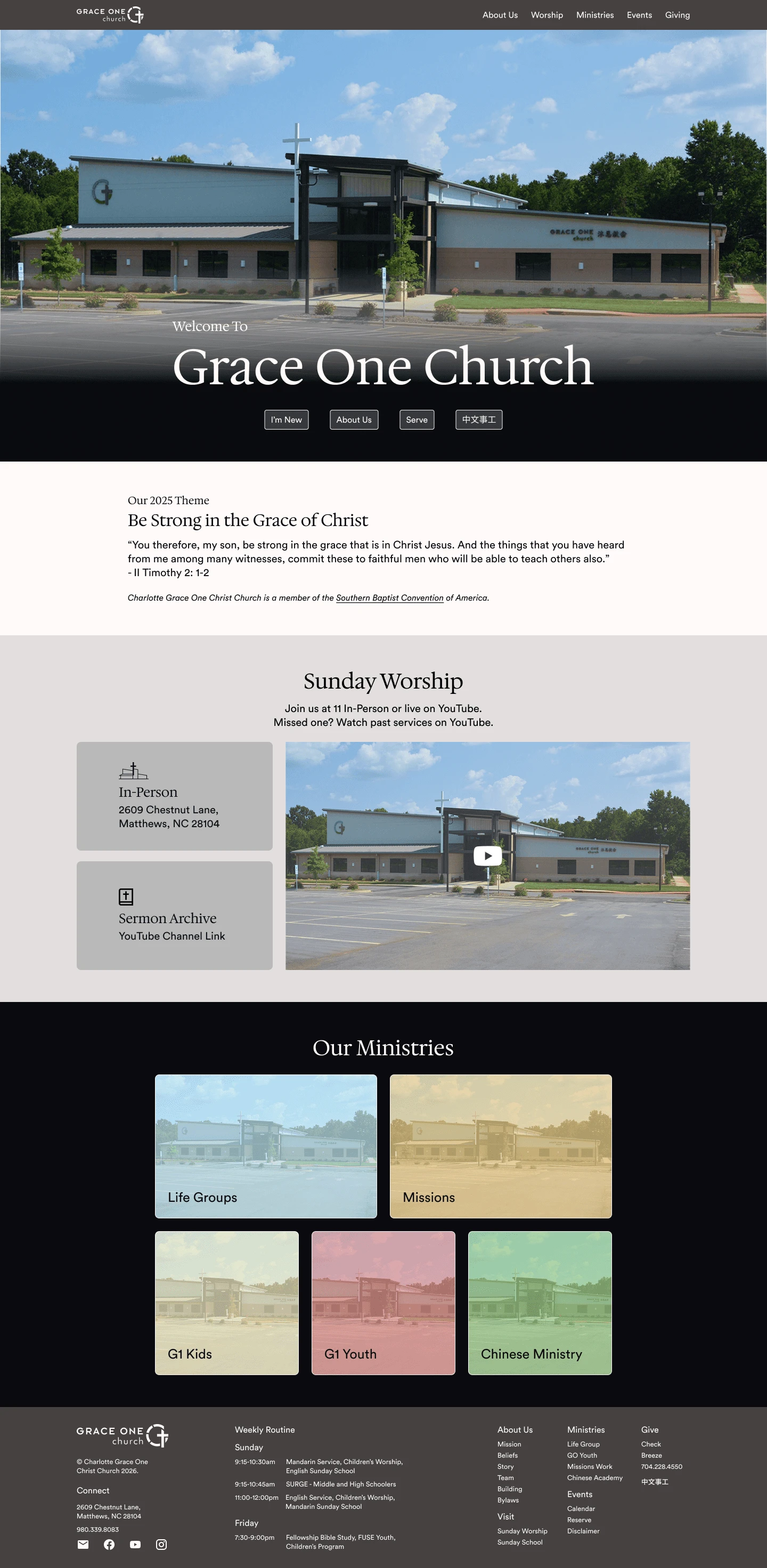
The English Ministry site is leaking engagement
The previous site included core details like service times, ministries, and contact info, but required visitors to work too hard to find more and understand the church’s identity, culture, and next steps. While some page drop‑off is expected, weak copy, unclear hierarchy, and few calls to action caused an outsized falloff in attention and action after the initial hero, leading to fewer intentional behaviours than the level of interest and traffic should support.
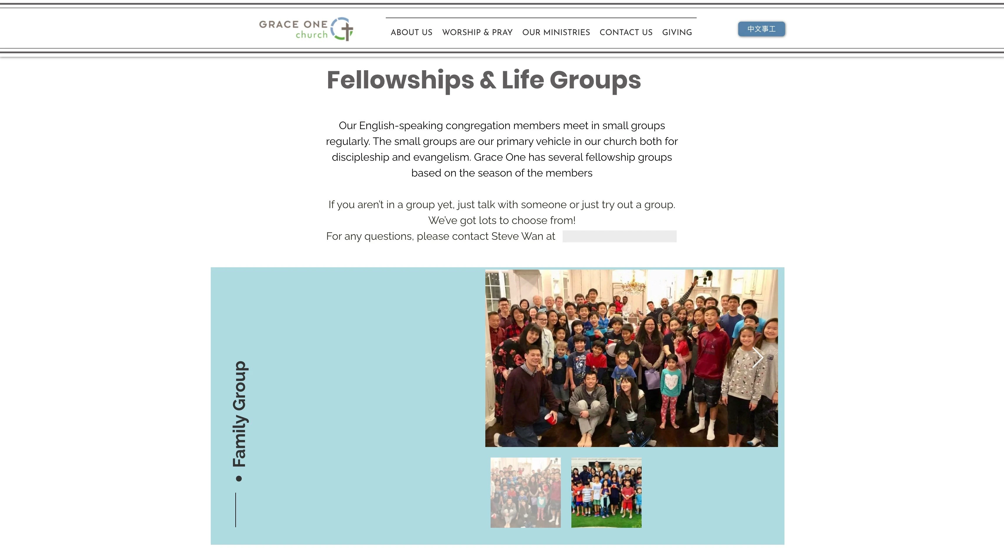
Experience: cognitive load over clarity
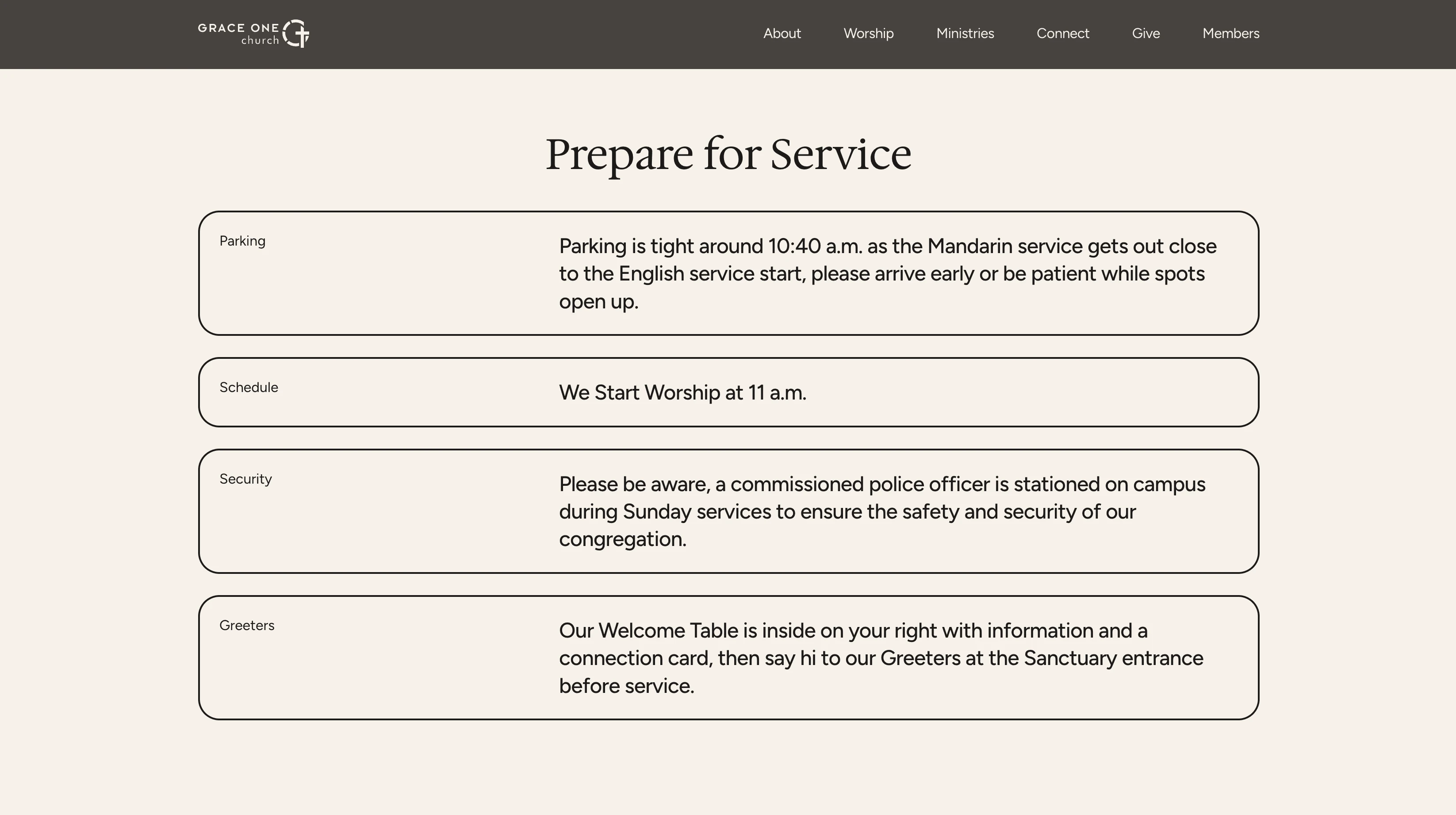
Lack of explanation, legacy navigation, and overlapping sections made it difficult to quickly answer “Who is this church, what is worship like, and what is available for my stage of life?”
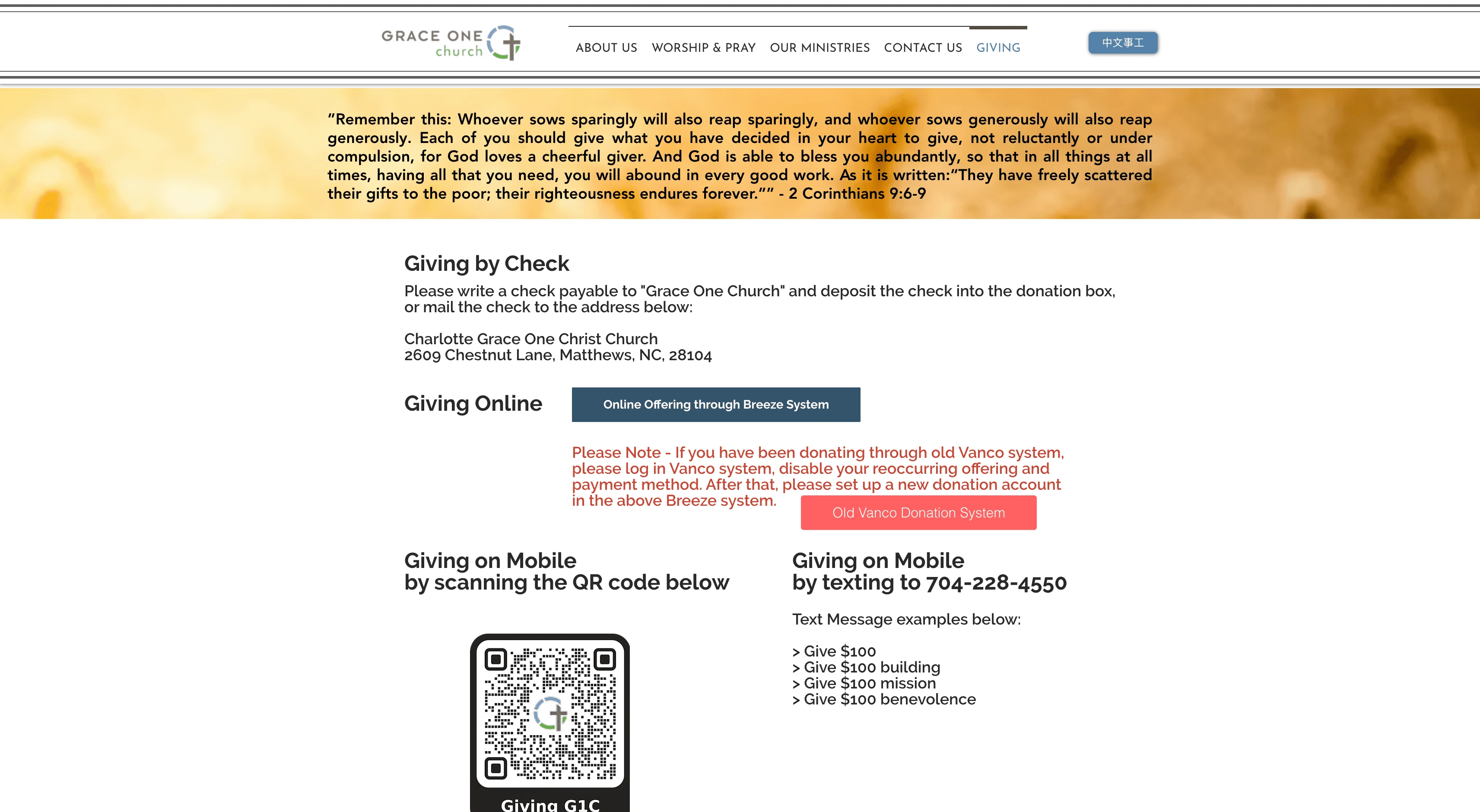
Funneling: weak paths to action
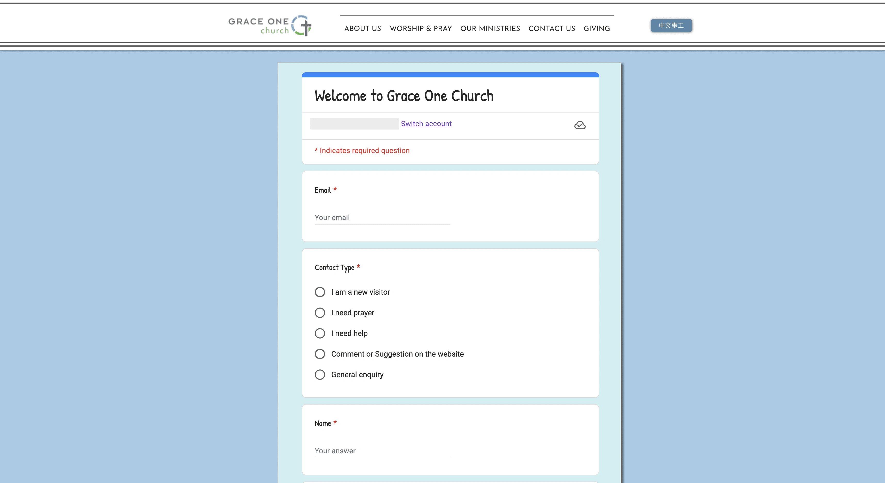
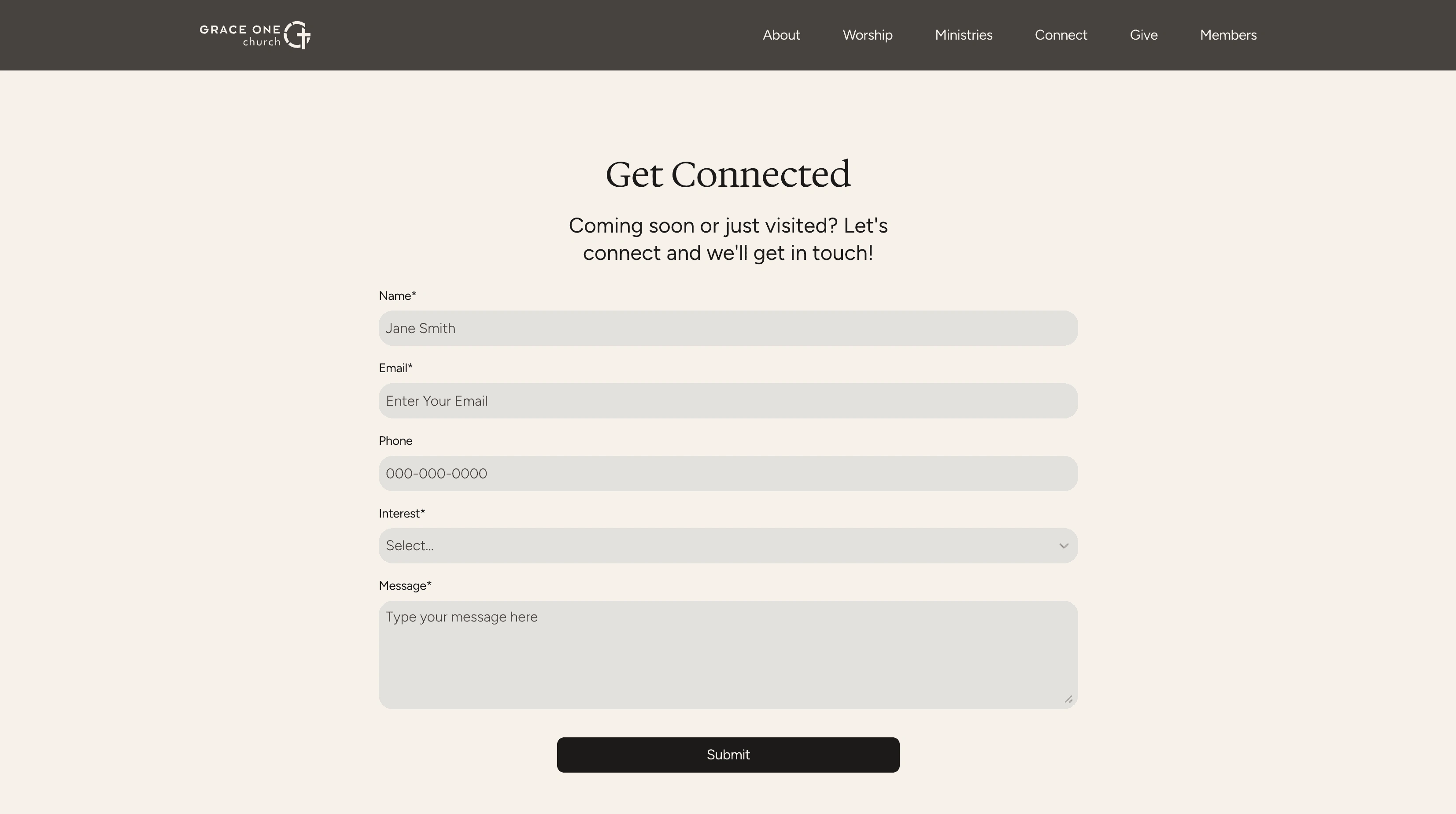
Key actions such as visiting, connecting, or joining a ministry were present but inconsistently surfaced, so intent stalled before becoming a clear next step like a visit, form submission, or group connection. The primary call to connect was hidden on its own page and integrated through Google Forms causing friction in retention and leads.
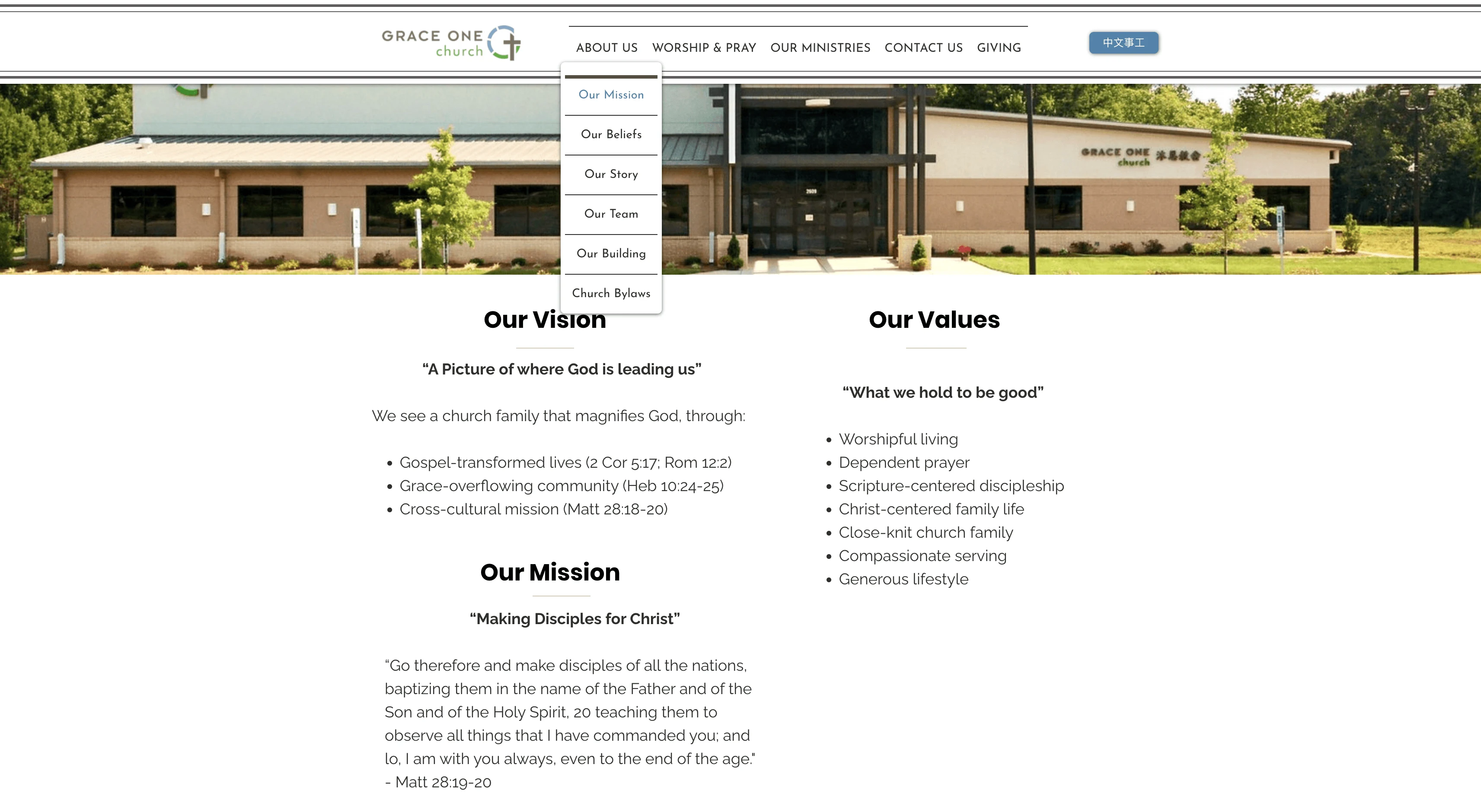
Visual language: outdated and misaligned
The visual system (typography, spacing, grid, hierarchy) did not fully reflect a warm, multicultural, multigenerational church, nor did it support fast scanning across different age‑specific ministries.
Strategy exploration
Designing a visitor‑first, ministry‑aligned experience
The redesign was approached as both an information‑architecture and visual‑language challenge, with Figma used to test structure and hierarchy before building in Framer.
Re‑architected the homepage narrative
The homepage was rebuilt as a single narrative arc: welcome, worship, weekly rhythm, ministries, and connection. Further refining the information and flow to be engaging all the way through.
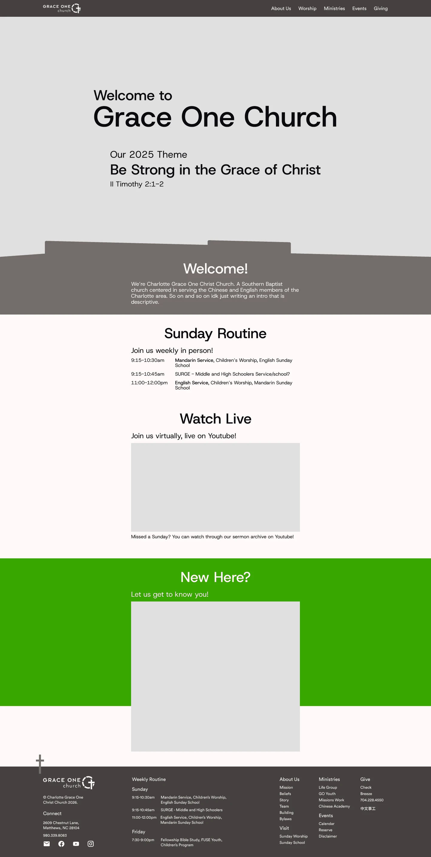
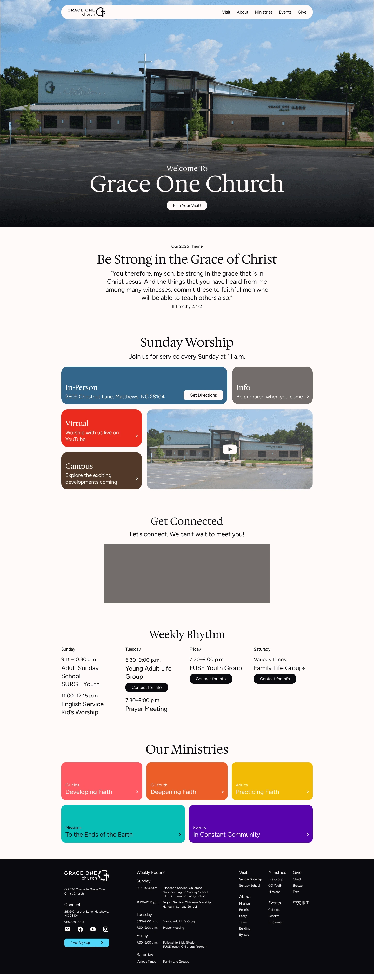
Codified a simple layout system
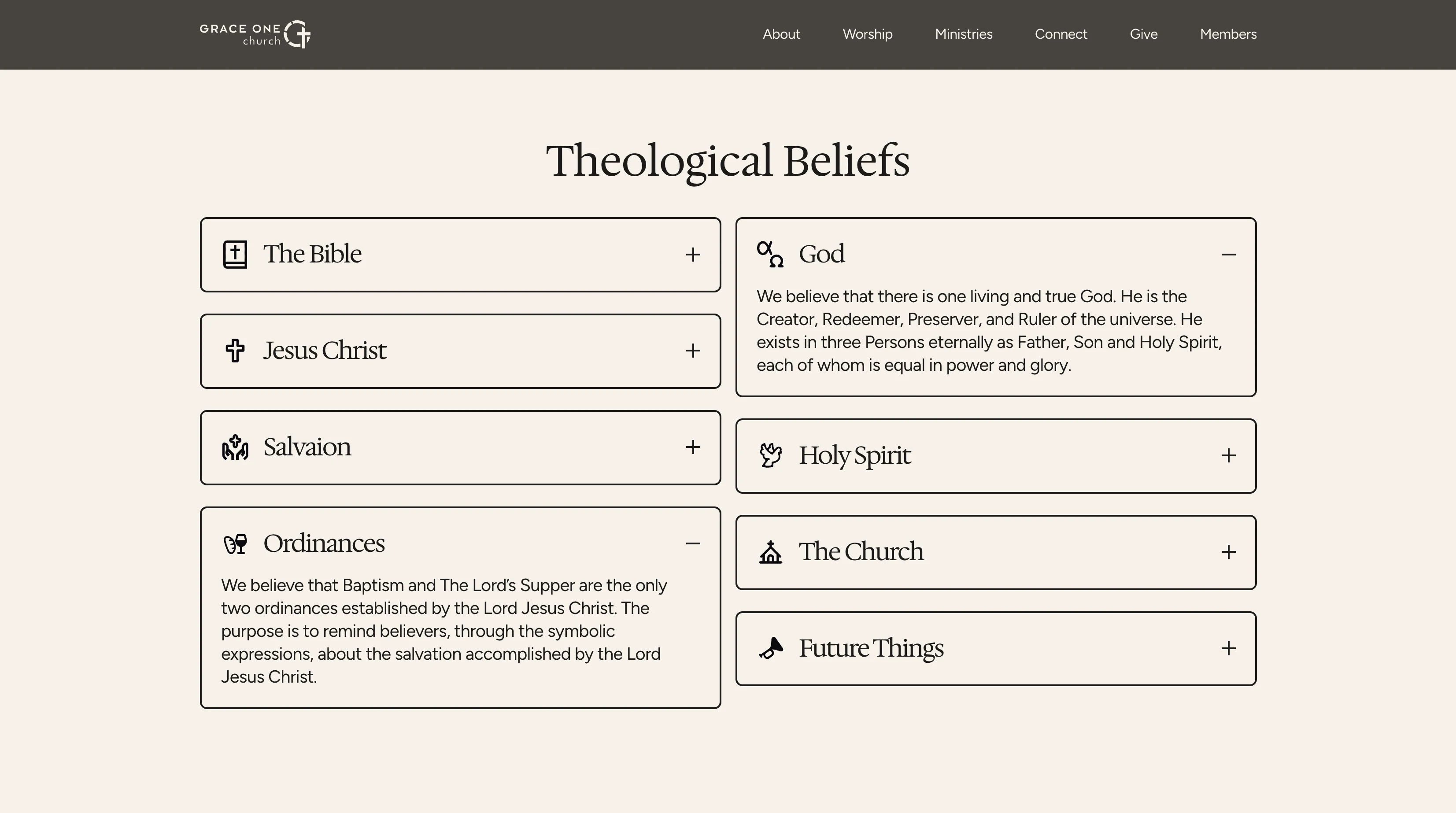
A simple grid, consistent section structures, and card‑based modules were established so users can easily scan the whole site and find relevant information and actions.
Evolved typography and color
Typography and color were tuned to create a clear hierarchy and highlight primary actions (such as “Plan Your Visit” and “Connect”), supporting a modern aesthetic that aligns with the contemporary tone of Grace One.
Final solution
How the new site addresses the needs
The final build translates this strategy into an interactive experience that makes understanding Grace One, and acting on that understanding, straightforward.
Experience: a guided journey formed
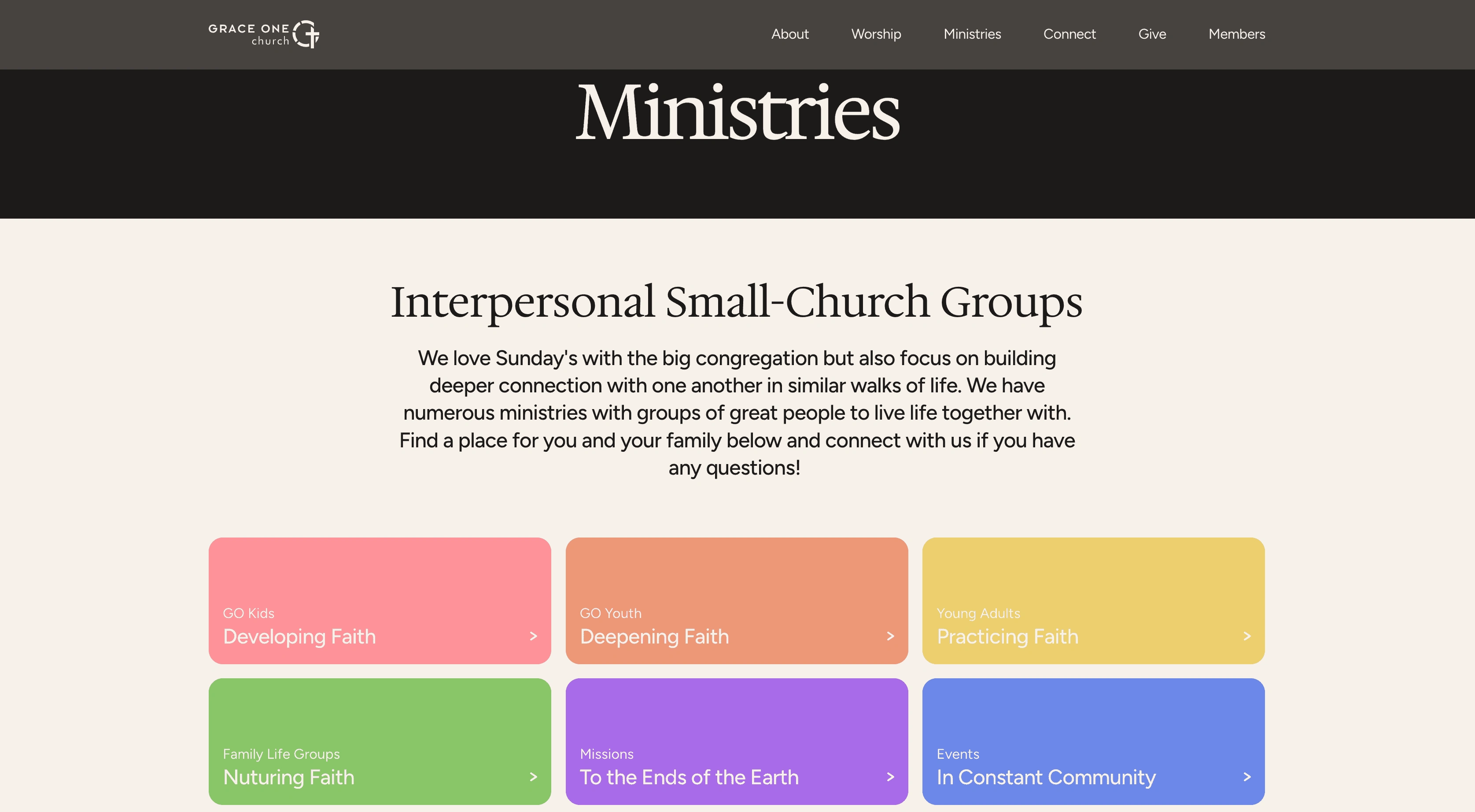
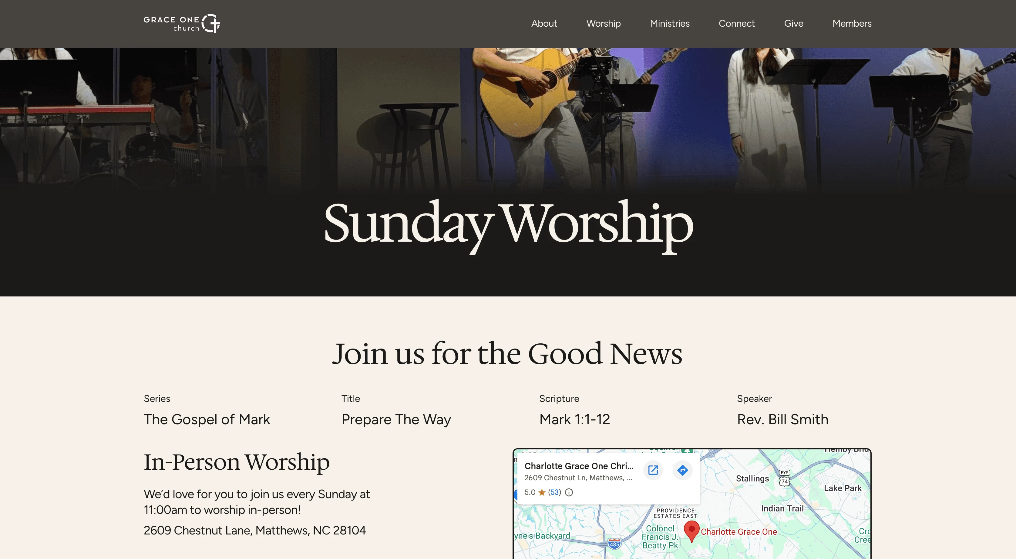
The homepage now walks visitors through a welcome message, worship details, weekly rhythm, ministries, and a call to connect, with copy written for first‑time guests and families rather than only long‑time members.
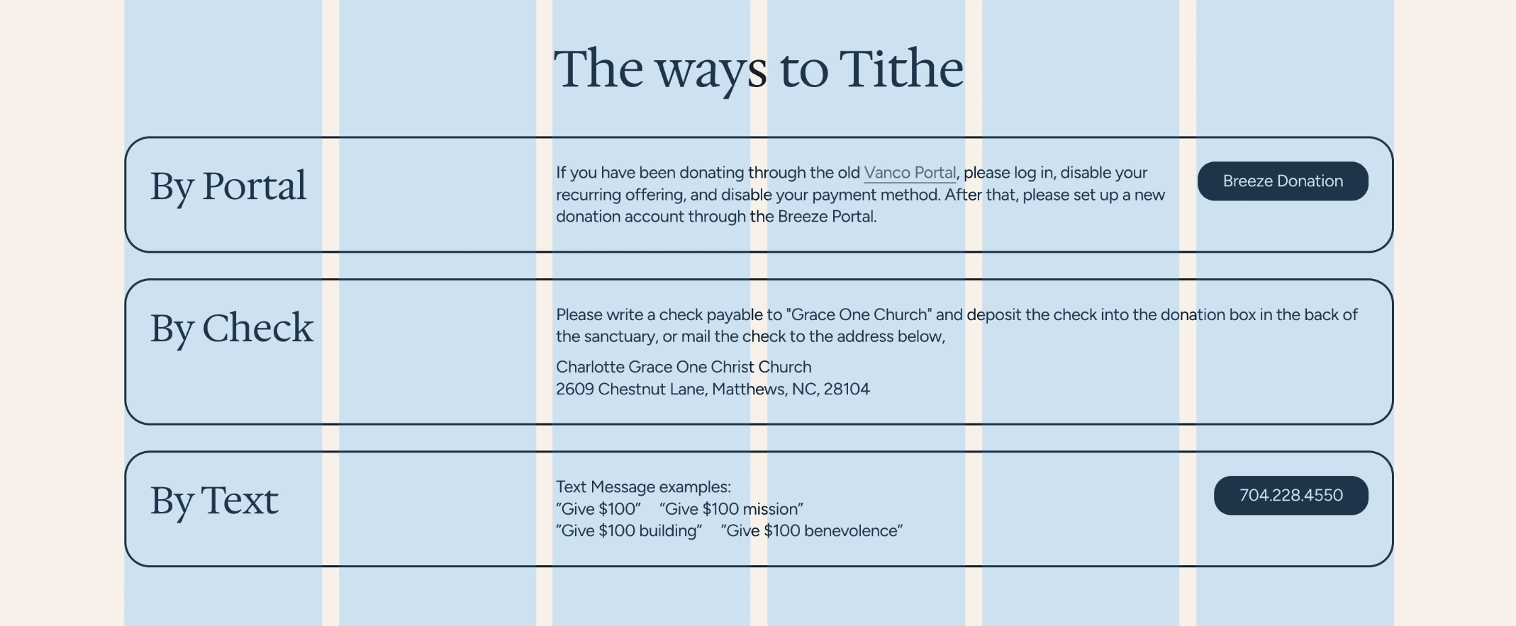
Funneling: clear, repeated calls to action
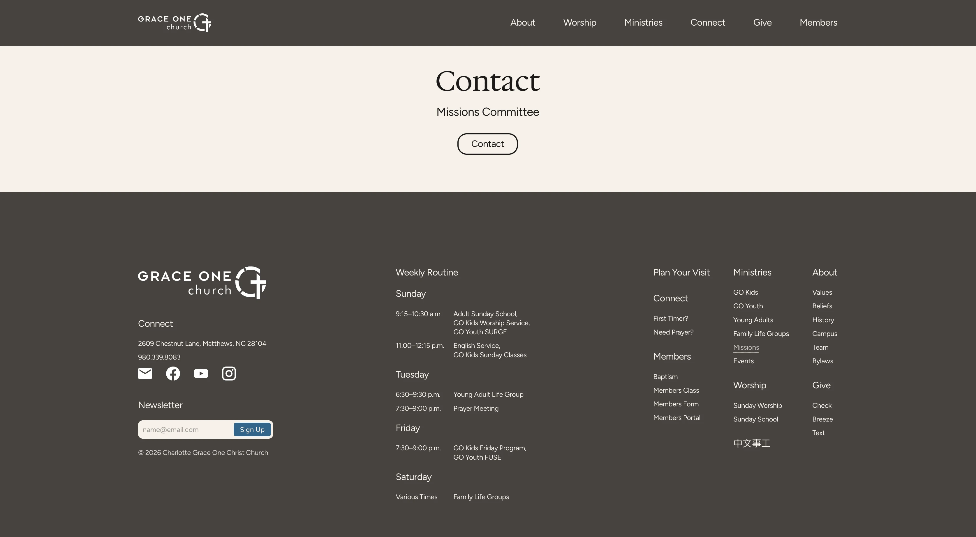
Navigation, hero, and footer consistently surface actions, and the new Plan Your Visit page turns the site into a funnel that points toward in‑person engagement.
Visual language: a new look that matches the message
Updated typography, spacing, and layout create a modern, readable, and consistent visual language that reflects both the warmth of the community and the energy of contemporary worship, while making it easy to scan across all age‑based ministries.
Outcome
From a virtual view to in-person visit
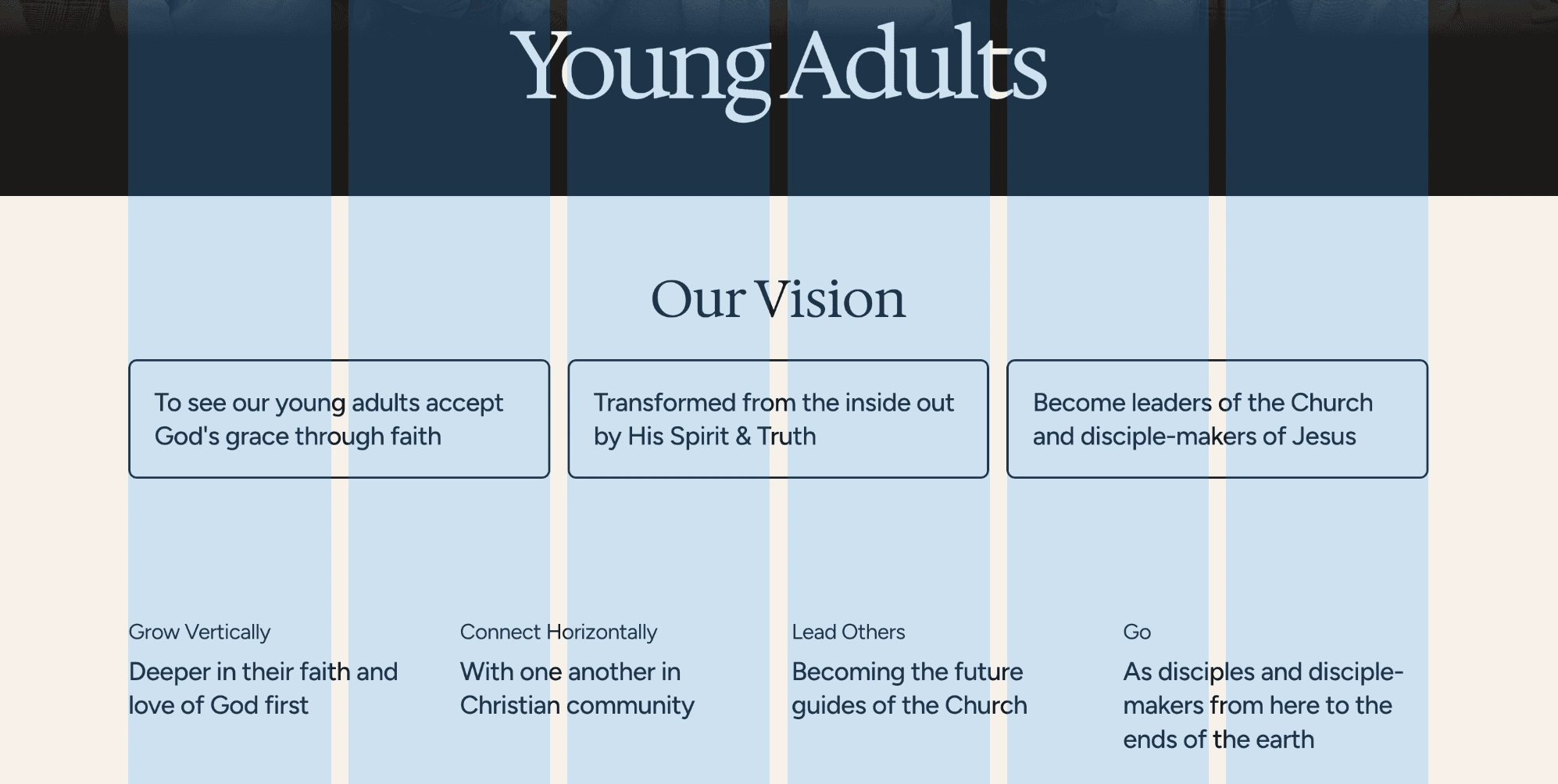
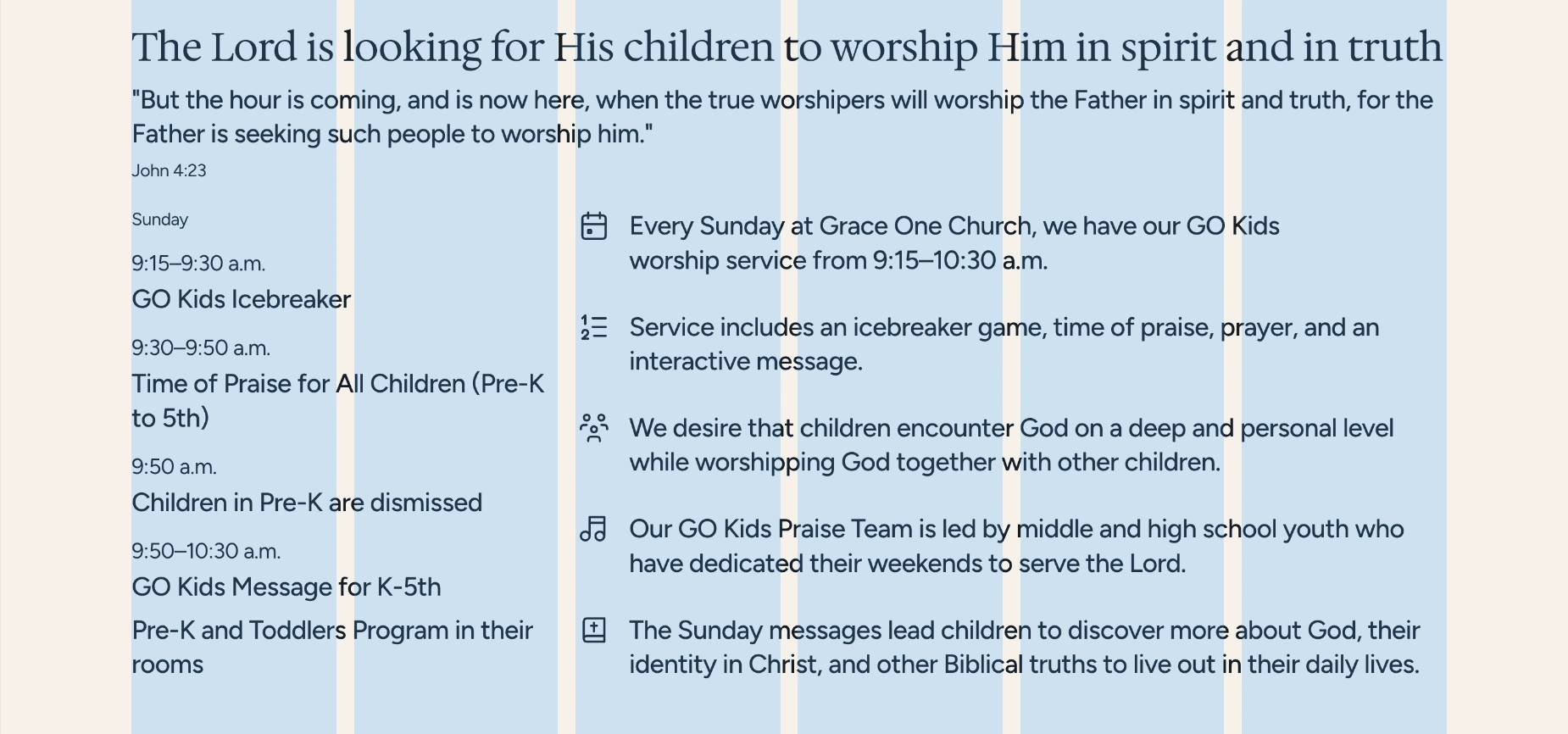
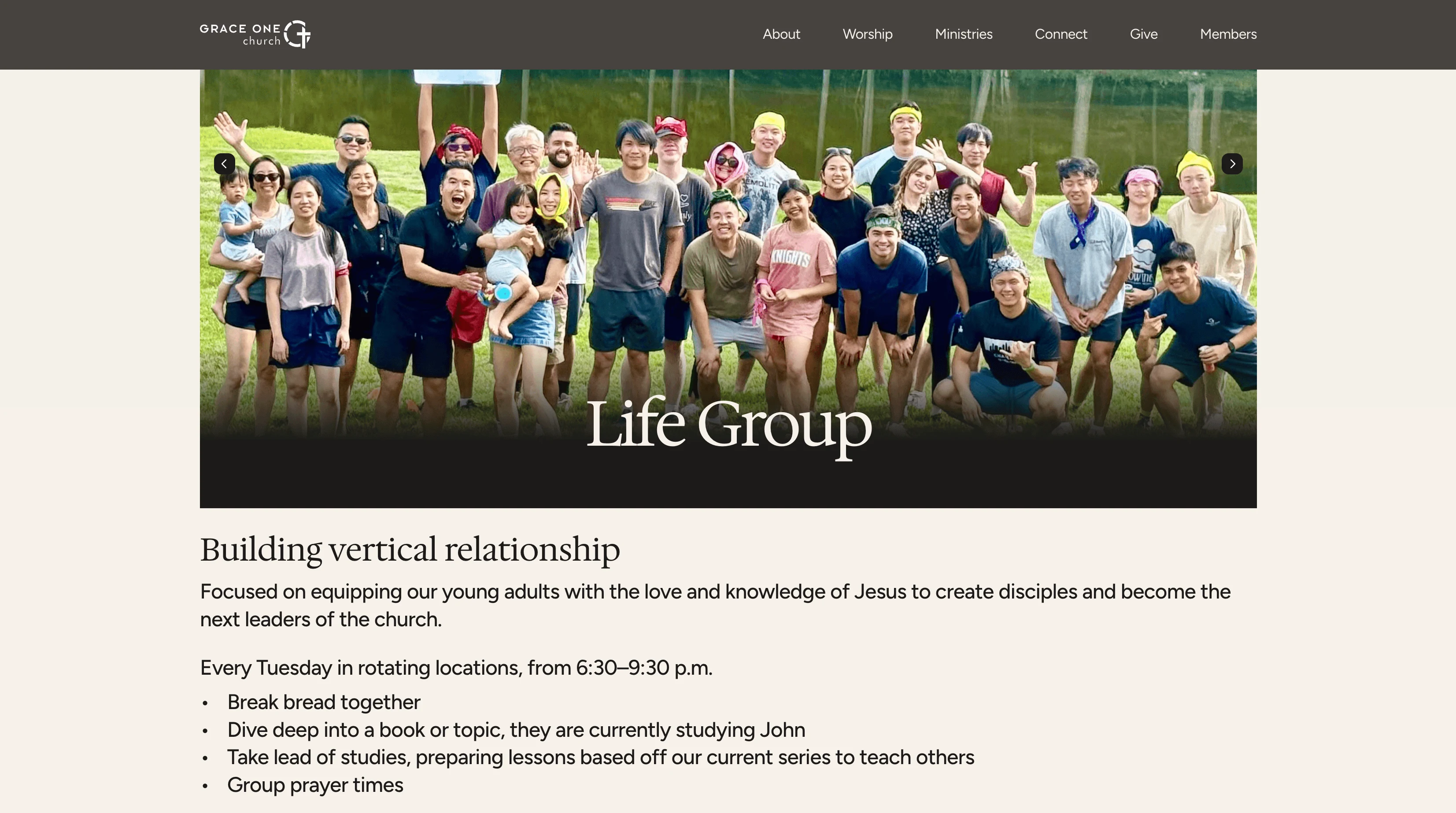
The redesigned experience is structured to support faster paths from curiosity to commitment: a new visitor can land on the homepage, confirm service times and location, get a clear sense of worship and preaching, see that ministries exist for babies, kids, students, young adults, and families, and then submit a connect form or plan a visit in a single, uninterrupted flow. Regular attenders and members gain clearer access to weekly rhythms, Life Groups, age‑specific ministries, and service opportunities reducing time spent searching and encouraging the site’s use as a regular touchpoint instead of a one‑off information lookup.
Reflection
Continuing to steward and refine the experience
The new site is treated as a living tool, not a static asset, and is expected to be tuned over time based on ministry priorities, analytics, and stories from newcomers about how they discovered and experienced the church. The website was built for ongoing refinement after handoff of copy, layout, and calls to action which will help the site remain a faithful digital front door that quietly supports discipleship, hospitality, and community life week after week.
Like this project
Posted May 22, 2026
Website redesign for Grace One Church enhancing visitor engagement and digital experience.
Likes
0
Views
0