Projects using Figma in Overijssel
Projects using Figma in Overijssel
Sign Up
Post a job
Sign Up
Log In
Filters
2
Projects
People
Message
22
Roos van Gestel
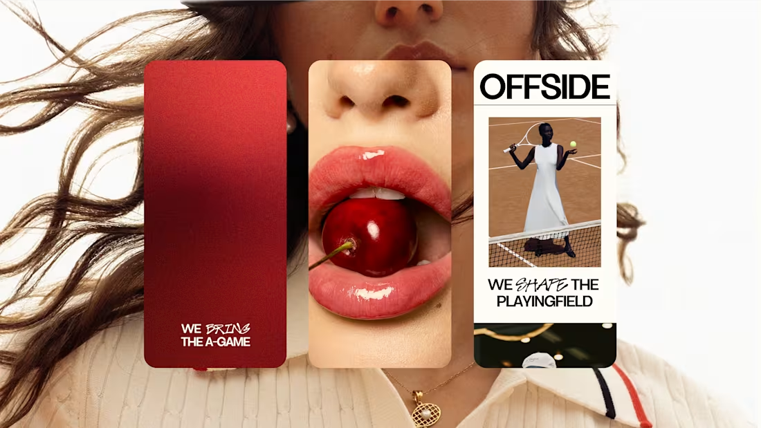
OFFSIDE Marketing Agency
22
141
Message
1
crew 7™ studio
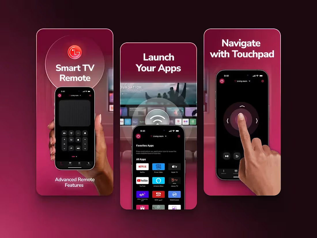
Screenshots design for LG Remote App
1
9
Message
1
Philip Wallage
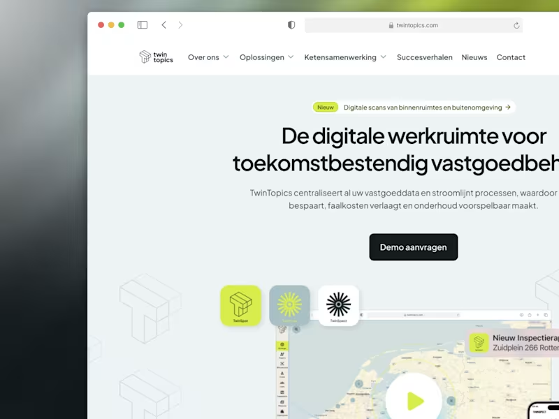
TwinTopics: Designing the Future of Real Estate Management
1
33
Message
1
Erwin Luijendijk, Cut the Code
A design system that enables international growth & ownership
1
17
Message
0
Aron Koehoorn
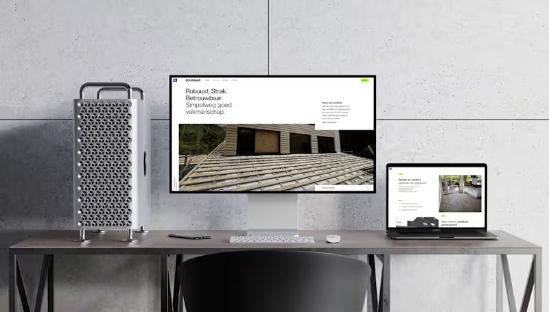
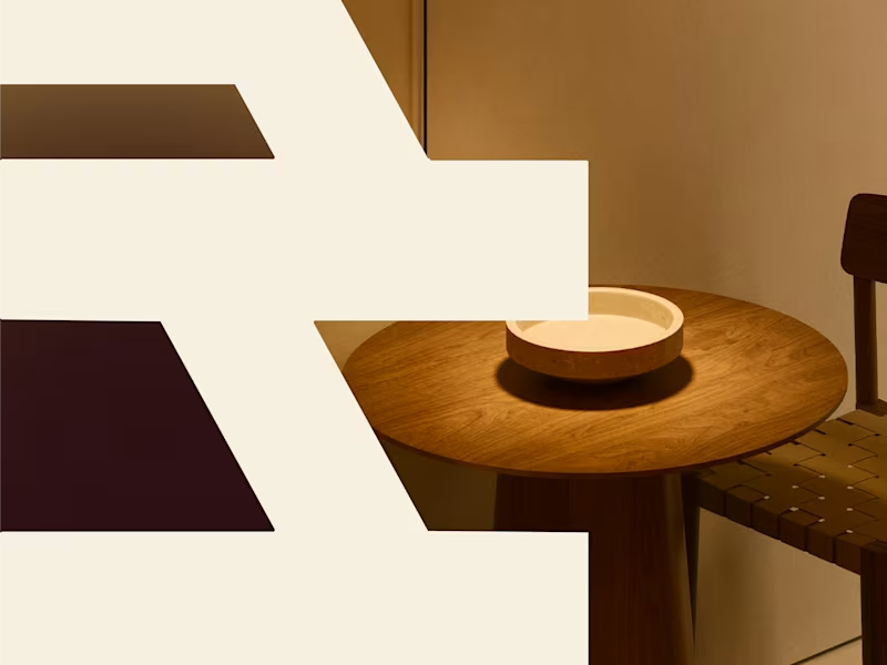
Bouwbaas – Brand Identity & Digital Presence for Modern Construction Services: Brand Identity, Web Design, UI/UX Design, Print Design, OOH (Out of Home) Design About the Project Bouwbaas is a construction and carpentry firm built on a foundation of robust, tight, and reliable craftsmanship. They needed a visual identity that steps away from the clunky, outdated aesthetics typical of the construction industry. The goal was to design a brand that feels as solid and meticulous as the physical work they deliver to their clients. The Challenge How do you make a construction brand look premium, modern, and trustworthy without losing its approachable, hardworking core? The challenge was to balance high-end digital minimalism with structural, bold typography and color choices that work just as well on a muddy construction site as they do on a high-resolution display. The Solution & Design Choices Logo & Identity System: The core of the identity is a structural, interlocking "BB" monogram. It conveys strength and architectural precision. The color palette pairs a deep, professional navy with a striking, vibrant blue and crisp white. Typography & Voice: Using a clean, sans-serif typeface, the brand voice is straightforward and confident ("Robuust. Strak. Betrouwbaar."). This no-nonsense approach is translated directly into the brand's visual hierarchy. Digital Experience: To showcase their projects, I designed a minimal, highly visual website. The layouts prioritize large, high-quality imagery of their carpentry and renovation work, ensuring a seamless experience across all devices, from desktop to mobile. App Design: The brand extends to mobile touchpoints with a sleek, highly legible app interface and an instantly recognizable home screen icon. Physical Branding & Print: A construction brand lives in the physical world. I designed clean, authoritative corporate stationery, including premium business cards. Furthermore, I created large-scale environmental graphics, like branded site fencing, which serves as an impactful billboard while a project is underway. Deliverables Brand Strategy & Identity System Custom Monogram Logo Responsive Website Design Mobile App Iconography Corporate Stationery (Business Cards) Environmental/Site Signage
0
113
Message
0
Ton Oor
Building a Cohesive and Trust-Driven Visual Identity
0
8
Message
0
Thuto Mojanaga
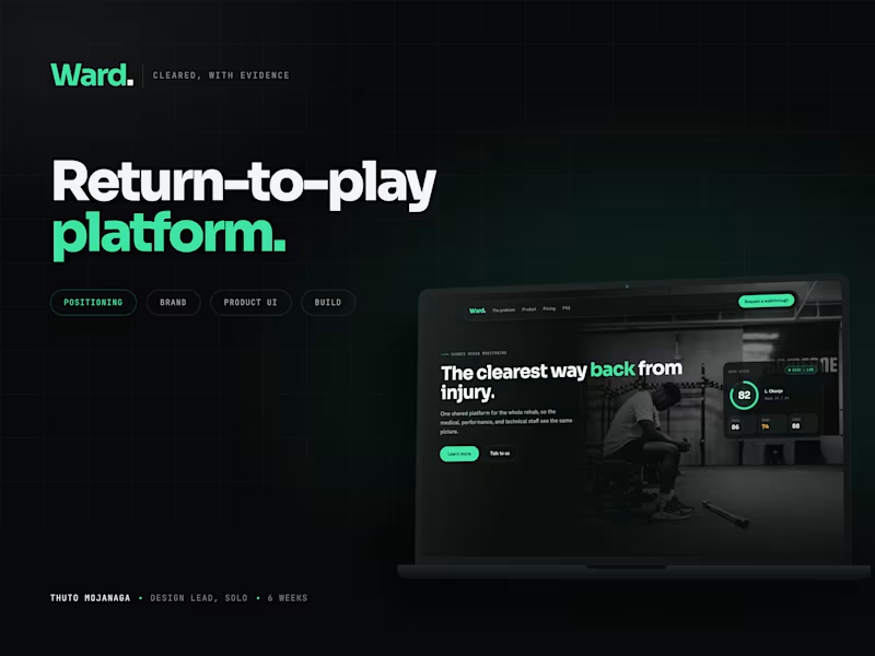
A return-to play platform for sports rehab | Ward 🟢
0
2
Message
1
Douwe Dijkink
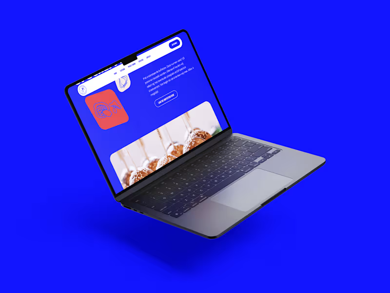
Catering de Opscheppers
1
12
Message
0
Mariia Nadzhar
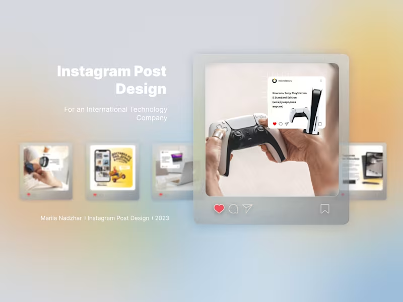
Instagram Posts Design for a Tech Company
0
9
Message
13
Roos van Gestel
NexHus Tiny Homes
13
79
Message
3
crew 7™ studio
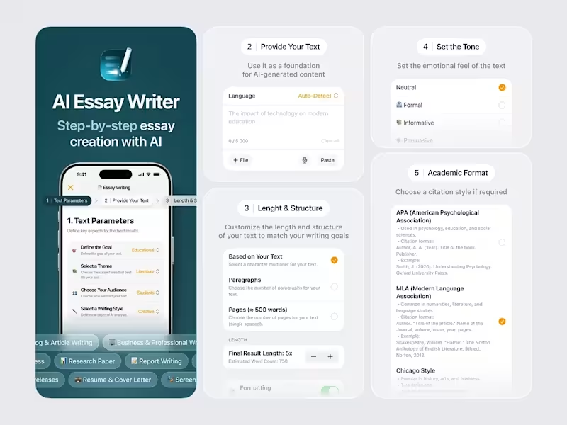
AI Essay Writer App Project
3
10
Message
26
Philip Wallage
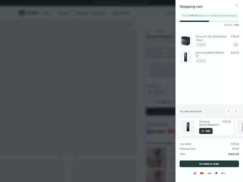
Most e-commerce stores leave money in the cart. Not because their products are wrong. Because their cart experience is lazy. New research from Baymard Institute: 52% of shoppers will actively hunt for more items if they see they're close to free shipping. Half your customers want to spend more. They just need to see how close they are. That's what a cart drawer with a dynamic progress bar does. Takes about 2 hours to implement. Results show within days. Here's what it looks like. The bar moves as they add items. Shows exactly how much more to hit the threshold. No guessing. No math. Just visual motivation. 23% will checkout anyway. Fine. But 52% will add more to their order. If your average order is €80... Can push 52% of customers to add one more item at €20?
26
470
Message
3
Aron Koehoorn
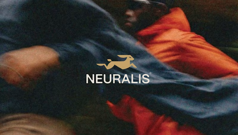
Neuralis – Brand Identity & UI/UX Design for an Urban Run Club Services: Brand Identity, UI/UX Design, Art Direction, App Design, OOH (Out of Home) Design About the Project For Neuralis, I had the opportunity to design the complete brand identity and app interface. Neuralis isn't just another running app; it's a premium, community-driven platform that connects and motivates athletes in cities like London, Amsterdam, and Berlin. The brand's mission is clear: elevate performance through the power of the pack. The Challenge The challenge was to create a visual language that feels high-end and minimalist, yet exudes the raw, athletic energy of urban street running. The brand needed to breathe a performance-oriented mindset while remaining deeply connected to a tight-knit community. The Solution & Design Choices The Logo & Mark: The core of the identity is the stylized, geometric golden hare. This symbolizes speed, agility, and relentless forward momentum. The logo is designed on a strict grid, ensuring perfect balance and scalability across all formats. Color & Typography: I opted for a bold, high-contrast palette. The base consists of deep dark gray and black, creating a 'stealthy' and premium feel. The gold adds a touch of exclusivity, while the bright action red is used for interface elements and key typography to instantly grab attention. The sleek, sans-serif typography gives the overall design a modern, urban aesthetic. UI/UX App Design: The iOS app interface is designed with a strict focus on clarity during workouts. By using striking, floating widgets (like the red 'Outdoor group run' card), users can check their route, fellow runners, distance, time, and calories burned at a single glance. Copywriting & Campaign: To reinforce the community's mindset, powerful slogans were integrated into the brand identity: "Forward is the only way", "PACE DICTATES THE PACK", and "WE RUN TOGETHER". These elements come to life across striking billboards, urban posters, and merchandise like tote bags. Deliverables Concept & Art Direction Logo & Brand Guidelines Mobile App Design (iOS Interface) Merchandise (Tote Bags) OOH Campaign Assets (Billboards & Posters)
2
3
148
Message
0
Ton Oor
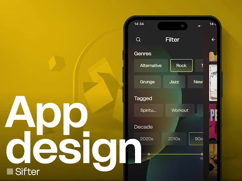
App Design: A Smarter Way to Organize Your Music Collection
0
6
Message
0
Mariia Nadzhar
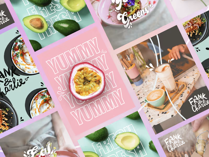
Vibrant Cafe Poster Collection
0
36
Message
14
Roos van Gestel
NoordWestGroep
14
129
Explore projects