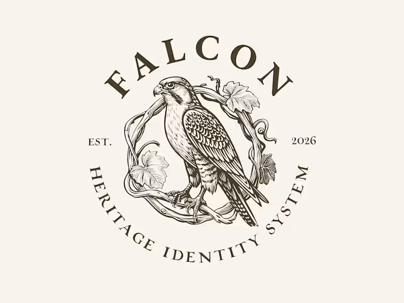
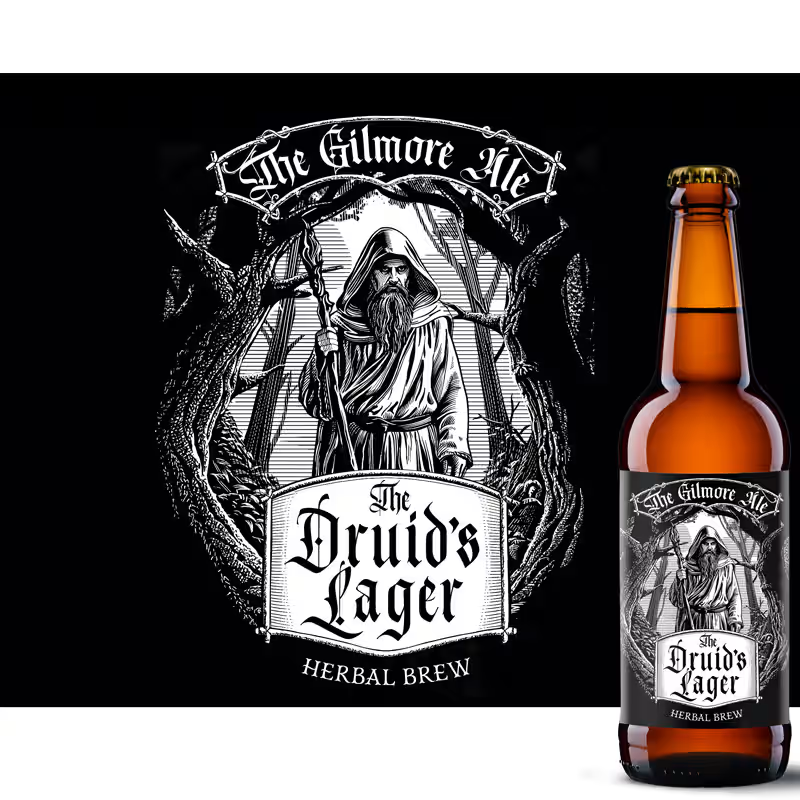
Digital illustration Projects in North HollandDigital illustration Projects in North HollandNew drop: Falcon 🦅 — an exclusive, engraving-style brand identity
system, for people who want their brand to look like it's been
around since 1887 (even if it launched last Tuesday).
Full pack: bird marks, 6 logo lockups, 4 monogram styles, frames,
dividers — all in one moody, hand-illustrated system.
The twist: this is an EXCLUSIVE license. The moment someone licenses
it, it's pulled from sale for a full year. So if you buy it, your
competitor literally cannot show up next month with the same falcon
on their wine label. (We checked. It's not possible. We removed it.)
$349/year. One buyer at a time. First come, first branded.
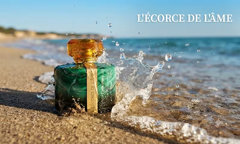
👉 https://contra.com/products/0yInhh9i-falcon-exclusive-heritage-brand-identity-system Every time I see the sunlight hitting the turquoise water, I think about the memory it leaves on the skin. I wanted to capture that precise moment where the elements collide: the raw, cooling salt of the ocean and the grounded, deep warmth of amber. I asked myself, "Can a fragrance feel like a sun-kissed horizon?"
Meet L'ÉCORCE DE L'ÂME.
L'Écorce de l'Âme isn't just a perfume; it’s a design study in duality. It starts with a cool, sharp rush of sea salt and bergamot , a crisp, modern surface ,before blooming into a heart of delicate jasmine and peppered freesia. Finally, it settles into an irresistible amber base, reminiscent of sun-drenched skin against the tide.
As a product designer, I treated the bottle design as the "bark" , the solid, protective exterior that, when cracked open, reveals the "soul" of the scent within. It’s about the tension between the mineral and the organic, the stillness and the wave. Premium Logo Proposal — IMA Massagepraktijk
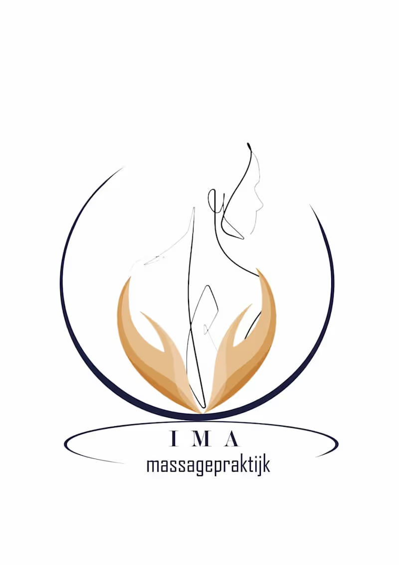
A visual translation of tranquility, alignment, and holistic healing, designed with pure minimal precision.
The Concept & Symbolism: This proposal introduces a continuous, elegant line-art silhouette representing human grace and posture. The form is gently embraced by warm-toned, organic hands to signify therapeutic care, trust, and ultimate comfort.
Spatial Harmony: Enclosed within a delicate, circular protective arch, the identity mirrors structural balance, symmetry, and architectural neatness.
Typography Integration: Paired with wide-spaced, elegant serif lettering for "IMA" and a clean, modern editorial typeface for "massagepraktijk" underneath to communicate premium luxury.
A timeless identity tailored perfectly for contemporary, upscale wellness spaces