The network for creativity
Join 1.25M professional creatives like you
Connect with clients, get discovered, and run your business 100% commission-free
Creatives on Contra have earned over $150M and we are just getting started
Back to feedPost

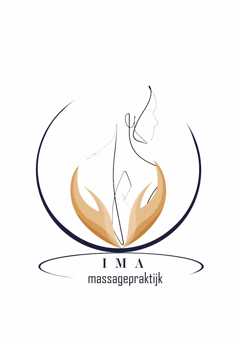
Premium Logo Proposal — IMA Massagepraktijk
A visual translation of tranquility, alignment, and holistic healing, designed with pure minimal precision.
The Concept & Symbolism: This proposal introduces a continuous, elegant line-art silhouette representing human grace and posture. The form is gently embraced by warm-toned, organic hands to signify therapeutic care, trust, and ultimate comfort.
Spatial Harmony: Enclosed within a delicate, circular protective arch, the identity mirrors structural balance, symmetry, and architectural neatness.
Typography Integration: Paired with wide-spaced, elegant serif lettering for "IMA" and a clean, modern editorial typeface for "massagepraktijk" underneath to communicate premium luxury.
A timeless identity tailored perfectly for contemporary, upscale wellness spaces

The network for creativity
Join 1.25M professional creatives like you
Connect with clients, get discovered, and run your business 100% commission-free
Creatives on Contra have earned over $150M and we are just getting started





Related posts

XNOMAD — Brand Identity Design!
XNOMAD is a premium modular camper brand based in Scandinavia, offering both rental experiences and ownership of off-road pickup campers.
The goal was to create an identity that could sit naturally between two worlds:
Scandinavian minimalism + rugged outdoor capability.
Rather than following the typical loud adventure aesthetic, we kept the system clean, modern, and confident, reflecting XNOMAD's idea of quiet luxury and freedom.
The identity was built around a distinctive X, supported by a minimal wordmark, bold blue palette, typography, graphic patterns, and applications across digital and physical touchpoints.
Wake Up Anywhere.
One of those projects where simplicity did most of the talking.


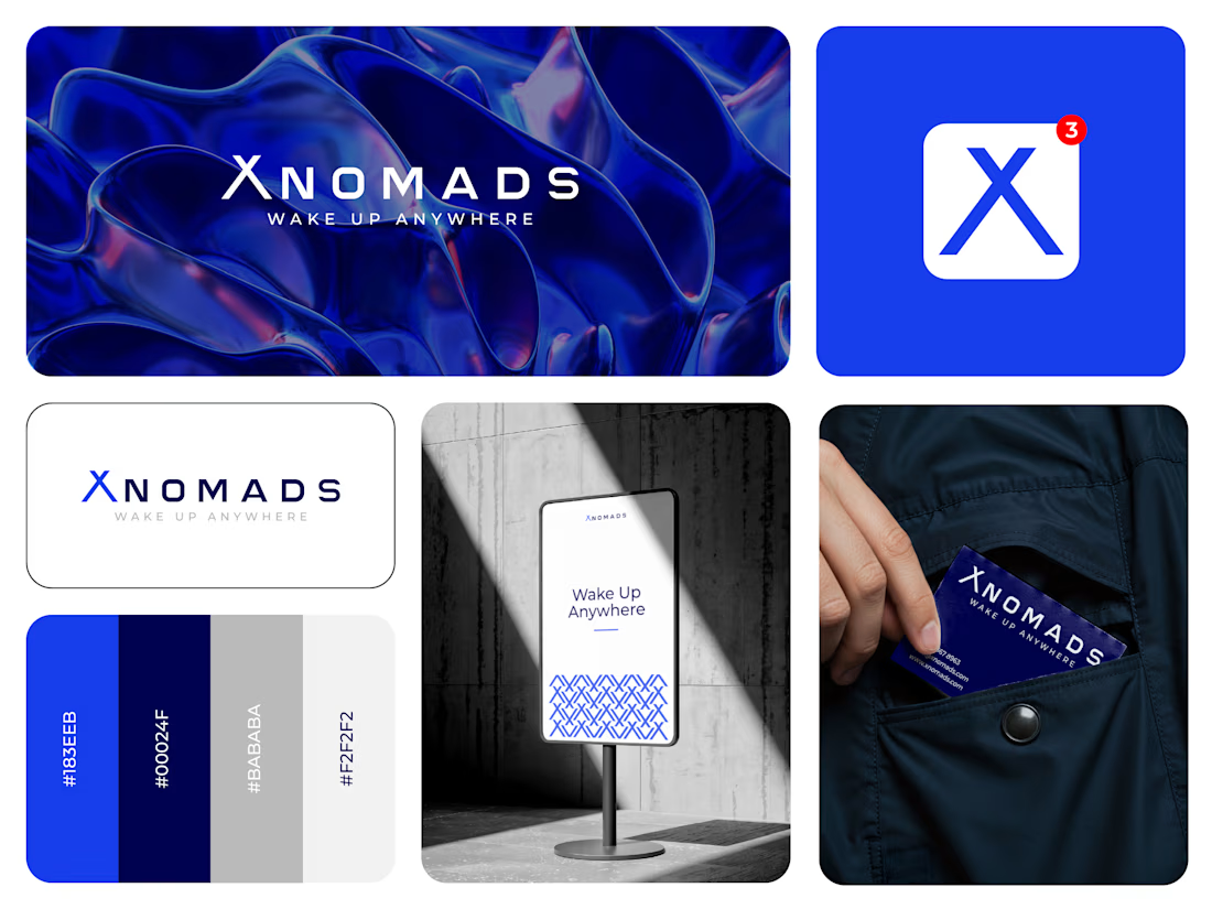

The blue visual system and mockup presentation work so well together.

Cleann🔥

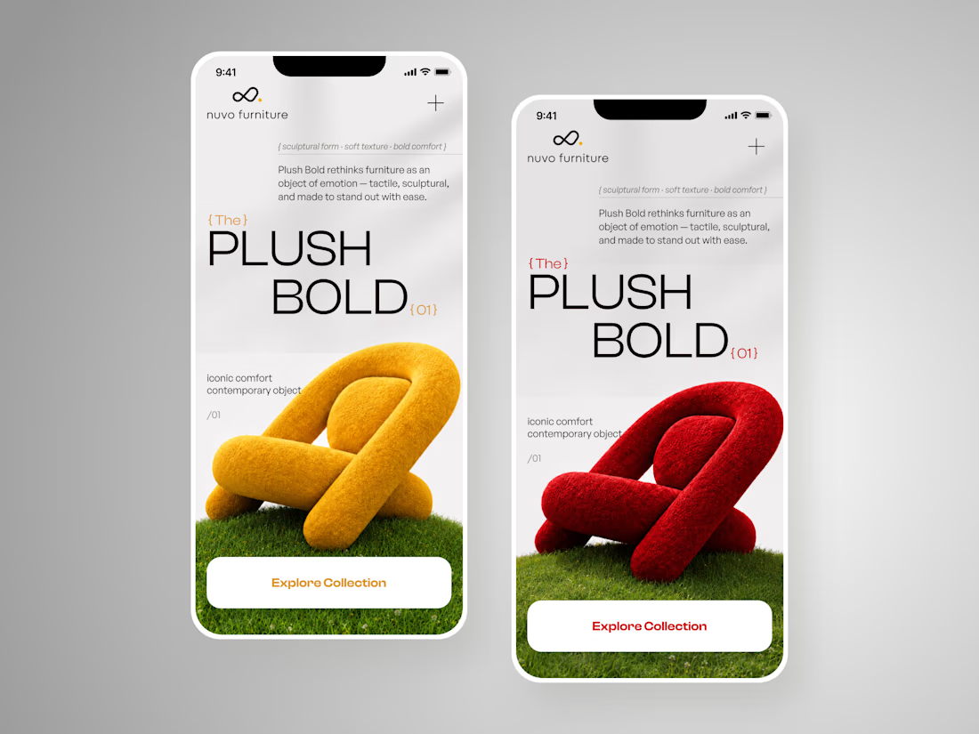
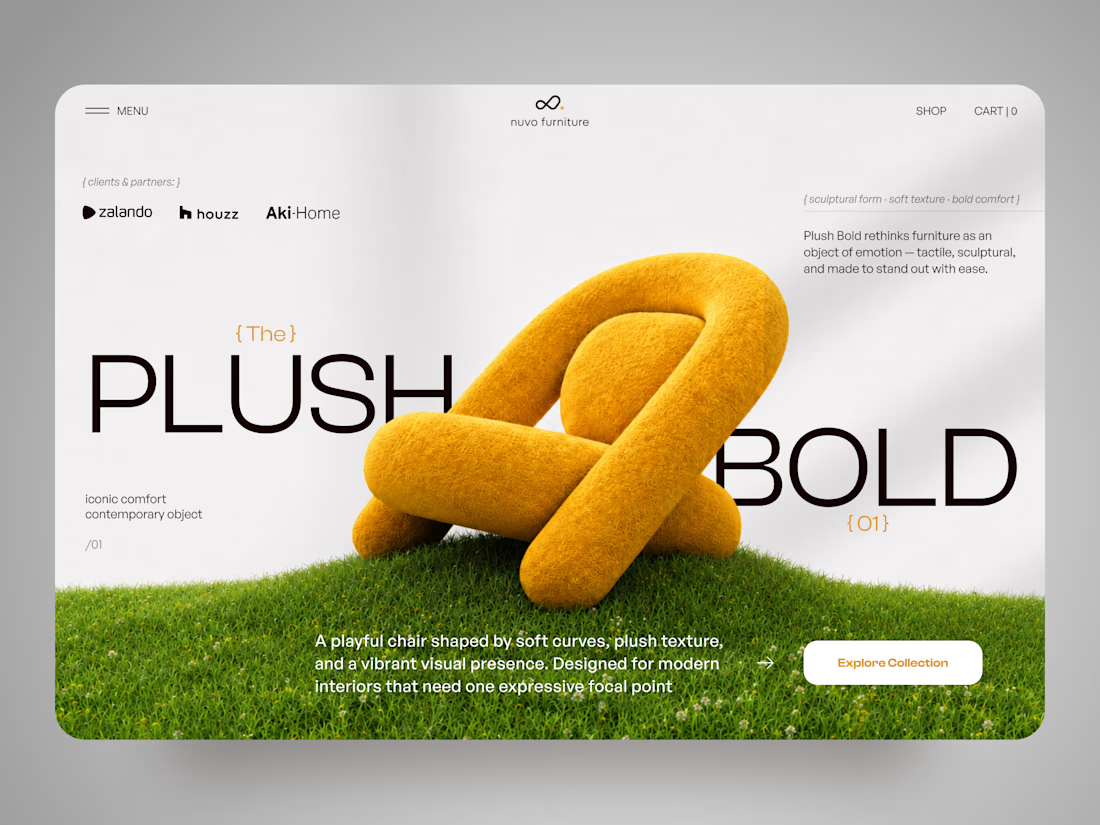
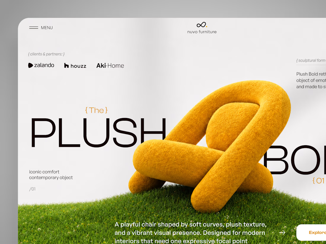
NUVO Furniture — Sculptural Furniture E-commerce Concept 🪑✨
NUVO is a contemporary furniture website concept built around one idea: let the product become the experience.
At the center of the concept is Plush Bold — an expressive statement chair designed to feel more like a...

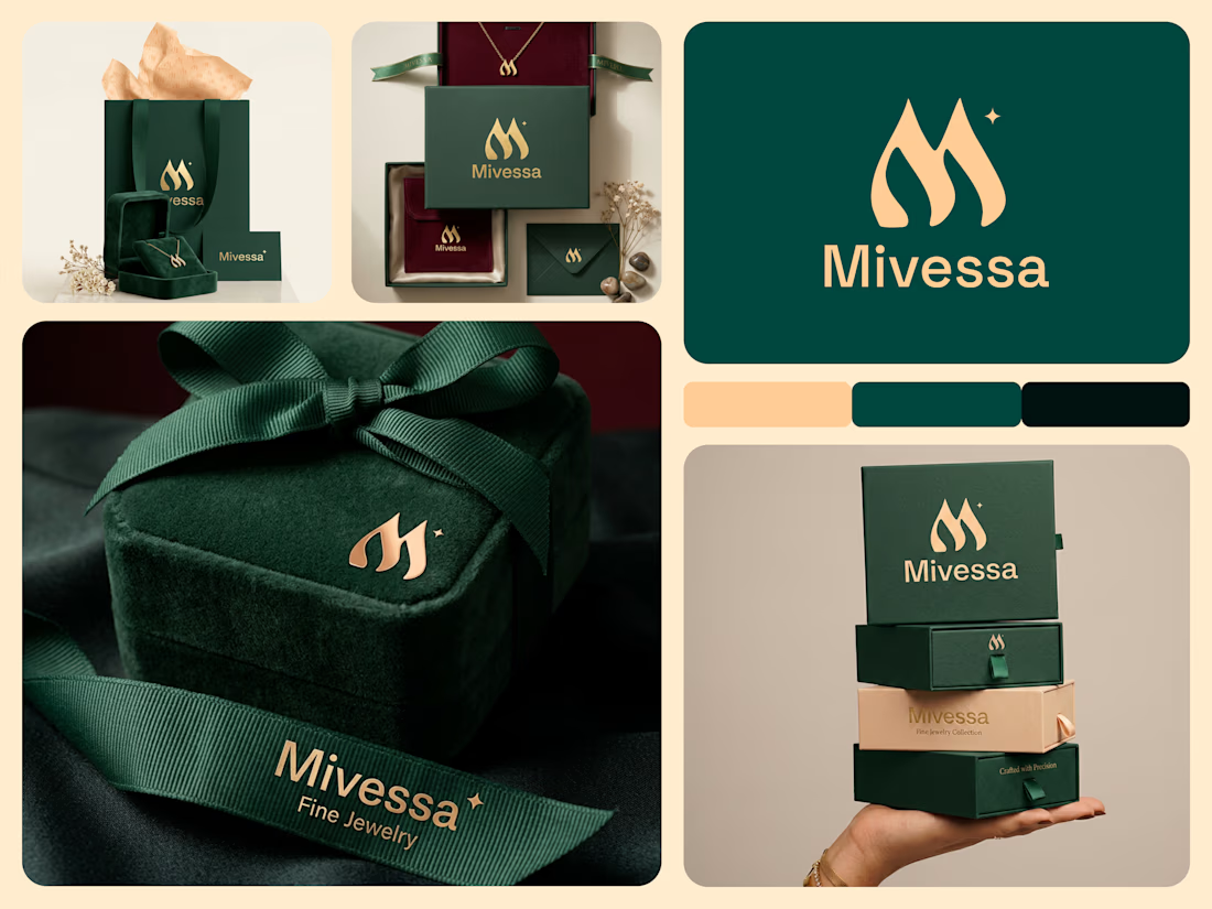
A jewelry brand shouldn't feel special only when the box is opened. For Mivessa, the goal was to build that feeling from the very first touchpoint.
The M monogram became the visual signature of the brand simple enough to remember, distinctive enough to own. Then we carried that identity into the full experience:
→ Jewelry boxes
→ Velvet pouches
→ Ribbons
→ Wrapping materials
→ Gift cards
→ Brand stationery
Deep green creates a rich, premium foundation. Gold adds warmth and elegance. And the consistent use of the identity turns separate materials into one recognizable brand experience. Because premium branding isn't only about how the jewelry looks. It's also about how the brand feels before, during, and after the purchase.
🏀 Full Design Showcase – Better View on Dribbble.
Premium Jewelry Brand Identity, Packaging & Brand Materials

The monogram, packaging, and overall visual language feel premium.