The network for creativity
Join 1.25M professional creatives like you
Connect with clients, get discovered, and run your business 100% commission-free
Creatives on Contra have earned over $150M and we are just getting started
Back to feedPost
A jewelry brand shouldn't feel special only when the box is opened. For Mivessa, the goal was to build that feeling from the very first touchpoint.
The M monogram became the visual signature of the brand simple enough to remember, distinctive enough to own. Then we carried that identity into the full experience:
→ Jewelry boxes
→ Velvet pouches
→ Ribbons
→ Wrapping materials
→ Gift cards
→ Brand stationery
Deep green creates a rich, premium foundation. Gold adds warmth and elegance. And the consistent use of the identity turns separate materials into one recognizable brand experience. Because premium branding isn't only about how the jewelry looks. It's also about how the brand feels before, during, and after the purchase.
🏀 Full Design Showcase – Better View on Dribbble.
Premium Jewelry Brand Identity, Packaging & Brand Materials


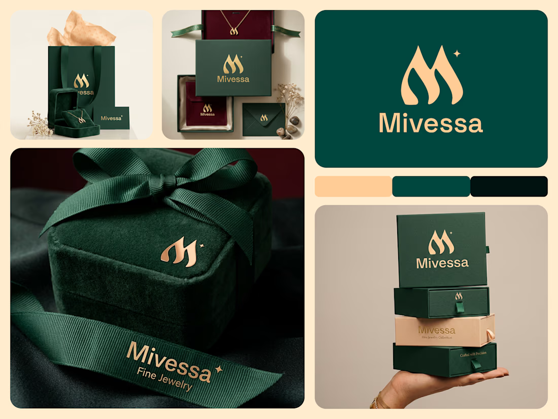

The monogram, packaging, and overall visual language feel premium.

Thank you!
The network for creativity
Join 1.25M professional creatives like you
Connect with clients, get discovered, and run your business 100% commission-free
Creatives on Contra have earned over $150M and we are just getting started







Related posts

Still finding little moments from this project that I want to share
A few more favorites from the launch video 💜


great work..

Essence - Cosmetics Brand Packaging


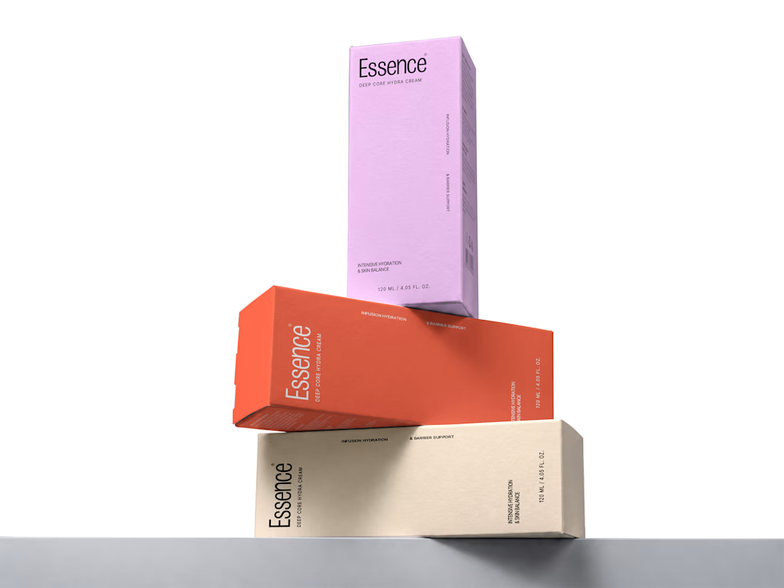
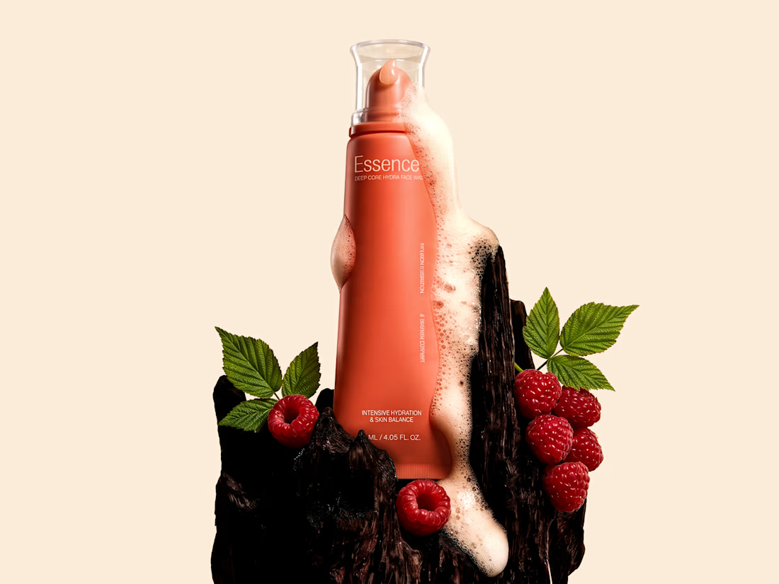
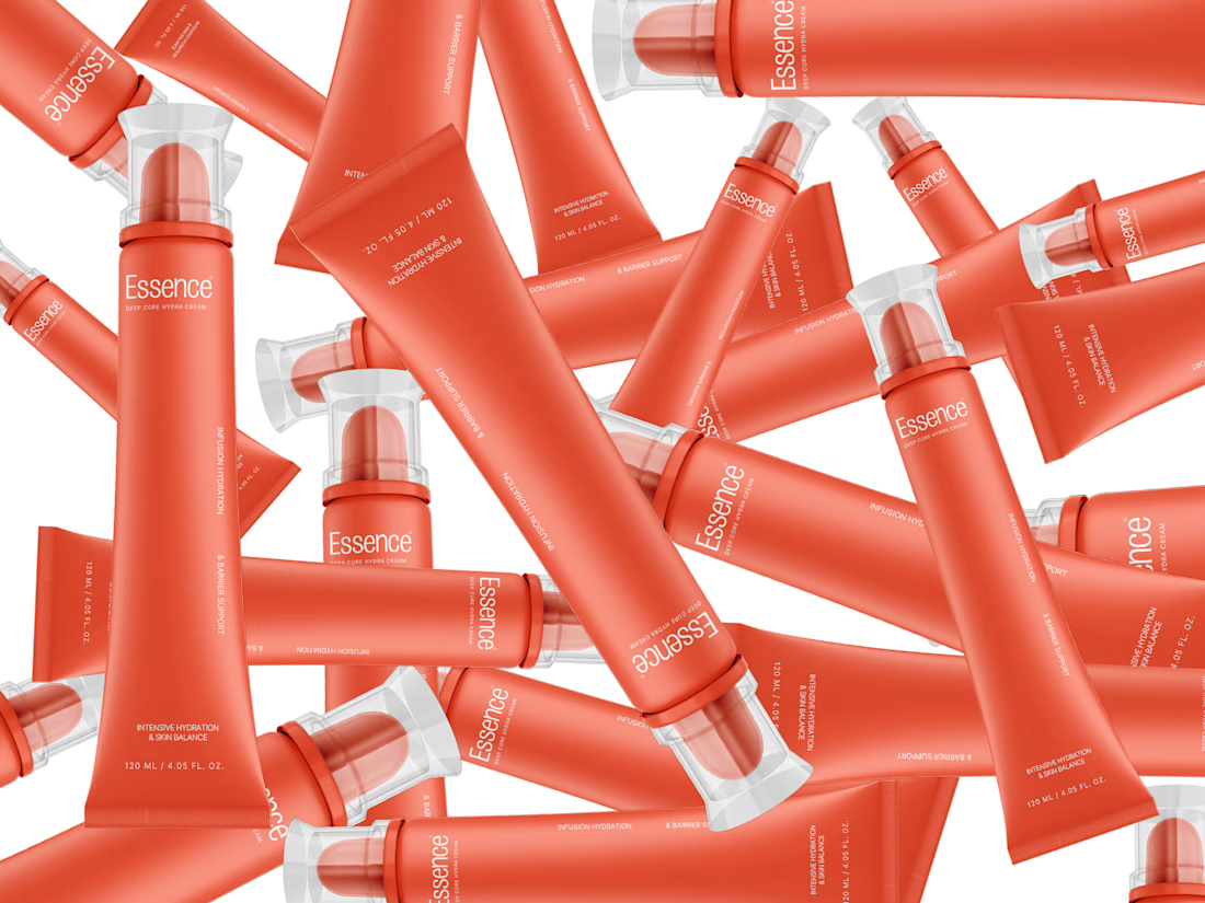

the pile of tubes shot is sick. did you model them or use a mockup?

