Web Designer & Framer Expert for creative small businesses
Web Designer & Framer Expert for creative small businesses
Architect | Founder at ARCh
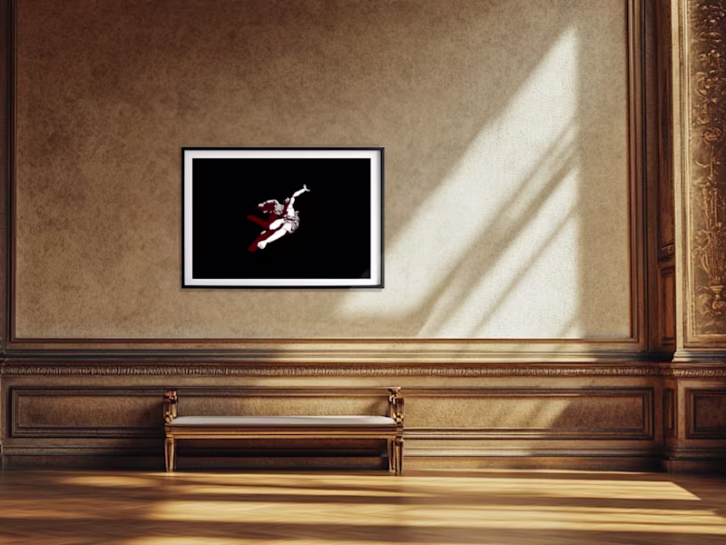
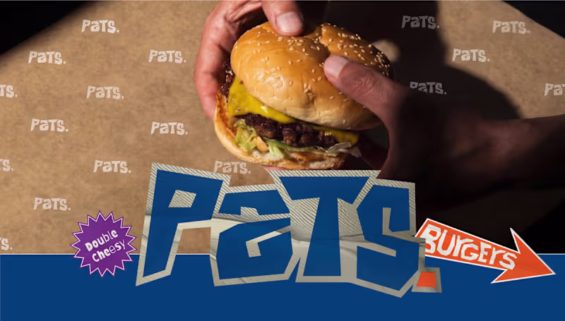
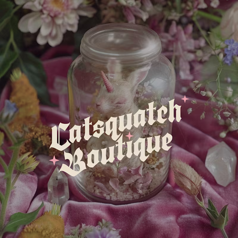
🗡️ Illustrator, Animator, Merch + Brand Designer ✨

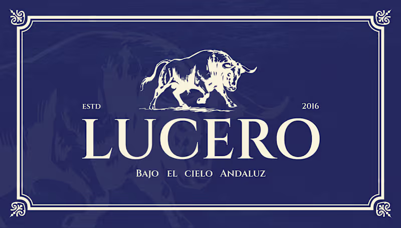
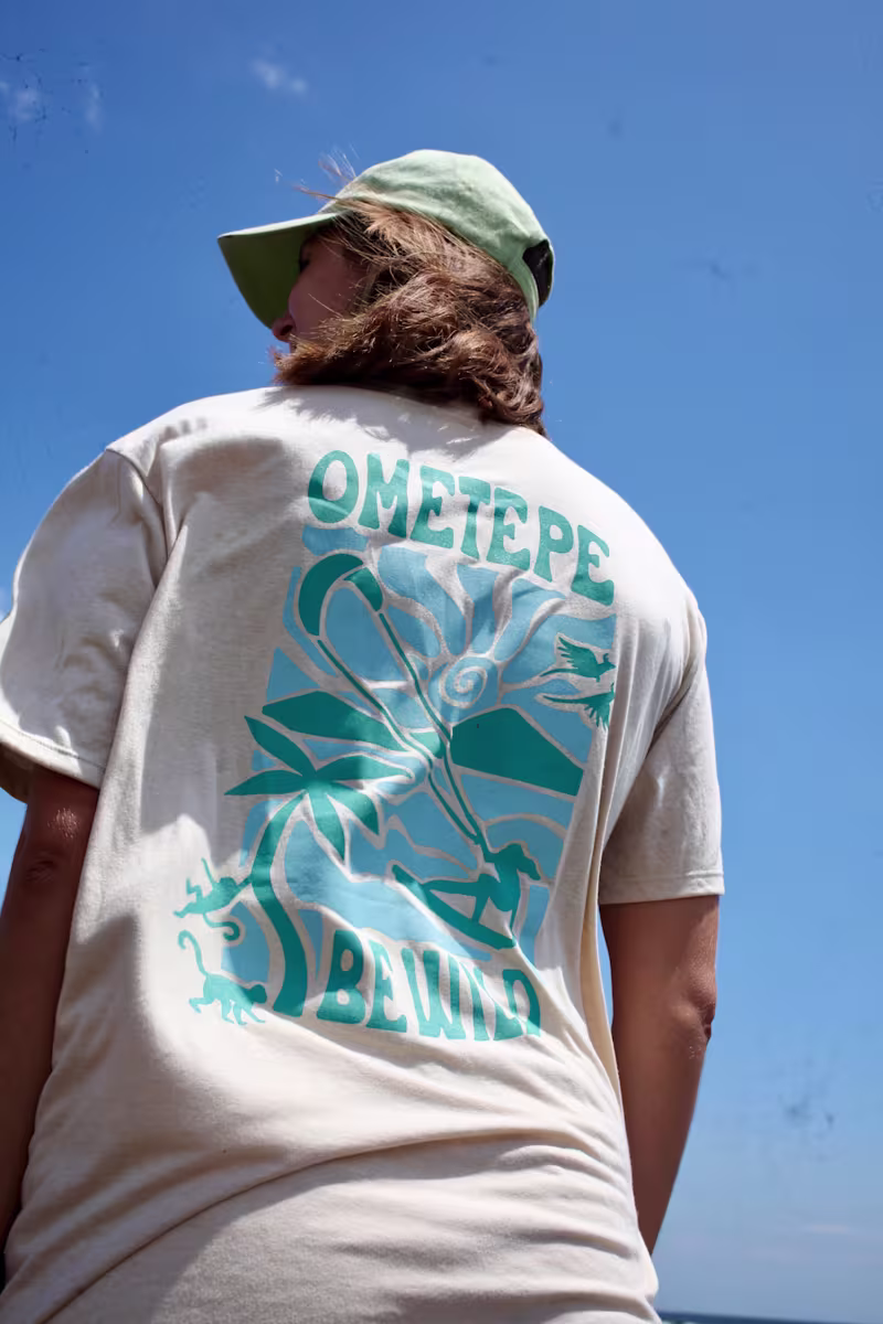
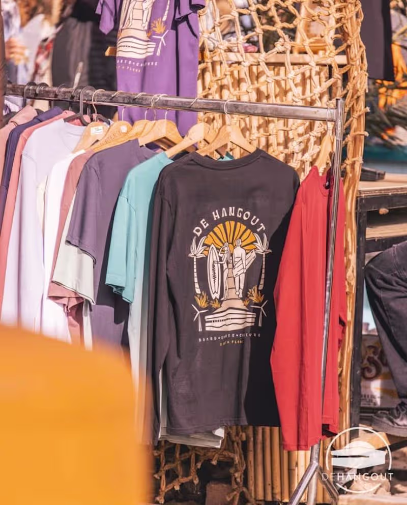
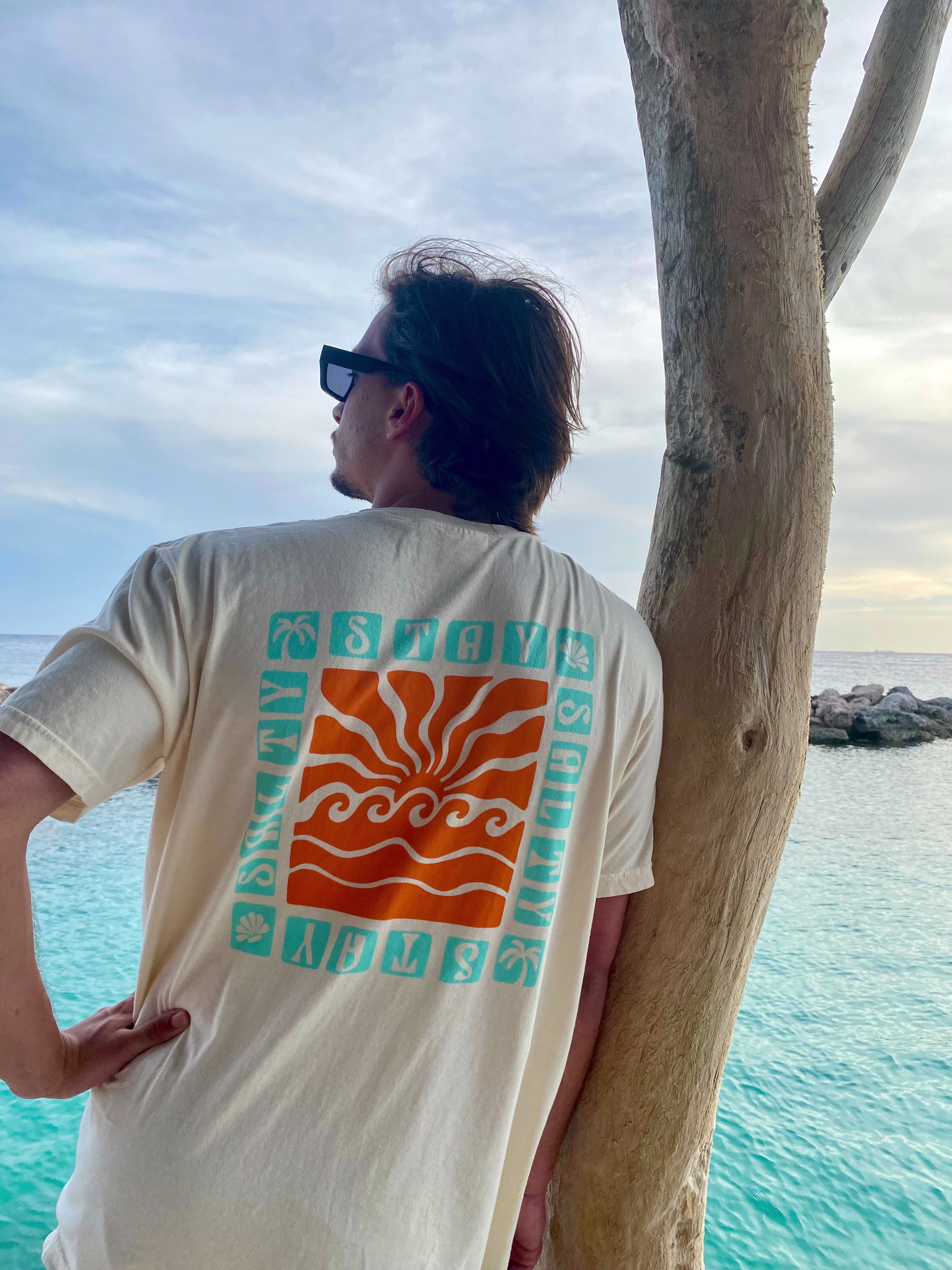
Surf-inspired graphic design 🏄♂️✨
Surf-inspired graphic design 🏄♂️✨

View more →
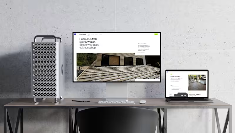
Have your personal all in-house studio at your fingertips.
Have your personal all in-house studio at your fingertips.
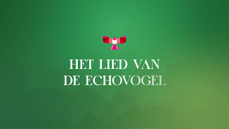
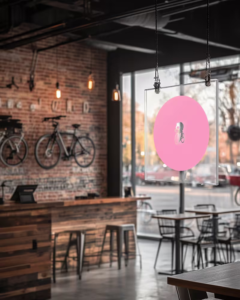
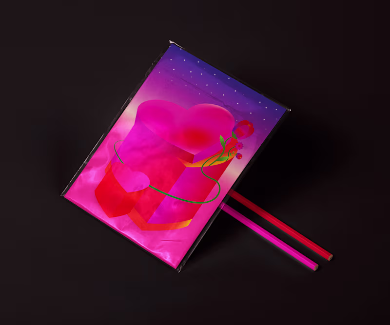
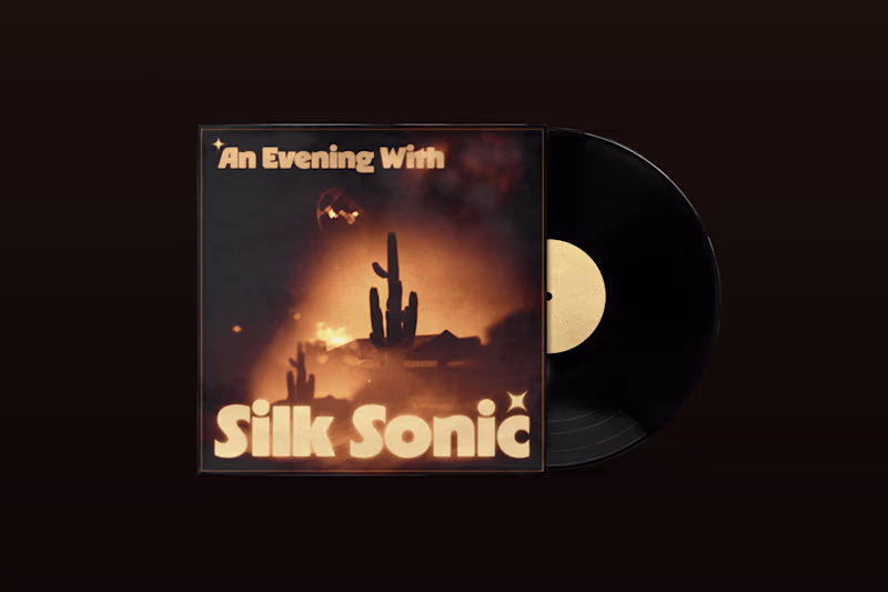
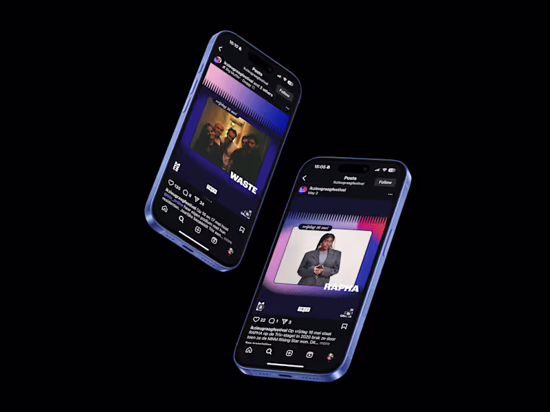
Graphic Designer – visual identities, music artwork & social
- 42
- Followers
Graphic Designer – visual identities, music artwork & social
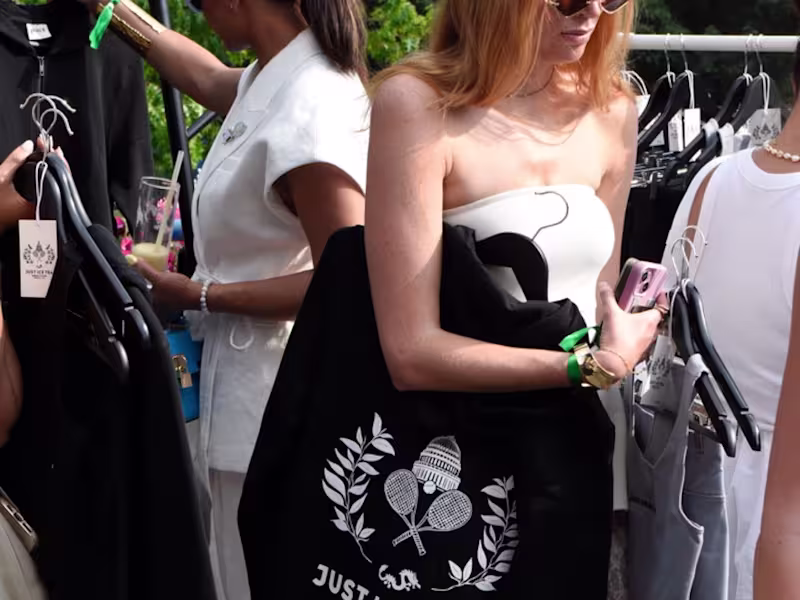
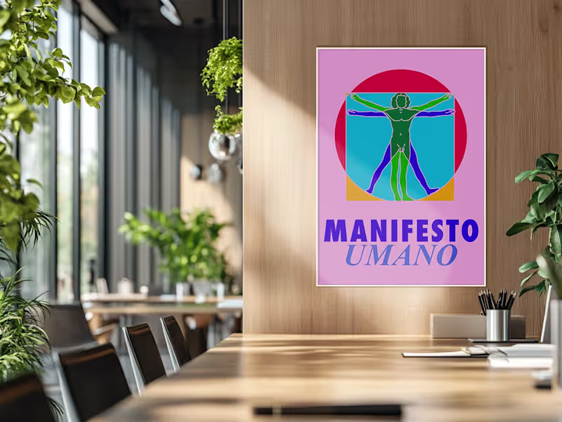
Brand Systems & Communication Designer
- 1x
- Hired
- 41
- Followers
Brand Systems & Communication Designer
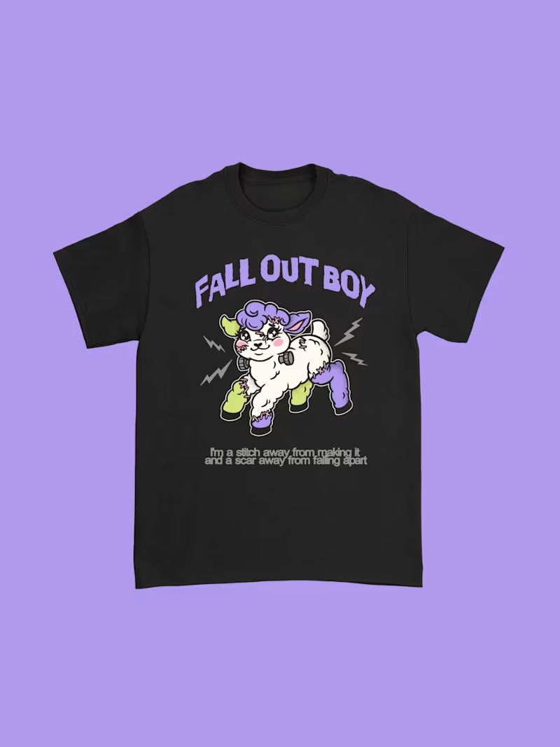
Strategic Brand & UI/UX Designer | Building high-end designs
New to Contra
Strategic Brand & UI/UX Designer | Building high-end designs