

BLAIRE | Brand Identity & Packaging
Blaire was built around the idea of making a minimal brand feel distinctive without relying on excess.
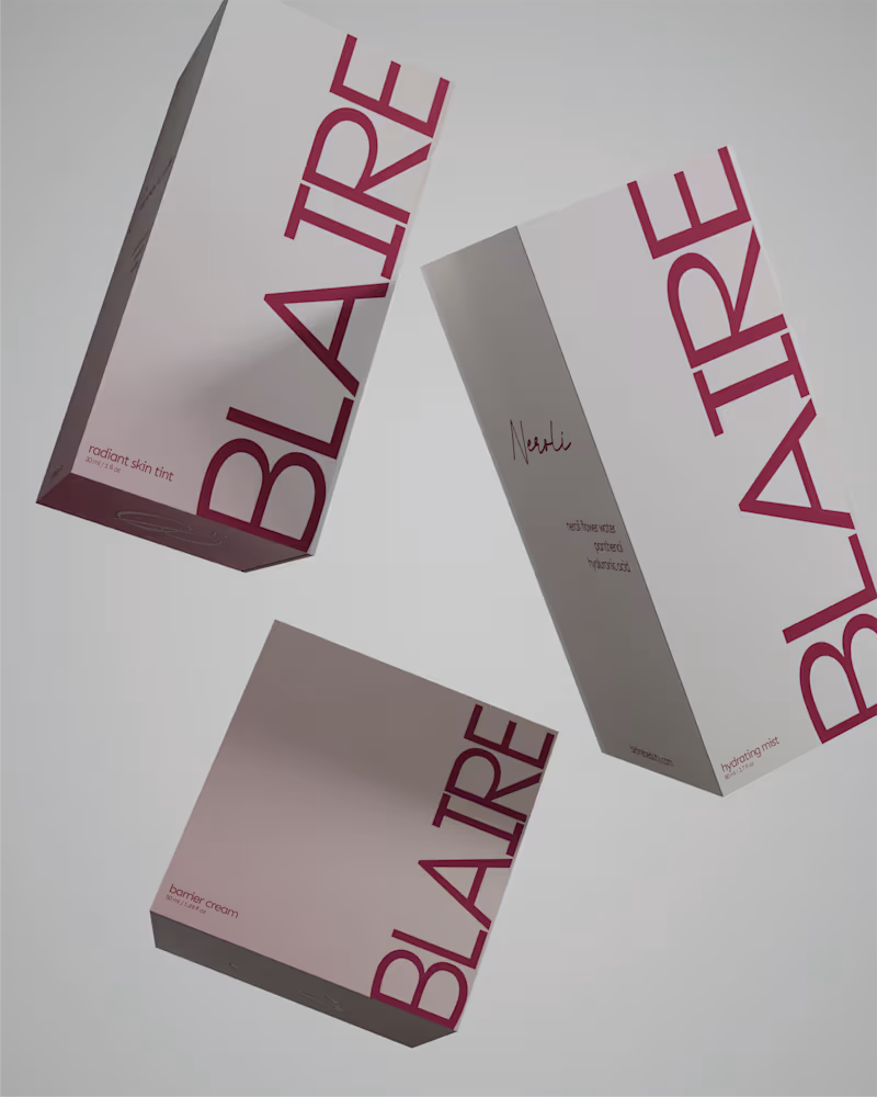
The visual direction combines a restrained palette, confident typography and metallic packaging details to create something that feels clean and elevated, while still carrying enough personality to be recognisable.
Rather than treating the logo, packaging and supporting graphics as separate pieces, the identity was designed as one system. Repetition, scale and typography become part of the brand language, allowing it to stay consistent across both product and communication.
A closer look at some of the applications that brought the Blaire identity together.
44
122
4.4K
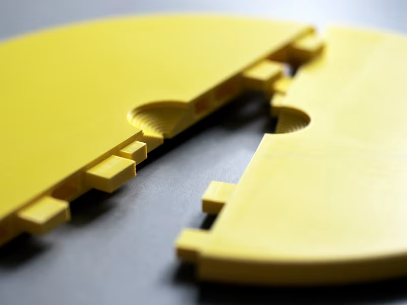
Introducing Click Lamp Ⓓ, a registered and protected design.
Contemporary living is constantly evolving. We rent, move and inhabit spaces that are not always our own, where even the simplest changes may require a landlord's permission. Drilling into ceilings or replacing light fittings is not always an option. Yet the desire to make a place feel like home remains unchanged.
Click Lamp was conceived in response to this everyday reality. A simple, removable lampshade that transforms an exposed light bulb into a colourful design element, without tools, rewiring or permanent alterations.
Made from 3D-printed recycled plastic, its design is based on a single semicircular shape, printed twice, with one half rotated 180 degrees. The two identical halves click together around an existing cable, creating a complete lampshade through one simple gesture.
Available in two sizes, different edge profiles and a variety of colours and patterns, Click Lamp brings colour, character and individuality to contemporary interiors.
Because making a space feel like home should not require owning it.
0
23