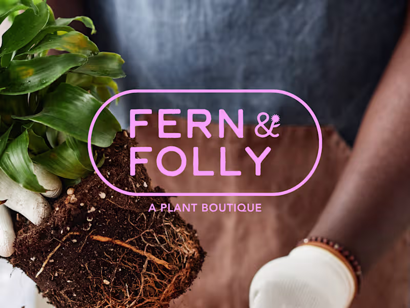
Creative Direction Projects in MooresvilleCreative Direction Projects in MooresvilleFern & Folly is the kind of plant shop you walk into and immediately want to live inside. Warmly lit, a little wild, and chock full of things you didn't know you needed. The problem was their branding didn't say any of that.
F&F came to me with a great name, a loyal customer base, and almost no visual identity. My job was to build something that matched the energy already in the room and could scale as the business (and plants!) grew.
I designed Fern & Folly's full identity system around a small set of bold, reusable shapes. Those shapes do everything, everywhere: they live in the logo, the iconography, the surface patterns, the hang tags, the packaging. The whole brand pulls from the same visual vocabulary, so every touchpoint feels like it belongs.
As a result, I built the missing piece for a brand that already has strong roots, making sure that they show up exactly as intended no matter where they're seen. The color palette is distinctive without being too loud, and beautifully alive in the same way the shop is — a little overgrown, in the best way.