The network for creativity
Join 1.25M professional creatives like you
Connect with clients, get discovered, and run your business 100% commission-free
Creatives on Contra have earned over $150M and we are just getting started
Back to feedPost
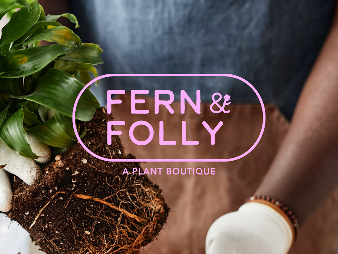
Fern & Folly is the kind of plant shop you walk into and immediately want to live inside. Warmly lit, a little wild, and chock full of things you didn't know you needed. The problem was their branding didn't say any of that.
F&F came to me with a great name, a loyal customer base, and almost no visual identity. My job was to build something that matched the energy already in the room and could scale as the business (and plants!) grew.
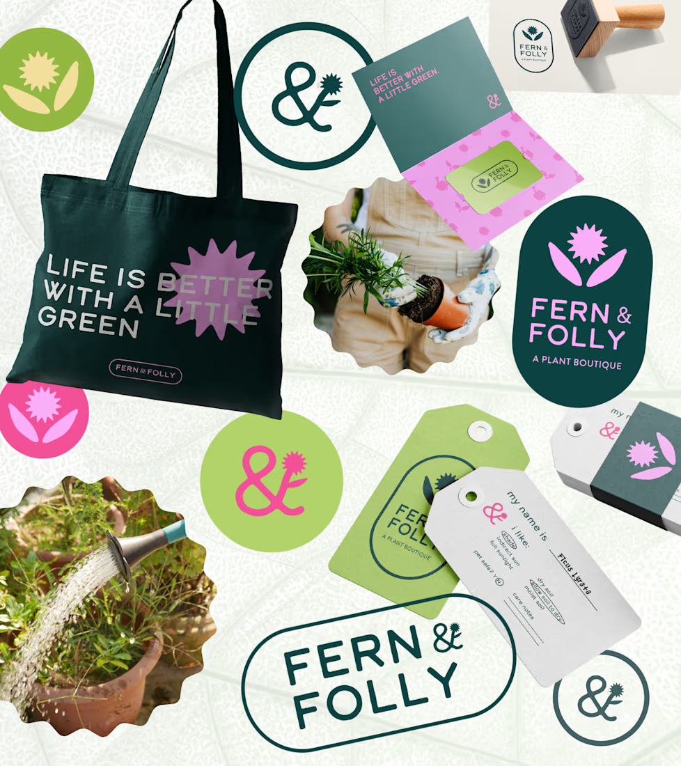
I designed Fern & Folly's full identity system around a small set of bold, reusable shapes. Those shapes do everything, everywhere: they live in the logo, the iconography, the surface patterns, the hang tags, the packaging. The whole brand pulls from the same visual vocabulary, so every touchpoint feels like it belongs.
As a result, I built the missing piece for a brand that already has strong roots, making sure that they show up exactly as intended no matter where they're seen. The color palette is distinctive without being too loud, and beautifully alive in the same way the shop is — a little overgrown, in the best way.




Ahhh thank you!! No, I haven't, but it's definitely on my bucket list for some day!
The network for creativity
Join 1.25M professional creatives like you
Connect with clients, get discovered, and run your business 100% commission-free
Creatives on Contra have earned over $150M and we are just getting started











Related posts

How can branding make people feel part of a community?
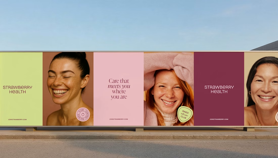
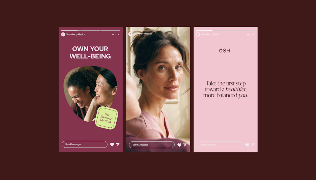
When working on Strawberry Health, we explored how visual identity could make women’s health feel more approachable and collective.
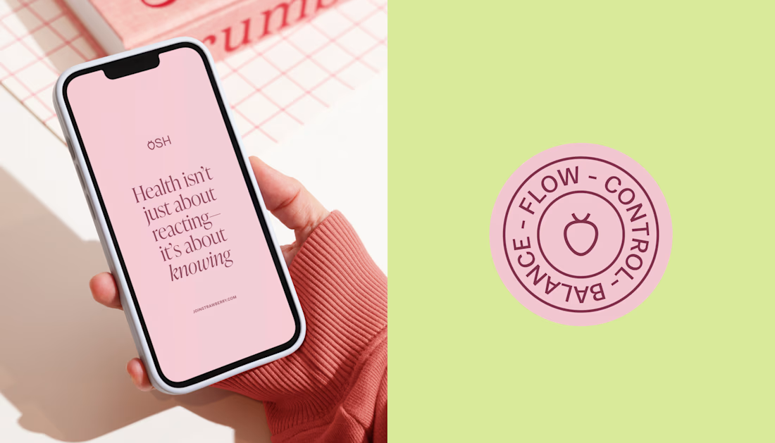
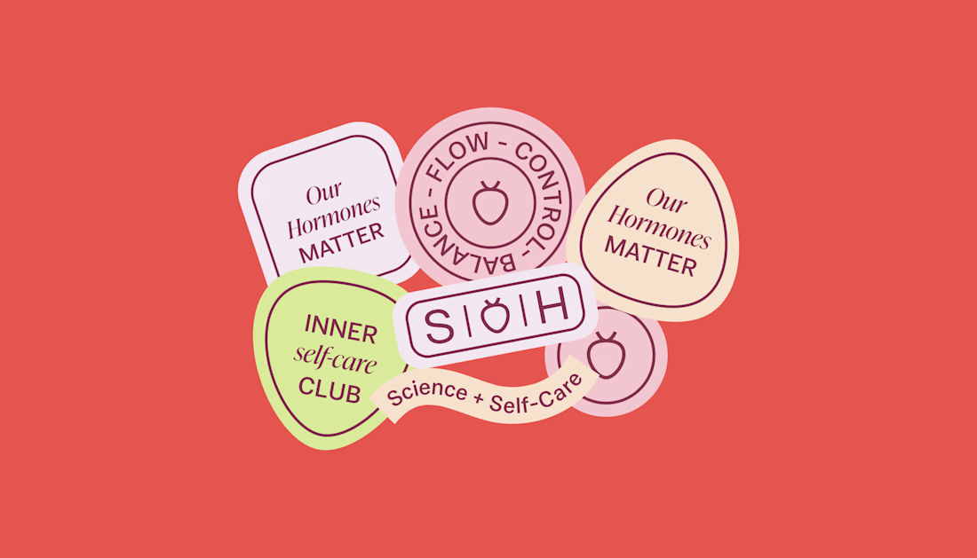
One of the ways was through supporting brand elements: stickers, badges and phrases that could live beyond the logo and become expressions of belonging.
These elements turned the identity into something people could interact with, share and make their own.
It’s a small detail, but I think it’s an important part of building brands around communities: the identity shouldn’t only identify the brand. It should give people something to identify with.

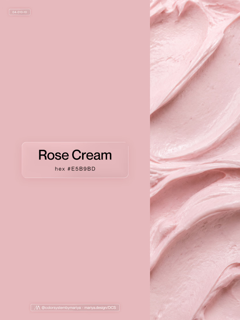
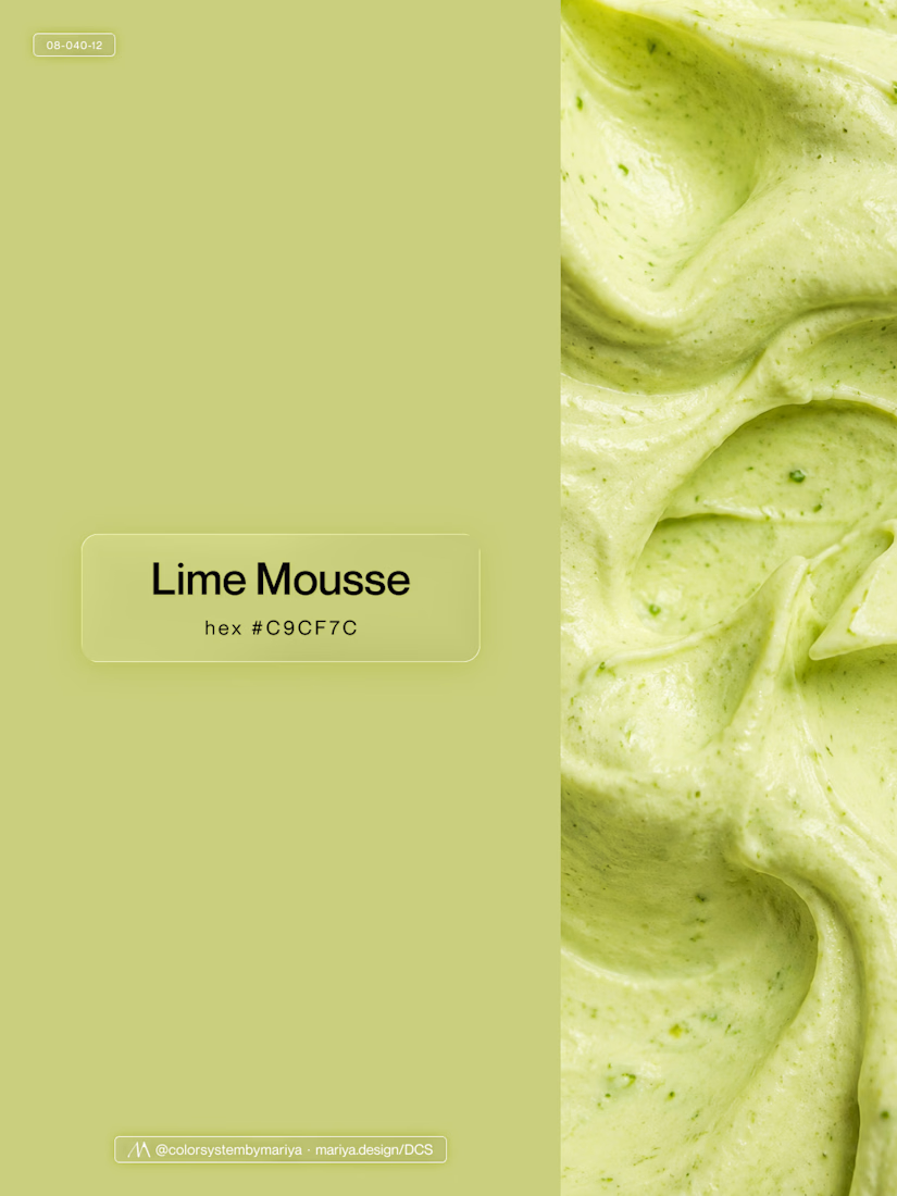
Love, love, love the colors. My mind goes: Rose Cream, Lime Mousse and Plum, hmmmm, which Plum... Plum Jelly. And of course, Strawberry Sorbet.
Let me match the vibe using my delicious swatches 😊
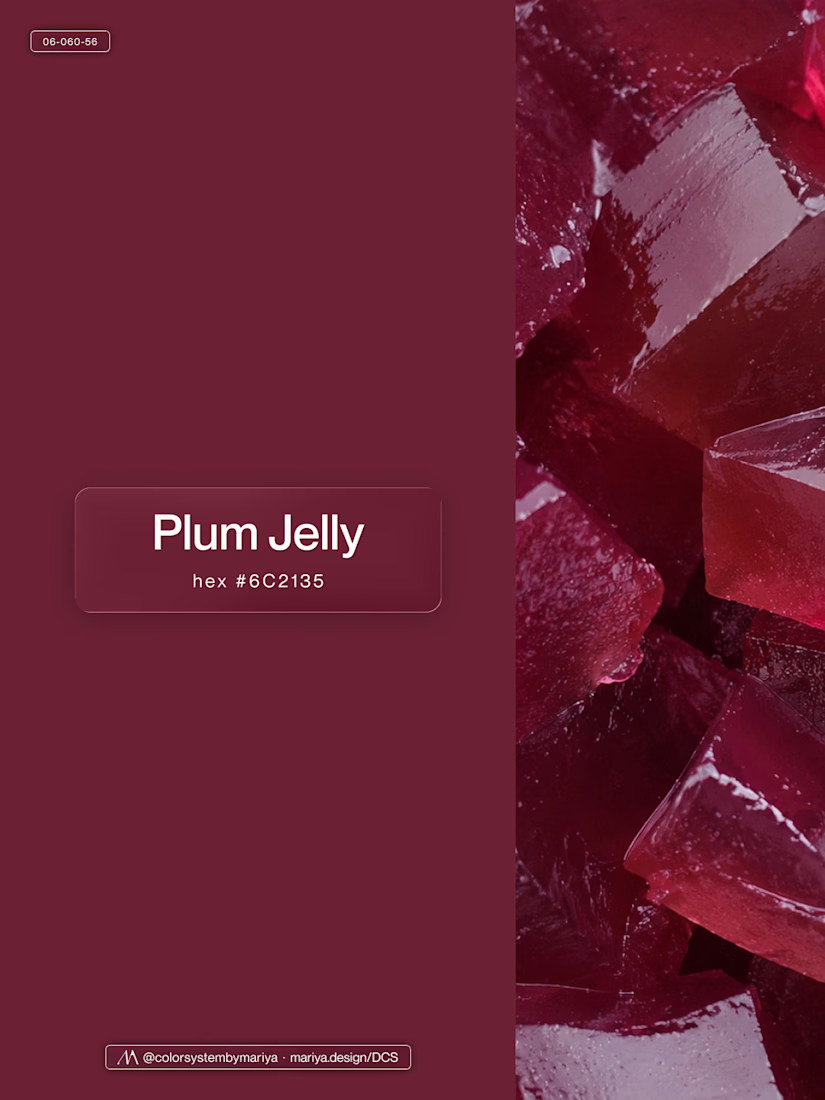
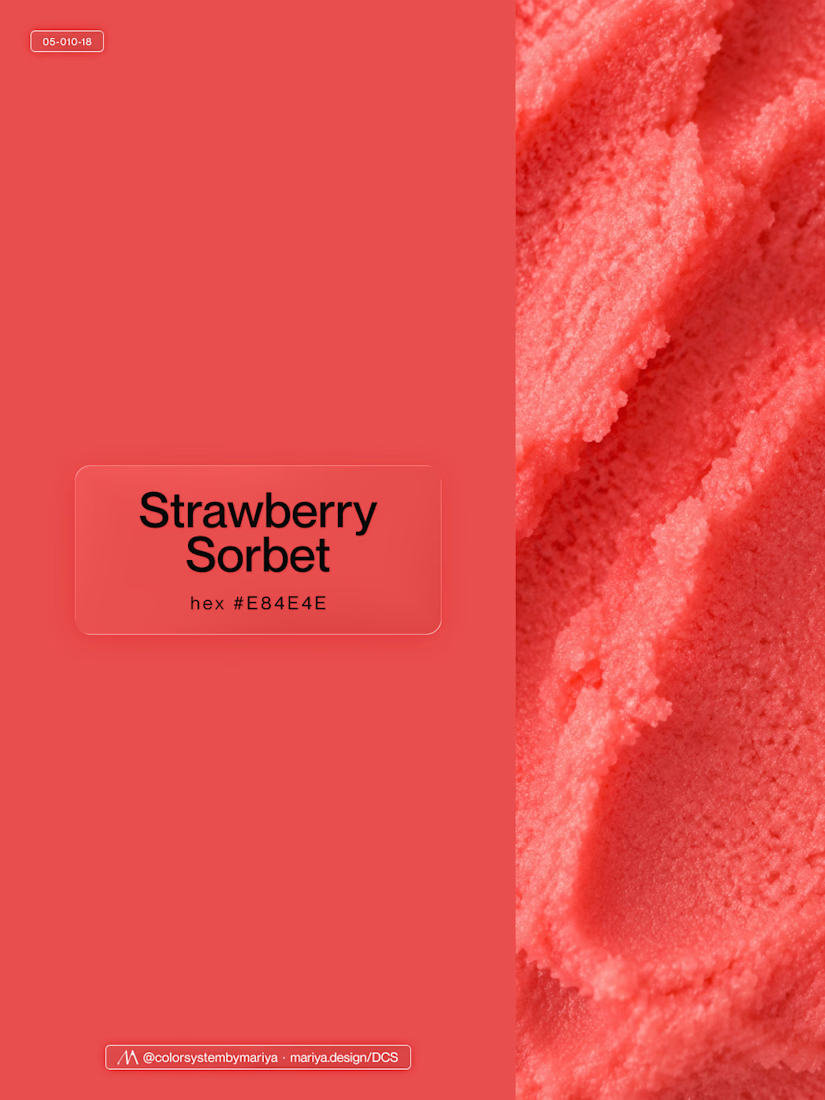


Can't believe this brand is 3years now.
Check out the full project here: https://behance.net/gallery/182972929/SAGAH-Branding-project

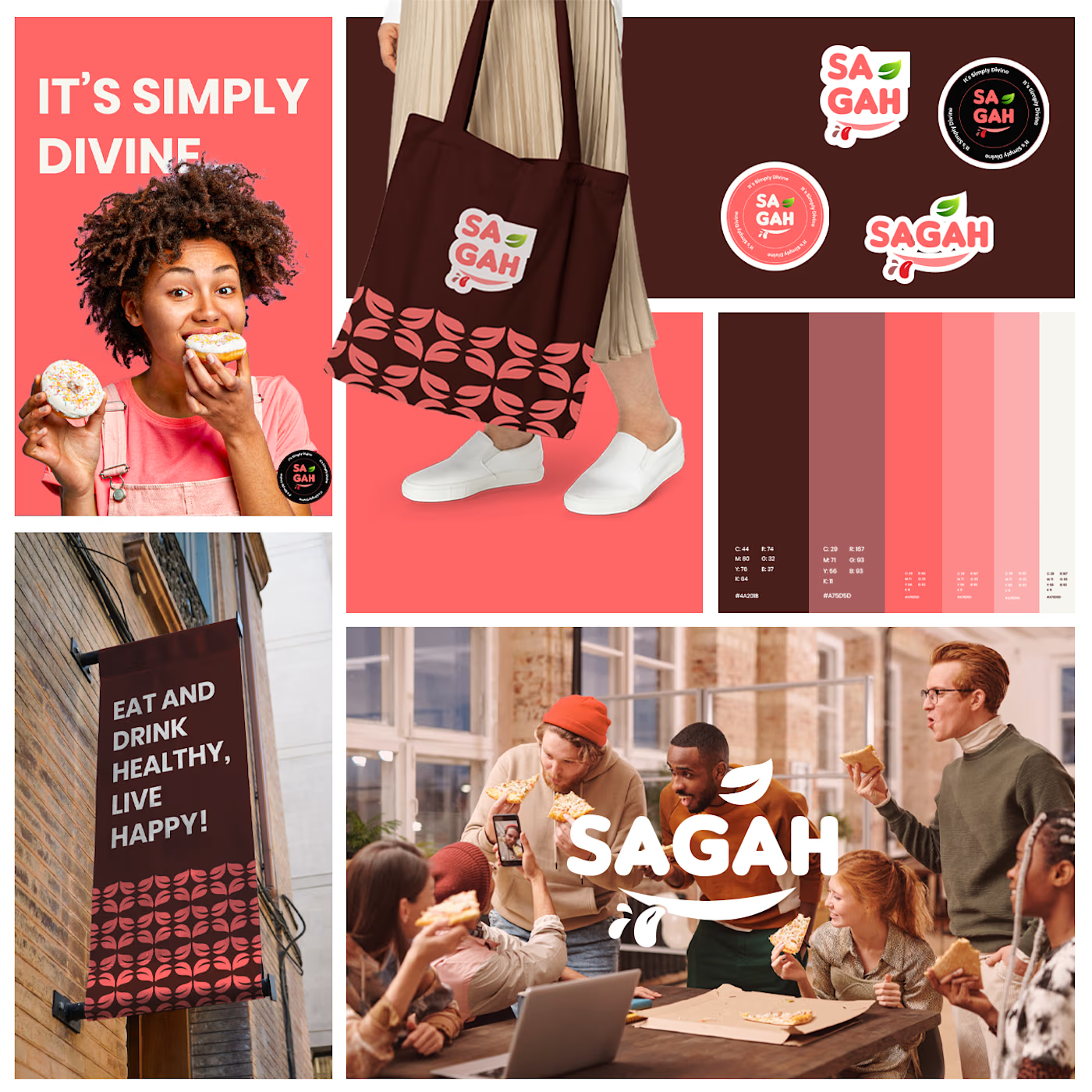
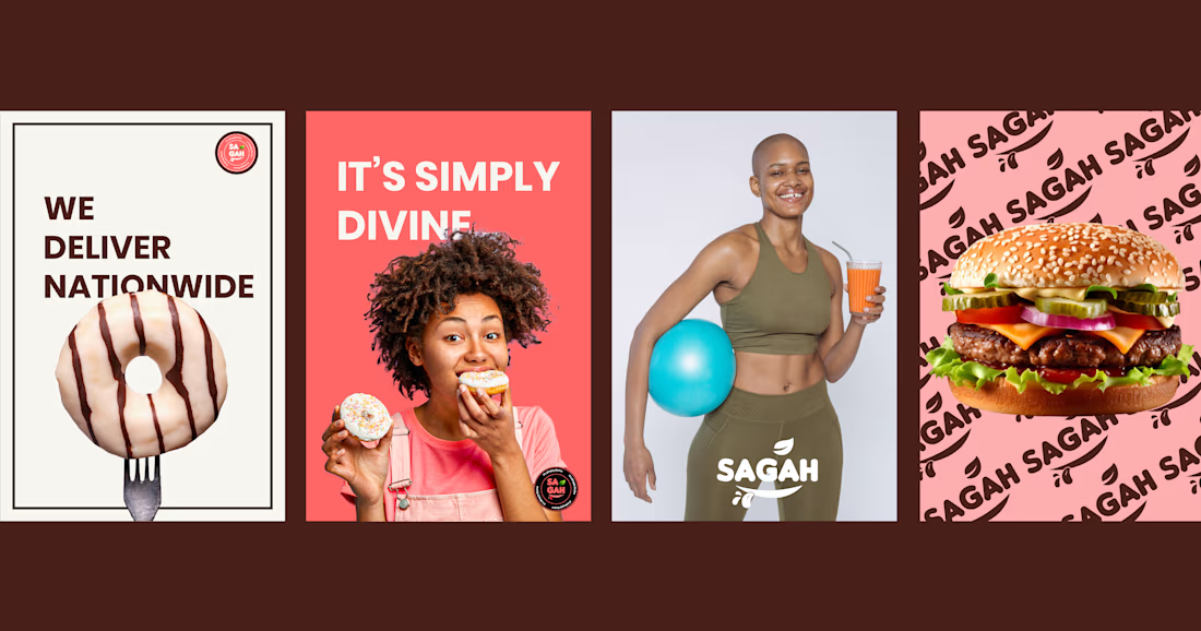
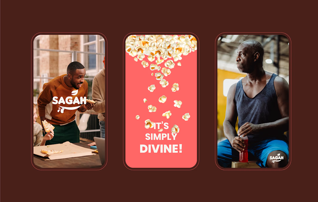
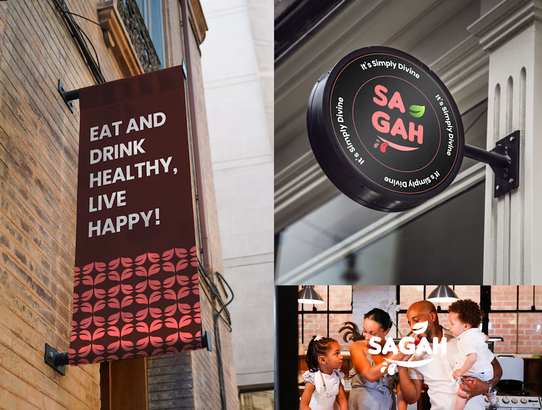

Really love this SAGAH branding! The color palette and the tote bag mockup look super clean and consistent. Great work on the overall identity 👏

When Typography Breaks the Rules. 🖤
Bold 3D lettering, dramatic shadows, and twisted perspectives turn typography into an experience you can’t ignore.
Would you call this art or an obsession?
3dtypographymotiondesignexperimentaldesignGraphic DesignMotion DesignTypographyAdobe After EffectsAdobe IllustratorCinema 4D


That's really great Saleha it's unique I like it ❤️❤️❤️