The network for creativity
Join 1.25M professional creatives like you
Connect with clients, get discovered, and run your business 100% commission-free
Creatives on Contra have earned over $150M and we are just getting started
Back to feedPost
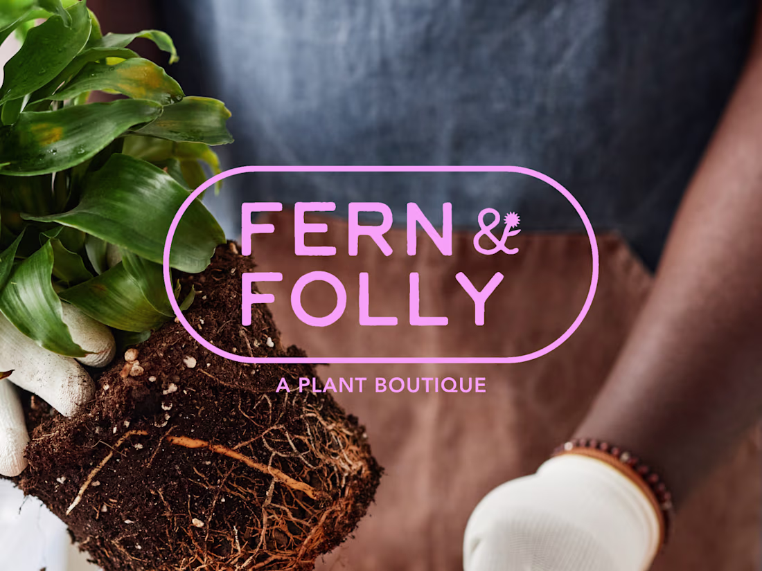
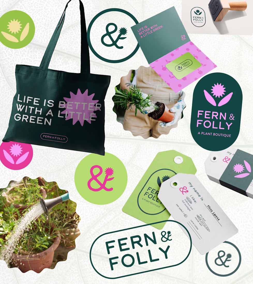
Fern & Folly is the kind of plant shop you walk into and immediately want to live inside. Warmly lit, a little wild, and chock full of things you didn't know you needed. The problem was their branding didn't say any of that.
F&F came to me with a great name, a loyal customer base, and almost no visual identity. My job was to build something that matched the energy already in the room and could scale as the business (and plants!) grew.
I designed Fern & Folly's full identity system around a small set of bold, reusable shapes. Those shapes do everything, everywhere: they live in the logo, the iconography, the surface patterns, the hang tags, the packaging. The whole brand pulls from the same visual vocabulary, so every touchpoint feels like it belongs.
As a result, I built the missing piece for a brand that already has strong roots, making sure that they show up exactly as intended no matter where they're seen. The color palette is distinctive without being too loud, and beautifully alive in the same way the shop is — a little overgrown, in the best way.
Ahhh thank you!! No, I haven't, but it's definitely on my bucket list for some day!
The network for creativity
Join 1.25M professional creatives like you
Connect with clients, get discovered, and run your business 100% commission-free
Creatives on Contra have earned over $150M and we are just getting started
Related posts
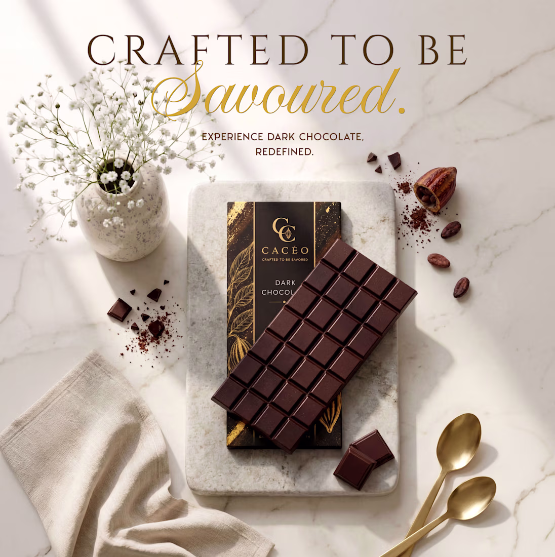
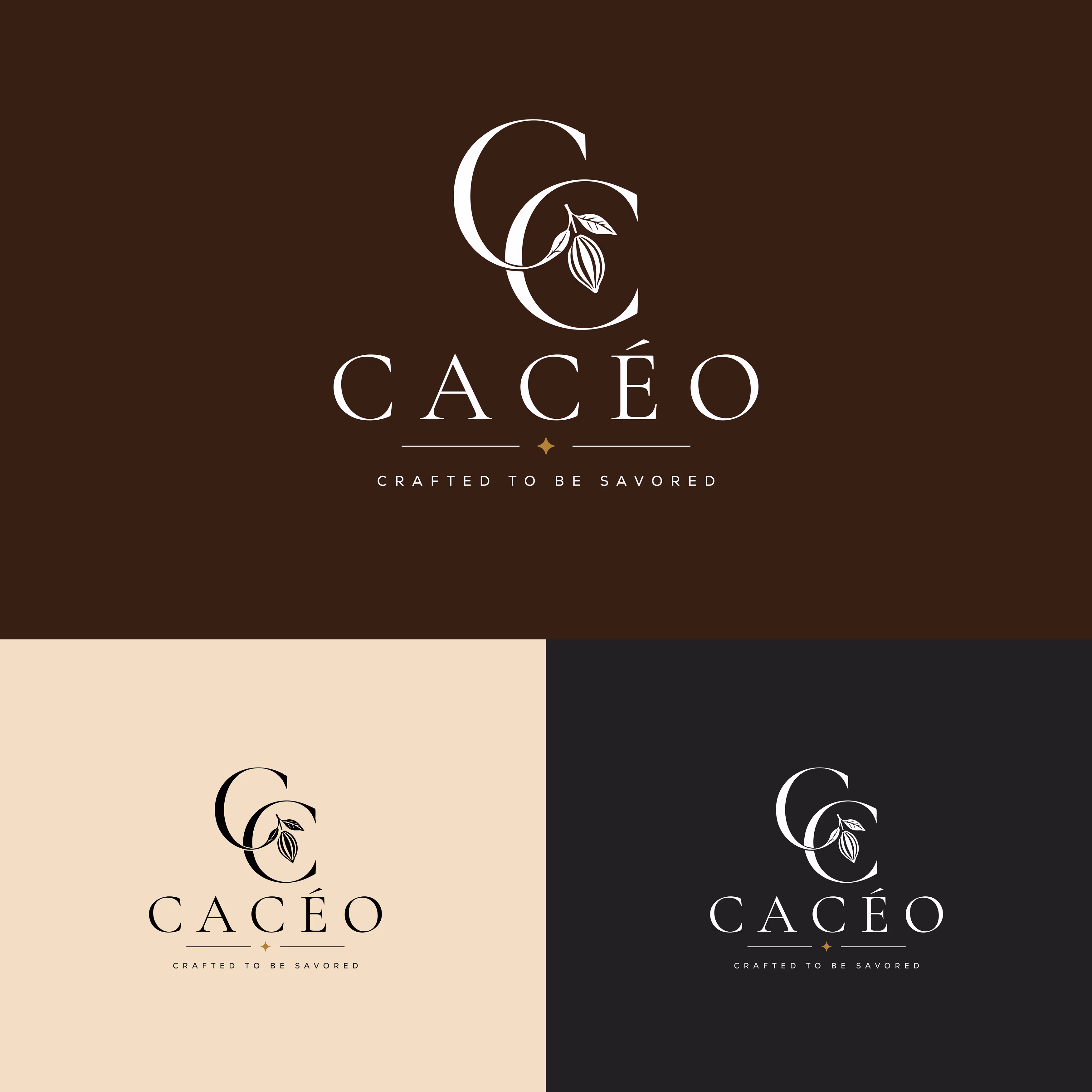
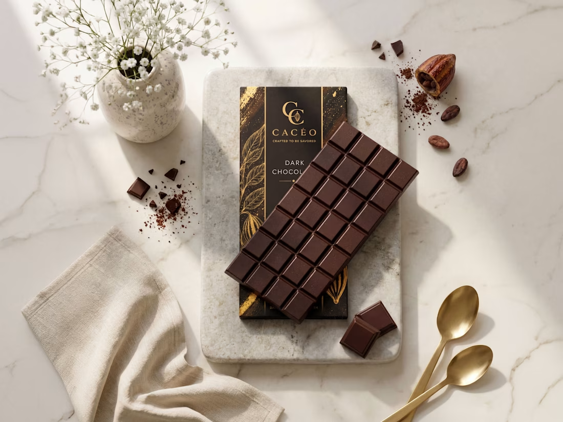
CACÉO – Premium Chocolate Brand Identity & Product Visualization 🍫
The project includes the complete visual identity, from logo design and packaging label development to realistic product presentation. Every element was designed to create a cohesive luxury brand, using refined typography, a warm color palette, and minimalist layouts that reflect the quality of an artisanal chocolate product.
To bring the brand to life, I created high-end product visuals and marketing imagery that showcase the packaging in a sophisticated lifestyle setting, demonstrating how thoughtful branding can extend beyond the logo into a complete visual experience.
💼 Services Provided
- Brand identity design
- Premium logo design
- Chocolate packaging & label design
- Brand color palette & typography
- Product visualization
- Marketing & social media visuals
🛠️ Tools Used
Kittl
Adobe Illustrator
🤎 Bringing CACÉO to life was an exciting collaboration, from crafting the brand identity to designing the packaging and final product visuals. This project reflects my commitment to creating cohesive, premium branding that not only looks refined but also helps brands make a lasting impression.
The logo is brilliant! This looks soo premium and elegant. Cocoa is should looks like this. Your client must be happy getting this quality! I wonder what the font of "Crafted to" is this Trajan Pro?
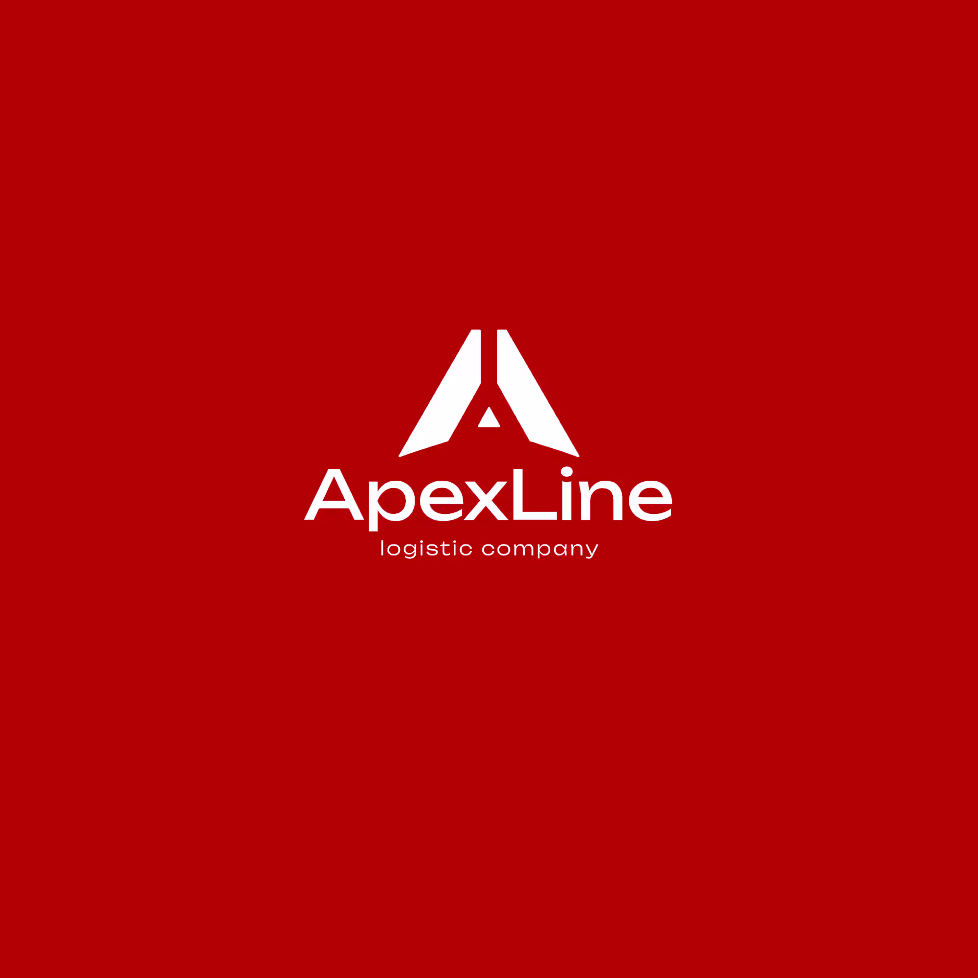
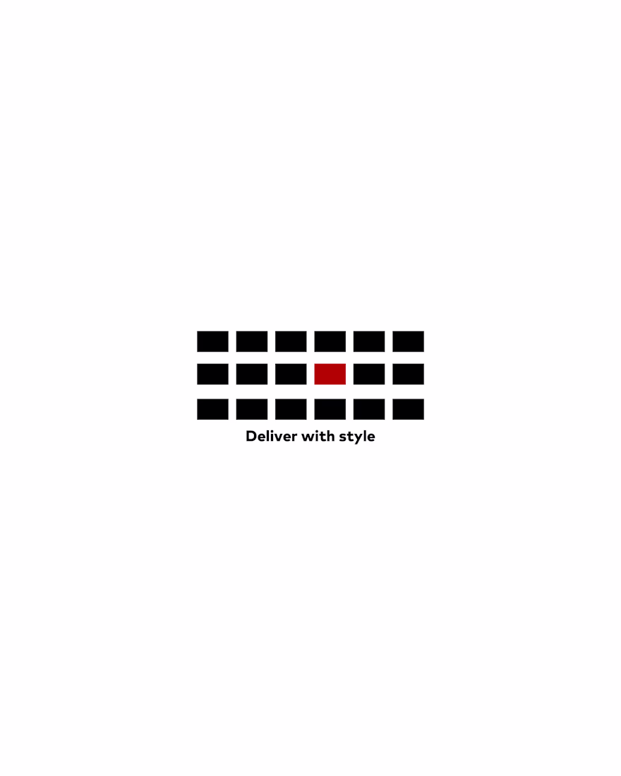
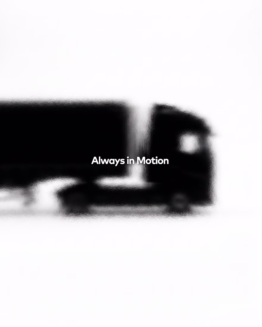
ApexLine — a bold and modern identity created for a logistics company. The visual system reflects movement, precision, speed, and reliability through strong geometry, high contrast, and a confident red-and-black palette.
Great logo! ❤️🔥
Created a fictional sci-fi film teaser using Envato as my main creative toolkit. 🎬📼 AI generated the possibilities, but I shaped the story, mood, and final creative decisions.
My Human by Design moment: turning a beautiful output into something with meaning.
#EnvatoChallenge #HumanByDesign
Trending
Claude
Claude has entered the design space. How are you using Claude Design?
Contra University
Learn from expert creatives how to earn more using next-gen AI tools.
creativeaiflow
Creative AI workflows are evolving. What tools do you use, and what are their strengths and weaknesses?
freelancerlife
Freelancer life is wins, pivots, and everything in between. What’s yours right now?