Freelance Visual Designers in MissouriFreelance Visual Designers in Missouri
Top-tier Brand Design Specialist with 10+ Years Experience
Cover image for A client of mine came
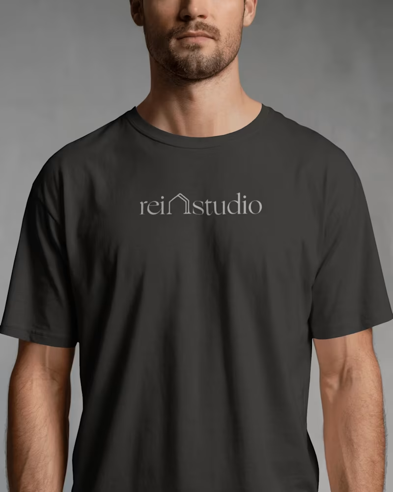
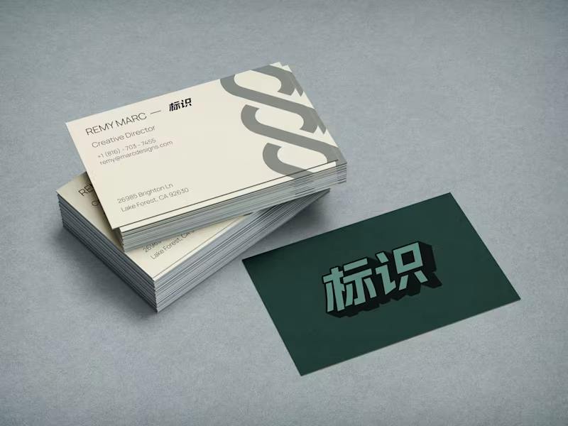
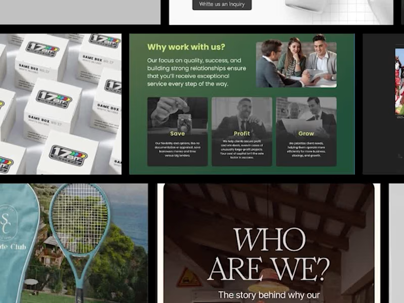
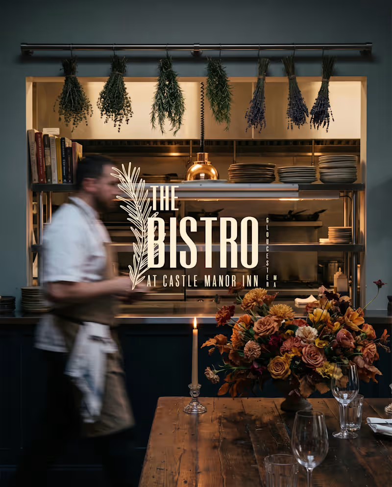
A client of mine came to me with a name problem.... He runs an interior design studio for real estate investors — flippers, new builds, STRs. Good work. Steady clients. One issue: the name. "Ivory Home." Problem #1: there's a national homebuilder called Ivory Homes. Every Google search sent people to a company he had nothing to do with. Problem #2: the name said nothing about who it was for. Nothing said "investor." Nothing said "return on your renovation." It just said... home decor. So we started over. Naming: We landed on REI Studio. Clear. Searchable. Says exactly who it's for — real estate investors — in three letters. Positioning: Not a traditional interior designer. Not a home builder. A design systems partner that helps investors move faster, make better decisions, and increase returns. That's the whole pitch. Voice: Short sentences. No luxury-boutique fluff. No jargon. Sound like an operator talking to another operator, because that's who's reading it. Visual identity: A minimal house mark with a "double line" — forward motion, transformation. Warm neutrals instead of cold luxury tones. A serif logotype that reads studio-grade without reading pretentious. Deployment: Full system, not just a logo: business cards, brochures, apparel, trade show booth, website, email templates — all speaking the same language. The result wasn't just a prettier brand. It was a brand that finally said the right thing to the right person, the first time someone saw it. That's the job. Not decoration. Clarity.
5
173
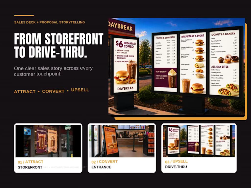
B2B Storytelling & Sales Enablement for Complex Products
New to Contra
B2B Storytelling & Sales Enablement for Complex Products
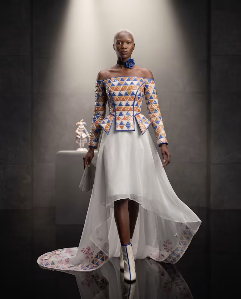
Cover image for An eight-inch porcelain figure learns
An eight-inch porcelain figure learns to move. OFF THE PEDESTAL — HARLEQUINA 1763/2027 Her pose once suggested movement. In 2027, she completes it. For the FLORA Museum Challenge, I chose Harlequina, a ca. 1763 hard-paste porcelain figure modeled by Franz Anton Bustelli for the Nymphenburg Porcelain Manufactory. What stopped me was not only the diamond-patterned costume, but the body language: the raised wrist, tilted head, folding fan, and elegant S-curve that already feels like a dance paused in the middle of a gesture. I reimagined her as a human-scale 2027 couture performer: • Painted diamonds became articulated glazed porcelain tesserae • The molded white skirt became translucent organza • The painted botanical border became silk and small porcelain petals • The folding fan became smoked glass In FLORA, I began with four Open Access views of the original object and explored three distinct material directions: Articulated Porcelain, Porcelain Bloom, and Smoked Glass Harlequin. The final design combines the strongest elements of each: the ceramic structure of the first study, the botanical restraint of the second, and the darker museum atmosphere of the third. The final moment completes Bustelli’s implied movement. Harlequina lowers her hand, steps off the porcelain plinth, and walks forward. Original artwork — The Met: https://www.metmuseum.org/art/collection/search/206045 Full FLORA canvas: https://app.flora.ai/projects/ns710a3rqyzhys5hv7z67rjzyd8dsy5p Created and iterated in FLORA. #FLORAMuseum #FLORAMuseumChallenge #ArtDirection #DigitalCouture For #FLORAMuseum, I reimagined Franz Anton Bustelli’s 1763 Harlequina as 2027 couture—glazed ceramic tesserae, translucent organza, porcelain petals, and a smoked-glass fan. Built in @floraai. Explore the full FLORA canvas: https://app.flora.ai/projects/ns710a3rqyzhys5hv7z67rjzyd8dsy5p
0
14
Creative Director crafting impactful digital experiences.