
Brand success powered by brand strategy.



AI wizard | Vibe Coder


Product designer for complex tools, dashboards and brands
- 5.0
- Rating
- 9
- Followers
Product designer for complex tools, dashboards and brands
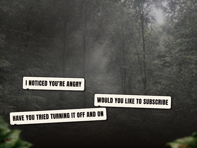
Rhinohed II: our own browser game, part two. A rhino rips robots apart and wears their parts.
We built it in about three days by taking AI tools apart: 8 levels, 2 bosses, his voice and a narrated trailer. Then 9 testers played it, and the data showed level one was far too hard. The whole story, with the trailer and playtest charts: https://bradyux.com/experiments/rhinohed-ii/
2
55
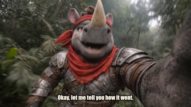
Rhinohed II is our gory, ridiculous action game. A rhino rips robots apart and uses their parts as weapons.
For the trailer, we wanted it to feel like a real game launch: wall-to-wall action from the first second, a character voice with some personality, and jokes that land. Everything in it is real gameplay, with the game’s own sound effects and music. The opener and the bloody selfie gag are a cinematic version of the character, built to stop the scroll.
What went into it:
• Game and character design
• Original soundtrack and 40+ sound effects
• Character voice and script
• Trailer edit, captions and sound mix
• Logo and title screen
Want a trailer, a launch video or a whole world built for your product? Let’s talk.
3
64
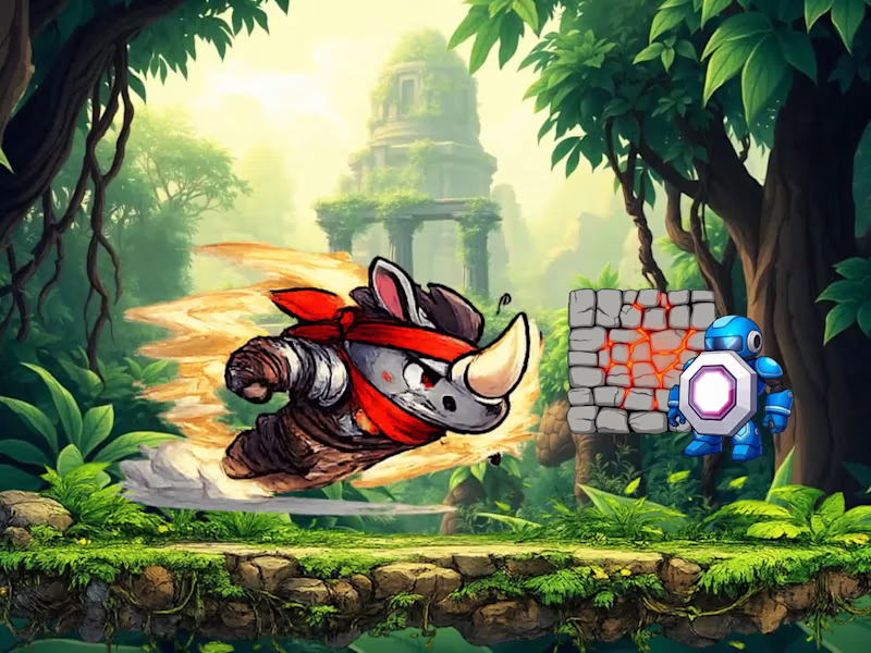
Rhinohed: a side-scrolling game you can play in your browser, no download or login. A rhino in a red bandana charges through a jungle and a refinery to smash a robot core.
It started as an old prototype, and when we came back to it, the phone controls did nothing and two stages couldn't be beaten. We fixed it properly, so now all three stages can be finished.
Play it: https://bradyux.com/experiments/rhinohed/
0
78
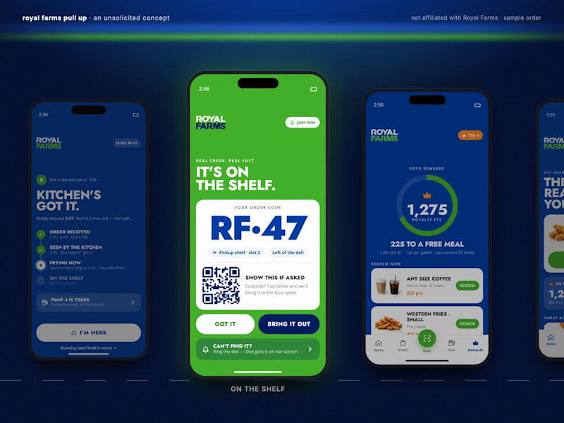
Royal Farms Pull Up: the order went through, and nobody in the kitchen saw it.
An unsolicited concept, not affiliated with Royal Farms. We audited 11 convenience-store apps and read about 150 real reviews, then designed a driver-first order-ahead app in their real brand. A person in the kitchen taps "got it" and you see their name and the time. Pickup shows a big code and the exact shelf slot. Fuel rides along on the same order. Shown with a sample order.
Case study: https://bradyux.com/portfolio/royalfarms/
1
1
98

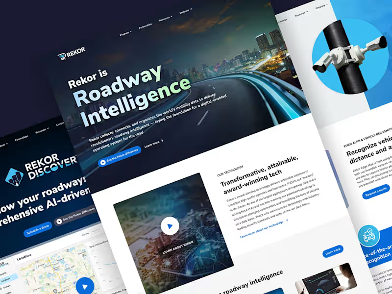
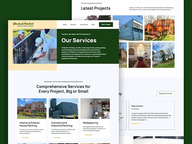
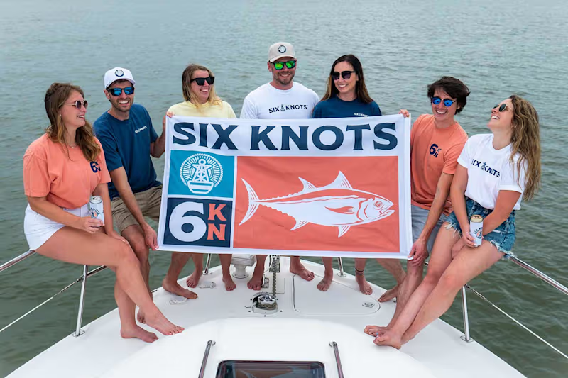
Crafting bold brands and seamless web experiences

Webflow Designer & Developer | Figma to Webflow
- 5.0
- Rating
- 11
- Followers
Webflow Designer & Developer | Figma to Webflow
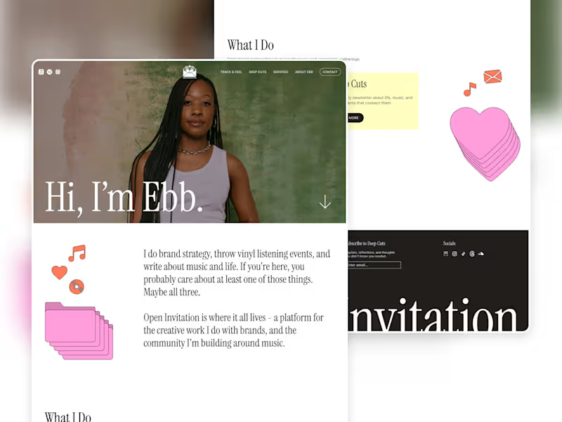
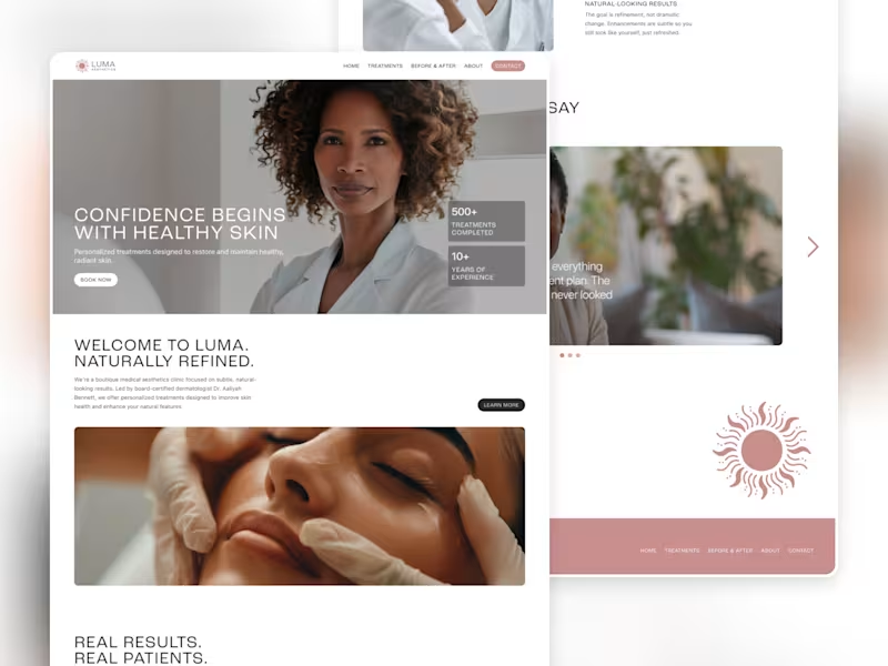
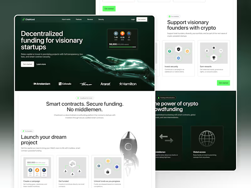


Creative problem solver, crafting brand stories


Strategic Brand & Packaging Design for Food & Bev Founders ⚡
- 35
- Followers
Strategic Brand & Packaging Design for Food & Bev Founders ⚡
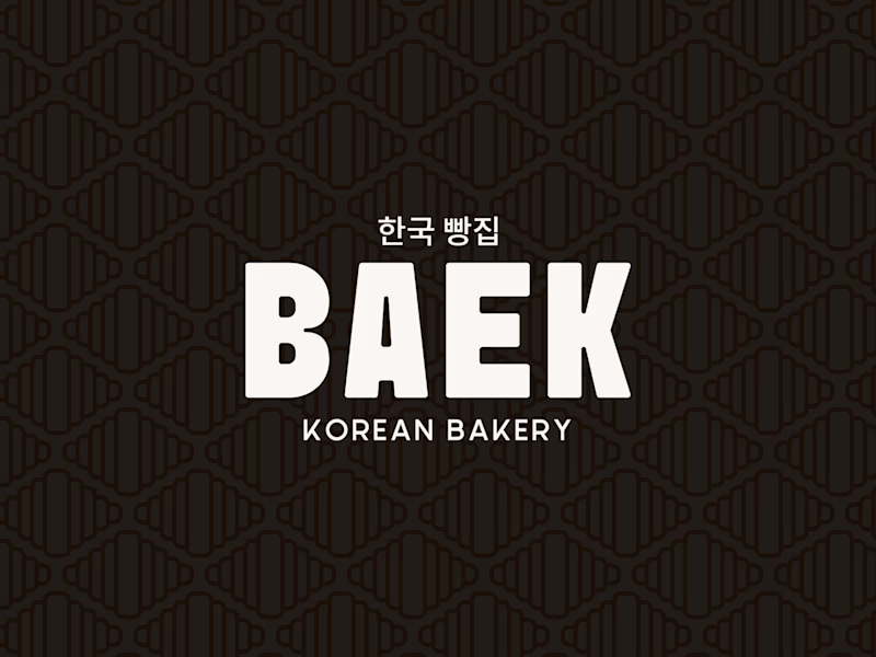
MEET BAEK 🥐🖤
A modern Korean Bakery + Cafe where heritage gets a bold, contemporary identity.
The vision: clean yin-yang aesthetic, loud personality.
The croissant’s natural pattern became the foundation woven into the logo mark, echoed in the brand pattern, and carried all the way through to the menu card and loyalty stamp shape.
Every touchpoint designed with intention.
This is what it looks like when a bakery brand has strategy behind the designs.
Scope of work:
✨Brand Strategy & Identity
✨Menu Card Design
✨Pattern Design
✨Social Media Revamp
1
170
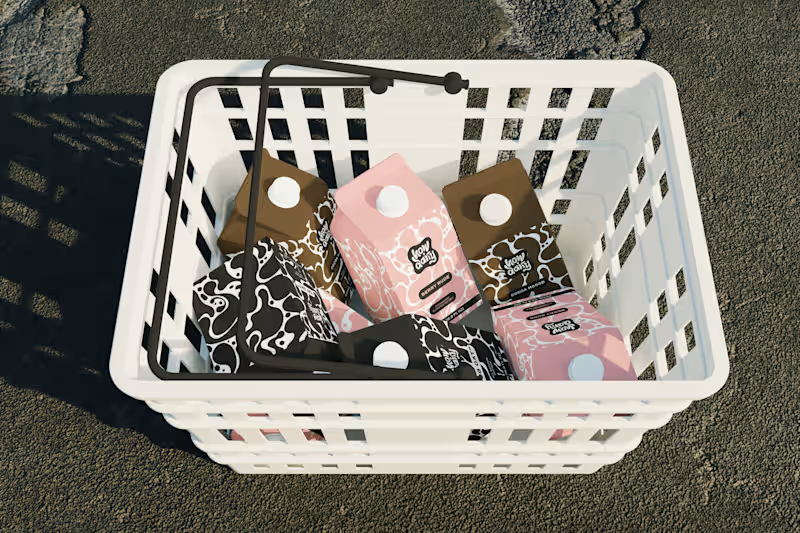
Every milk brand wants to be "bold."
However, most of them just slap a cow on the carton and call it a day.
How Dairy needed to actually feel bold. Not "we added a sans-serif" bold. Bold as in: you see it from 10 feet away and you already know it's not the same organic plain thing you've seen 50 times.
I built the brand identity and packaging system from scratch. The name does the heavy lifting tonally (playful, modern, irreverent), so I let the visual system match that energy: high-contrast colors, type hierarchy, and zero overused dairy imagery. The carton design reads more like a streetwear drop than a dairy aisle staple.
The goal: make someone grab it because it looks like it has personality and speaks to their values, not just protein content.
If your product is blending into the shelf, let's talk → contra.com/shakya_vaughn (https://contra.com/shakya_vaughn)
#PackagingDesign #CPG #BrandIdentity #FoodAndBeverage
0
154

Here's my first post for the #stealmyprompt sprint!
First, this prompt was created in Chatgpt ✨
Then used in Sora to create this base mockup image for Tropina✨
Left: Before
Right: After
Prompt: "A woman in a muted pink swimsuit lounging on her back on a sandy tropical beach, one arm resting over her head holding a wide-brimmed straw hat that partially covers her face. Her skin is sun-kissed and she’s relaxed beside the shoreline. Next to her in the sand is a small plain white rectangular beverage bottle with a brown cap, similar to a coconut water carton, The bottle is covered in light condensation, glistening slightly in the sun to emphasize its refreshingly cold temperature. The background includes turquoise water and a softly sunlit sky, capturing a luxurious, serene summer vibe"
2
2
210

Modern organic milk, but make it luxury. 🥛
I recently wrapped the brand identity and packaging design for Moo Moo, a modern high-end milk brand based in Toronto.
Packaging mockup was made with AI and I added my final design and edits in Photoshop.
This project was a great reminder of why cohesive brand systems matter so much:
-Custom wordmark with “O” counters inspired by cow spots + the flow of milk
-Pattern system built from those same organic shapes
-Collateral (cartons, billboards, thank-you cards)
When every touchpoint is aligned, a brand stops feeling generic and starts feeling instantly recognizable.
Whether it's on the shelf, a billboard, or in a customer’s hands.
👉 If you’re building a beverage brand and want your visual identity, packaging, and collateral to work together (not against each other), let’s connect.
6
16
316

Product designer & front-end developer for complex workflows
New to Contra
Product designer & front-end developer for complex workflows
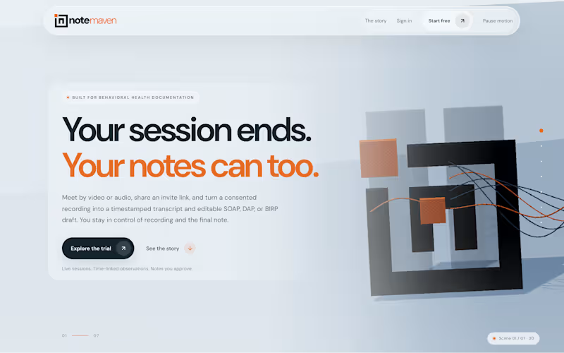
A therapy session ends. Then the second shift starts: writing the note.
NoteMaven began with one question. Could the note start itself, without the clinician giving up control?
The hard part wasn't the AI. It was trust. A clinician has to know exactly when they're being recorded, and that nothing becomes part of the record until they say so. So in September I rebuilt the whole product around the session itself: pick a client, choose video, audio or an upload, and everything after follows from there.
• Meet by video or audio in NoteMaven and send your client a join link, or upload a recording you already have.
• Camera, mic and recording all start off. Recording begins only after everyone agrees.
• After the session, NoteMaven transcribes the conversation with timestamps and drafts the note you chose: SOAP, DAP or BIRP.
• While reviewing, you can pin a private observation to the exact moment it happened. It stays separate from the clinical note.
• Every draft is marked for review. Edit any section and finalize only when the note is yours.
The look follows the same idea: a calm consultation room, not a cockpit. Warm grays, one orange for the next step, and a plain text label on every status.
Behind the screen, the AI keys stay on the server, each provider sees only their own clients, and actions are logged.
I designed and built NoteMaven end to end, from the interface to the transcription pipeline.
See the story in seven 3D scenes: notemaven.tech (http://notemaven.tech)
1
108
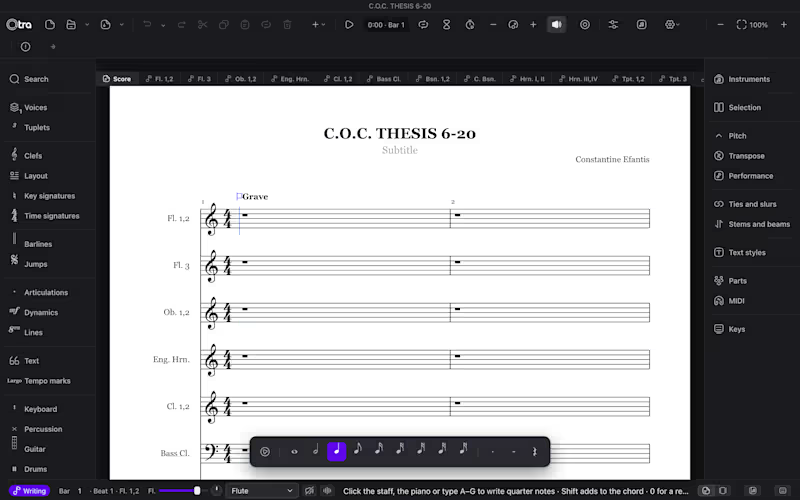
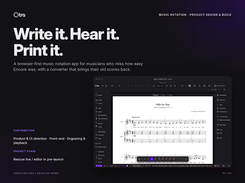
"Otra" is Spanish for "another one!", what an audience shouts for an encore. That's the whole idea behind this project.
Encore was the notation program musicians loved because it got out of the way: pick a note, click the staff, keep writing. Then the music stopped. Encore 5 doesn't run on current Macs, Encore 6 has been promised since 2022 and still hasn't shipped, and years of scores are stuck in .enc files that few programs can open.
When I polled Encore users, they all said the same thing. They didn't miss a feature. They missed how easy it was.
So Otra has two jobs.
First, give people their music back. Otra Rescue is live today. Drop in a folder of Encore files and it turns them into MusicXML for MuseScore, Dorico and Sibelius, right in your browser, so your scores never leave your computer. Preview every file and convert one for free.
Second, bring back the ease. The Otra editor opens October 31:
• Pick a duration, click anywhere on the staff, and the gaps fill with rests.
• Click the same spot again to build a chord.
• Number keys pick durations, and everything also works with the mouse alone.
• Everything can be undone, so nothing ever asks "are you sure?"
The turning point was deciding that "easy" can't be a feeling. It has to be a test. Every flow in Otra has a test that counts the clicks, so a change that adds a step fails before it ships. From opening Otra to hearing your first note takes five actions or fewer.
I lead the product, the design and the build. Claude helped crack the hardest engineering problems along the way.
Try Rescue or pre-order the editor: rescue.otramusic.com (http://rescue.otramusic.com)
See the countdown: otramusic.com (http://otramusic.com)
Otra is made by sikahaus and isn't connected with or endorsed by the makers of Encore.
1
91
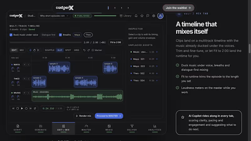
Does your team move the same job between documents, spreadsheets, and several tools?
That is the kind of product problem I like working on.
With CastGenX, I’m organizing podcast production around one episode, with connected workspaces for the steps from script to delivery. I led the product and UI direction, worked through reusable components in Figma, and used Claude’s guidance during development. The public tour also presents TypeSafe Jev quality feedback within the workflow.
The same design approach could help a content team manage approvals, an agency build a client workspace, or a founder turn a manual service into an app.
We would start by mapping your current process, identifying the costly handoffs, and choosing a focused first version. From there, I can help design the interface, implement the frontend, and explain the product on its launch website.
CastGenX is currently in pre-launch; you can see the product direction in my case study.
Message me on Contra with three things: who uses the workflow, where it gets stuck, and what a better result would look like.
Case study: https://contra.com/p/UQqRQR6Z-cast-gen-x-one-episode-one-connected-workspace
#availablefornewprojects #WebDevelopment #UIDesign
1
4
342