
Trustworthy, On-time, Quality Design Solutions


Trustworthy, On-time, Quality Design Solutions


Design Forensics: Research-Driven UI/UX Design
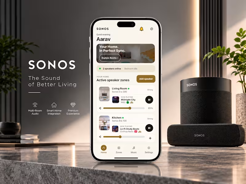
Design
Forensics: The $15M Preventative Failure Architecture for Connected Hardware
Role: Lead Product Architect & System
Engineer
Project Overview:
An independent, risk-mitigation framework engineered to eliminate critical
onboarding failures in connected multi-room audio hardware. Built on a
deterministic 12-scenario state-machine logic, this system is architected to
natively deflect high-volume customer support queues, protect brand equity, and
drop retail product return rates by up to 90%.
Core Specifications & Visual Layout Hierarchy:
Asset1 | Operational Case Study Video: A comprehensive 2-minute architectural demonstration
detailing the real-world root causes of connected speaker setup failures and
showcasing the live automated recovery engine.
Image1 | Daylight Frontend: Premium, fail-safe client interface optimized with adaptive
diagnostics to maximize consumer setup satisfaction and eliminate initial
installation anxiety.
Image2 | The Loop-of-Death Intercept: Real-time UI state-machine responding directly to
Scenario 10 (Connection Timeout), serving as verifiable visual evidence of
in-app self-healing without system crashes.
Image3 | Integrated Enterprise Specification: A high-security, combined
engineering layout merging tokenized Figma design system handoffs and Git
configurations directly with the 12-Scenario functional controller logic panel.
🌐 View Public Interactive Interface(No-Code Preview) https://sonos-fail-safe-diagnostics.netlify.app
📄 Read the Full 'Design Forensics' Strategic Architecture Expose Case Study - sonos-support-deflection-blueprint.netlify.app (http://sonos-support-deflection-blueprint.netlify.app)
[🔒 Enterprise Vault: Request Protected
Developer Blueprint & Git Handoff]
Access Restrictions: Strictly restricted to verified Corporate Boards, Legal
Counsel, and Authorized Lead Engineers. Viewing requires an executed Mutual NDA
and secure Escrow confirmation via private key validations. Unauthorized access
is legally actionable.
0
42
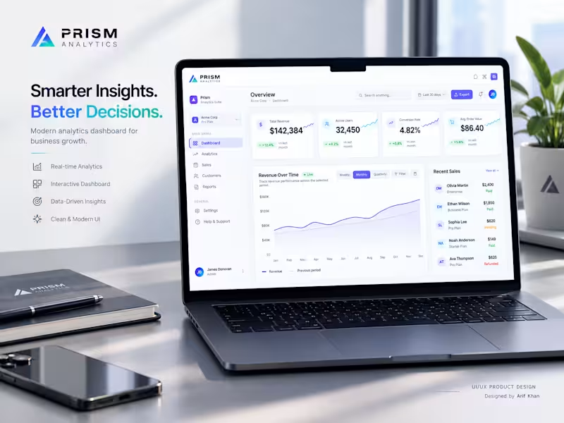
Prism Analytics — From Complex Data to Clear Decisions
PRISM ANALYTICS
From Complex Data to Clear Decisions.
The Problem
B2B teams often have plenty of data, but finding the right business signal quickly can be difficult.
The Solution
I designed a premium analytics dashboard that brings Revenue, Active Users, Conversion Rate, Average Order Value, Revenue Trends, Recent Sales, and User Engagement into one clear workspace.
My Approach
I focused on information hierarchy, data visualization, fast scanning, consistent components, and a clean responsive UI — turning complex metrics into an interface that feels simple to use.
The Result
A focused SaaS dashboard experience that helps founders, product teams, and decision-makers understand performance faster and move from data to action with less friction.
Designed for real-world B2B SaaS products — not just a visual concept.
UI/UX • Product Design • SaaS • Dashboard • Data Visualization
Live Prototype →
https://cycle-drop-04018066.figma.site/
Building a SaaS product and need a dashboard that makes complex data easier to understand?
Let’s work together →
2
3
862
TaskRelay — AI-Powered Work Continuity
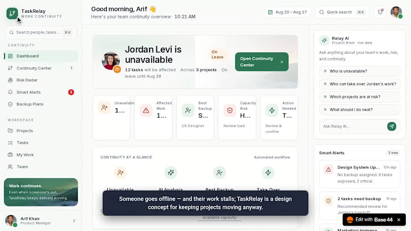
I designed TaskRelay to solve a common team problem: when someone becomes unavailable, their work context often disappears with them.
Existing tools already manage tasks and projects, but they can still struggle with work context, skill matching, team capacity, alert overload, and smooth handoffs.
So instead of building another project-management tool, I explored a Work Continuity Layer that helps teams understand what’s affected, find the right backup, prevent overload, and take over with minimal friction.
The project includes Automatic Work Context, SkillMatch, Capacity Guard, Smart Alerts, Auto Backup Plans, Risk Radar, Take Over, and Relay AI — all designed around one simple idea:
When someone goes offline, the work doesn’t.
Designed by Arif Khan.
🔗 Explore the UI/UX Design → [https://juicy-relay-work-flow.base44.app/ ]
2
766
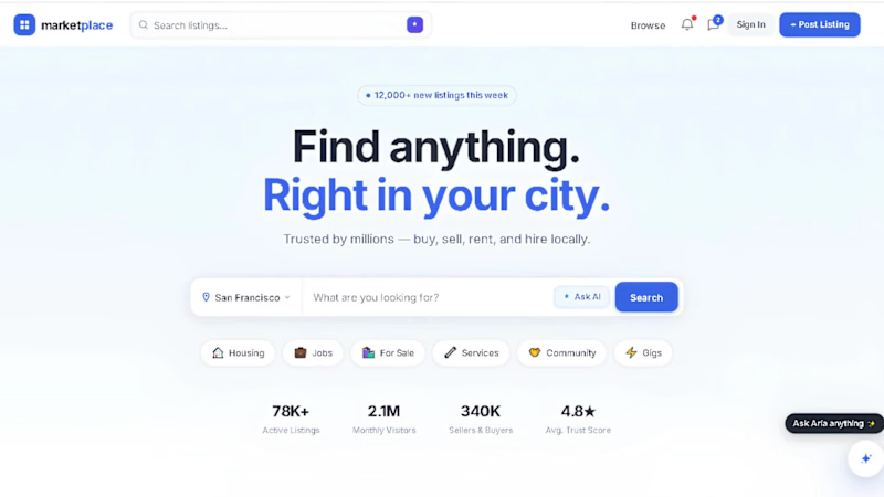
AI-Powered Local Marketplace UX/UI Redesign
A modern UX/UI redesign concept inspired by Craigslist—reimagined with AI-powered search, trust-first interactions, and a premium user experience. Built as an independent product design case study to explore how local marketplaces can feel faster, safer, and more intuitive.
📌 Project Note
Independent Concept Project
This is an independent concept project created for educational and portfolio purposes.
It is not affiliated with, endorsed by, or commissioned by Craigslist or any other company.
The goal was to explore how a modern AI-powered marketplace could improve trust, usability, accessibility, and the overall user experience while respecting the original product category.
🔗 Quick Links
🎨 View Interactive Figma Prototype
👉 [https://tree-nice-91506355.figma.site ]
📖Explore the Case Study
👉 [https://elevate-marketplace-story.lovable.app ]
Let's Build Something Great Together
If you're looking for a modern UX/UI redesign, AI-powered product experience, or a scalable design system for your startup or business, I'd love to collaborate.
Whether it's a complete product redesign, SaaS dashboard, marketplace, mobile app, or enterprise platform, feel free to reach out.
Feedback Section
Your Feedback Matters
If you enjoyed this case study, I'd really appreciate your feedback.
⭐ Share your thoughts
💬 Leave a comment
🔁 Share this project with others
❤️ Recommend it if you found it valuable
Every piece of feedback helps me improve as a product designer.
📩 Final CTA
Need a UX/UI Designer?
I'm available for:
✔ Product Design
✔ UX/UI Design
✔ Mobile Apps
✔ SaaS Platforms
✔ AI Products
✔ Marketplace Platforms
✔ Enterprise Dashboards
✔ Design Systems
✔ Website Redesigns
If you'd like to discuss your project or collaborate, feel free to send me a message.
Let's create products people genuinely enjoy using.
🔥 Footer
Designed with curiosity, crafted with precision, and built for real-world user experiences.
1
2
896

I design apps & websites that users actually enjoy
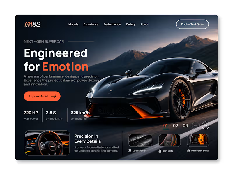
Automotive Web Design: Next-Gen Supercar
Description: Concept UI for a luxury supercar brand focusing on the "Engineered for Emotion" aesthetic.
1. Design Focus: Dark UI to highlight the sleekness of the vehicle and establish a premium, high-octane feel.
2. Key Features: Prominent hero section with clear CTAs ("Explore Model"), clean visual hierarchy for car stats (720 HP, 2.8s), and a sophisticated navigation layout.
Tools Used: Figma
0
60
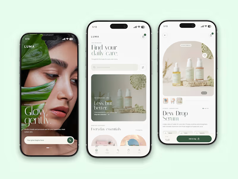
LUMA – Skincare & Beauty Shopping App
Project Overview
LUMA is a modern skincare shopping app concept designed to make discovering and purchasing skincare products feel simple, elegant, and personalized.
The Challenge
Create a seamless shopping experience that combines product discovery, clean navigation, and premium visual aesthetics while helping users explore skincare products effortlessly.
The Design Solution
I designed a minimal and intuitive mobile experience with a focus on visual storytelling, product presentation, and easy navigation.
Key Features
Elegant welcome and onboarding experience
Clean product discovery and category browsing
Premium product detail pages
Clear product information and pricing
Simple add-to-bag interaction
Intuitive bottom navigation
Visual Direction
A soft sage green and warm neutral color palette, refined typography, spacious layouts, and high-quality product imagery create a calm and premium skincare identity.
My Role: UI/UX Designer
Tools: Figma
Deliverables: Mobile App UI Design, User Flow, High-Fidelity Screens.
0
62

Veer Shrivastava


Ideas begin somewhere. I turn them into experiences.
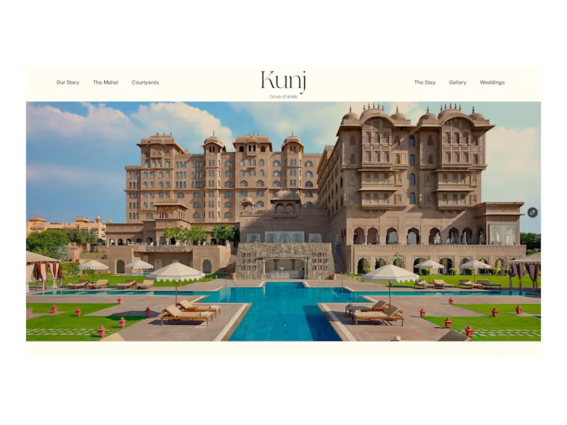
Kunj — A Heritage Hotel Website Concept
An exploration of luxury, Indian hospitality, and editorial web design.
Kunj is a heritage-inspired hotel website concept built around a simple idea: a place should feel memorable long before you arrive.
The design brings together the warmth of Indian hospitality, architectural character, and the understated elegance of luxury editorial websites. Rather than relying on conventional hotel layouts, the experience focuses on immersive imagery, considered typography, generous whitespace, and a calm, deliberate visual rhythm.
The language is primarily English, with subtle cultural touches that give the brand a distinctly Indian identity without compromising its international appeal.
The direction
Editorial layouts inspired by high-end hospitality and fashion websites
A restrained, warm visual palette with heritage-inspired details
Thoughtful presentation of rooms, spaces, dining, and celebrations
Minimal navigation and carefully composed sections
A balance between Indian character and contemporary luxury
The goal
To create a digital experience that feels as considered as the property itself — inviting guests to discover Kunj, imagine their stay, and picture the occasions they could celebrate there.
An independent design concept exploring the intersection of Indian hospitality and contemporary luxury.
0
21
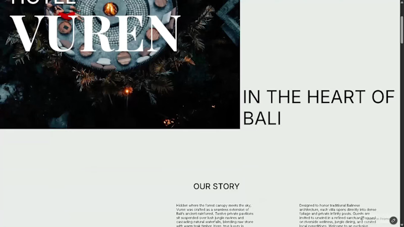
Hotel Vuren — Luxury Retreat in Bali
Hotel Vuren is a self-initiated concept for a luxury retreat in Bali, surrounded by dense tropical vegetation and designed around a slower, more intimate sense of hospitality.
The goal was to create a digital experience that feels as calm and considered as the retreat itself. I took an editorial, almost magazine-like approach to the layout, using oversized typography, generous whitespace, and carefully controlled asymmetry to create rhythm without making the experience feel busy.
The visual system is intentionally restrained — a soft eucalyptus-inspired #E6EBE6 paired with black typography and occasional white text. Rather than relying on decorative elements, the design uses scale, composition, negative space, and imagery to create the sense of luxury.
The layouts move between symmetry and asymmetry throughout the experience, giving each section its own visual character while keeping the overall system cohesive.
Designed and built entirely in Framer, with a focus on responsive composition, subtle interactions, and creating a premium editorial experience that feels closer to a luxury travel publication than a conventional hotel website.
One of my favourite projects to date — built from concept to final interaction.
#Framer #WebDesign #UIUX #LuxuryHospitality #EditorialDesign #FramerDesigner
1
3
212
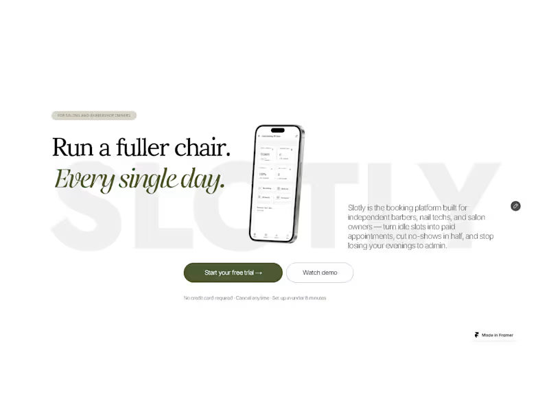
Slotly — Booking & Scheduling Platform
Slotly is a self-initiated SaaS concept exploring a modern booking and scheduling experience built for the Indian market.
The goal was to create a product that feels simple, approachable, and modern while handling the complexity of discovering services, choosing a time slot, and managing bookings. I focused heavily on the UI/UX, building a clear visual hierarchy, a flexible color system, and an interface that feels easy to navigate without looking overly generic or corporate.
The landing page and product experience were designed and built in Framer, with interactive elements and subtle motion used to make the SaaS feel more like a real product rather than a static concept.
A big part of the project was experimenting with color, typography, spacing, and component consistency to create a visual system that could scale across the entire product.
Rather than designing just a marketing page, I wanted Slotly to feel like a complete SaaS product — from the first landing-page interaction to actually discovering a service and making a booking.
A self-initiated project, designed and built from concept to final interaction.
#Framer #WebDesign #UIUX #SaaS #FramerDesigner
1
4
224
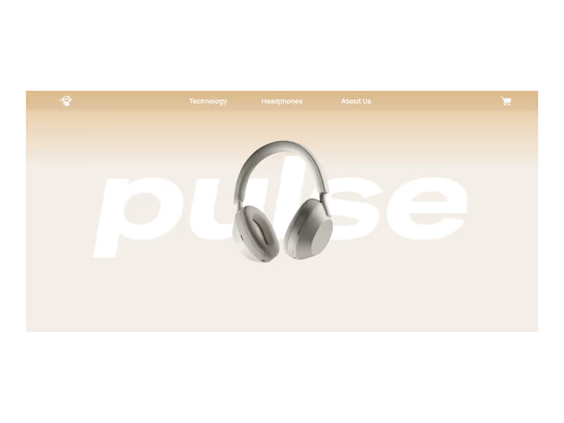
PULSE - Headphone Product Landing Page
PULSE is a self-initiated concept project exploring the digital identity of a premium headphone brand.
The goal was to create a product-first experience where the headphone itself remains the protagonist. I focused on oversized typography, soft neutral tones, immersive product imagery, and a restrained visual language to create a sense of luxury without overloading the interface.
The landing page was designed and built in Framer, with interactive 3D elements created using Spline. The experience includes an interactive 3D hero, a visual color selector showcasing five headphone finishes, and product-focused sections that explore the listening experience and design of the headphones.
Rather than treating the product as just another element on the page, I wanted every section to build around it from the way it is introduced, to how users explore its colors, details, and personality.
A self-initiated project, built from concept to final interaction.
#Framer #Spline #WebDesign #UIUX #ProductDesign #WebDevelopment
0
130

weaving experiences.


Product Designer ✦ Websites, Apps, and Digital Products.
Product Designer ✦ Websites, Apps, and Digital Products.


UI/UX Designer & Frontend Engineer
UI/UX Designer & Frontend Engineer


