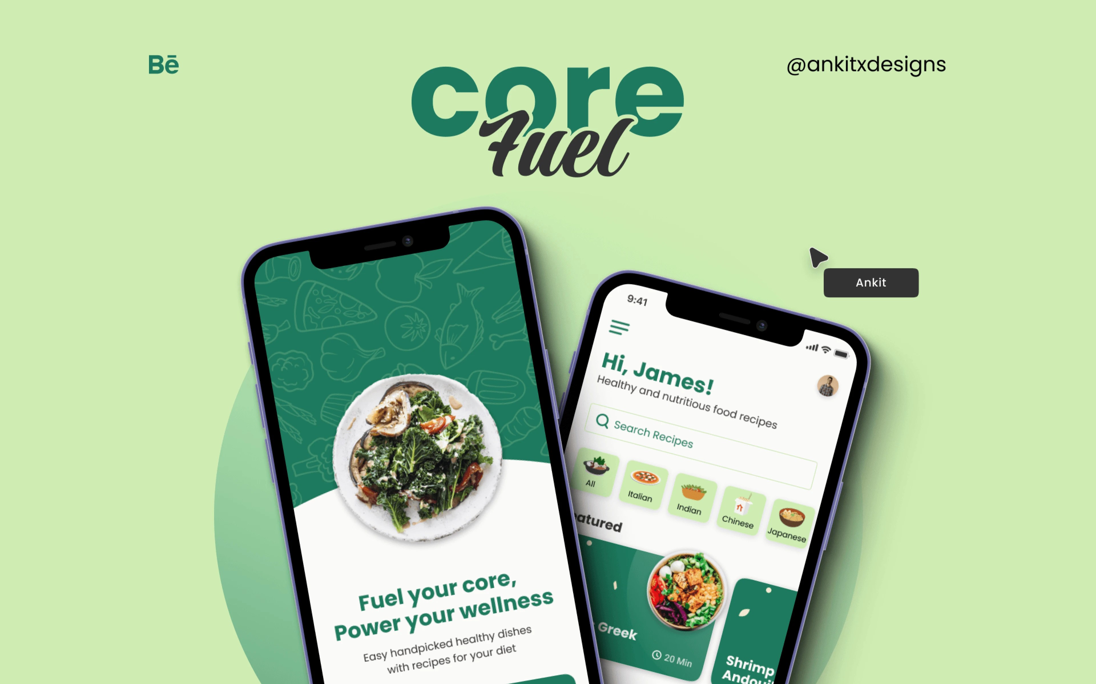
Core Fuel — Healthy Recipe App UX
Sūtra Studio
Role: Product Designer - UX/UI, Visual Design, Interactions
Timeline: 2 Weeks
Impact: Engineered a structured, healthy recipe book in the form of an app, designed to simplify nutritious cooking for everyday life.
Project Overview
Core Fuel is a digital healthy recipe companion designed to seamlessly integrate nutritious cooking into everyday life. By combining thoughtful UX, a clear information hierarchy, and a sophisticated visual design, the app helps users discover health-focused recipes and vital nutritional insights without feeling overwhelmed. It transforms meal planning from a chore into an effortless routine.
Problem Statement
Kitchen Cognitive Overload
Most healthy recipe apps suffer from feature bloat. They overload users with dense walls of text, cluttered layouts, and intrusive elements that are incredibly frustrating to navigate with messy hands while cooking. Important details—like ingredient measurements, sequential steps, and macro-nutritional data—constantly compete for attention, leading to friction and meal-prep abandonment.
How might we strip away the noise and design a recipe interface that acts as a quiet, helpful sous-chef?
Solution
CoreFuel solves the problem of kitchen cognitive overload by strictly prioritizing readability, flow, and structural precision.
Focused Hierarchy: Recipes are broken down into easy-to-scan, modular blocks
Distraction-free UI & easy-to-follow recipes: A minimalist environment that removes unnecessary pop-ups, keeping the user’s attention strictly on the ingredients and timing.
Accessible Nutrition: Essential macros and health insights are surfaced intuitively, without requiring the user to dig through complex charts.
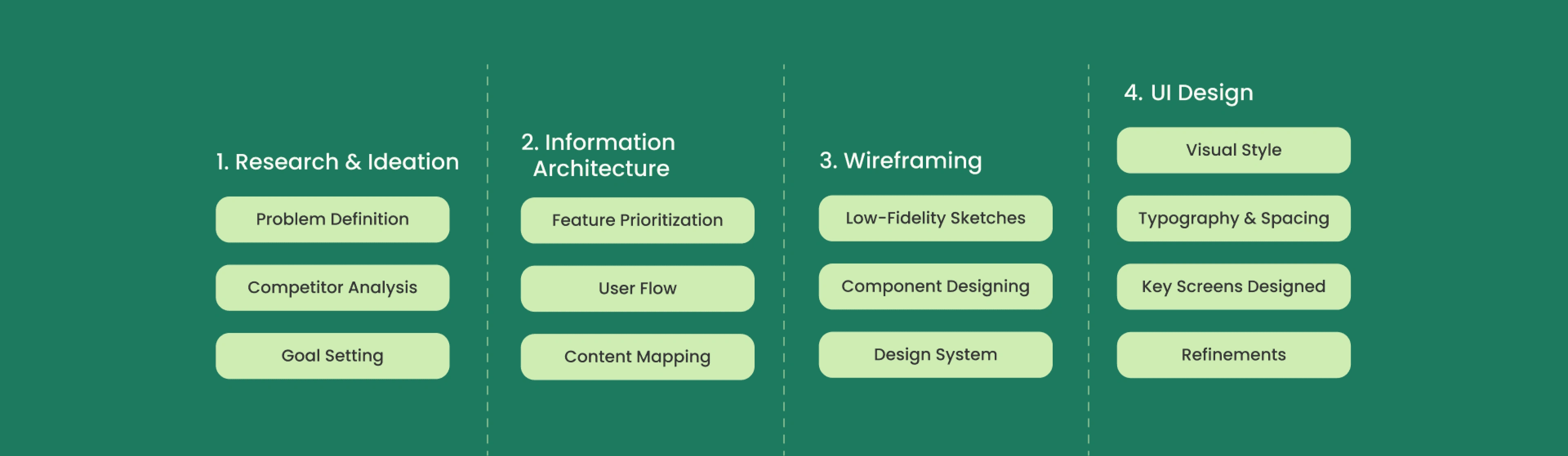
Design Process
The design process for CoreFuel focused on building a clean, health-first recipe experience that feels effortless and approachable. From the beginning, the goal was to understand how users interact with recipe apps and what features could genuinely support healthier eating habits.
I identified key friction points. The resulting interface minimizes scrolling, utilizes generous negative space, and relies on a highly logical structure to guide the user step-by-step with zero ambiguity.
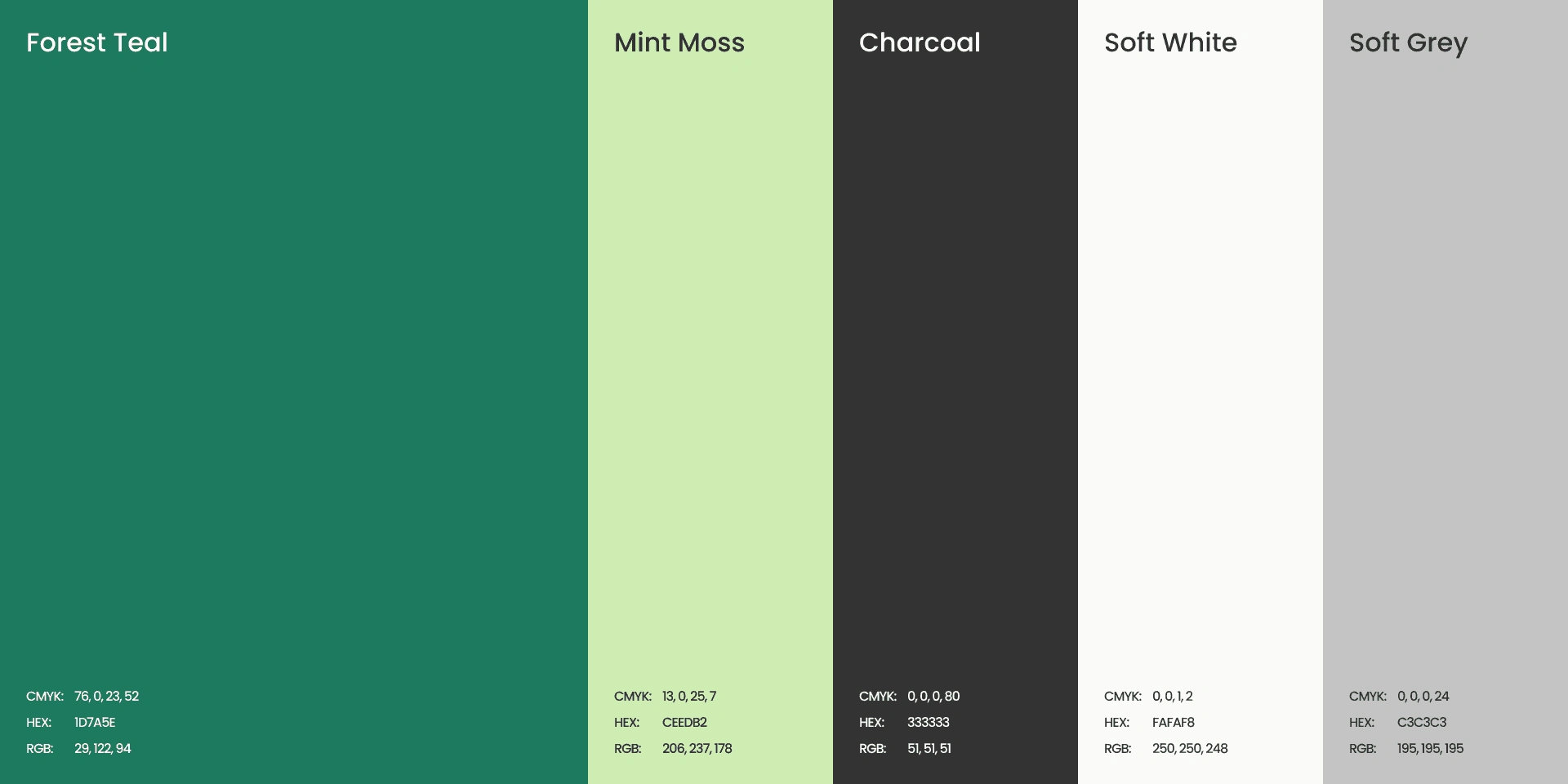
Color Palette
The palette relies on stark, neutral backgrounds paired with intentional, vibrant accent colors. This contrast not only highlights the Apps theme about health but also clearly defines primary calls-to-action without overwhelming the user's senses.
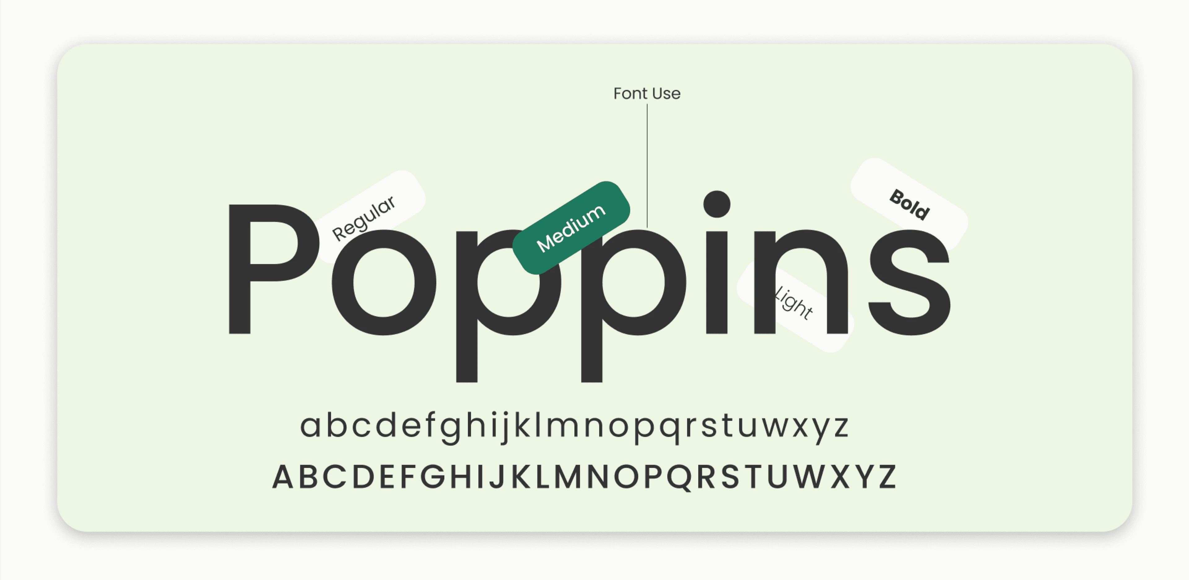
Typography
I selected highly legible, modern sans-serif typefaces. In a cooking environment, text must be readable at a glance. The typographic scale deliberately contrasts large, bold headers with crisp body copy to establish an immediate hierarchy.
Wireframing
Low-fidelity wireframing was crucial for testing the information architecture before introducing any visual styling. The focus here was entirely on structure and hierarchy. By iterating rapidly at this stage, I ensured that the layout intuitively guided the user’s eye from the dish overview, down to the prep time, and straight into the active cooking steps.
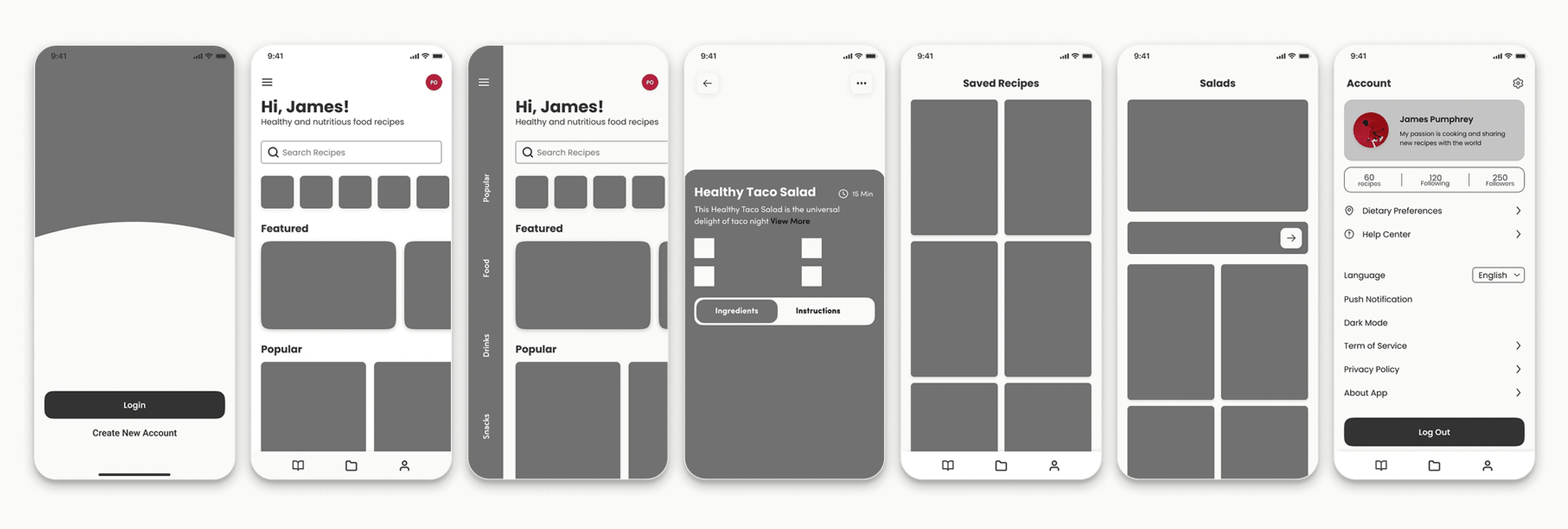
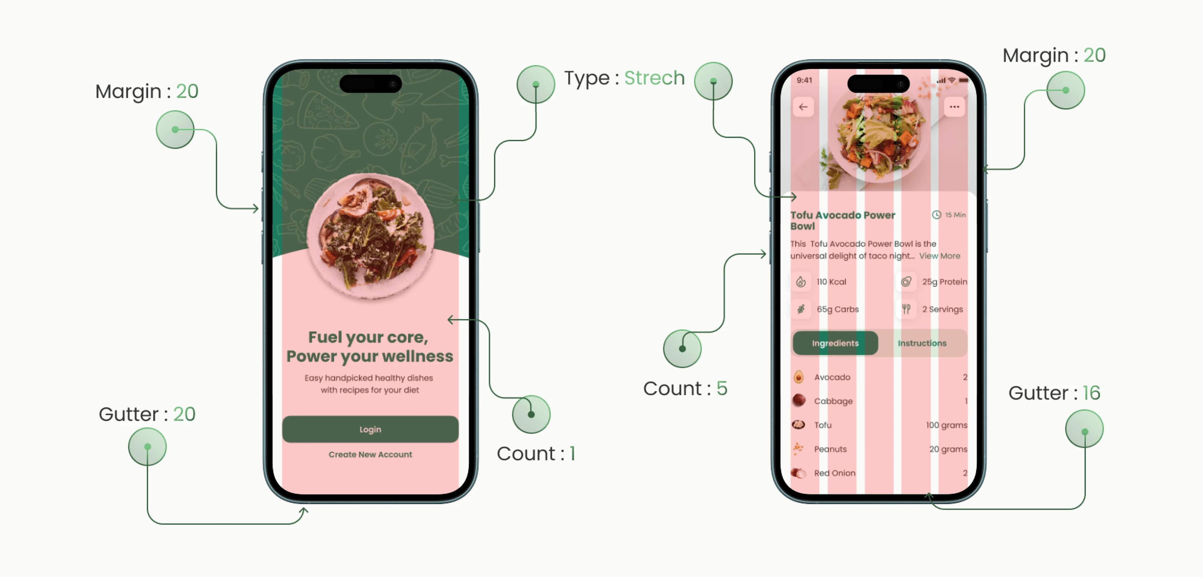
Grid System
A rigid, underlying grid system was employed to ensure absolute consistency and alignment across all viewports. This structural precision is what gives the interface its clean, almost brutalist efficiency, ensuring content never feels crowded.
HFD
The Recipe Hub: A visually engaging but highly organized discovery page that uses soft shadows and clean cards to make browsing for the next meal feel inspiring, not exhausting.
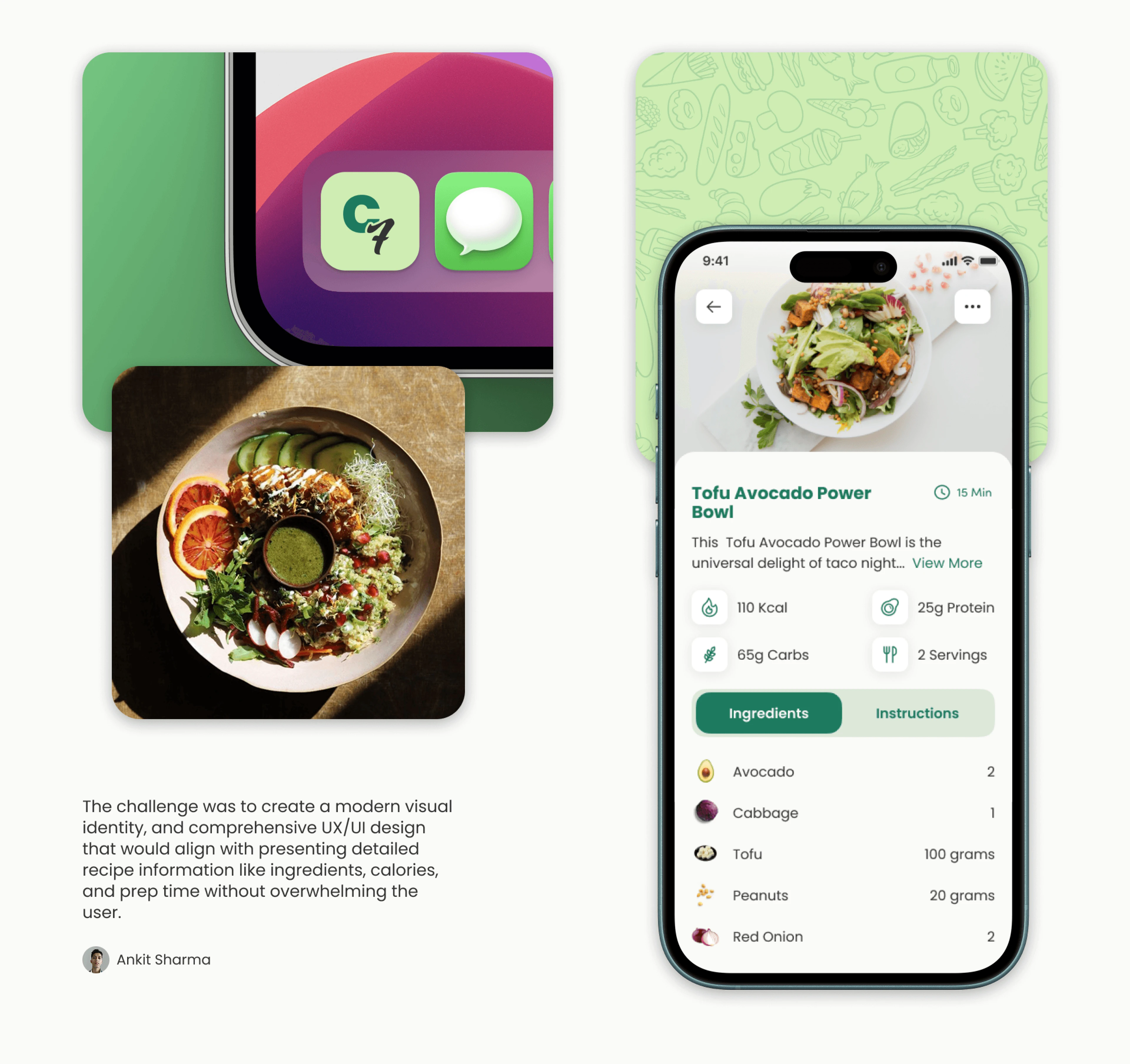
Step-by-Step Focus Mode: The layout isolates active cooking steps and ingredients, ensuring the user never loses their place while moving around the kitchen.
Nutritional Transparency: Macros and health benefits are displayed with elegant simplicity, allowing users to track their dietary goals at a single glance.
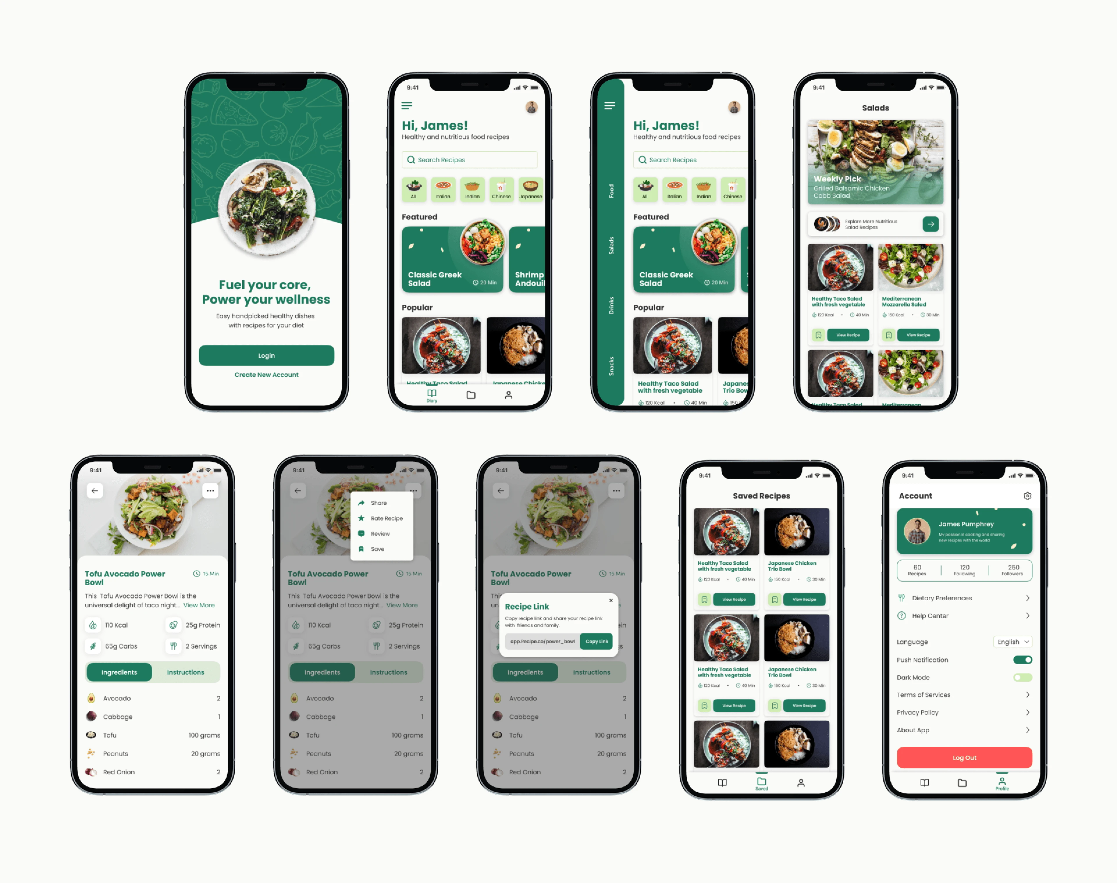
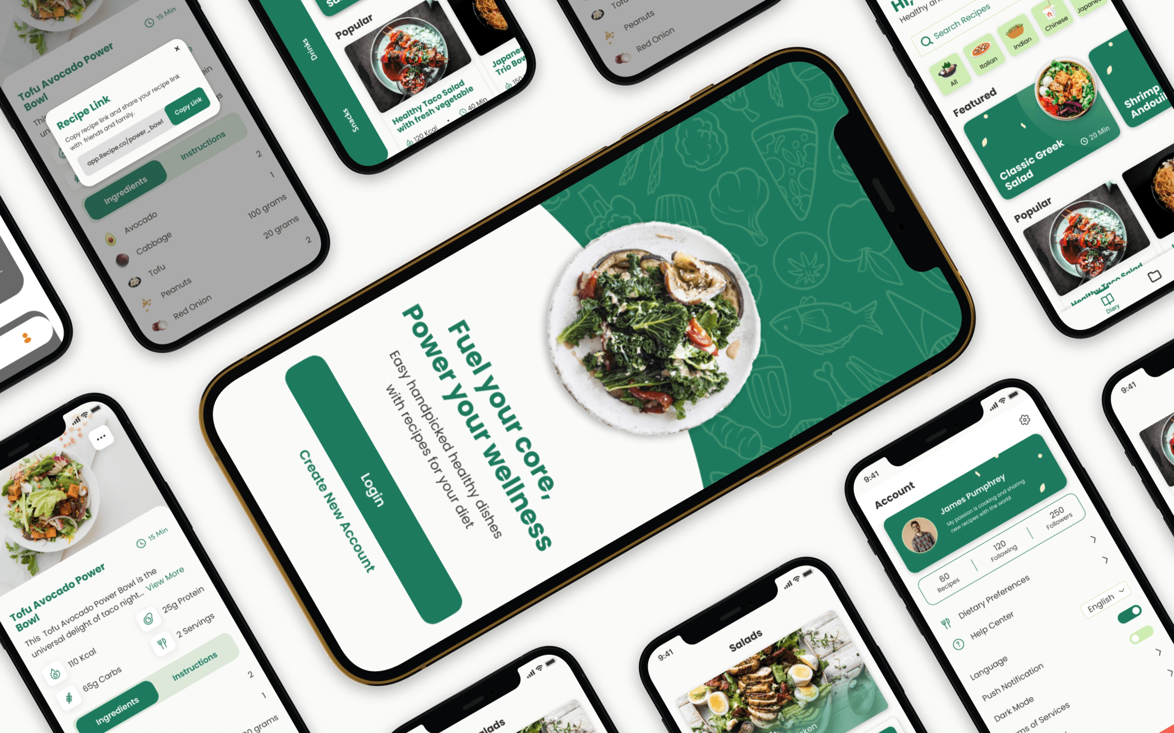
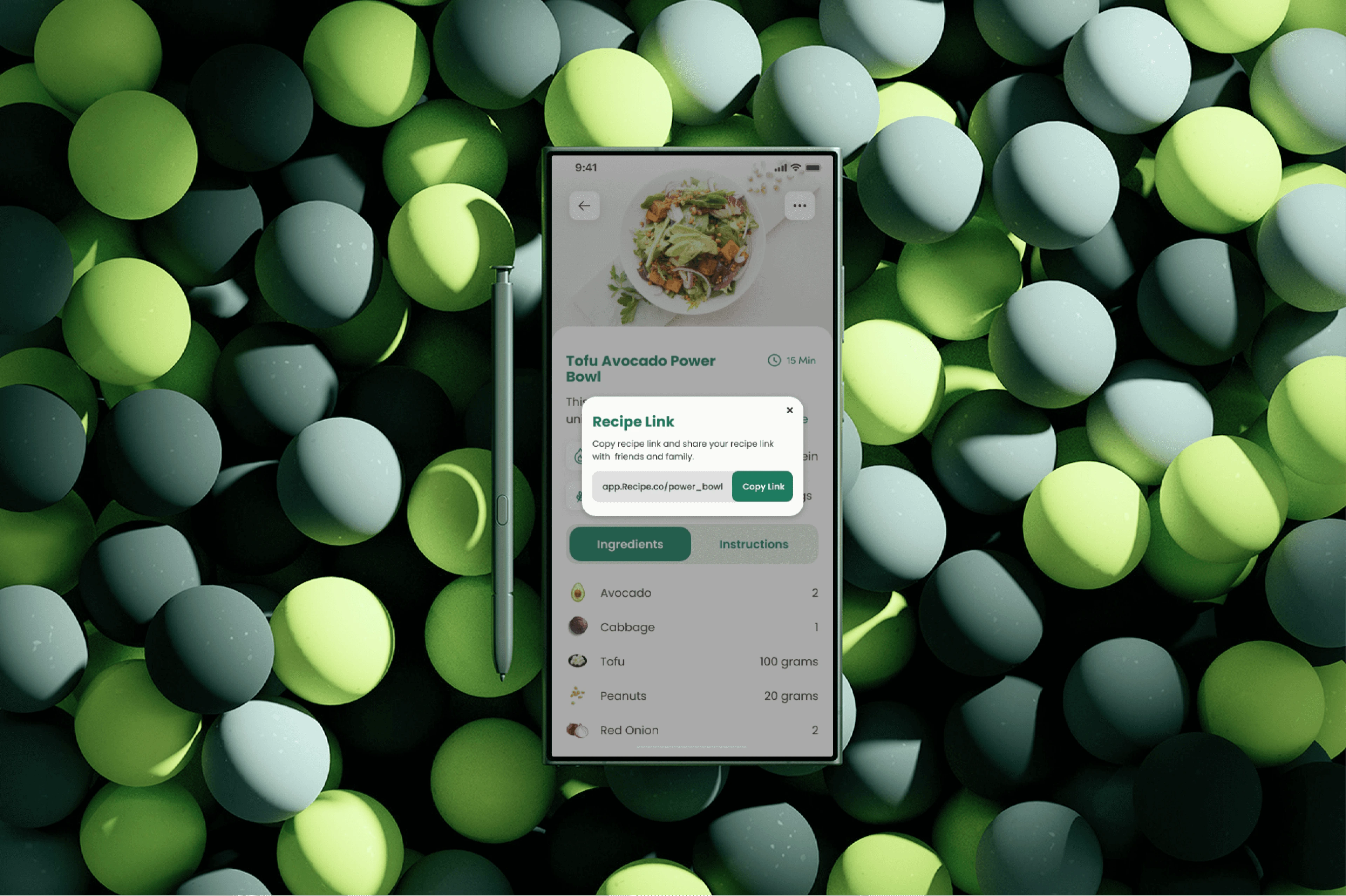
UI Mockups
Reflections and Next Step
Building for Utility
Creating CoreFuel reinforced the idea that good design is often invisible. In utility-driven applications like a recipe book, the interface should never get in the way of the task. Stripping a design down to its absolute essentials—embracing minimalism and strict grid systems—ultimately creates a more powerful and user-friendly product.
If I were to develop this project , I would introduce a voice-command feature for hands-free navigation while cooking, and integrate a dynamic grocery list generator that automatically compiles ingredients from selected weekly recipes.
Like this project
Posted Jun 16, 2025
A mobile app UX design that simplifies healthy cooking through easy-to-follow recipes and clear nutritional insights.
Likes
3
Views
4
Timeline
May 10, 2025 - May 28, 2025