Typography Projects in Lahore
Typography Projects in Lahore
Sign Up
Post a job
Sign Up
Log In
Filters
2
Projects
People
Message
3
Asif Bashir
pro
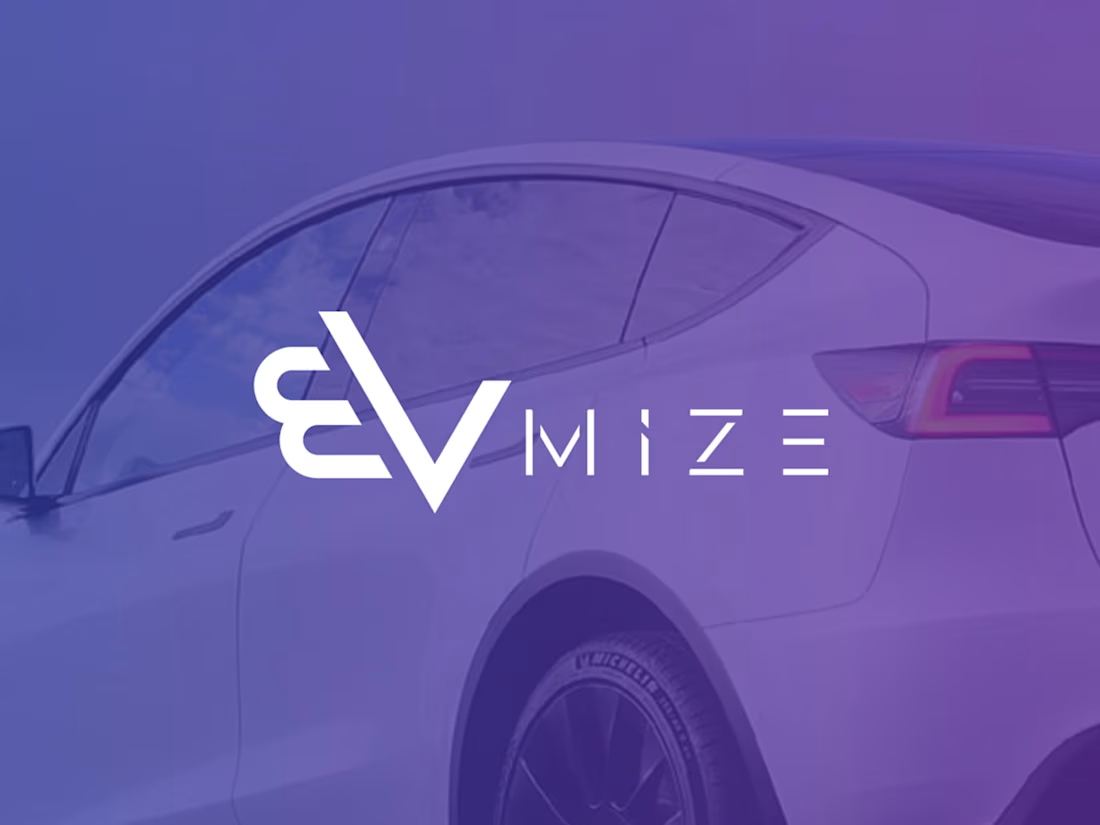
EVMIZE - Branding Visual Identity
3
34
Message
0
KAZIM HAIDER SYED
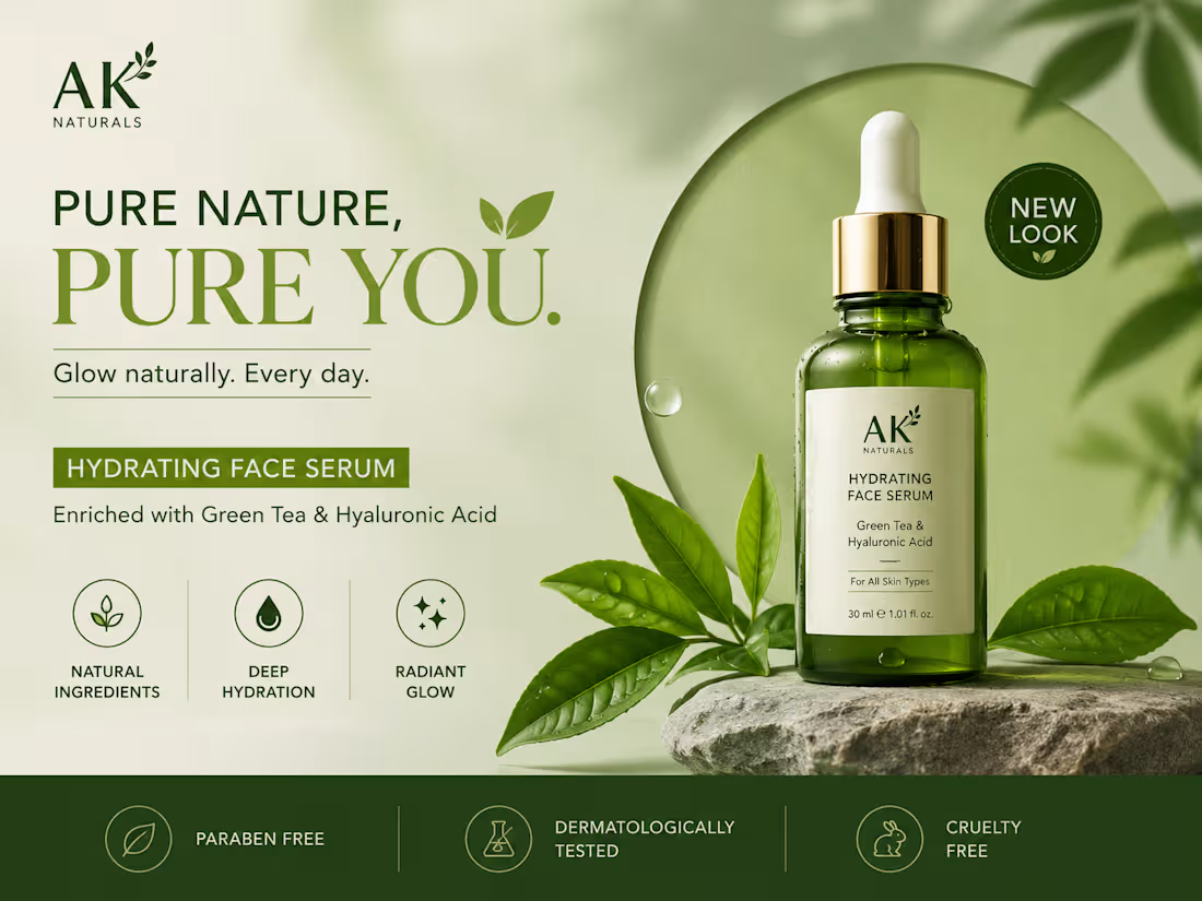
🌿 PURE NATURE. PURE YOU. 🌿 Your brand deserves a design that speaks before words do. Clean visuals, premium feel, and a modern aesthetic that instantly grabs attention ✨ This skincare product ad was designed to create: ✔ Strong brand identity ✔ Client trust & attraction ✔ Modern luxury vibes ✔ High-converting social media presence Good design doesn’t just look beautiful — it sells your product. 🚀 Need eye-catching graphics for your brand? 📩 DM me for: • Product Ads • Social Media Posts • Brand Identity • UI/UX Designs • Creative Marketing Visuals Let’s make your brand impossible to ignore. 💚
0
67
Message
6
Waleed B.
pro
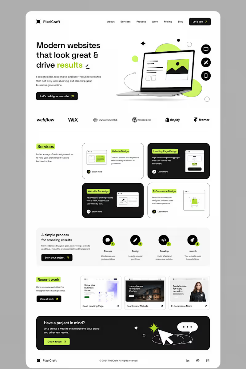
I didn’t want to build another website that simply “looked good.” I wanted to build something that felt clear, modern, and actually guided people toward taking action. So I started with a simple idea: less clutter, more clarity. I built the layout around strong typography, clean spacing, bold contrast, and small lime-green accents to make important elements stand out. Then came the details — service cards, responsive sections, portfolio previews, a simple process, and CTAs placed where they naturally make sense. The goal was simple: Make the website feel good to explore — and even better to use. This is what I love about web design. It’s not just about designing a pretty page. It’s about turning an idea into an experience. #Graphic Designer #Webdesigner #Website Designer
6
6
408
Message
2
Moeez Ahmed
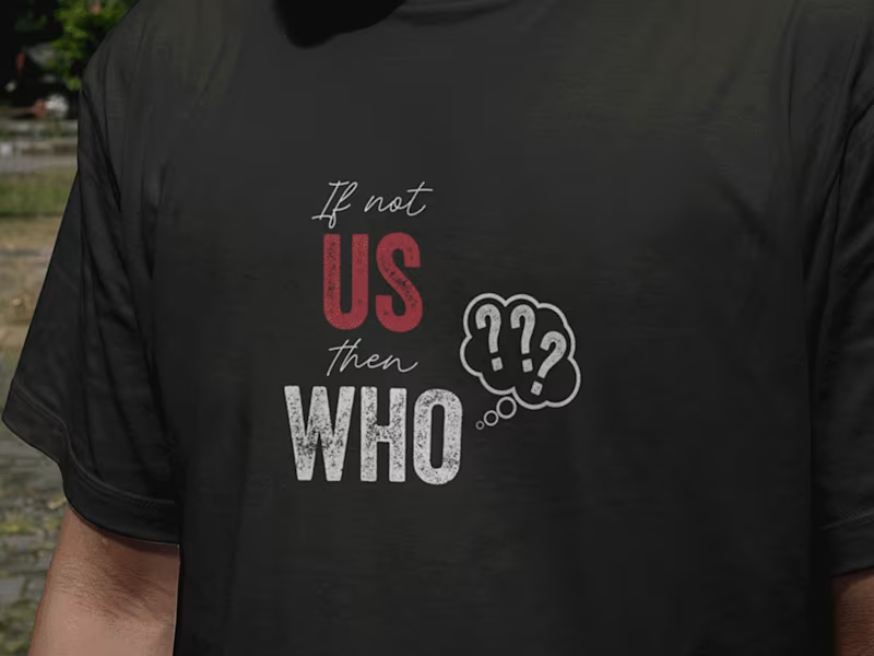
20 powerful and inspiring t-shirt designs Quotes
2
5
Message
1
Ammarah Azyal
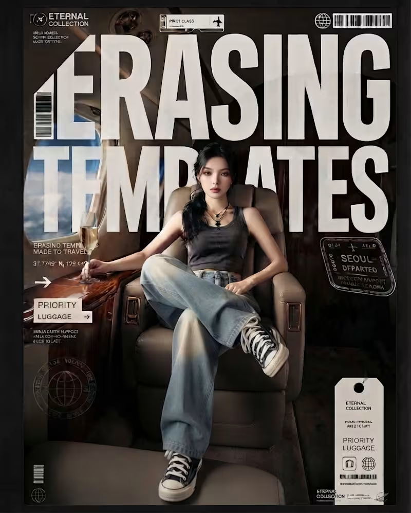
Lately, I’ve been spending a lot more time thinking about typography not just as something you place on a design, but as something that shapes the entire visual language. These pieces are all AI-generated, but the part I’ve been intentionally exploring is what happens after the image: how typography can interact with scale, perspective, composition, movement, and the subject itself. From oversized type becoming part of the image, to hand-drawn lettering carrying the energy of an illustration, to bold editorial type creating structure around a photograph. I’ve been experimenting with different ways for type and imagery to feel like one composition rather than two separate elements. The goal isn’t simply to make AI images look good. It’s to use AI as a visual tool while pushing the art direction, typography, hierarchy, and composition further. Still experimenting. Still learning. And honestly, typography is becoming one of my favorite parts of the process. Which of these approaches do you think works best, and is there one where the typography made you stop and look twice?
1
200
Message
0
Abyaz Ahmed
Designed eye-catching packaging that enhances shelf appeal and strengthens the Candyland brand identity.
0
179
Message
1
Eeman Nasir
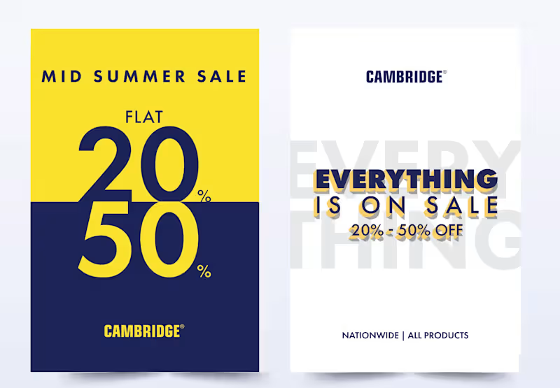
SALE -key visual
1
10
Message
0
Ummul Bannin
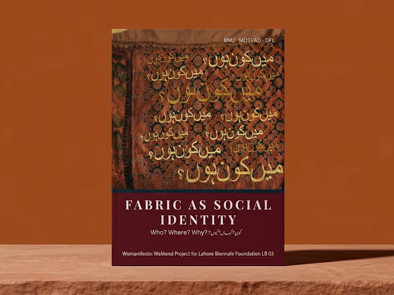
Fabric as Social Identity Publication Design
0
1
Message
1
Huzaifa Asim
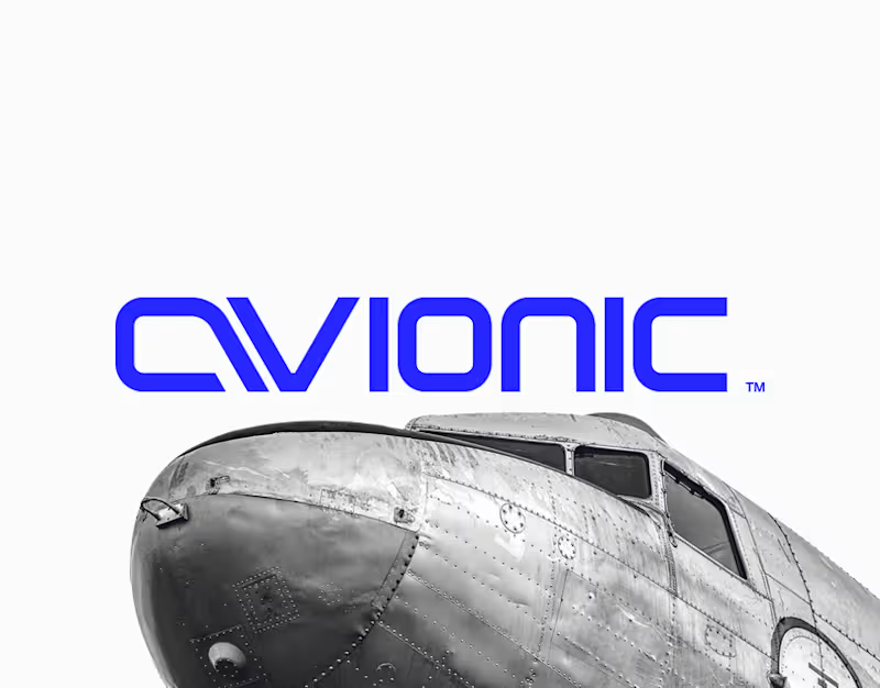
avionic™ | Brand Identity
1
0
Message
0
Abrar A. Faiz
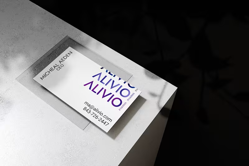
Alivio Pharma - Formation of a Brand
0
7
Message
1
Fajar Rizwan
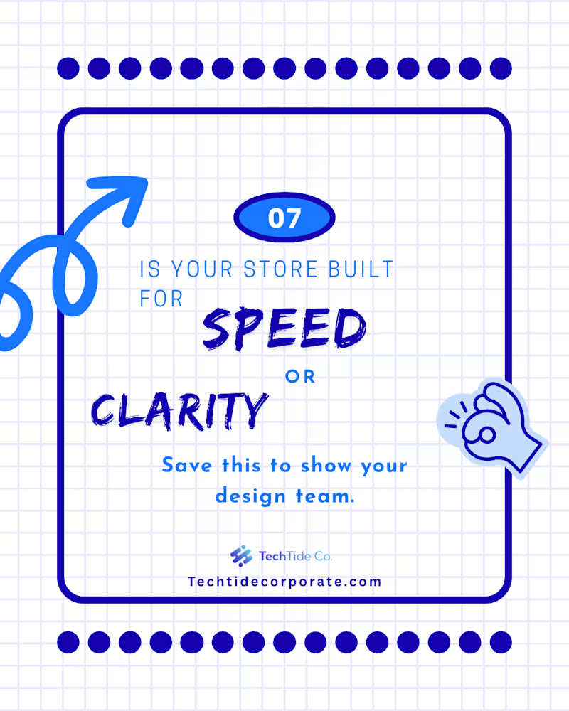
Since you mentioned Part 1 was about the "Psychology" and the "Problem," Part 2 needs to be about the "Solution" and the "Action." This makes you look like a designer who doesn't just point out flaws but actually knows how to fix them. Here is the professional English text for your Part 2 Contra post: Project Title: The "5 Confident Clicks" Framework – UX Case Study (Part 2 of 2) The Design Challenge: Following the psychological groundwork laid in Part 1, this second installment focuses on the practical execution of a high-conversion user journey. The challenge was to visualize a framework that balances speed with user certainty, ensuring that every interaction leads the customer closer to a "Confident Yes." My Creative Approach: In this concluding part, I transitioned from identifying myths to presenting actionable architectural solutions. My design strategy included: Framework Visualization: I designed the "5 Confident Clicks" roadmap, using a step-by-step visual flow to show how information should be staggered to prevent user overwhelm. Blueprint Detail: I maintained the blue-on-white technical aesthetic to ensure continuity from Part 1, signaling to the audience that this is a data-driven design solution. Clarity over Speed: I utilized custom icons and directional cues to demonstrate that "Certainty Converts." The design illustrates that a guided path, even if longer, significantly reduces cart abandonment. Conversion Optimization (CRO): The final slides focus on the "Visit" and "Contact" CTAs, transforming the educational experience into a direct lead-generation tool for the client. The Final Result: This two-part series serves as a comprehensive masterclass in modern UX. By the end of this installment, the viewer isn't just informed—they are equipped with a tangible framework to audit and improve their own digital storefronts. Series Conclusion: This completes the "Psychology of Conversion" series. While Part 1 challenged the status quo, Part 2 provides the roadmap for the future of digital interaction. “Mystery kills the sale. Certainty converts.”
1
55
Message
0
Adnan Ahmed
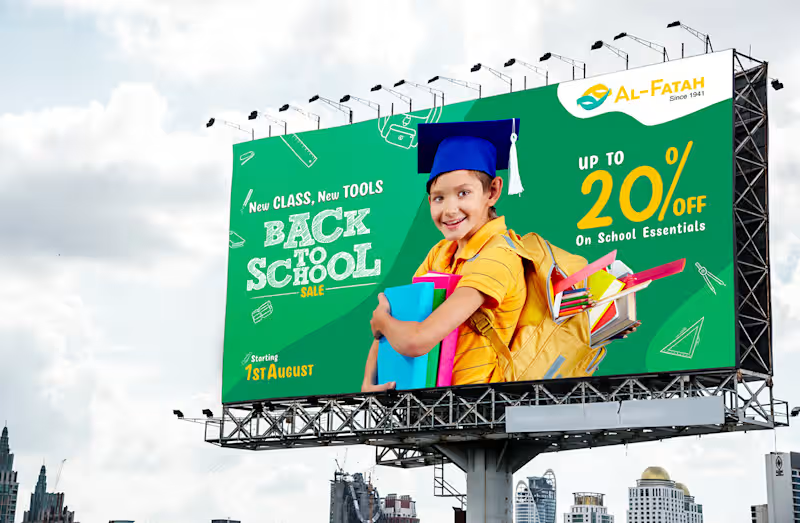
Out of Home Campaign
0
3
Message
1
Freelance With Subhan
pnj logo
1
62
Message
0
Muhammad Imran
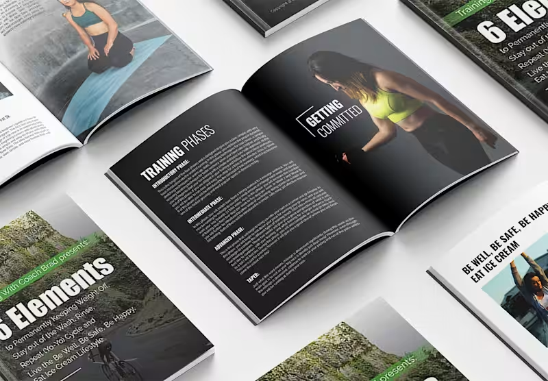
Exercise, Fintess, and Self-Improvement genre book design
0
48
Message
0
Syed Ahmad Ali
Align Skin Care Branding & Packaging Design
0
4
Message
0
TAYYBA | TheGlazeCreative
Logo design & branding
0
0
Explore projects