The network for creativity
Join 1.25M professional creatives like you
Connect with clients, get discovered, and run your business 100% commission-free
Creatives on Contra have earned over $150M and we are just getting started
Back to feedPost

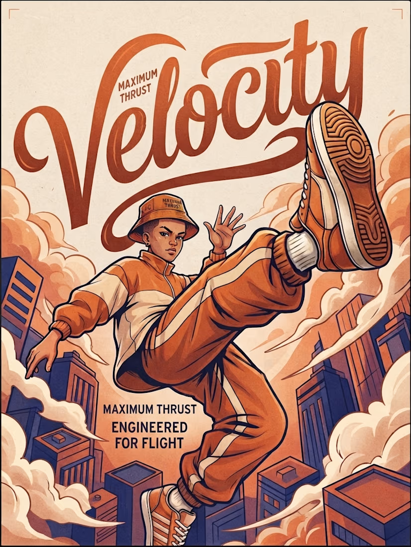
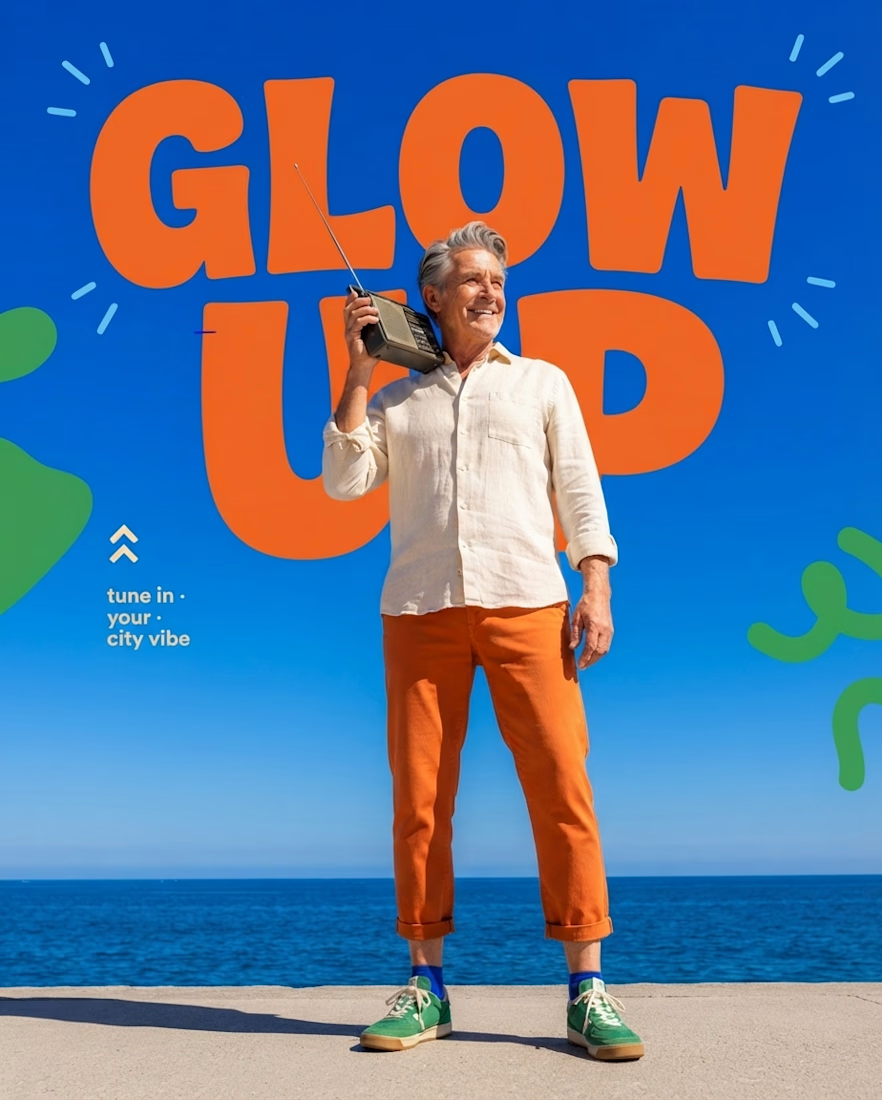
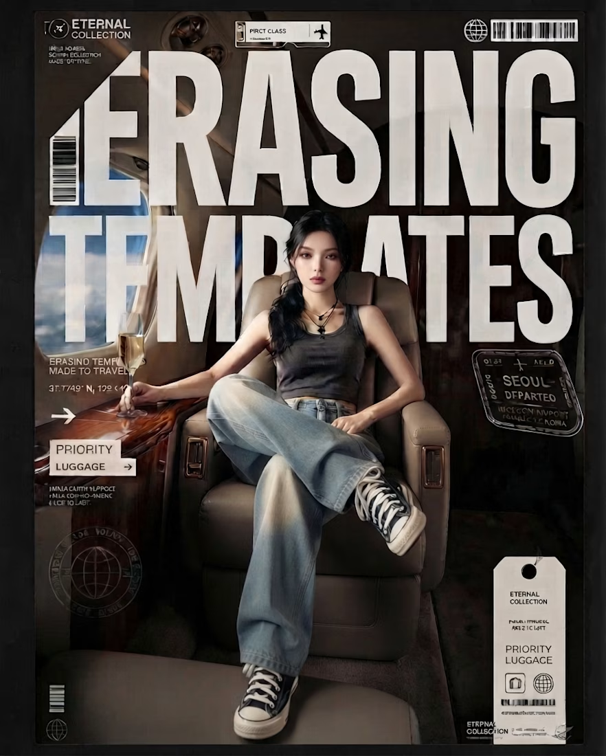
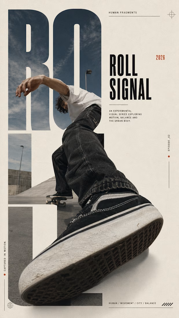
Lately, I’ve been spending a lot more time thinking about typography not just as something you place on a design, but as something that shapes the entire visual language.
These pieces are all AI-generated, but the part I’ve been intentionally exploring is what happens after the image: how typography can interact with scale, perspective, composition, movement, and the subject itself.
From oversized type becoming part of the image, to hand-drawn lettering carrying the energy of an illustration, to bold editorial type creating structure around a photograph. I’ve been experimenting with different ways for type and imagery to feel like one composition rather than two separate elements.
The goal isn’t simply to make AI images look good.
It’s to use AI as a visual tool while pushing the art direction, typography, hierarchy, and composition further.
Still experimenting. Still learning. And honestly, typography is becoming one of my favorite parts of the process.
Which of these approaches do you think works best, and is there one where the typography made you stop and look twice?


The network for creativity
Join 1.25M professional creatives like you
Connect with clients, get discovered, and run your business 100% commission-free
Creatives on Contra have earned over $150M and we are just getting started





Related posts

Most creative brands try to say everything at once.
More colour.
More shapes.
More visual noise.
But for this identity exploration, the idea was simpler:
Make creativity feel meaningful.
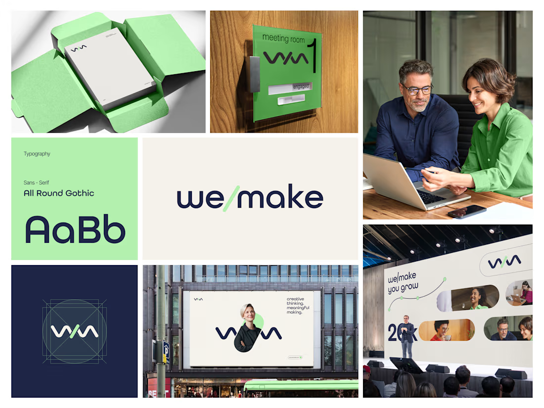
Introducing we/make, a bold, human-centred visual identity built around collaboration, growth, and purposeful making.
The mark is designed as a flexible expression of “we” and “make” coming together.
It represents:
• Ideas turning into action
• People creating together
• Growth through meaningful work
• A creative process that stays clear, warm, and confident
The visual system pairs a deep navy foundation with a fresh green accent, bringing together trust, focus, energy, and optimism.
Rounded typography and soft graphic elements keep the brand approachable, while the structured layouts give it a modern, professional feel.
From stationery and meeting-room signage to campaigns, billboards, and event spaces, the identity is built to work wherever creativity needs to show up.
Creative thinking. Meaningful making.
Would love to hear your thoughts on the visual direction.
What stands out to you first, the logo, colour palette, or overall brand feel?
#BrandIdentity #BrandDesign #CreativeDirection #VisualIdentity #GraphicDesign #LogoDesign



AI UGC - Minimalist Watch Ad | Viral E-com TikTok
This is an AI UGC video - I created this human avatar + voice without hiring real models.
Hook: 0-1.5 sec smile close-up with watch (emotional hook for female audience) Avatar: Custom AI model - cute, warm, natural - not robotic Edit: DaVinci Resolve + CapCut - clip-by-clip color correction, logo placement, beat sync, no on-screen text
Why AI UGC? ✓ No model fee - saves $200/video for brand ✓ 48 batch delivery (5-10 videos/day) ✓ Perfect for testing product angles fast
This exact style got 1.1M organic views for my watch brand client.
Tools: HeyGen / Arcads + CapCut + DaVinc


I'm loving the depth of field in this shot, the focus pull from the model's face onto the wrist is a good move and there's some nice background walla/clinking that makes it feel grounded in the first two seconds that gets ducked against the vocals. Still some observations and...

Throughout my life as a creative, I always found myself in typography.
Started with graffiti.
Then graphic design with a focus on typography.
Then designing fonts.
Then pixel art with custom typography.
