Projects using Lovart in Lagos
Projects using Lovart in Lagos
Sign Up
Post a job
Sign Up
Log In
Filters
2
Projects
People
Message
1
Henry Tochukwu
pro
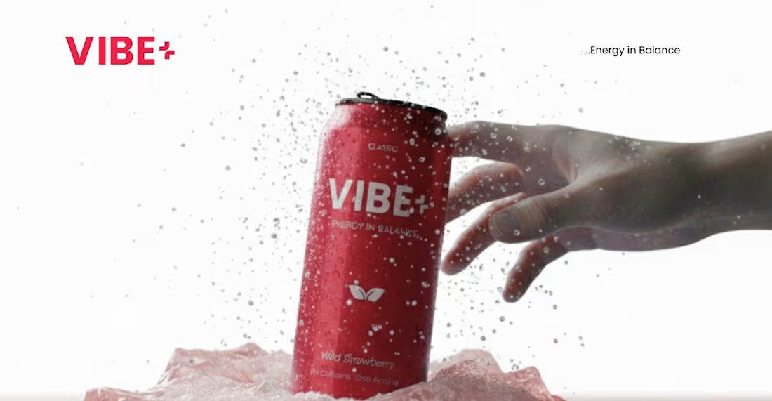
Brand Overview Summary VIBE+ is a modern functional drink designed for young creatives, tech builders, and high achievers. It promotes “Energy in Balance,” offering focused, clear, and intentional energy without the overstimulation or crash of traditional energy drinks.
1
661
Message
6
Peace Ukutegbe
pro
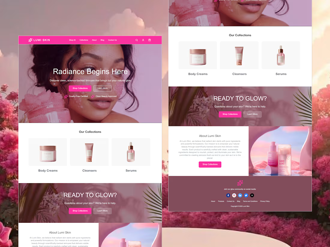
Custom Shopify Store Design: A visually appealing, brand-aligned store design tailored to your help business make sales.
6
4.1K
Message
5
Khadijah (Dija) 💥
pro
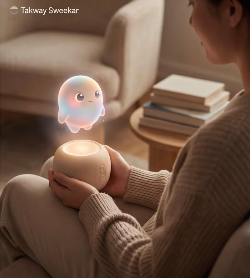
One of my favourite things to do is build product concepts that don’t exist yet This one is Takway × Nintendo: a small gadget that houses an AI pet. It responds to touch, movement, and quiet moments. The idea isn’t utility, it’s companionship. Nintendo feels like the right inspiration: simple, playful, and full of character. I’m curious, do you think gadgets should be made to feel alive, like companions or just tools?
2
5
388
Message
4
anthony jennifer
pro
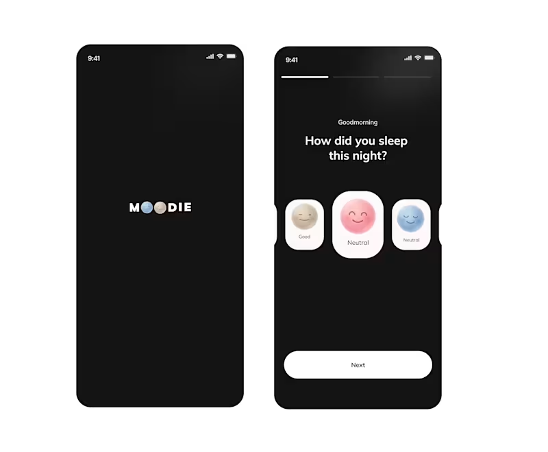
I used @Lovart AI (https://contra.com/company/lovart) to create illustrations for a moody app onboarding, focusing on consistent style.
4
241
Message
0
Stephenie Amadhe
pro
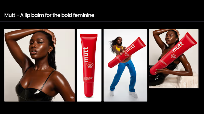
Lip Balm Brand AI-Driven Creative Exploration
0
15
Message
5
Rosebeth Anyiam
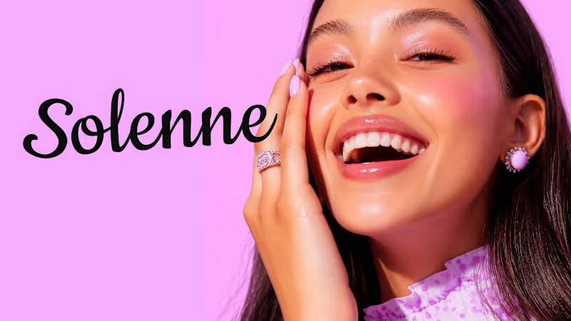
Solenne is a mental health and wellness studio created to make support feel safe, calm, and approachable. For the brand identity, I wanted the visuals to reflect that feeling from the first interaction. The audience is coming to Solenne because they need support. I did not want the colours to feel loud or overwhelming, so I chose soft pink and blue tones that feel calm, warm, and welcoming. The imagery follows the same direction. Soft and expressive visuals bring a human feeling to the brand and help communicate emotion without making everything feel too serious. The goal was simple. Create a brand that feels like a place you can breathe.
11
5
268
Message
0
Oreoluwa Ayanleye
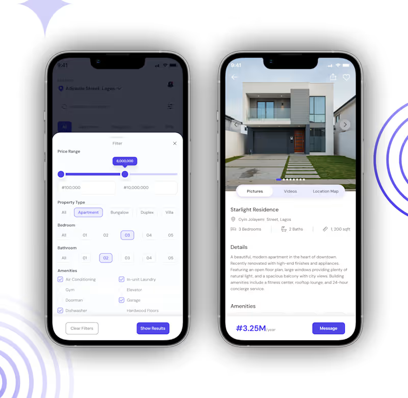
UI/UX Design for a Real Estate
0
4
Message
1
Abdullahi Usman
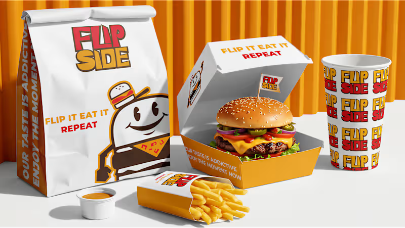
I recently completed the visual identity for Flip Side, a street burger brand targeting the US and European markets. For this project, the goal was to marry the high-energy vibe of modern street food with a nostalgic, character-driven aesthetic. The Strategy: Market Positioning: Leveraged a "rubber-hose" mascot style to create instant brand recognition and approachability in a competitive urban landscape. The System: Implemented a strict 60-30-10 color rule using a palette of Golden Yellow (#F0A116), Red (#E5192D), and Dark Brown (#442D17) to ensure consistency across every touchpoint—from burger wraps to staff apparel. Scalability: Designed a versatile pattern system that works as well on a snack box as it does on a digital menu. Deliverables: Brand Strategy, Mascot Illustration, Pattern Design, and Packaging Systems. Looking to launch or rebrand? I’m currently accepting new projects here on Contra. Let’s build something memorable. #BrandIdentity #LogoDesign #MascotDesign #PackagingDesign #ContraIndependents #StreetFoodBranding #GraphicDesign
1
54
Message
0
Marcus Oris
pro
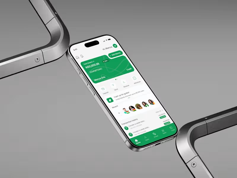
PAYSOS Financial Tech Product Design
0
7
Message
0
Yinka Adedeji
London Logic Property Management
0
8
Message
0
TAOFEEK MAYOWA YAYA
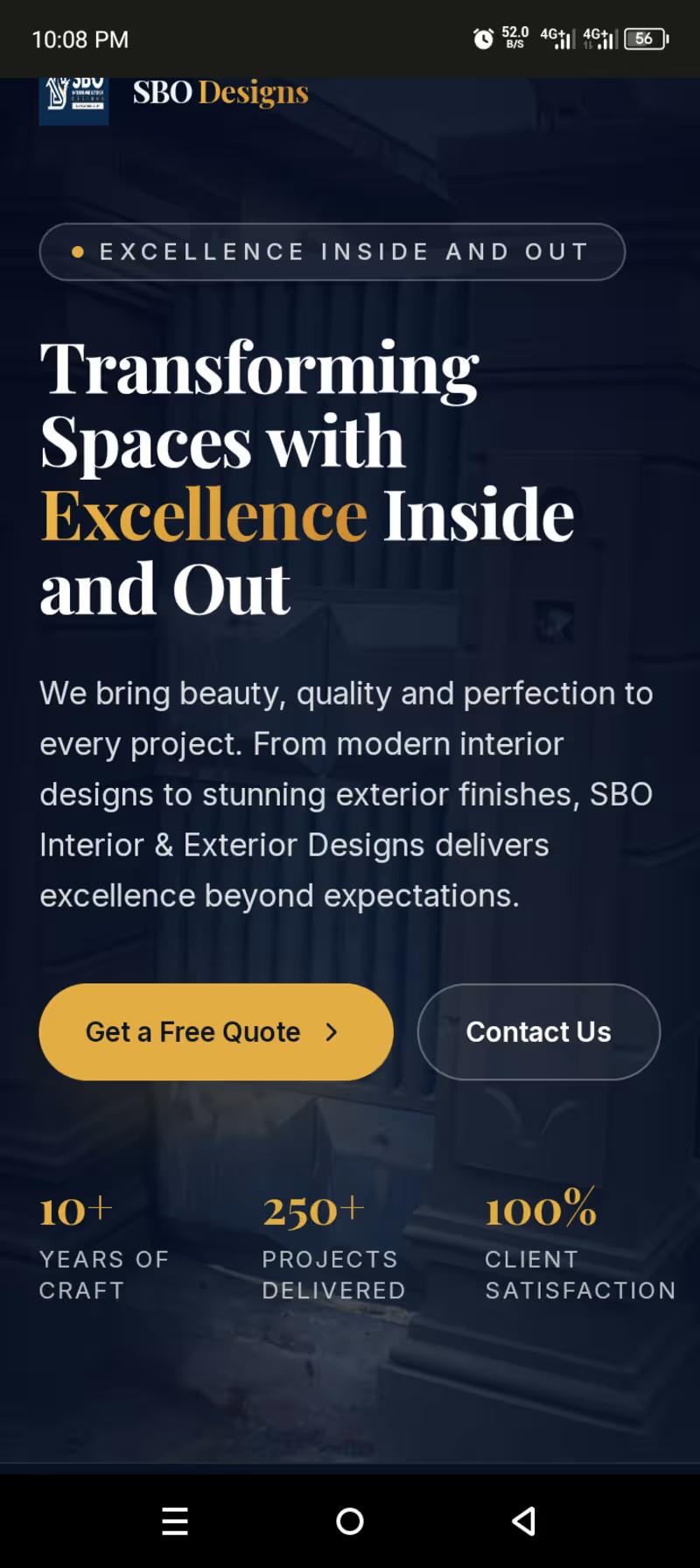
Website design
0
29
Message
2
Henry Tochukwu
pro
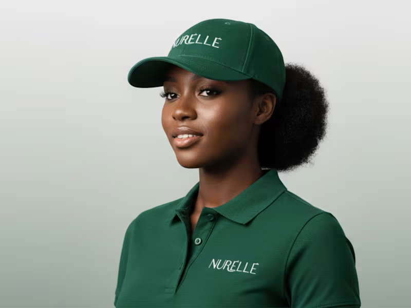
About Summary NURÉLLÉ is a premium skincare brand that blends ancient botanical wisdom with modern dermatological science. It focuses on deep, natural nourishment and skin health, offering a mindful approach to beauty. The brand’s hero ingredient is high concentration Aloe Vera, used for intense hydration and soothing relief, relying on bioactive compounds rather than water-based fillers to support lasting skin health and radiance.
2
690
Message
3
Khadijah (Dija) 💥
pro
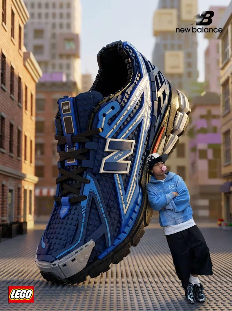
Made an imaginary New Balance x LEGO. Would you wear this? 👀
3
503
Message
3
Rosebeth Anyiam
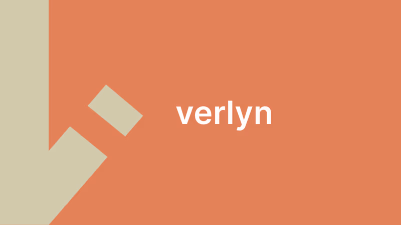
Most AI brands try to convince you they are intelligent. So they use glowing gradients, futuristic graphics, and loud messaging. I went in the opposite direction with this concept. Verlyn is an AI verification platform. It does not replace AI. It quietly checks AI decisions before they reach customers. That idea shaped every design decision. The visual identity is intentionally simple. A clean wordmark. Plenty of white space. One accent color. No unnecessary effects. The tone of voice follows the same principle. No "revolutionizing AI." No "unlocking the future." Just clear, factual language. "Every AI decision, reviewed before it matters." A brand should not only reflect what a company does. It should reflect how the company behaves. For Verlyn, confidence comes from restraint, not noise. What do you think? Does simplicity make a brand feel more trustworthy?
3
237
Message
2
Henry Tochukwu
pro
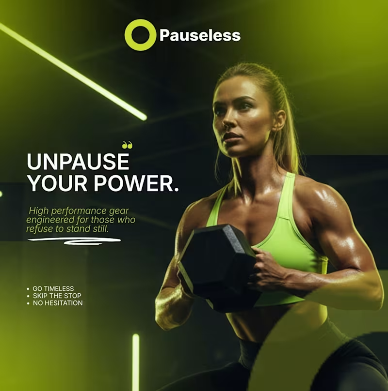
Pauseless Brand Identity Design
2
730
Message
5
Khadijah (Dija) 💥
pro
Day 2 of testing creative tools, today’s pick is still @Lovart AI (https://contra.com/company/lovart), now with @Canva (https://contra.com/company/canva). Used it to turn the custom designs into short video ads for social media :) Seeing how visuals can bring ideas to life Excited to keep experimenting and sharing what work.
5
601
Explore projects