
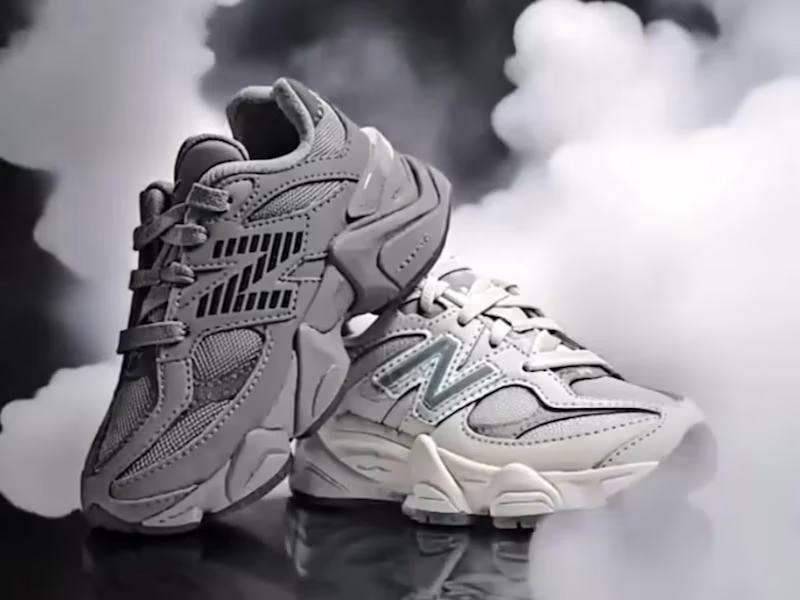
I created this fictional drink brand a while ago and decided to bring it to life inside a Blender scene. The goal was simple. Build a product that feels alive in its world. A drink that belongs in rugged landscapes and quiet moments of strength.
This is Grizzly.
A flavour that hits with confidence.
A design that stands firm in any terrain.
A brand shaped by imagination and craft.
Exploring ideas is one thing. Presenting them in a world where they feel real is another. This scene is a small step toward blending both.
2
3
266


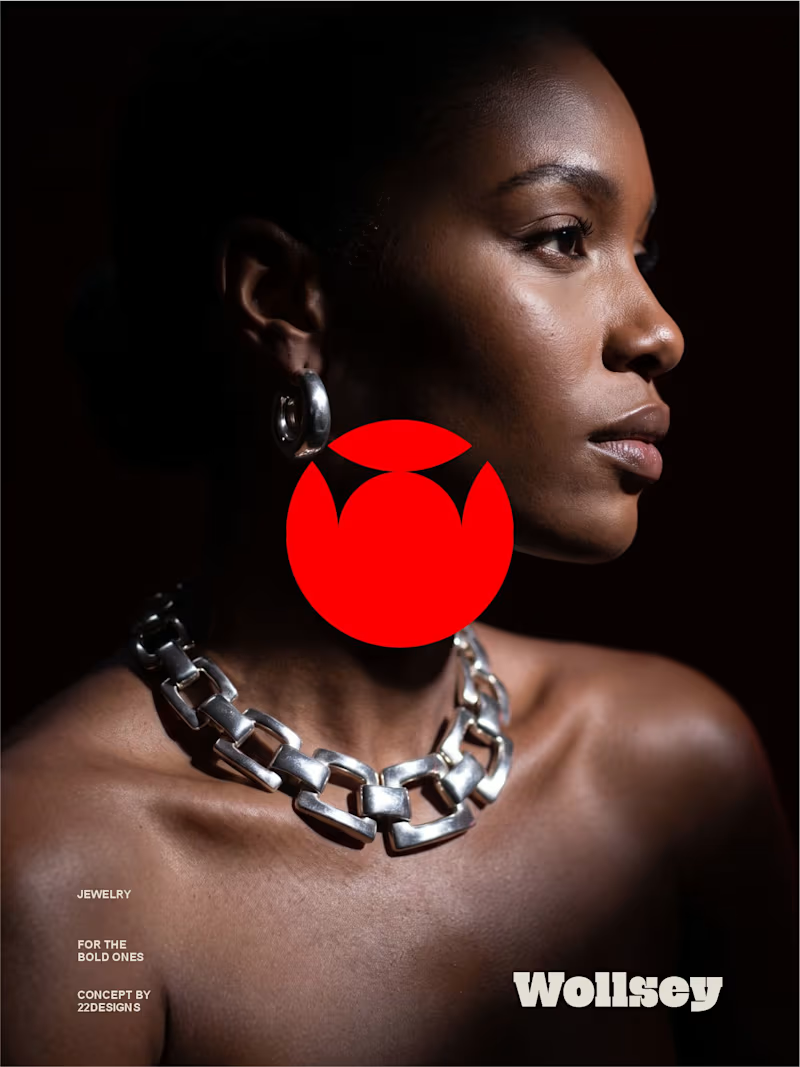
WOLLSEY - Jewelry for the Bold Ones
Wollsey is a jewelry brand built on one idea: bold jewelry should never blend in.
The identity centers on two interconnected principles; presence and permanence. The symbol takes the form of a solid, self-contained mark: a circular silhouette holding a crown-like negative space at its center, representing a piece of jewelry as an object of its own weight and status, not an accessory borrowed from someone else's trend cycle.
This concept carries through the entire visual system. The custom wordmark is built in a bold, condensed sans — compressed, confident letterforms that read as a stamp rather than a script, echoing the same solidity as the symbol itself.
The color palette pairs deep matte black with a controlled, high-impact red, balanced by warm cream and stone tones across packaging and supporting materials — a system built for contrast and attention rather than quiet luxury.
Full casestudy is coming soon
17
20
2.6K

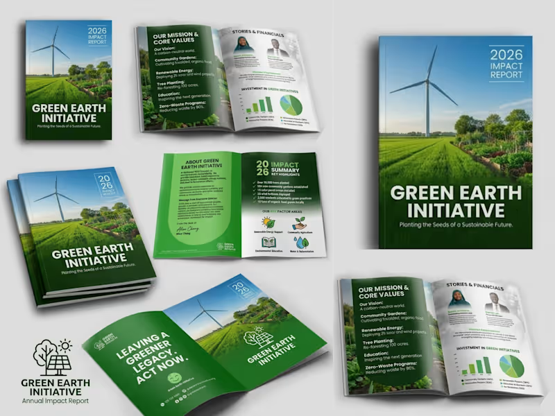
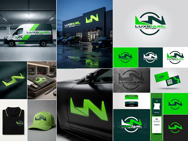
Luxenuel Autos: Brand Identity
Luxenuel Autos needed a brand that felt premium but still had energy, something that would look right on a dealership front and on a work van. I built the identity around a monogram that blends an "L" and "N" into one bold, angular mark. The shape reads like a road turning and a bolt of speed at the same time, and it sits inside a circular badge so it stays strong at any size.
For color, I went with a deep forest green paired with a bright electric green. The dark tone gives it weight and trust, and the bright one gives it that "always moving" feel. Black and white keep everything clean and easy to read.
Then I tested the mark on real touchpoints to make sure it worked outside the logo sheet: a wrapped service van, glowing storefront signage, embroidered polos and caps, business cards, ID badges, a key holder, and a car door decal. The logo also comes in solid, reversed, and embossed versions, so it holds up on light, dark, and textured surfaces.
The result is a complete, ready-to-use identity that makes the business look established from day one.
Deliverables: Primary logo, alternate and icon marks, color palette, brand applications, and mockups.
0
51
Mercent Brand Identity -
Mercent is a corporate fintech brand built to simplify global finance while maintaining the authority and structure expected from a serious financial institution.
The ambition behind the brand was clear from the beginning: create a financial identity that feels established, trustworthy, and internationally scalable. This was not about looking trendy. It was about building a system that could sit confidently alongside traditional banking institutions while still feeling modern and digitally fluent.
1
112
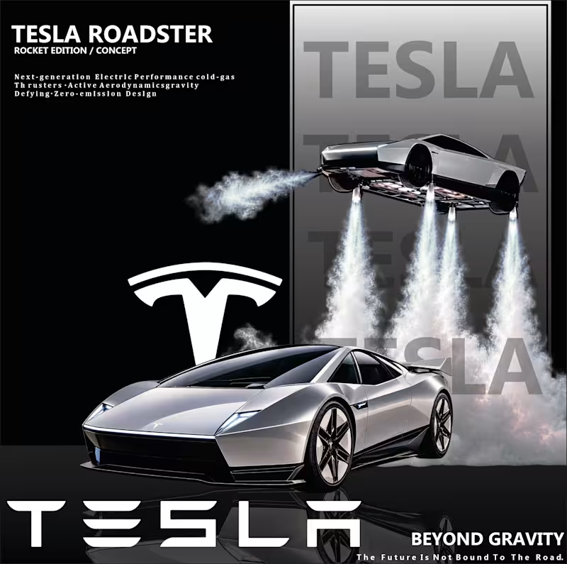
TESLA ROADSTER — BEYOND GRAVITY
A futuristic automotive design concept exploring the next generation of electric performance. Inspired by Tesla's vision of innovation, speed, and advanced technology, this poster brings a flying Roadster concept to life through cinematic lighting, bold typography, and a premium futuristic aesthetic.
Designed to capture attention, spark imagination, and showcase the possibilities of automotive design beyond the road.
#Tesla #TeslaRoadster #AutomotiveDesign #GraphicDesign #ConceptArt
0
5


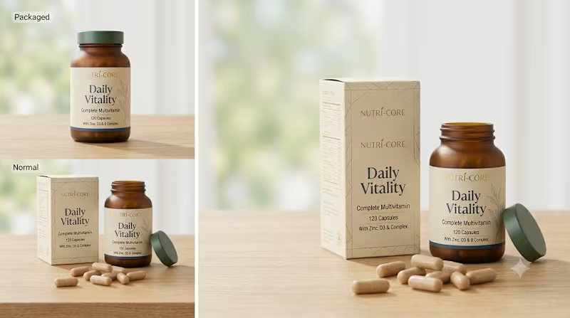
Premium Multivitamin Supplement Packaging Design with Realistic 3D Product Mockups
Designed a premium packaging solution for a daily multivitamin supplement, combining elegant branding, functional packaging, and realistic 3D product mockups to create a professional and market-ready presentation. The design emphasizes trust, clarity, and premium quality, helping the product stand out on retail shelves and digital marketplaces.
The project included custom folding carton packaging, bottle label design, typography, color palette development, product information layout, and print-ready artwork. To enhance the final presentation, realistic 3D mockups were created to showcase the product from multiple angles, making it ideal for e-commerce stores, social media campaigns, product launches, and client presentations.
Every design element was carefully developed to ensure brand consistency, improve customer perception, and deliver a clean, modern packaging experience that reflects the quality of the supplement inside.
Skills
Supplement Packaging Design
Multivitamin Packaging Design
Product Packaging Design
Product Label Design
Folding Carton Design
Packaging Design
Brand Identity Design
Branding
3D Product Mockups
Packaging Mockups
Graphic Design
Print Design
Typography
Print-Ready Artwork
Visual Communication
Tools
Adobe Illustrator
Adobe Photoshop
Adobe InDesign
Adobe Dimension
Blender
Figma
Canva
#SupplementPackaging #MultivitaminPackaging #PackagingDesign #ProductPackagingDesign #LabelDesign #BoxPackaging #3DMockup #PackagingMockup #BrandIdentity #Branding #GraphicDesign #AdobeIllustrator #PrintDesign #HealthBranding #ProductBranding
4
168
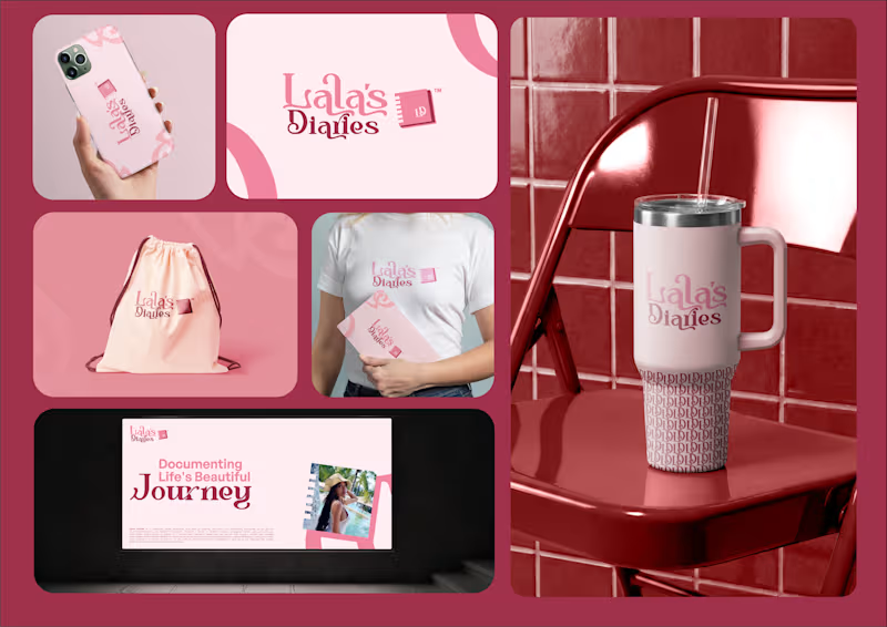
Brand identity design I created for Lala’s Diaries.
Lala’s Diaries is a captivating online platform dedicated to inspiring, educating, and entertaining individuals on their journey of entrepreneurship and lifestyle exploration.
Through insightful videos, engaging stories, and practical tips, the brand encourages viewers to:
• Discover their passions
• Unleash their creativity
• Build a fulfilling lifestyle
Whether it’s exploring the world of business, embracing personal growth, or finding joy in everyday moments, Lala’s Diaries is designed to empower people to grow and evolve.
Designing this identity was about creating a visual language that reflects inspiration, creativity, and personal transformation.
Would love to hear your thoughts on the design.
3
4
188