Freelance Mobile Designers in Karachi CityFreelance Mobile Designers in Karachi City
Web and Mobile Application Developer | UI/UX Designer
$1k+
Earned
1x
Hired
4.3
Rating
5
Followers
Web and Mobile Application Developer | UI/UX Designer
Digital, Brand & Product Designer | PS · Figma · Rive · AI
14
Followers
Digital, Brand & Product Designer | PS · Figma · Rive · AI
Cover image for AI MOBILE EXPERIENCE — Designing
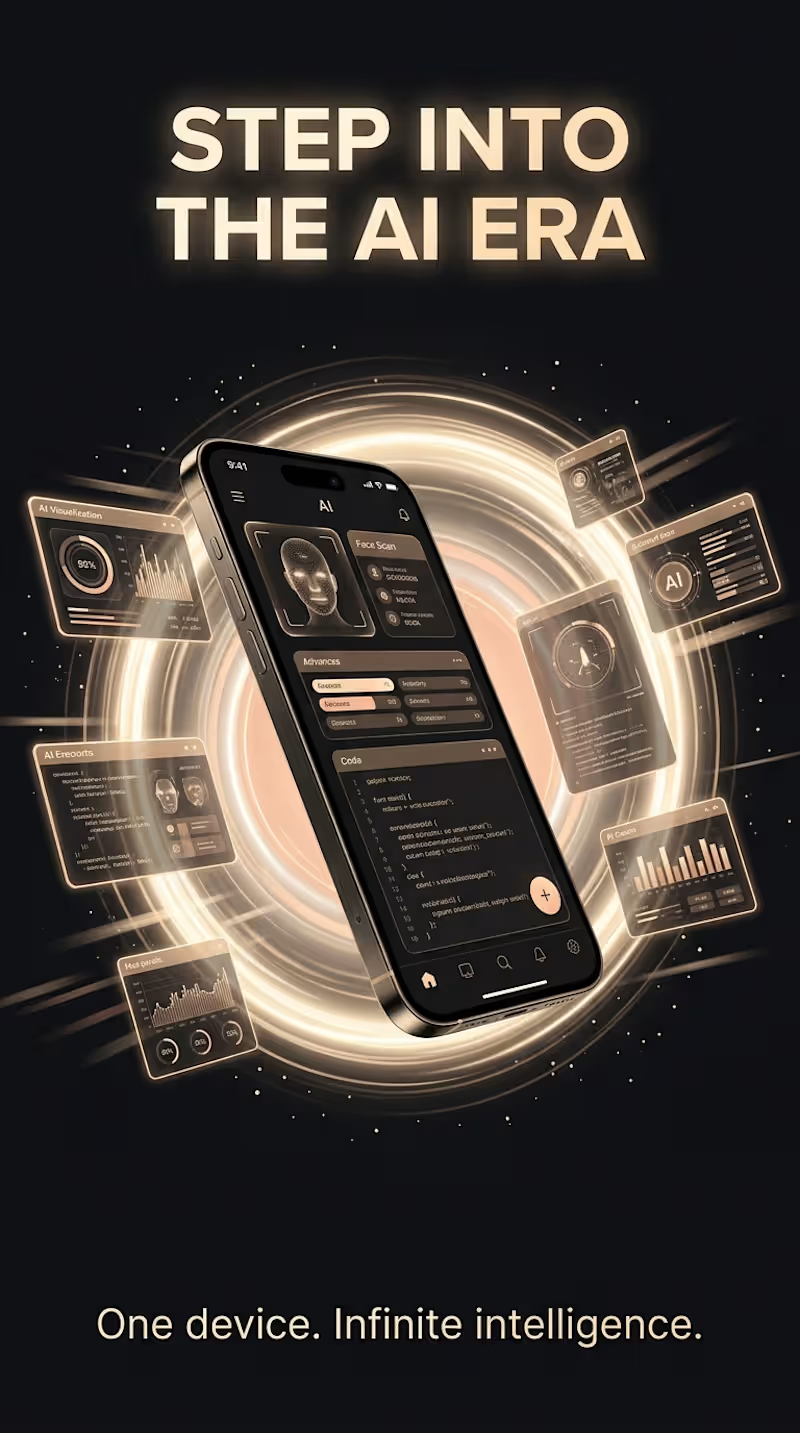
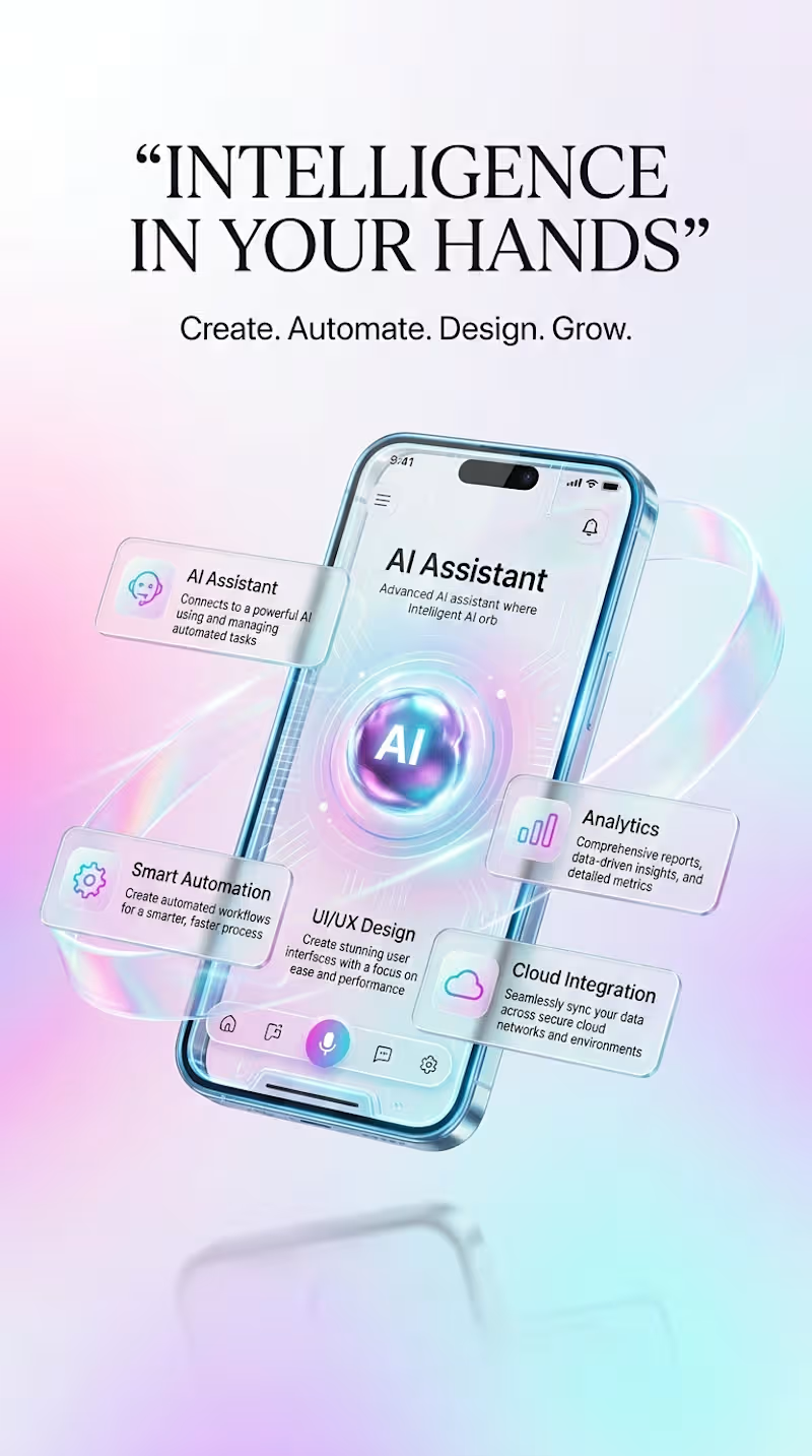
AI MOBILE EXPERIENCE — Designing Smarter Digital Experiences This concept series explores the future of AI-powered mobile experiences through a collection of four connected visual directions. The goal was to imagine how artificial intelligence, automation, cloud connectivity, analytics, and intelligent digital tools could come together inside a modern mobile product while still keeping the experience clear, accessible, and visually engaging. Rather than treating AI as a single feature, the concept presents it as the central layer of the mobile experience. Each visual explores a different way users could interact with intelligent tools — from AI assistance and automated workflows to analytics, cloud-connected services, creative tools, and personalized productivity features. The UI direction combines clean mobile layouts with futuristic interface elements, floating feature cards, dimensional lighting, interactive AI elements, and structured information hierarchy. The visual system moves between bright minimal environments and darker high-contrast technology scenes, allowing the same overall product idea to be explored through different moods while maintaining a consistent futuristic identity. A major focus of the project was balancing visual impact with usability. The interfaces are designed to feel advanced without becoming overly complicated. Clear navigation, recognizable feature categories, focused content areas, and organized dashboard elements help communicate what the product can do at a glance. The four concepts explore: • AI-powered assistance and intelligent interaction • Smart automation and connected workflows • Analytics and data-driven insights • Cloud integration and digital connectivity • Creative and productivity tools • Modern mobile UI/UX and intuitive navigation The accompanying motion concept extends the static designs into a more immersive product experience, using movement to highlight the interface, AI functionality, feature transitions, and overall visual hierarchy. This project is an exploration of how thoughtful UI/UX design and emerging AI capabilities can work together to create mobile products that feel intelligent, useful, and ready for the next generation of digital experiences.
0
50
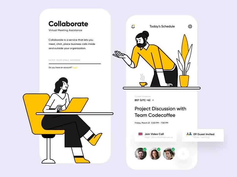
Cover image for UI/UX Face-Off: Which Version Would
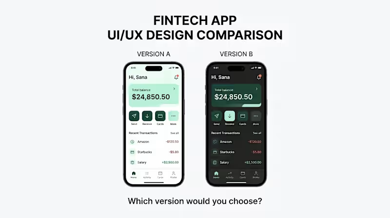
UI/UX Face-Off: Which Version Would You Choose Mobile ? ​Introduction: Design isn't just about looking good; it's about an intuitive experience and usability. We have created two design versions for four different app categories—Productivity, E-commerce, Healthcare, and Fintech. Take a look and tell us which one you prefer. ​Carousel Details: ​Slide 1: Productivity App ​Image: image_7.png ​Description: A showdown between a clean, light-themed version (A) and a modern, dark-mode version (B). Which style keeps you more focused? ​Slide 2: E-commerce Beauty App ​Image: image_6.png ​Description: Two elegant, beige-toned beauty shop designs. They are similar at first glance, but notice the subtle difference in the bottom navigation bar. Does this small change improve the user experience? ​Slide 3: Healthcare App ​Image: image_5.png ​Description: A side-by-side of a healthcare dashboard. Version A uses a calm, cool-blue background, while B uses a warm, beige tone. Which feels more clinical or more caring? ​Slide 4: Fintech App ​Image: image_4.png ​Description: The difference between a high-contrast fintech interface (A) and a more muted, dark-themed version (B). Which style feels more secure and trustworthy for financial transactions? ​Call to Action: Swipe to see the entire design comparison, and then tell us in the comments : ​Which version (A or B) do you like for each app ? ​Which single design element influences your decision the most? ​#UIUX #DesignComparison #AppDesign #UserExperience #ProductDesign #UIDesign #DesignFaceoff
2
1
221
⭐ Top Rated UI/UX Designer | Web & Mobile App Design | Figma
1x
Hired
5.0
Rating
16
Followers
⭐ Top Rated UI/UX Designer | Web & Mobile App Design | Figma
Certified Full stack AI Developer | 4+ Years of Experience
5.0
Rating
4
Followers
Certified Full stack AI Developer | 4+ Years of Experience
Cover image for Wayfar: Smart Travel Planning &
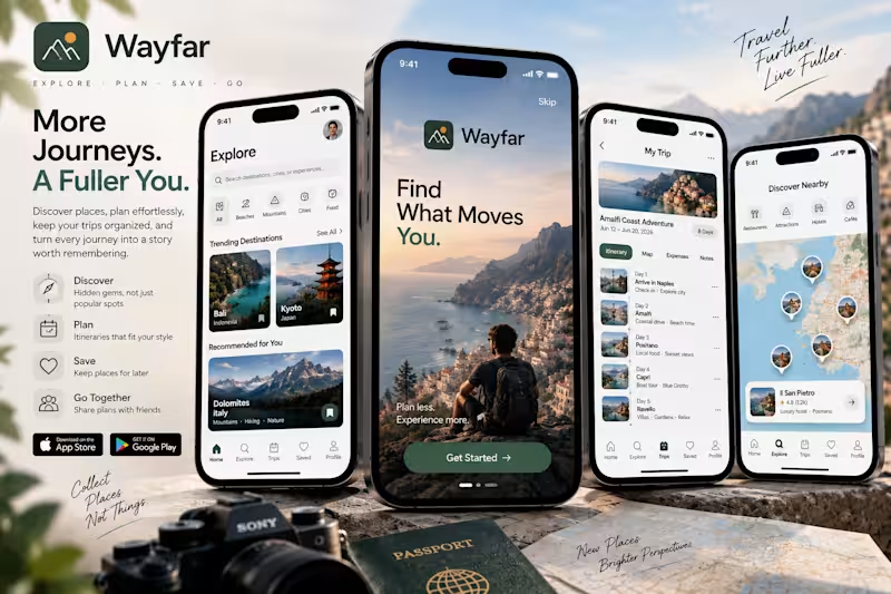
Wayfar: Smart Travel Planning & Discovery App I created Wayfar as an all-in-one travel companion designed to make discovering, planning, and experiencing new destinations feel effortless and inspiring. Rather than juggling disconnected booking apps, messy spreadsheets, and cluttered map pins, I designed the experience around how travelers actually move through a journey, finding hidden gems, organizing seamless day-by-day itineraries, and exploring neighborhoods in real time. The visual direction pairs a bright, airy aesthetic with deep forest green and warm sun-amber accents, reflecting an outdoor, wanderlust-driven identity while keeping navigation clean and legible under bright sunlight. Forest green is used deliberately for primary call-to-action buttons, active tab indicators, and itinerary milestones, while crisp white cards and spacious margins allow rich photography to take center stage. The splash and onboarding screen immediately sets an aspirational tone with the prompt "Find What Moves You." Grounded by cinematic coastal scenery, it emphasizes a clear travel philosophy, plan less, experience more, welcoming users with a prominent "Get Started" trigger. The explore feed rethinks destination discovery through curated intent. At the top, a universal search bar sits alongside quick filter pills for Beaches, Mountains, Cities, and Food. Below, high-impact photo cards showcase "Trending Destinations" like Bali and Kyoto alongside personalized recommendations like the Dolomites, each equipped with one-tap bookmarking to quickly save spots for later. The trip planning view turns complex logistics into a cohesive visual timeline. The Amalfi Coast Adventure screen demonstrates how multi-day trips are organized through clear tabs, Itinerary, Map, Expenses, and Notes. Each day is represented as an intuitive chronological stop complete with destination thumbnails, check-in details, and daily activities, making schedule adjustments effortless. The neighborhood discovery screen integrates a clean interactive map view with quick category toggles for Restaurants, Attractions, Hotels, and Cafés. Floating card overlays spotlight high-rated local gems like Il San Pietro, offering instant ratings, descriptions, and directional routing. Across all four screens, I focused on high legibility, cohesive travel iconography, and a dependable five-tab bottom navigation, Home, Explore, Trips, Saved, and Profile. The result is a travel product that feels thoughtful, grounded, and premium, giving travelers the confidence to explore further with complete peace of mind.
0
76
Cover image for Inkly: Mindful Journaling and Mood
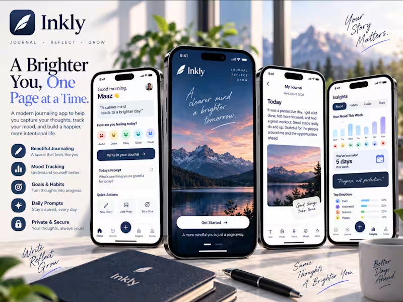
Inkly: Mindful Journaling and Mood Tracking App I designed Inkly to create a serene personal sanctuary where daily reflection feels natural, restorative, and rewarding. Rather than overwhelming users with complex productivity trackers or rigid writing templates, I shaped the experience around mindful self discovery: logging honest emotions, capturing unprompted thoughts, tracking emotional patterns, and nurturing gradual personal growth. The visual direction centers on deep midnight and twilight blue surfaces complemented by soft cornflower and periwinkle accents. This quiet, evening inspired palette calms the eye and encourages vulnerability, making the screen feel less like a digital device and more like the textured page of a private notebook. Restrained blue highlights anchor the primary call to action buttons, floating creation controls, and active metric bars, while clean neutral cards preserve breathing room. The onboarding screen sets a tranquil, meditative tone framed by scenic twilight mountains and the guiding philosophy: "A clearer mind, a brighter tomorrow." With an encouraging prompt reminding users that a mindful life is just a page away, it establishes an immediate atmosphere of safety and quiet reflection. The home dashboard turns daily check ins into an effortless, friction free ritual. A personalized greeting pairs with a gentle daily affirmation and a one tap mood scale ranging from Awful to Great. Users can jump straight into open writing via a prominent action button, draw inspiration from rotating daily reflective prompts, or use quick action shortcuts to add photos and set intentions. The journaling and insights screens balance intimate expression with self awareness. The journal entry view offers a clean, distraction free canvas with integrated rich media triggers for photos, voice notes, and mood tags. Meanwhile, the insights screen transforms daily reflections into meaningful trends, featuring weekly mood distribution bar charts, habit streaks, and a breakdowns of top emotions like calm, motivation, and gratitude. Across the product, I prioritized spacious margins, gentle typography, and an intuitive bottom navigation anchored by a prominent central entry creator. The final result is a journaling space that feels private, deeply calming, and crafted to help people find clarity one page at a time.
0
99
Cover image for Vita: Holistic Health and Daily
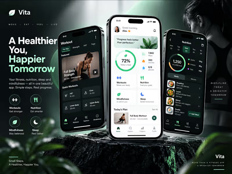
Vita: Holistic Health and Daily Wellness Companion I created Vita as an all-in-one wellness companion designed to bring balance to daily living. Rather than isolating fitness, meal tracking, and mental well-being into separate, overwhelming apps, I unified the four pillars of health, Move, Eat, Feel, and Live, into a serene, cohesive experience that prioritizes steady progress over perfection. The visual direction centers on an organic, refreshing mint and emerald green palette paired with clean, luminous white surfaces and deep dark accents. Green serves as a natural symbol for vitality and renewal, guiding the user's eye across daily completion rings, primary buttons, macro trackers, and active navigation states. Soft shadows and generous whitespace maintain a tranquil rhythm throughout the product. The primary dashboard welcomes the user with personal encouragement and immediate health metrics. An intuitive circular progress ring displays daily goal completion alongside glanceable indicators for steps, burned calories, and water intake. Below, dedicated gateway cards for Workouts, Nutrition, Mindfulness, and Sleep make jumping into daily healthy habits effortless. The workout screen delivers focused physical training with zero distraction. Users can quickly filter between modalities like Strength, HIIT, and Yoga, while featured sessions showcase clear time commitments and intensity levels. A compact quick workouts grid allows users to target specific muscle groups or squeeze in high-impact routines even on busy days. The nutrition view transforms dietary logging into an organized, stress-free habit. A clean calendar strip pairs with an intuitive calorie ring and macro-nutrient split across carbs, protein, and fats. Categorized meal logs for breakfast, lunch, dinner, and snacks allow users to track their fuel with a single tap. Across the entire interface, I prioritized calm visual breathing room, crisp health iconography, and consistent navigation. The result is a wellness experience that feels encouraging, modern, and built to help people build lasting, sustainable routines.
0
132
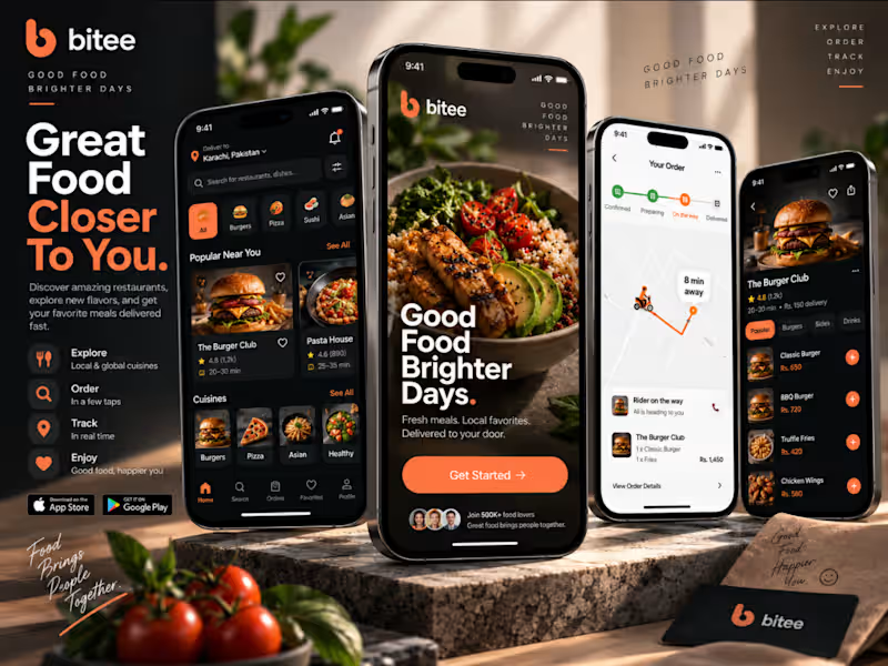
Cover image for Bitee: Modern Food Delivery and
Bitee: Modern Food Delivery and Culinary Discovery App I designed Bitee to transform digital food ordering into an appetite driven, seamless mobile experience. Instead of overwhelming hungry users with endless lists and confusing menus, I structured the product around intuitive cravings, mouthwatering visual storytelling, and real time delivery transparency. The visual identity pairs a dark, immersive background with vibrant sunset orange accents. The warm orange hue naturally evokes energy and appetite while functioning as a functional guide for interactive elements, including primary action buttons, active order tracking steps, and quick add triggers. Dark neutral cards and rich food photography create depth, ensuring each meal looks irresistible on screen. The onboarding screen sets a welcoming, uplifting tone with the brand promise: "Good Food Brighter Days." Highlighting vivid, healthy culinary imagery alongside social proof of over 500k food lovers, it creates instant trust and excitement from the very first tap. The home discovery screen optimizes how diners explore their local scene. A persistent location switcher sits beside an intuitive search bar, followed by quick craving chips like Burgers, Pizza, Sushi, and Asian cuisine. Curated sections such as "Popular Near You" showcase restaurant cards complete with ratings, delivery estimates, and quick favorite toggles to minimize order friction. The restaurant detail and tracking views prioritize speed and clarity. The restaurant screen highlights signature dishes with clear pricing and one-tap orange add buttons, while the dedicated tracking screen provides complete peace of mind. Users can monitor a clean four-stage status timeline (Confirmed, Preparing, On the way, Delivered) coupled with an interactive live delivery map showing estimated arrival times and direct courier contact. Across the entire interface, I prioritized visual balance, scannable typographic hierarchy, and a reliable five-tab bottom navigation (Home, Search, Orders, Favorites, Profile). The end result is a food delivery experience that feels premium, dependable, and delightfully straightforward.
0
144
Craft an Ultimate Solution & make YOUR Ideas Alive
6
Followers
Craft an Ultimate Solution & make YOUR Ideas Alive