Framer Web Design & Development for a Creative Studio
Xulfi Shah
Zaffiro
💎 ZAFFIRO — Creative Studio Web Design & Framer Development
Editorial Blue-World Digital Experience for a Premium Design Agency
🔥 Project Overview
Zaffiro is a creative studio that elevates bold ideas into iconic brands. The brief was as ambitious as the brand itself: build a digital presence that doesn't just describe what Zaffiro does — it demonstrates it. A creative agency's website is its most important piece of work because it's the first work every potential client sees. If it doesn't stop the scroll, nothing else matters.
I built Zaffiro's complete digital world from scratch. Every decision — the deep sapphire blue color universe, the oversized editorial typography that bleeds past viewport edges, the team portrait photography with its signature blue-gel lighting treatment, the Framer interactions that make the site feel alive — came from a single creative vision executed entirely by me. Brand identity, UI/UX design in Figma, full Framer development, image editing, SEO architecture, pricing page design, and team section art direction — zero handoffs, zero compromises.
The result is a creative studio website that competes with the top-tier global design agencies: Pentagram, Fantasy, Ueno. A site that doesn't just say "we do great work" but proves it before the visitor reads a single service description. 💎🔵⚡
🚨 The Pain Points (What Was Broken Before)
Here's the honest diagnosis of what Zaffiro needed fixed:
🚫 No ownable visual identity — "creative studio" is one of the most crowded categories in digital services. Zaffiro had no single visual idea that made it immediately distinguishable from hundreds of other agencies claiming to do brand strategy, UI/UX, and product design. No color signature, no typographic personality, no photographic treatment that said "this is us and nobody else"
🚫 Generic agency website syndrome — the existing digital presence used the same portfolio grid, the same service cards, the same "we craft digital experiences" headline that every mid-tier agency deploys. It communicated competence but zero conviction
🚫 No editorial presence — premium creative studios don't just list services, they publish a point of view. Zaffiro had no brand manifesto, no studio philosophy section, no copy that communicated what they actually believe about design and branding
🚫 Weak team presentation — for a creative studio, the team IS the product. Clients hire people, not logos. The existing team section used standard LinkedIn-style headshots with zero visual personality, which actively undermined the studio's premium positioning
🚫 No awards or credibility architecture — Zaffiro had recognition worth displaying (Best Web Design Agency, Top UI/UX Innovation, Site of the Day, Website of the Year) but no dedicated section that made those wins visible and credible in the conversion flow
🚫 No pricing transparency — creative services buyers increasingly want pricing context before initiating a conversation. No pricing page meant every lead came in cold with no budget alignment, wasting time on both sides
🚫 No Framer animation system — the site felt static when the entire brand promise was about elevating and transforming. Scroll interactions, hover states, and transition animations are table stakes for a studio claiming expertise in digital experience design
🚫 Zero mobile experience — over 60% of agency website traffic arrives on mobile. A creative studio with a broken mobile experience sends an immediate signal of carelessness to any potential client checking the site from their phone
🚫 No SEO foundation — invisible on search for: creative studio, brand identity agency, UI/UX design studio, product design agency, digital branding, web design agency New York. Every competitor ranking above them was capturing organic leads that should have been Zaffiro's
🛠️ Full Deliverables Breakdown
🎨 Brand Identity & Visual System
The Zaffiro identity is built on one powerful visual idea: deep sapphire blue as a total world. Not blue as an accent color, not blue as a nav bar — blue as the entire photographic universe the brand inhabits. Every portrait, every project image, every editorial photograph on the site is bathed in blue-gel lighting that transforms subjects into something otherworldly and unmistakably Zaffiro.
The wordmark uses an ultra-heavy condensed sans-serif that bleeds past the right edge of the viewport — a typographic treatment that communicates scale, ambition, and a brand that refuses to be contained by conventional layout boundaries. The "Z" icon mark — bold, angular, with a subtle diamond/sapphire reference — functions as the favicon, the app icon, and the nav logo independently of the full wordmark.
The color system runs on three values: deep navy black for backgrounds, pure electric blue for accent typography and photography treatment, and clean white for body copy and light sections. The blue accent text — "and fearless execution," "that makes every brief come alive," "with your brand's ambitions" — creates a consistent visual rhythm that highlights the most emotionally compelling part of every headline, making the copy both readable and visually dynamic.
The full brand system covers primary and secondary logotypes, the complete color palette with hex values and Framer variables, type scale from display to caption, spacing tokens, button states, and photography treatment guidelines — all documented for consistent application across every touchpoint. 💎🔵🖤
🖥️ UI/UX Design in Figma
The complete Figma design system covers every page, section, and component at desktop, tablet, and mobile breakpoints:
Homepage Architecture:
Navigation — Zaffiro logo left, five-item nav (Home, Studio, Projects, Blog, Contact), hamburger menu icon for mobile — minimal, confident, stays out of the content's way
Hero Section — Full-viewport dark blue environment with the subject photographed under blue-gel lighting, the Zaffiro wordmark at massive scale bleeding right, studio credentials running along the bottom (Established 2010, New York, US, Scroll Down), and three numbered service pillars (01 Brand Strategy, 02 UI/UX Design, 03 Product Design) as a sub-navigation
Brand Statement — "We elevate bold ideas into iconic brands with deep blue precision and fearless execution" — the studio manifesto in large editorial type with the blue accent on the emotional payoff line
Featured Projects Grid — Editorial photography project thumbnails with hover interactions, project titles, and "View all" CTA
Services Section — "We partner with visionary founders and growth teams to translate ambition into disciplined brand ecosystems" with four numbered service cards: Brand Identity, Product Design, Digital Strategy, Social Media — each with supporting copy and editorial photography
Team Section — "We're a bold team of creators igniting ideas and delivering vibrant work that makes every brief come alive" with six team member portraits in the signature blue-gel treatment, names, and titles (Co-founder, Chief Executive, Product Manager, Creative Director, Vice Chair)
Awards Section — "Hall of Fame / Awards and Recognition" with six numbered achievement rows: Best Web Design Agency, Top Digital Marketing Firm, Top UI/UX Innovation, Excellence in Web Design, Site of the Day, Website of the Year — each with the corresponding year
Pricing Section — "We offer flexible sapphire crafted plans designed to align with your brand's ambitions" starting at $1,900 with plan comparison architecture
Footer — Full-width with the massive "ZAFFIRO" watermark typographic treatment as the closing visual statement
The Figma file includes a complete component library, design tokens, responsive grid specifications, and interaction annotations for Framer development. 🎨📐✨
💻 Framer Development
The Figma designs were built into a fully custom Framer site with advanced interactions and CMS integration. Technical deliverables:
⚡ Custom Framer build with zero template dependency — every component built from scratch with clean override architecture
⚡ Scroll-triggered animations — hero wordmark entrance, section reveal staggering, team portrait fade-ins, and project card parallax effects
⚡ Hover interactions on project cards, team portraits, navigation items, and CTA buttons — micro-interactions that make every touchpoint feel responsive and alive
⚡ Framer CMS integration for blog posts, project case studies, and team member profiles — client updates content independently without touching code
⚡ Mobile-responsive layouts across all breakpoints with touch-optimized interactions
⚡ Custom cursor interaction design for desktop visitors — a signature detail that signals design craft immediately on page load
⚡ Smooth page transitions between homepage, studio, projects, and contact pages
⚡ Pricing section with interactive plan toggle and feature comparison
⚡ Contact form with Framer form integration and email notification pipeline
⚡ Performance optimization — WebP image pipeline, lazy loading, and Framer's built-in CDN for fast load times globally
⚡ Open Graph and Twitter Card metadata for professional social sharing previews
Mobile View
🖼️ Image Editing & Photo Direction
The Zaffiro photography treatment is the most distinctive visual element of the entire brand system — and it required precise post-production to execute consistently across all six team portraits and all project imagery:
🎞️ Blue-gel lighting simulation — portrait photographs edited to match the deep sapphire blue environmental lighting treatment, creating the sense that every subject exists within the same blue world
🎞️ Skin tone preservation within the blue treatment — the most technically demanding part of the edit, ensuring subjects look otherworldly but not washed out
🎞️ Contrast enhancement on all portraits to ensure they read clearly against both dark and light backgrounds throughout the scroll
🎞️ Project photography color grading to maintain visual consistency across diverse project imagery
🎞️ Hero image compositing — layering the subject photography with the wordmark and UI overlay elements to create the integrated editorial hero treatment
🎞️ Mobile crop optimization — every hero image reframed and regraded for vertical mobile viewport without losing the compositional intent
🔍 SEO Strategy & Architecture
Primary keyword targets: creative studio New York, brand identity agency, UI/UX design studio, product design agency, digital branding studio, web design agency
Secondary targets: brand strategy agency, digital experience design, creative agency for startups, logo design studio, visual identity design
Meta title and description for every page with keyword-rich, click-optimized copy
Heading hierarchy structured for search crawler logic across all sections
Awards section formatted to build E-E-A-T (Experience, Expertise, Authoritativeness, Trustworthiness) signals for Google
Image alt text across all photography covering both descriptive and keyword-relevant language
Blog CMS structured for ongoing content SEO — each post template pre-configured with meta fields, OG images, and canonical URLs
Sitemap and robots.txt configured through Framer's SEO settings
📸 Image-by-Image Breakdown
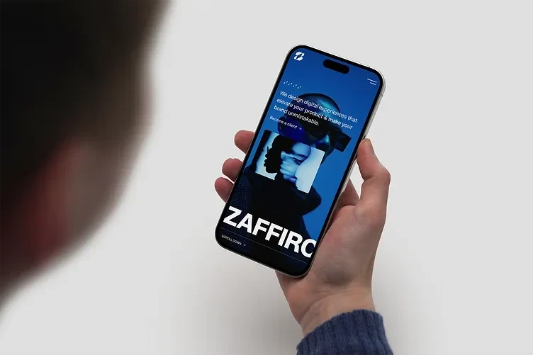
🖼️ Image 1 — Mobile Hero in Hand Mockup
This image presents the Zaffiro hero section on a current-generation iPhone held in someone's hand against a clean light grey background. The photography is shot over-the-shoulder with the phone held at natural reading distance — not a flat lay, not a device frame floating in space, but a real human holding a real phone reading a real website. This presentation choice is deliberate: it communicates mobile-first thinking and grounds the design in actual human use rather than abstract portfolio presentation.
On the phone screen, the Zaffiro hero section is fully visible at mobile scale. The deep blue environment with the subject portrait dominates the upper portion of the screen. The hero copy — "We design digital experiences that elevate your product & make your brand unmistakable" — is set in clean white on blue, readable at the small scale the mockup requires. The "Become a client →" CTA sits below the copy. The massive ZAFFIRO wordmark fills the bottom of the visible screen, the letterforms cut off at the right edge exactly as designed — the mobile layout preserves the editorial intent of the desktop wordmark treatment, which is a technically demanding responsive design challenge most designers solve by simply shrinking the type rather than rethinking the composition.
The person's blue knit sleeve in the lower-left corner adds warmth and humanity to what could otherwise be a cold tech showcase. The clean white background keeps all attention on the screen. This image is the strongest single argument for the mobile-first quality of the Framer build. 📱💎🔵
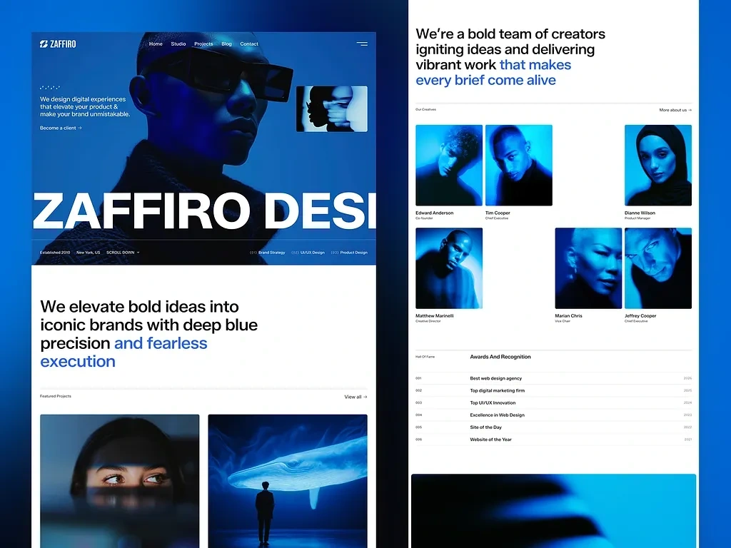
🖼️ Image 2 — Desktop Dual-Panel Mockup
This image shows two desktop browser windows side by side — left panel displaying the homepage from hero through featured projects, right panel showing the studio/about page from the brand statement through the team section and awards.
Left panel — Homepage:
The hero section occupies the top of the left panel with the full blue environment, the Zaffiro logo and five-item navigation, the hero copy and "Become a client →" CTA, and the massive ZAFFIRO DESI wordmark visible at the bottom of the hero (the full wordmark bleeds right as designed). Below the hero fold, the brand statement section appears in clean white: "We elevate bold ideas into iconic brands with deep blue precision and fearless execution" — the blue accent text on the emotional payoff is clearly visible. The Featured Projects section begins at the bottom of the left panel with two editorial photography thumbnails visible.
Right panel — Studio/About Page:
The right panel opens with the studio brand statement in large editorial type: "We're a bold team of creators igniting ideas and delivering vibrant work that makes every brief come alive" — the blue accent on "that makes every brief come alive" is the emotional anchor of the sentence. Below it, "Our Creatives" introduces the six-member team grid with the signature blue-gel portrait photography. All six team members are visible: Edward Anderson (Co-Founder), Tim Cooper (Chief Executive), Dianne Wilson (Product Manager), Matthew Marinelli (Creative Director), Marian Chris (Vice Chair), and Jeffrey Cooper (Chief Executive). The portraits are all shot and edited with the consistent blue-gel treatment, creating a team section that looks like a fashion editorial spread rather than a corporate about page.
The Awards section appears at the bottom of the right panel — six numbered achievement rows (Best Web Design Agency through Website of the Year) in a clean list format with years aligned right. A blue image section is visible below the awards, beginning the next content block.
The dual-panel presentation gives the portfolio viewer a comprehensive picture of both the homepage conversion architecture and the studio brand storytelling without requiring them to scroll through a long single-column screenshot. 🖥️✨🏆
🖼️ Image 3 — Full Site Scroll (Complete Desktop View)
This image shows the complete Zaffiro website in a single-column full-scroll view — every section from the hero to the footer visible in sequence, giving a top-to-bottom picture of the entire information architecture and design system.
Starting from the top: the hero with its blue environment, the wordmark bleeding right, and the three-column service pillar navigation along the bottom edge. The brand statement section follows in white. Then the services section with the four numbered service cards — Brand Identity, Product Design, Digital Strategy, Social Media — each with supporting editorial photography on the right side showing project work: a 3D product render, orange bottle product design, jewelry photography, and food/lifestyle photography. The section copy "We partner with visionary founders and growth teams to translate ambition into disciplined brand ecosystems" frames the services as a partnership philosophy rather than a vendor offering.
The featured projects section shows multiple editorial project cards in the brand's blue-tinted photography style. The team section follows with the six blue-gel portraits. The awards list occupies a clean section below the team. A full-width blue editorial image creates a visual pause before the pricing section — "We offer flexible sapphire crafted plans designed to align with your brand's ambitions" starting at $1,900 — one of the few agency sites that publishes pricing transparently, which is a conversion strategy decision as much as a design one.
The FAQ section appears below pricing to handle objections at the exact right moment: immediately after a visitor sees the price, they have questions. The FAQ answers them before they can leave the page. The footer closes with the full-width ZAFFIRO wordmark at massive scale — the same typographic confidence statement from the hero, now serving as a brand signature on exit. The complete scroll demonstrates that every section has a strategic reason to exist in its position in the conversion journey. 💎🔵🚀

Zaffiro
🧰 Skills Demonstrated
Figma · Framer Development · Framer CMS · UI/UX Design · Logo Design · Brand Identity · Creative Studio Branding · Editorial Design · Image Editing · Photo Retouching · Blue-Gel Photography Treatment · Color Grading · Typography · SEO · Mobile-Responsive Design · Scroll Animations · Micro-Interactions · Design Systems · Wireframing · Prototyping · Pricing Page Design · Team Section Art Direction · Awards Architecture · Web Performance Optimization💬 Final Word
Zaffiro needed a website that proved the studio's capabilities before a single word was read. The blue world does that. The editorial typography does that. The team portraits do that. The scroll interactions do that. Brand identity, Figma design, Framer development, image editing, SEO, and conversion architecture — all from one person, one vision, one uncompromising standard. 💎🔵🚀
Like this project
Posted May 13, 2026
Full brand and web build for a premium creative studio. Logo design, UI/UX in Figma, custom Framer development with CMS, and scroll animations.