AI-Powered Skincare Website Design for SensiSkin

Xulfi Shah


🌿 SENSISKIN — AI-Powered Skincare Website UI/UX Design & Development
An Editorial Sage-Green Digital Experience for Intelligent Skin Health
🔥 Project Overview
SensiSkin is an AI-powered skincare platform built to solve a problem the entire beauty industry profits from confusion: people don't actually know what's in the products they put on their face, or whether those products are right for their skin. The brief was to design a digital experience that turns skincare from a guessing game into a guided, evidence-based routine — without ever feeling clinical, cold, or like a dermatology textbook.
I designed and developed SensiSkin end to end: the AI skin diagnostic interface, the ingredient intelligence system, the budget-tiered routine builder, and the full visual identity that ties all of it together. The brief demanded two things that usually pull against each other — scientific credibility and beauty-editorial desirability — and the entire design system was built to hold both at once.
The result is a platform that feels like it belongs on a glossy beauty editorial page and a clinical skin-analysis report simultaneously. Soft sage tones instead of sterile lab white. Editorial serif typography instead of dashboard sans-serif. Glassmorphism overlays that make AI feel premium instead of robotic. Every design decision pushes the same idea: your skin deserves precision, not guesswork. 🌿🤖✨
🚨 The Pain Points (What Was Broken Before)
Here's the honest diagnosis of what SensiSkin needed solved:
🚫 Skincare decisions made blind — the average person buys skincare based on packaging, influencer hype, or a vague sense that "this one is supposed to be good for sensitive skin." There was no product, no flow, no interface that translated a person's actual skin condition into a defensible product decision
🚫 Ingredient lists nobody can read — cosmetic ingredient labels are written in INCI Latin-adjacent naming that even attentive consumers can't parse. "Melaleuca Alternifolia" means nothing to most people scanning a tube in a drugstore aisle, but it can mean the difference between relief and a reaction
🚫 No connection between diagnosis and action — even skin-scanning apps that exist tend to stop at the diagnosis. They'll tell you your skin is "dehydrated" and then leave you to figure out, alone, what to actually buy. There was no product on the market that closed the loop from analysis to routine to purchase
🚫 One-size-fits-all recommendations — most skincare guidance ignores budget entirely. A diagnosis is only useful if the path forward fits the person's real life, and nothing existed that let someone see the same clinical outcome achievable at a $49 drugstore price point or a $135 prestige price point
🚫 AI interfaces that feel cold — health-tech and AI products tend to default to clinical blues, dashboard grids, and sterile data visualization. That visual language actively repels the beauty audience SensiSkin needed to serve, who expect the sensory warmth of a skincare brand, not the chrome of a lab
🚫 No visual trust signals for AI accuracy — telling a user "AI analysis: 98% match" means nothing if the interface doesn't visually earn that confidence. There was no design language in place that made AI-generated skin data feel authoritative rather than arbitrary
🚫 Decision fatigue at every step — skin type, ingredient safety, routine order, budget, product brand — every one of these is its own decision tree, and stacking them without a clear hierarchy turns a helpful tool into an overwhelming one
🚫 No premium positioning — skincare is an aesthetic category before it's anything else. A platform that nails the science but ships it in a generic SaaS UI loses the audience's trust before they've read a single insight
🛠️ Full Deliverables Breakdown
🎨 Visual Identity & Design Language
SensiSkin's identity runs on a single tension held deliberately in balance: beauty editorial meets clinical intelligence. The palette centers on soft sage green — calm, natural, dermatologically reassuring — paired with warm skin-tone photography and small accent reds and ambers used exclusively for data states (irritation levels, allergen flags). Green never appears as a decorative color; it always means something is safe, balanced, or recommended. Red and amber are reserved for caution and alert states. The entire interface trains the user's eye to read color as information within the first few seconds of landing on the page.
The wordmark is a refined serif logotype — "SensiSkin" — set with the same editorial sensibility as a skincare magazine masthead, immediately signaling premium beauty rather than health-tech utility. The hero headline treatment pairs an oversized italic serif display word ("Results," "Routine") with a smaller sans-serif lead-in ("Just"), a typographic pairing borrowed directly from editorial print design and rarely seen in AI product interfaces.
Glassmorphism is used purposefully, not decoratively: every AI insight card — skin condition callouts, ingredient safety scores, hydration readings — floats above the photography in a frosted, translucent panel. This treatment does two things at once: it keeps the human face as the visual hero of the page, and it gives every AI-generated insight a literal layer of "depth" that reinforces the sense that the data is overlaid intelligence, not a static interface. 🌿💎🔬
🖥️ UX Architecture & Information Design
The core UX challenge was reducing decision fatigue across a genuinely complex decision tree — skin diagnosis, ingredient safety, routine building, and budget — without flattening any of it into oversimplified advice. The architecture solves this through progressive disclosure and a strict information hierarchy:
Navigation — a minimal four-item structure (Technology, Analysis, Routine, Results) that mirrors the user's actual journey through the product rather than a generic site map, with a single persistent "Scan Now" CTA that's always one click away regardless of scroll position
Hero / Skin Balance Panel — the first thing a user sees after their scan is not a wall of data but three numbers that matter most: Water Level, Oil Balance, and Redness/Irritation, each rendered as a simple radial progress indicator with a plain-language label (Low, Normal, Moderate) instead of raw percentages alone. A floating "Skin Condition" callout zooms into the actual problem area on the face — dehydration around the eye, for instance — pairing the AI's finding with a literal visual anchor on the user's own skin, which is far more persuasive than a number on a dashboard
AI Treatment Protocols — "One Diagnosis, Two Budget Paths" is the structural idea that makes the entire routine-builder section work. Rather than recommending a single product line, the same clinical diagnosis is mapped to a Simple Care and a Luxury Care path, letting the user toggle between an affordable kit (The Ordinary, starting around $49–58) and a prestige kit (Rituals, around $135) while the underlying skincare logic — cleanser, serum, moisturizer, treatment, toner — stays identical. This single toggle interaction does the decision-fatigue-reduction work of an entire onboarding quiz
Smart Ingredient Scanner — a dedicated AR-style scanning interface lets users point their camera at any product's ingredient list and get instant, color-coded breakdowns: green "Recommended" tags for beneficial ingredients like Ceramide (98% safety/efficacy score), amber "Neutral" tags for ingredients with mild effects like Fumaric Acid, and red "Sensitive Alert" tags for known allergens like Melaleuca Alternifolia (Tea Tree). Each tag includes a plain-language explanation of what the ingredient actually does, closing the literacy gap between INCI naming and real understanding
Modular card system — every insight on the platform, regardless of category (hydration data, ingredient scores, routine steps, product recommendations), is built on the same underlying card component with consistent padding, corner radius, typography scale, and color-state logic. This was a deliberate scalability decision: as SensiSkin adds new AI capabilities, every new insight type slots into a design language users already trust 🧠📐✨
💻 Web Development
The Figma designs were built into a fully responsive, production-ready website with interactive components and AI-result rendering logic:
⚡ Custom-built responsive layouts across desktop, tablet, and mobile, with particular care given to how the floating glassmorphism cards reflow and stack on smaller viewports without losing their layered depth effect
⚡ Interactive budget-toggle component (Simple Care / Luxury Care) with live re-rendering of product kits, pricing totals, and ingredient call-outs as the user switches paths
⚡ Carousel-style product browsing within each routine card, letting users step through every product in a kit individually while keeping the full-kit view as the default anchor
⚡ AR-style ingredient scanner interface with simulated live camera framing, animated scan brackets, and dynamically positioned result callouts that anchor to specific points on the scanned product
⚡ Radial progress components for skin-metric visualization (water level, oil balance, ingredient safety percentage), built with smooth animated fill states on load
⚡ Color-coded status tag system (Recommended / Neutral / Sensitive Alert) built as a single reusable component with semantic color logic baked in at the token level
⚡ Glassmorphism panel system with backdrop blur, subtle border treatment, and layered z-index logic to preserve visual hierarchy over photography backgrounds
⚡ Performance-optimized image pipeline for the high-resolution editorial photography that anchors every hero section, ensuring fast load without sacrificing the premium beauty-editorial visual quality
⚡ Smooth scroll-triggered reveals between sections (Skin Balance → AI Treatment Protocols → Smart Ingredient Scanner) so the page narrative unfolds the way a guided skin consultation would, not the way a generic landing page scrolls 💻🌿⚙️
Homepage Hero & AI Treatment Protocols Section
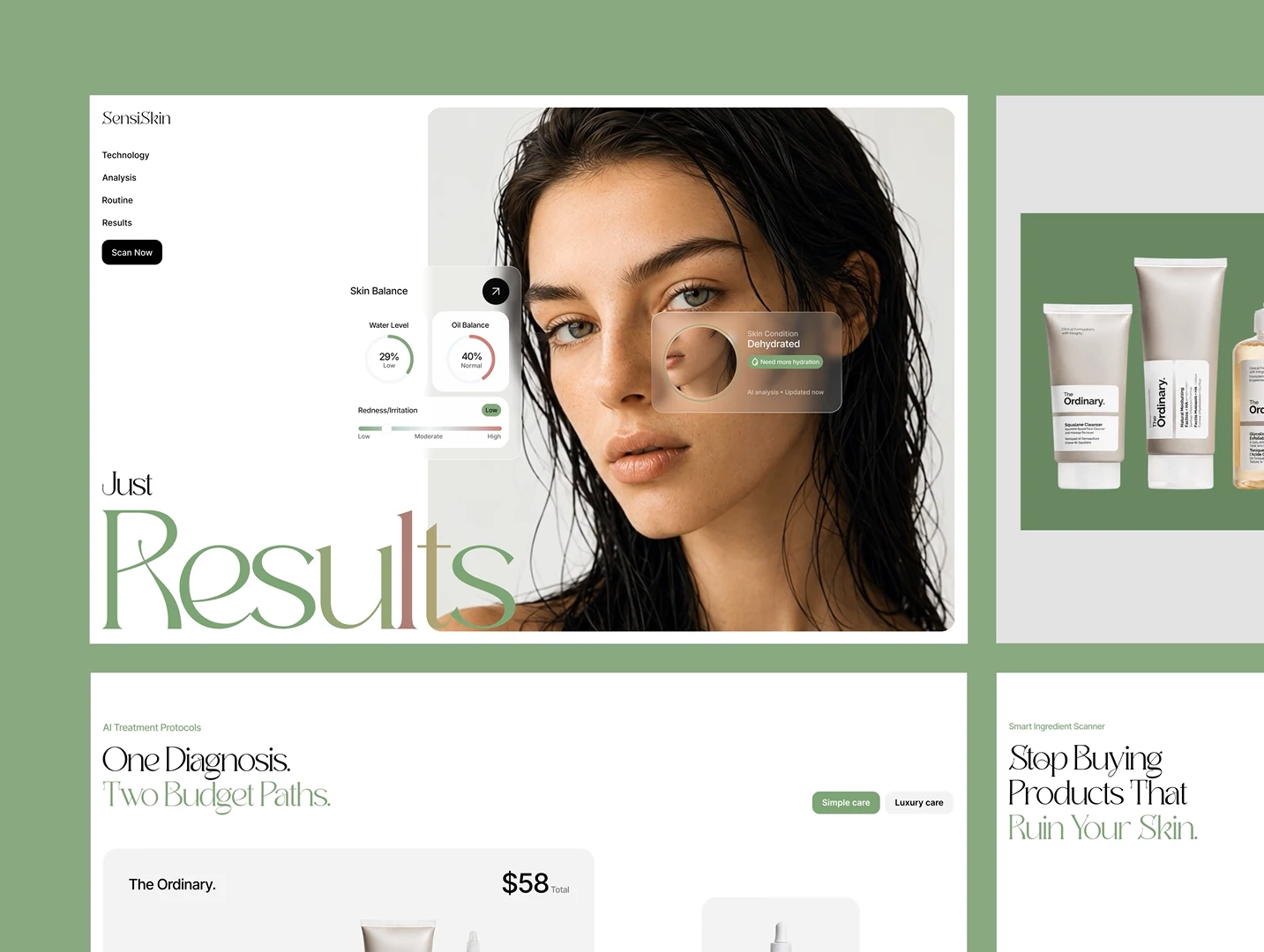
This image captures the full top-of-page experience in a two-column editorial layout. The left panel shows the primary hero: the SensiSkin wordmark and four-item nav top-left, a close-up portrait of a model with wet, natural hair styling photographed in soft, even lighting that reads as clinical-grade but never cold. Floating above the photography are the AI result cards — Skin Balance with Water Level at 29% (Low) and Oil Balance at 40% (Normal), a Redness/Irritation gradient bar reading Low, and a translucent "Skin Condition: Dehydrated" callout zoomed into the under-eye area with a "Need more hydration" tag and an "AI analysis • Updated now" timestamp that reinforces real-time credibility. Below the hero, the oversized italic "Results" wordmark closes the section with editorial confidence.
The right panel shows a clean grey product-shelf photography block — The Ordinary tubes and bottles arranged against the sage-green brand backdrop — leading into the "AI Treatment Protocols" section: "One Diagnosis. Two Budget Paths." with the Simple Care / Luxury Care toggle visible top-right and the first routine card ("The Ordinary," $58 total) beginning to display its five-product kit. This composition does the structural work of the entire page in one frame: diagnosis on the left, budget-flexible action on the right. 🌿📊💸
Smart Ingredient Scanner Detail
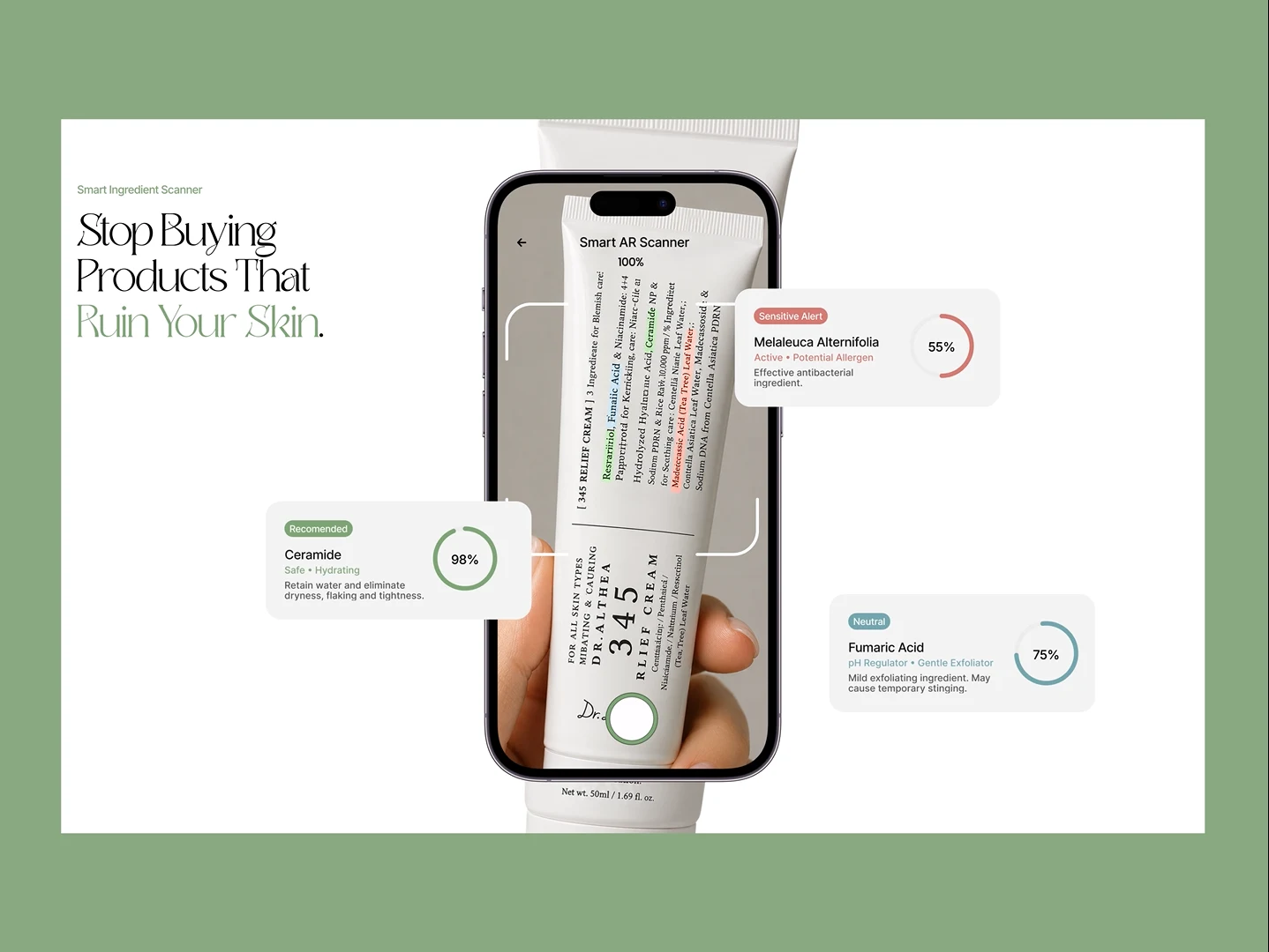
This image isolates the platform's second core capability: the Smart Ingredient Scanner. A smartphone mockup displays the AR scanning interface mid-analysis, framing a real skincare tube (Dr. Althea "345 Relief Cream") with bracket-style scan guides reading "100%" complete. Three floating result cards surround the device, each addressing a specific ingredient pulled directly from the product's printed list: Ceramide tagged "Recommended" in green with a 98% score and a plain-language explanation ("Retain water and eliminate dryness, flaking and tightness"); Melaleuca Alternifolia tagged "Sensitive Alert" in red-orange with a 55% score, flagged as an active potential allergen; and Fumaric Acid tagged "Neutral" in blue-grey at 75%, noted as a mild exfoliant that may cause temporary stinging.
The headline framing the section — "Stop Buying Products That Ruin Your Skin" — sets the emotional stakes plainly, while the green accent treatment on "Ruin Your Skin" mirrors the same typographic technique used throughout the rest of the site: highlight the emotionally loaded payoff, let the rest of the sentence carry the logic. This single screen makes the strongest case in the entire platform for why ingredient transparency, not just skin diagnosis, is the product's real differentiator. 📱🔍🚩
🎬 Motion & Interaction Walkthrough
The product walkthrough video demonstrates the full live interaction model: the Skin Balance percentages animate on load to reflect a freshly completed scan (Water Level moving between scan sessions, Oil Balance recalculating), proving the metrics are treated as dynamic data rather than static placeholder content. The "One Diagnosis, Two Budget Paths" toggle is shown switching live between Simple Care and Luxury Care, with the routine card instantly swapping from a $49–58 "The Ordinary" five-step kit to a $135 "Rituals" five-step kit — same protocol structure, completely different price tier and brand experience — while the right-hand product carousel updates in sync with descriptive bullet points for the active hero product (Retinol 0.2% in Squalane on the budget path, a Hydrating Serum Booster on the luxury path). This interaction is the clearest proof point in the whole platform that one piece of AI-driven diagnostic data can responsibly branch into genuinely different, budget-aware outcomes without diluting the underlying clinical logic. 🎥🔁🛍️
🧰 Skills Demonstrated
Figma · UI Design · UX Design · Web Development · AI Product Interface Design · Design Systems · Glassmorphism · Editorial Typography · Information Architecture · Progressive Disclosure · Component-Based Design · Data Visualization · Color Semantics · Responsive Design · Interaction Design · Micro-Animations · E-commerce UX · Health-Tech UX · Beauty & Cosmetics Branding · Accessibility-Aware Feedback States · Prototyping · Wireframing
💬 Final Word
SensiSkin needed to prove two things at once: that AI-driven skin analysis can be trusted, and that trust doesn't have to look clinical to be credible. The sage palette does that. The editorial typography does that. The glassmorphism data cards do that. The budget-flexible routine builder does that. UI design, UX architecture, and full web development — one coherent system, built to turn skincare confusion into skincare confidence. 🌿🤖💎
Like this project
Posted Jun 30, 2026
Designed and developed an AI-powered skincare platform for SensiSkin, blending scientific credibility with beauty-editorial appeal.
Likes
0
Views
47
Timeline
Dec 22, 2024 - Dec 28, 2024