Illustration & Motion Design for the Mayabytes Website

Xulfi Shah


🖤 MAYABYTES — Website Illustration & Animation
A Bold Editorial Identity for a Houston Creative Agency
🔥 Project Overview
Mayabytes is a creative agency in Houston that designs, brands, and builds digital experiences for ambitious companies — but their own website wasn't telling that story. The original site was built years prior with a traditional template-driven structure: static layouts, generic stock-style visuals, and nothing that demonstrated the agency's actual design capability. For a studio whose entire pitch is "we make brands unforgettable," a forgettable website is the worst possible advertisement.
The brief was a full overhaul: take Mayabytes from a competent-but-flat agency site to a portfolio-grade digital experience with custom illustration, character-driven motion, and a visual identity bold enough to be remembered. I led the brand design, UI/UX design, illustration system, and front-end build — translating the agency's personality (playful, confident, craft-obsessed) into a website that performs the way their actual client work performs.
The signature idea threading through the entire site is a custom-illustrated hand character that physically interacts with each project card — holding it, presenting it, gesturing toward it — recoloring itself to match every individual case study's brand palette as the user scrolls. It's a small, technically deliberate detail that turns a standard portfolio carousel into something closer to a flipbook with personality. ✋🎨⚡
🚨 The Pain Points (What Was Broken Before)
Here's the honest diagnosis of what Mayabytes needed fixed:
🚫 A design agency with a forgettable website — the single worst credibility problem an agency can have. If the homepage doesn't demonstrate craft within the first scroll, no amount of client logos or service copy will convince a visitor the studio is worth hiring
🚫 No illustration or motion language — Mayabytes' actual client work involved playful branding and animation, but the agency's own site had zero custom illustration, zero character work, and zero motion design — none of the visual tools the studio sells to clients were visible on its own homepage
🚫 Static, disconnected portfolio presentation — projects were displayed as flat thumbnails with no narrative connective tissue between them. Each case study felt like an isolated tile rather than part of a cohesive "this is what we do" story
🚫 Generic agency-template feel — the hero copy, the layout grid, the typographic choices all read as "creative agency starter template" rather than as a studio with its own voice. Nothing on the page was ownable or distinctive to Mayabytes specifically
🚫 Weak culture and values storytelling — Mayabytes has a defined set of internal values (love your craft, be bold, be humble) that differentiate how they work with clients, but the old site buried this entirely, missing an opportunity to build trust before the pitch call even happens
🚫 Credibility signals scattered and undersold — awards, recognitions, and the "100 potential clients" trust marker existed but were treated as an afterthought rather than a structured trust-building section in the page flow
🚫 No emotional warmth — despite copy like "we pour love into our work," the visual execution stayed cold and corporate, undercutting the studio's actual personality with generic photography and impersonal layout patterns
🚫 Inconsistent color direction — without a system tying color to content, the page lacked the visual rhythm needed to keep a long-scrolling agency site feeling fresh from hero to footer
🛠️ Full Deliverables Breakdown
🎨 Brand Identity & Illustration System
The Mayabytes visual identity was rebuilt around a confident, editorial type-driven aesthetic paired with hand-drawn line illustration — a combination chosen specifically to telegraph "human craft" in a market full of AI-generated stock visuals and templated layouts.
The centerpiece of the system is a custom-illustrated hand character, rendered in a loose, confident line-art style reminiscent of fashion sketching. This hand appears throughout the site holding, presenting, or gesturing toward project imagery — and critically, it recolors itself contextually: black-and-white line art against the brand's signature purple-and-black hero treatment, then shifting to warm terracotta tones against the Pizzrelish case study, then to sage green against the Elksquad case study. This recoloring logic does real narrative work — it signals that Mayabytes' design thinking adapts fully to each client's world rather than imposing a single house style on every project.
The wordmark mark itself — a minimal bar-chart-meets-skyline glyph — stays neutral and constant across every color treatment, anchoring the brand identity while the illustration system flexes around it. Typography runs on a confident serif display face for headlines ("Designs that empower your brand," "Sharing the branding Experience") paired with a clean sans-serif for body copy and UI labels — an editorial pairing that reads as more magazine than SaaS dashboard.
The color system itself is deliberately maximalist by agency-website standards: deep violet-purple for the awards and recognition section, sunshine yellow for the values and contact sections, warm terracotta and sage tones activated contextually within project case studies, and high-contrast black-and-white for the team and culture sections. Rather than committing to one or two brand colors, Mayabytes' identity is built on confident, controlled color-switching — treating color itself as a storytelling device tied to content rather than a fixed brand constraint. 🎨✋🌈
🖥️ UI/UX Design in Figma
The complete Figma system covers the full site architecture across desktop and mobile breakpoints:
Hero Section — "Designs that empower your brand" headline with a typographic treatment that fades the middle word ("empower") to light grey, drawing the eye to the bookending words while the illustrated hand animates in beside the copy holding a blank canvas shape that gets dressed with project imagery as the user scrolls
Portfolio Narrative Flow — "Sharing the branding Experience" section structured as a single continuous scroll-driven sequence rather than a static grid: each project (Pizzrelish, Elksquad, Dmetrics, Square Clothing, Educure) appears as a full-bleed colored panel with its own background tone, project photography held by the illustrated hand, a right-aligned vertical project index for quick navigation, and a consistent "View Case" CTA
Recognitions Section — "Empower growth, increase impact" set against the bold violet background, featuring a "100 Potential Clients" stat treated with oversized outlined numerals, and five industry award badges (DesignRush, GoodFirms, The Manifest, Clutch, and a fifth recognition mark) arranged in a clean horizontal row for immediate scannable credibility
Diagonal Service Tape — a signature transitional element: overlapping diagonal ribbon bands in black and yellow listing the agency's full service range (2D Animation, Branding, Print Media, Text Magic, Social Media Ads, Pitch Decks, and more) — a high-energy, almost skateboard-deck visual motif that breaks up the page rhythm right before the team introduction
Team Section — "Meet Our Team" introduced on a stark black background, creating strong visual contrast against the colorful sections above and below it and signaling that the people behind the work deserve their own dedicated, undistracted spotlight
Values Section — "Our culture, values, and beliefs" with a numbered list format (01 Love Your Craft, 02 Be Bold Be Humble, and beyond) paired with small custom icon illustrations like the stitched heart icon — giving abstract company values a tangible, almost handmade visual presence
Contact / CTA Section — "Ready to start your project?" on the signature sunshine-yellow background with a circular rotating badge ("Custom Design Outline to Your Business") wrapped around the central "Let's talk" CTA button — small interactive detail that makes the most important conversion point on the page feel crafted rather than default 🧠📐✨
💻 Web Development & Animation
The Figma designs were built into a fully animated, production-ready website with custom motion sequences:
⚡ Custom hand-illustration animation system — SVG/vector-based character animation that reveals, re-colors, and repositions the illustrated hand as users scroll between sections, synced precisely to scroll position rather than running on a fixed timer
⚡ Scroll-driven color transitions — full-section background color shifts (purple → tan → sage → black → yellow) triggered by scroll position, executed smoothly enough to feel like a continuous experience rather than abrupt section breaks
⚡ Staggered text reveal animations on every headline, with word-level opacity/weight transitions (such as the faded "empower" treatment in the hero) built as reusable animation components
⚡ Interactive project index navigation — the vertical project list (Pizzrelish, Elksquad, Dmetrics, Square Clothing, Educure) updates active-state styling in sync with scroll position, letting users jump directly to any case study
⚡ Diagonal marquee/ticker components for the services tape section, built with seamless infinite scroll loops in both directions for the overlapping black and yellow bands
⚡ Responsive rebuild of every illustrated and animated element for mobile, ensuring the hand-illustration storytelling device still functions at smaller viewports without losing its narrative role
⚡ Rotating badge animation for the contact CTA, built as a lightweight looping rotation that draws the eye without becoming distracting
⚡ Performance optimization across all custom illustration assets — SVG optimization and lazy-loading sequencing so the animation-heavy homepage still loads fast despite its visual density 💻✋🎬
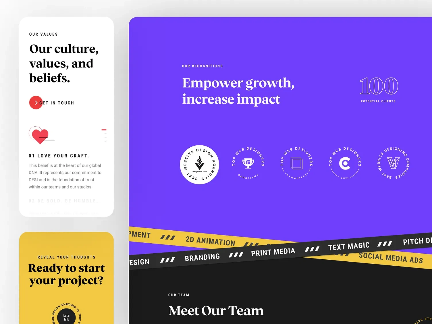
This image captures three distinct sections in sequence, demonstrating the page's tonal range. On the left, the "Our Culture, Values, and Beliefs" panel sits on clean white with a bold serif headline, a "Get in Touch" CTA marked with a red arrow bullet, and the first value statement — "01 Love Your Craft" — paired with a hand-stitched heart icon illustration that gives the abstract value a tactile, handmade quality. Below it, the sunshine-yellow contact panel begins to appear with "Ready to start your project?" and the rotating circular "Let's talk" badge peeking in at the bottom edge.
The right side of the image shows the violet "Our Recognitions" section in full: "Empower growth, increase impact" in large serif type, the oversized outlined "100 Potential Clients" stat in the top right, and five circular award badges arranged in a clean row beneath the headline. The section closes with the diagonal black-and-yellow service tape — 2D Animation, Print Media, Text Magic, Social Media Ads, Branding, Pitch Decks — overlapping at an angle as a high-energy transitional device leading into the stark black "Meet Our Team" section beginning at the very bottom of the frame. This single image demonstrates the deliberate tonal whiplash the site uses to keep a long scroll feeling alive: white to yellow, violet to black, calm to energetic, section by section. 🏆🎀⚡
Hero, Portfolio Case Study & Team Photography
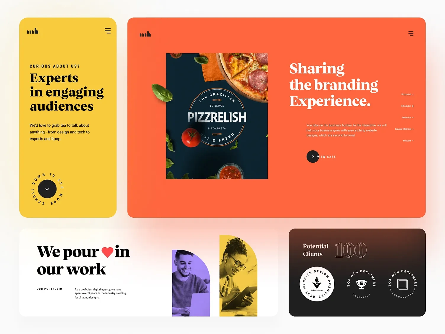
This image opens with the yellow "Curious about us? Experts in engaging audiences" panel — the agency's logo top-left, a clean hamburger menu top-right, warm introductory copy about the studio's range of interests, and a circular "Scroll down to see more" rotating badge anchoring the bottom of the panel, mirroring the same interactive badge motif used at the contact section.
To its right, the orange Pizzrelish case study panel shows the illustrated hand mid-gesture, fingers pinching near the project photography — a moody flat-lay of pizza, fresh basil, and tomatoes around "The Brazilian Pizzrelish" branding mockup. The headline "Sharing the branding Experience" sits beside it in bold white serif type, with the vertical project index (Pizzrelish, Elksquad, Dmetrics, Square Clothing, Educure) listed at the far right and a "View Case" CTA below the body copy.
Below both panels, the white "We pour ❤️ in our work" section introduces the team and portfolio framing copy, paired with two duotone-treated team photographs — one in violet, one in yellow — that tie directly back into the site's broader color-shifting brand language even at the human-photography level. The dark "Potential Clients" panel closes the frame, repeating the 100-clients stat and award badges in a more compact footer-adjacent format. This image is the clearest single proof of how thoroughly the illustrated-hand motif, the color-shifting backgrounds, and the editorial typography work together as one unified system rather than as separate decorative choices. 🍕✋📸
🎬 Motion & Interaction Walkthrough
The site walkthrough video reveals the full choreography behind the static screens. On load, the homepage builds in with the agency wordmark and navigation settling first, followed by the hero headline assembling word by word and the illustrated hand drawing itself in beside the copy — the line art appears to "sketch" into place rather than simply fading in, reinforcing the handcrafted positioning of the brand.
As the user scrolls into the portfolio section, the background shifts from the violet-and-black hero environment into the warm tan-and-orange Pizzrelish treatment, with the illustrated hand recoloring in real time to match — skin tone shifting from a neutral outline to warm terracotta — while its fingers reposition to pinch the new project image into frame. Continuing the scroll, the same hand transitions again into the sage-green Elksquad section, now holding a laptop mockup displaying the Elksquad product UI, with the right-hand project index updating its active state to track scroll position throughout. The fluidity of this recoloring and repositioning, synced precisely frame-by-frame with scroll rather than running as a separate animation layer, is the single most technically demanding piece of motion work on the entire site — and the clearest demonstration of why the project required dedicated illustration and animation expertise, not just a template-based portfolio carousel. 🎥✋🌀
🧰 Skills Demonstrated
Figma · UI/UX Design · Brand Identity Design · Custom Illustration · Character Animation · Scroll-Triggered Animation · Web Development · Motion Design · SVG Animation · Editorial Typography · Color Systems · Design Systems · Responsive Design · Interaction Design · Portfolio Architecture · Micro-Interactions · Prototyping · Wireframing
💬 Final Word
Mayabytes needed a website that proved the studio's design and animation chops before a single client logo was shown. The illustrated hand does that. The scroll-synced color shifts do that. The editorial typography does that. The diagonal service tape and the rotating contact badge do that. Brand identity, illustration, motion design, UI/UX, and front-end development — one cohesive creative vision built to make an agency's own homepage as memorable as the work it sells. 🖤✋🎬
Like this project
Posted Jun 29, 2026
Illustration & motion design for the Mayabyte custom hand-drawn character system animated across the site to add personality and warmth.