Anchor - UI/UX Case Study
Project Background
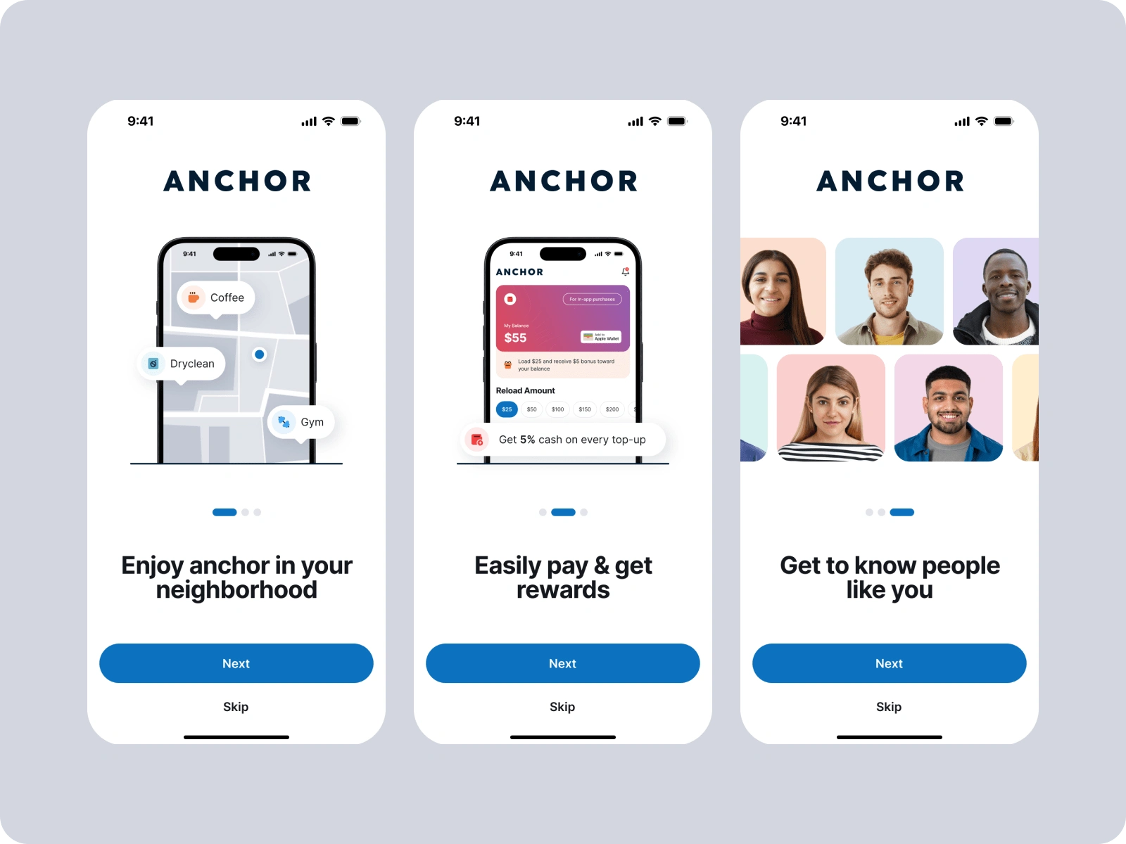
Anchor is a revolutionary platform designed to help users discover various services near them, such as ice cream shops, barber shops, gyms, and more. The goal was to create an intuitive and user-friendly app that seamlessly connects users with local businesses.
Objectives
User-Centric Design: Develop a UI/UX design that prioritizes ease of use and user satisfaction.
Service Discovery: Enable users to quickly find and explore different services in their vicinity.
Engaging Experience: Create an engaging and visually appealing interface to enhance user interaction.
Responsive Design: Ensure the platform is accessible across different devices, including mobile phones and tablets.
Research and Analysis
User Research: I conducted surveys and interviews with potential users to understand their needs, preferences, and pain points when searching for local services.
Competitive Analysis: Analyzed existing service discovery platforms to identify gaps and opportunities for differentiation.
Persona Development: Created user personas to represent the target audience and guide the design process.
Design Process
1. Wireframing and Prototyping:
Wireframes: Developed low-fidelity wireframes to outline the app's structure and layout.
Prototypes: Created interactive prototypes in Figma to visualize the user journey and get early feedback.
2. User Flow and Navigation:
Intuitive Navigation: Designed a simple and intuitive navigation structure to ensure users can easily find services.
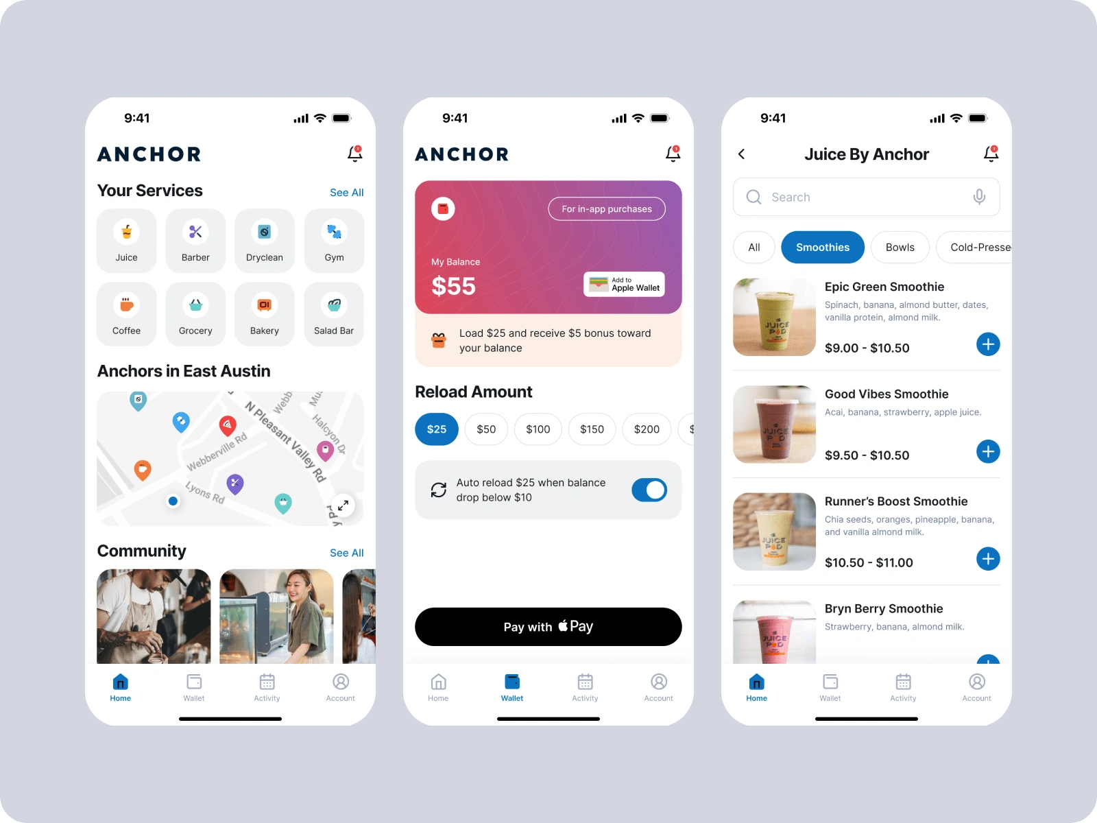
Service Categories: Categorized services into distinct groups (e.g., food, beauty, fitness) to streamline the discovery process.
3. Visual Design:
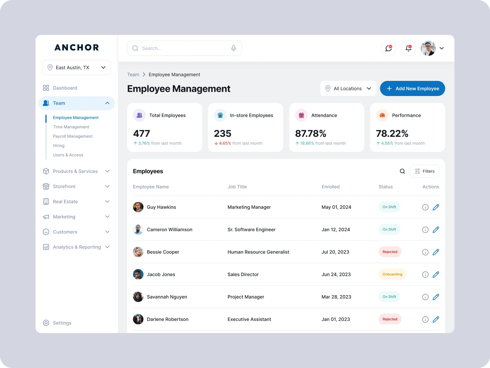
Branding: Developed a cohesive visual identity for Anchor, including color schemes, typography, and icons.
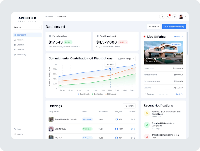
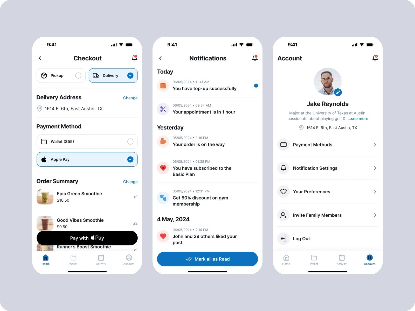
User Interface: Designed an appealing and consistent UI, focusing on usability and aesthetic appeal.
4. Usability Testing:
Testing Sessions: Conducted usability testing sessions with real users to gather feedback and identify areas for improvement.
Iterative Design: Refined the design based on feedback, ensuring a polished final product.
Key Features
Search Functionality: Robust search feature allowing users to find specific services quickly.
Service Listings: Detailed service listings with reviews, ratings, and contact information.
Maps Integration: Integrated with maps to show service locations and provide directions.
Community Feed: Enabled users to interact with the community and see what is popular in their area.
Favorites: Option to save favorite services for quick access.
Results
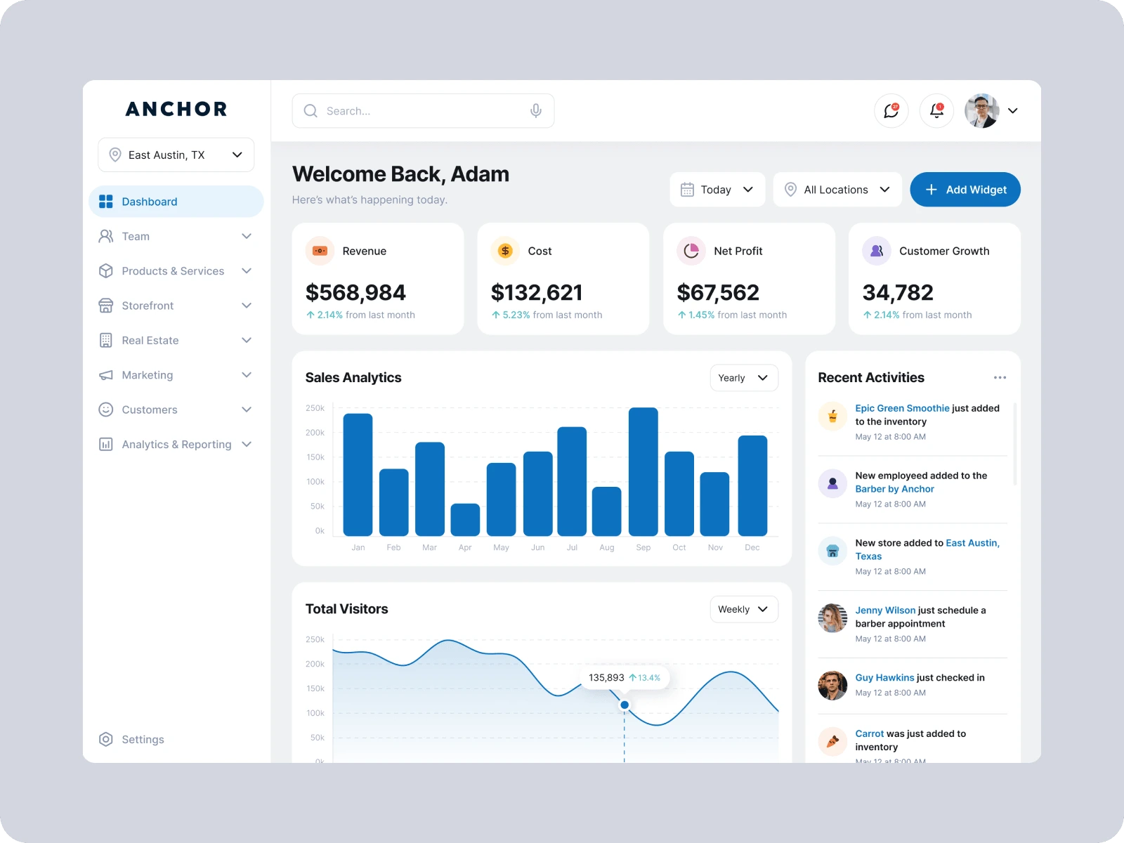
Enhanced User Engagement: Increased user engagement due to the intuitive and visually appealing design.
Positive Feedback: Received positive feedback from users appreciating the ease of use and functionality.
Improved Discovery: Users reported finding services more quickly and efficiently compared to competitors.
Conclusion
The UI/UX design for Anchor successfully met the project objectives, providing a user-friendly and engaging platform for discovering local services. The thorough research, iterative design process, and focus on user needs resulted in a product that stands out in the market and enhances user satisfaction.
Like this project
Posted Aug 1, 2024
Anchor is a revolutionary platform designed to help users discover nearby services, such as ice cream shops, barber shops, gyms, and more.
Likes
1
Views
41

