The network for creativity
Join 1.25M professional creatives like you
Connect with clients, get discovered, and run your business 100% commission-free
Creatives on Contra have earned over $150M and we are just getting started
Back to feedPost

UI/UX Face-Off: Which Version Would You Choose Mobile ?
Introduction:
Design isn't just about looking good; it's about an intuitive experience and usability. We have created two design versions for four different app categories—Productivity, E-commerce, Healthcare, and Fintech. Take a look and tell us which one you prefer.
Carousel Details:
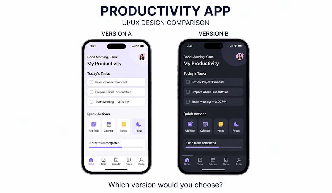
Slide 1: Productivity App
Image: image_7.png
Description: A showdown between a clean, light-themed version (A) and a modern, dark-mode version (B). Which style keeps you more focused?
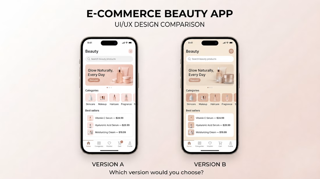
Slide 2: E-commerce Beauty App
Image: image_6.png
Description: Two elegant, beige-toned beauty shop designs. They are similar at first glance, but notice the subtle difference in the bottom navigation bar. Does this small change improve the user experience?
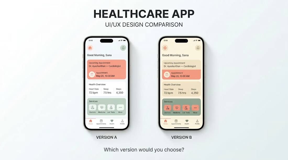
Slide 3: Healthcare App
Image: image_5.png
Description: A side-by-side of a healthcare dashboard. Version A uses a calm, cool-blue background, while B uses a warm, beige tone. Which feels more clinical or more caring?
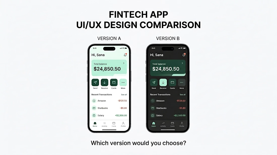
Slide 4: Fintech App
Image: image_4.png
Description: The difference between a high-contrast fintech interface (A) and a more muted, dark-themed version (B). Which style feels more secure and trustworthy for financial transactions?
Call to Action:
Swipe to see the entire design comparison, and then tell us in the comments :
Which version (A or B) do you like for each app ?
Which single design element influences your decision the most?
#UIUX #DesignComparison #AppDesign #UserExperience #ProductDesign #UIDesign #DesignFaceoff


The network for creativity
Join 1.25M professional creatives like you
Connect with clients, get discovered, and run your business 100% commission-free
Creatives on Contra have earned over $150M and we are just getting started

Challenges
View all


Related posts


“Or similar” leaves a lot to the imagination.
A few billboard designs I made for Sync as part of the rebrand. The campaign centres on a simple promise: the car you see is the car you drive.
I kept that message big and direct, with the cars up close and enough pink to make you look twice.
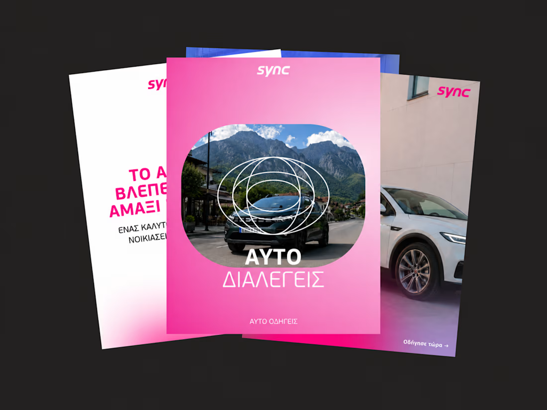
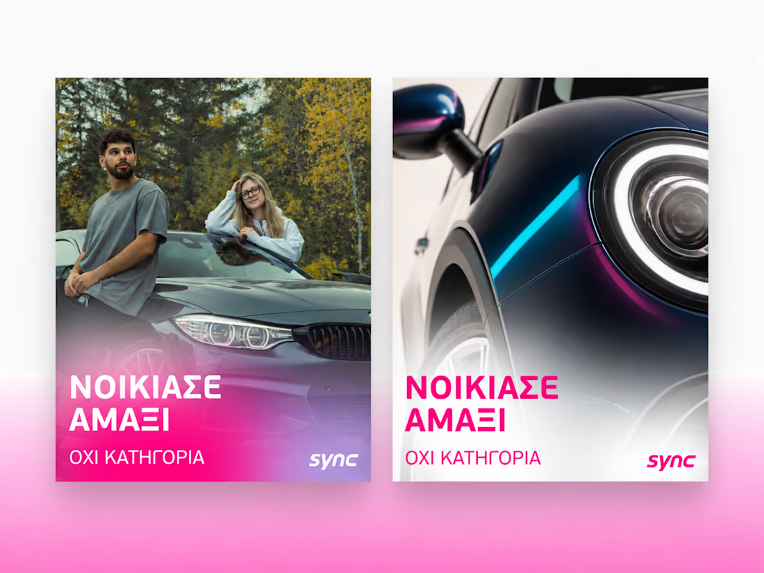
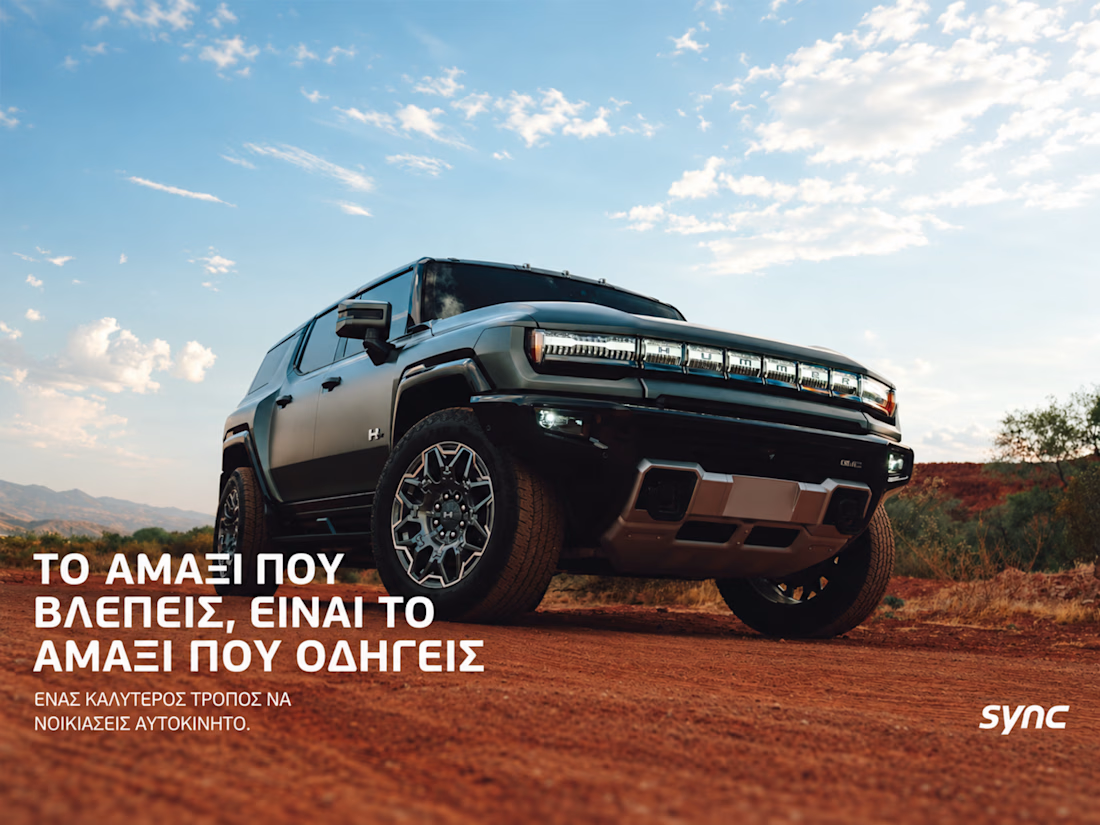

The way the oversized promise carries through the pink palette is really effective—the close-up crops make the car feel immediate without losing the campaign idea.

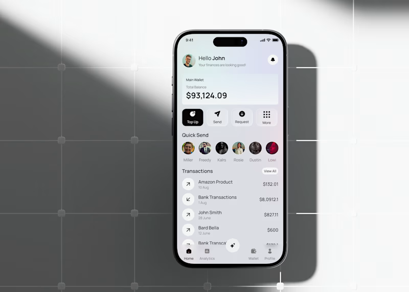
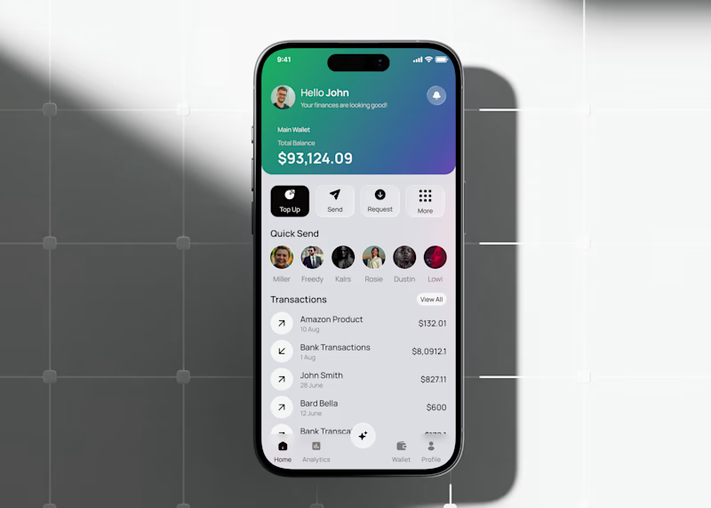
Fintech app home dashboard design
A mobile wallet app concept focused on everyday money management: checking your balance, sending money to people you pay often, and keeping an eye on recent transactions all from one home screen.
The layout keeps the essentials up top (balance, quick actions like Top Up, Send, Request) and moves frequent contacts and transaction history below, so the most-used actions stay within reach without extra taps.
This version tests a gradient treatment on the balance card to see if it helps the total stand out against the rest of the screen, versus a flatter, neutral card.
Would love to hear which balance card style feels more natural to use day to day.
3 voted
33%
6 voted
67%
9 votes
Closed

the gradient is cool


The low-poly scene already has a strong sense of place, and the 60fps browser target makes the interaction feel ambitious in the best way. I especially like how the restrained palette lets the “Explore the Silo” typography lead the experience.