
Product Designer | Mobile Apps, Landing Pages & Framer Dev


Product Designer | Mobile Apps, Landing Pages & Framer Dev


We craft brands, uiux, design & dev, & digital products
We craft brands, uiux, design & dev, & digital products



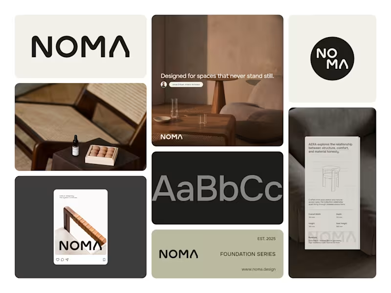
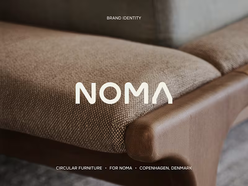
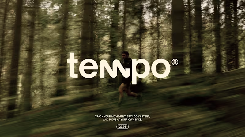

Professional layout geek!
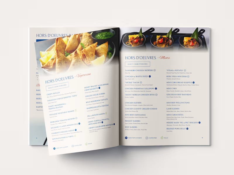

WIP! Revisiting a previous menu restaurant project and refining it for new items for my client.
My favorite part of this menu is still the wings sauces section 🍗
2
680


Brand, Website, Product, Motion, & Development for Startups
- $25k+
- Earned
- 10x
- Hired
- 5.0
- Rating
- 23
- Followers
Brand, Website, Product, Motion, & Development for Startups


For years we helped other startups and studios to build other people's websites, products & brands.
Today we're launching Componine Creative Studio.
A few things we care about:
→ Staying close to the work. You'll talk to the founder directly, not someone passing your brief down a chain.
→ Keeping things under one roof. Web, product, brand, motion, all in the same place.
→ Quality over quantity. We only take on a limited number of projects at a time, so nothing gets rushed or watered down.
New site is live. Visit Componine.com (https://www.componine.com/)
2
2
430


Graphic Designer, Brand Designer & Logo Designer.
- $•••••
- Earned
- 1x
- Hired
- 21
- Followers
Graphic Designer, Brand Designer & Logo Designer.

New Identity for Uncle Wire
Uncle Wire is an alternative-rock band from Jakarta, Indonesia.
Uncle Wire’s new identity blends the precision of origami with the wild spirit of a cowboy, guided by the good fortune of a horseshoe. Origami represents patience, discipline, and meaningful transformation, while the horseshoe symbolizes luck, protection, strength, and prosperity.
Together, these elements shape Uncle Wire’s visual identity. A reflection of a cowboy’s wild spirit evolving into something more meaningful, positive, and wise. Bringing luck and optimism to everyone who listens to its music.
See the full preview of Uncle Wire's new identity (https://www.instagram.com/p/DThvCDoEyHK/?hl=en&img_index=1)
1
416

Brand Refreshment for Seca Works
Seca Works is an Indonesian accessories brand that crafts unique accessories from denim, rugged fabrics, and Japanese boro textiles. Their signature boro tie with concho blends heritage and modern style.
For this rebranding project, the main focus is on creating a logogram that represents the Seca Works brand, while the logotype remains unchanged, as the brand owner prefers to retain the existing logotype.
The logogram is inspired by a sunflower transformed into a concho, symbolizing resilience, craftsmanship, and the beauty of imperfection, hallmarks of every Seca Works creation.
1
371

Visual Identity work for Bhava Fragrance.
Bhava is more than fragrance; it is the essence of existence, emotion, and soul. Each spray captures life itself, inviting you to journey within, where scent transcends into pure feeling. Let Bhava awaken your spirit, a whisper of beauty that lingers, timeless and true.
1
385

Rebranding and Visual Identity for SFE (Sound From Everywhere)
SFE (Sound From Everywhere) is a Jakarta-based platform that celebrates music, culture, lifestyle, and community both online and offline.
The new identity is designed to reflect SFE’s ongoing journey, moving forward in harmony, growth, and connection.
'S' stands for Sound, representing the vibrant waves that bring us together.
'F' stands for From, symbolizing SFE roots and the diverse paths that shaped.
'E' stands for Everywhere, expressing unity and inclusivity across cultures.
Together, these elements capture SFE’s spirit of connection and shared experiences through music and community.
2
2
449

Creative Content Editor


Brand identity for founders who mean business
- $10k+
- Earned
- 5x
- Hired
- 5.0
- Rating
- 7
- Followers
Brand identity for founders who mean business


