Outcomes Accelerator Brand Identity Development
Gilang Gaviasa
Outcomes Accelerator Brand Identity
Outcomes Accelerator is a global initiative dedicated to one critical mission: increasing the effectiveness of donor and government spending. By bridging the gap between capital and results, they ensure that every dollar spent on social and environmental challenges actually delivers. They needed a brand that felt both technologically advanced and deeply human.
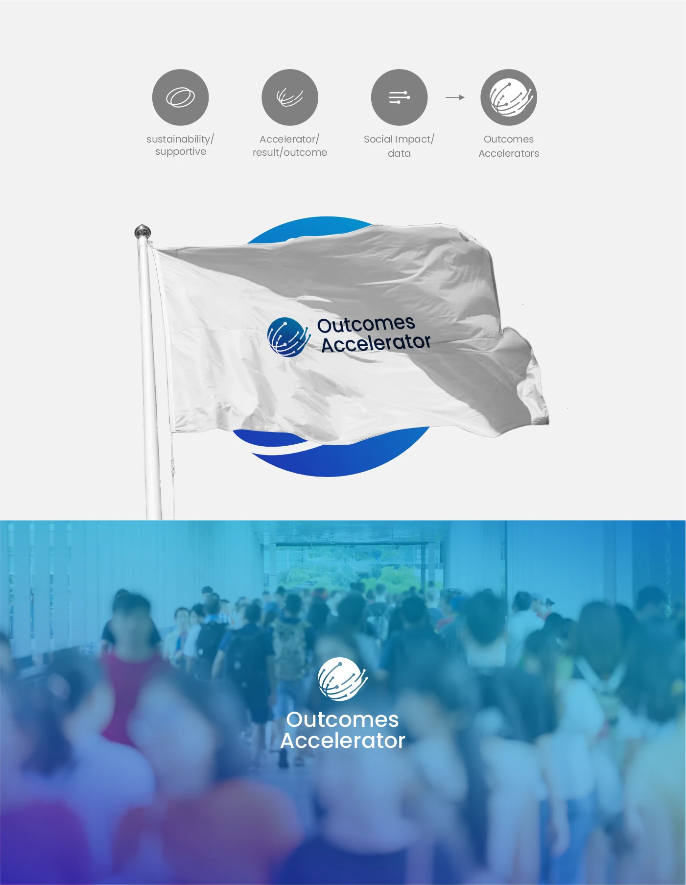
The creative strategy was born from the brand’s name itself. We looked at the concept of an "Accelerator" not just as speed, but as a focused direction of energy.
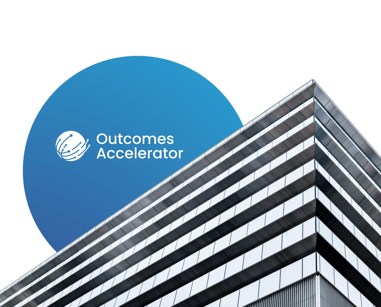
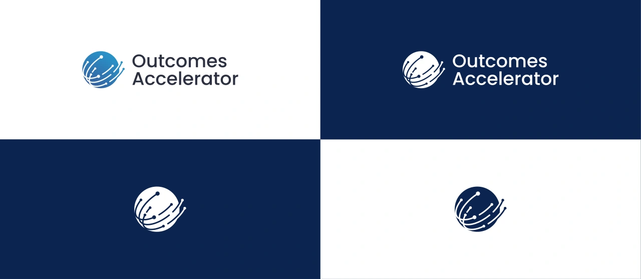
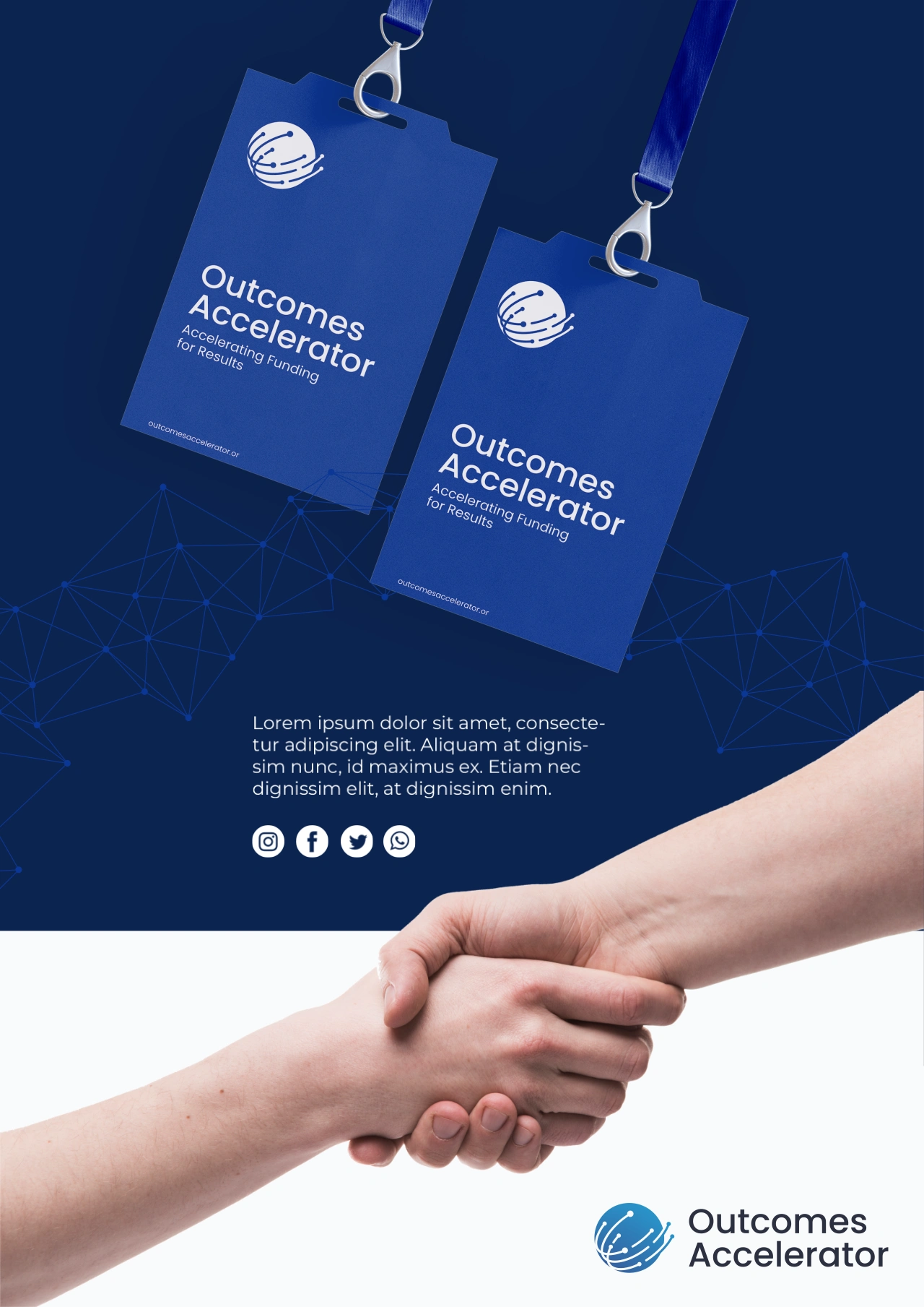
The logo mark is built within the silhouette of an 'O' (for Outcomes), doubling as a globe to represent the international scale of the initiative. I moved away from static lines, instead using curved paths with terminal "nodes." These represent data points and financial pipelines converging to create a unified force. By varying the lengths and trajectories of the lines, we created a sense of forward momentum; the "acceleration" of funding moving toward real-world results. I also paired the symbol with a clean, geometric sans-serif that balances the intricate detail of the mark with professional, approachable stability.
The final brand identity provides Outcomes Accelerator with a sophisticated toolkit that thrives across digital and physical platforms.
From the high-contrast professional website to event collateral and digital roadmaps, the brand maintains a consistent "pulse."
The result is a visual language that signals trust to governments and innovation to donors. It doesn’t just represent a company; it represents a more efficient way to change the world.

Client: Outcomes Accelerator
Project Date: 2023
Like this project
Posted May 13, 2026
Developed a brand identity for Outcomes Accelerator to enhance trust and innovation.
Likes
0
Views
2
Timeline
Jan 1, 2023 - Dec 31, 2023