We craft brands, uiux, design & dev, & digital products

We craft brands, uiux, design & dev, & digital products
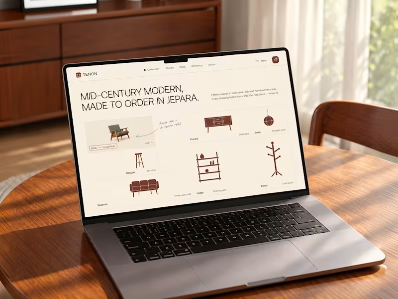
Tenon is Furniture Website Design
Exploring a digital experience for an Indonesian furniture brand inspired by mid-century modern design.
The website brings together product discovery, storytelling, and visual direction to make the digital experience feel as considered as the furniture itself.
Made to order. Made to last.
23
65
4.3K


Professional layout geek!
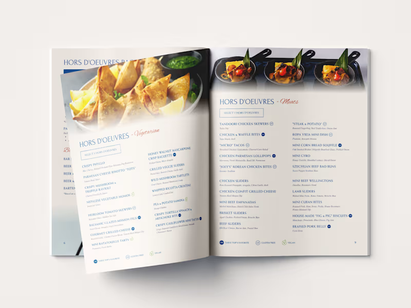

WIP! Revisiting a previous menu restaurant project and refining it for new items for my client.
My favorite part of this menu is still the wings sauces section 🍗
2
666


Graphic Designer, Brand Designer & Logo Designer.
- $•••••
- Earned
- 1x
- Hired
- 21
- Followers
Graphic Designer, Brand Designer & Logo Designer.

Brand Refreshment for Seca Works
Seca Works is an Indonesian accessories brand that crafts unique accessories from denim, rugged fabrics, and Japanese boro textiles. Their signature boro tie with concho blends heritage and modern style.
For this rebranding project, the main focus is on creating a logogram that represents the Seca Works brand, while the logotype remains unchanged, as the brand owner prefers to retain the existing logotype.
The logogram is inspired by a sunflower transformed into a concho, symbolizing resilience, craftsmanship, and the beauty of imperfection, hallmarks of every Seca Works creation.
1
367

Rebranding and Visual Identity for SFE (Sound From Everywhere)
SFE (Sound From Everywhere) is a Jakarta-based platform that celebrates music, culture, lifestyle, and community both online and offline.
The new identity is designed to reflect SFE’s ongoing journey, moving forward in harmony, growth, and connection.
'S' stands for Sound, representing the vibrant waves that bring us together.
'F' stands for From, symbolizing SFE roots and the diverse paths that shaped.
'E' stands for Everywhere, expressing unity and inclusivity across cultures.
Together, these elements capture SFE’s spirit of connection and shared experiences through music and community.
2
2
445


Creative Content Editor


Brand identity for founders who mean business
- $10k+
- Earned
- 4x
- Hired
- 5.0
- Rating
- 7
- Followers
Brand identity for founders who mean business


Brand & UX Designer | Memorable Brands, Easy-to-Use Products
- 5.0
- Rating
- 29
- Followers
Brand & UX Designer | Memorable Brands, Easy-to-Use Products
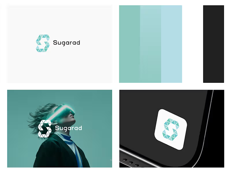
What if an agency's visual identity could reflect the way great digital work comes together?
I explored this concept by visualising the agency's workflow, where every piece contributes to performance and meaningful results.
The identity takes shape through geometric triangle elements, bringing individual pieces together to create a bold, distinctive logo. A little exploration of branding, geometry, and visual storytelling.
I'd love to hear your thoughts and feedback!
Explore the full case study here (https://contra.com/p/YQERrLlM-brand-identity-design-for-a-digital-agency-sugarad?referralExperimentNid=DEFAULT_REFERRAL_PROGRAM&referrerUsername=akbar_rhaditstya_putra_sw_u7cpps).
2
3
147
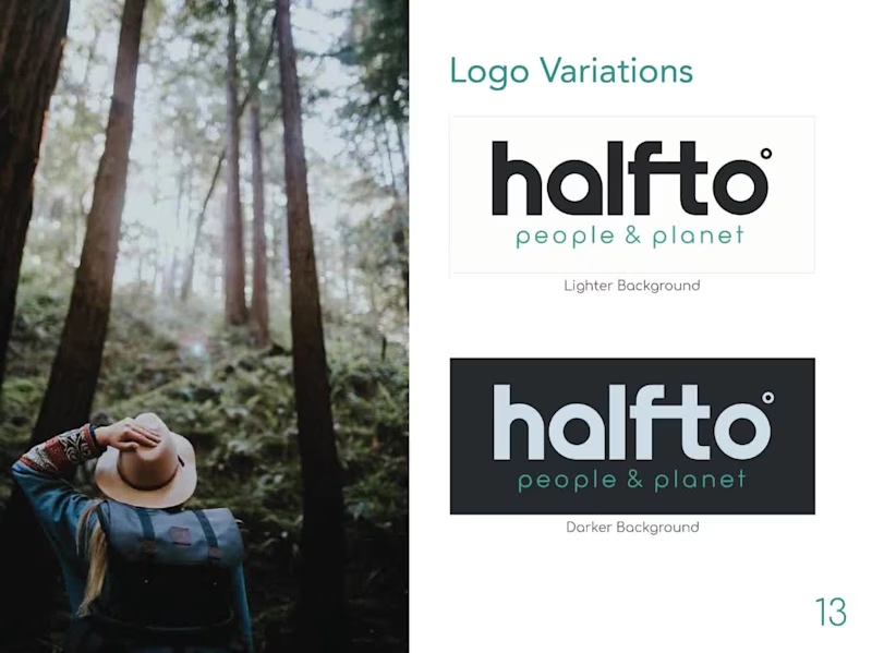
A sneak peek at the brand style guide I created last year for Halfto, an outdoor and travel business.
The client wanted a wordmark as the main logo, with one of the letters incorporating an element related to the outdoors.
I customised the letter “a” in “halfto” to resemble a map pin, creating a subtle connection to travel and exploration. I also designed a custom typeface specifically for the brand to give the wordmark a unique identity.
Have a similar project or need help with your branding? Feel free to get in touch, and I’d be happy to review your brief!
1
97

Product designer specialized in SaaS, Web and Apps
- 5.0
- Rating
- 30
- Followers
Product designer specialized in SaaS, Web and Apps


Strategic Brand Identities, Built to Stand Out.
- 5.0
- Rating
- 17
- Followers
Strategic Brand Identities, Built to Stand Out.