
Premium Framer Websites and Motion Design for Growing Brands


Premium Framer Websites and Motion Design for Growing Brands




Enterprise Brand & Web for Series A+ Startups
Enterprise Brand & Web for Series A+ Startups



Crafting experiences at intersection of design & technology

Crafting experiences at intersection of design & technology

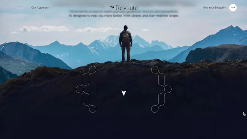

Senior Brand Designer for Product Brands & Startups
- $10k+
- Earned
- 7x
- Hired
- 5.0
- Rating
- 113
- Followers
Senior Brand Designer for Product Brands & Startups

Vibrant Life Chiropractic - bringing wellness to life through design.
Created a calming yet confident brand identity for a chiropractic and wellness clinic that wanted to move away from the typical “clinical” look and feel.
Soft, modern tones and clean typography were used to communicate trust, care, and holistic healing, all while keeping the visuals fresh and approachable.
A brand that feels as rejuvenating as the service it represents. 🌿
2
6
165
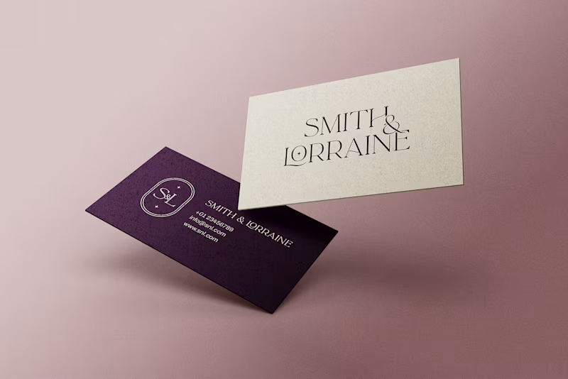
✨ Smith & Lorraine - a brand born inside a castle.
This project was for two business partners who recently bought Killoskehane Castle in Ireland and wanted to create a timeless personal brand around it.
I crafted their full visual identity, from logo concepts to business cards, social media banners, and merchandise.
The goal was clear: build a brand that feels luxurious, elegant, and quietly powerful... just like the castle itself.
Deep plum tones, graceful typography, and subtle metallic accents came together to form the final look.
2
5
195
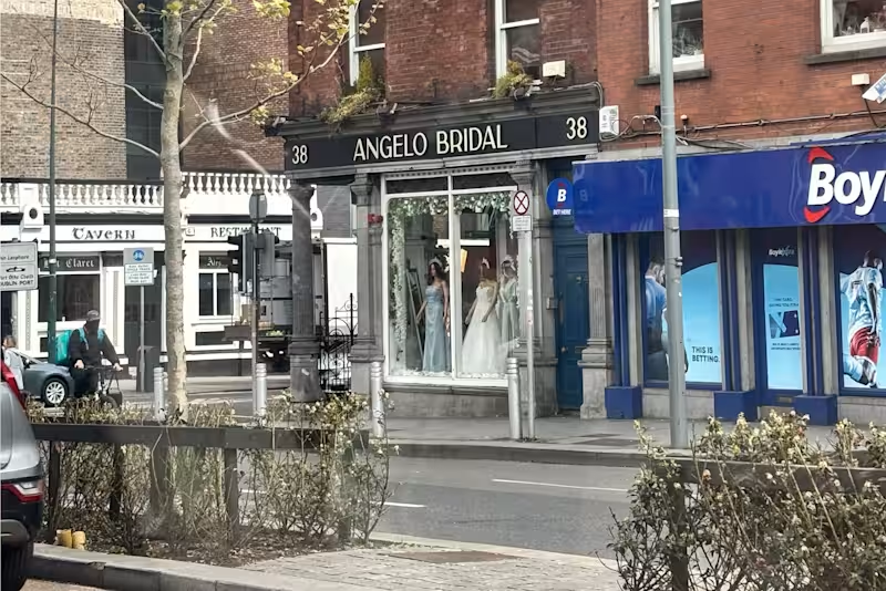
Angelo Bridal - A Luxury Rebrand close to my heart ✨ 🥹
Earlier this year, I visited this boutique in Dublin 🇮🇪 the same one I had rebranded from scratch a while back.
Seeing my work in person, from the signage to the business cards displayed inside was surreal.
This project was about more than design. It was about redefining elegance and building a brand that felt timeless, luxurious, and true to their brides. 💍
Scope:
→ Full Brand Identity
→ Website Design
→ Print & Business Collateral
(will be sharing more about the project in upcoming posts. 👀)
For now, here’s a glimpse into the new identity that became the foundation for everything else.
9
10
242


Innovative Framer Developer

Innovative Framer Developer


Branding & Website Design


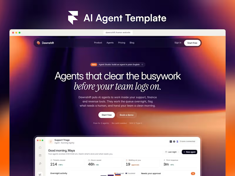
Dawnshift - a free Framer template for AI agent startups
https://www.framer.com/marketplace/templates/dawnshift/
Most SaaS templates put a stock dashboard image in the hero.
I wanted founders to launch with something that looks like their product on day one, so Dawnshift builds the whole dashboard from real Framer layers: stats, an overnight activity chart, agent runs and an approvals queue, all editable in a click.
The agent cards were the fun part.
Each one plays its own animated scene, an inbox being cleared, invoices being matched, renewals being tracked, access being granted, and the scene is picked automatically from a CMS field. Add a new agent and it just works.
What's inside:
- 11 pages with desktop, tablet and phone layouts
- Liquid-gradient shaders in one sunrise palette
- Agents, Blog and Changelog CMS
- Pricing with a comparison table, contact form with real button states
- A Start Here guide on the canvas
It's free to remix.
If you'd rather have it set up for your startup, with your logo, copy, colours and domain, I can have it live in 3 days
4
3
191


We make brands to stand
out digitally differently.
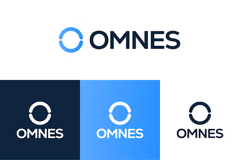
For Omnes, a digital Bitcoin infrastructure platform, we created a modern and scalable brand identity inspired by the technology behind Bitcoin mining.
The symbol draws from the circular form of a mining hardware cooling fan and transforms it into a distinctive “O,” representing continuous computing power, connectivity and movement. Supported by bold typography and a technology-led colour palette, the identity remains clear and consistent across the website, digital platforms and profile icons.
Brand identity designed by ABOX Agency (https://abox.agency/).
1
196


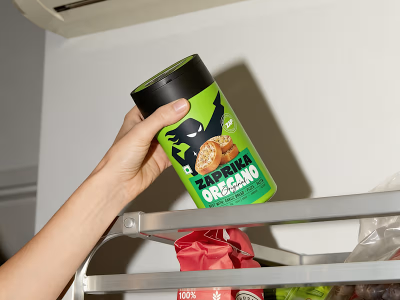

3D Visualization & Graphic Design Specialist
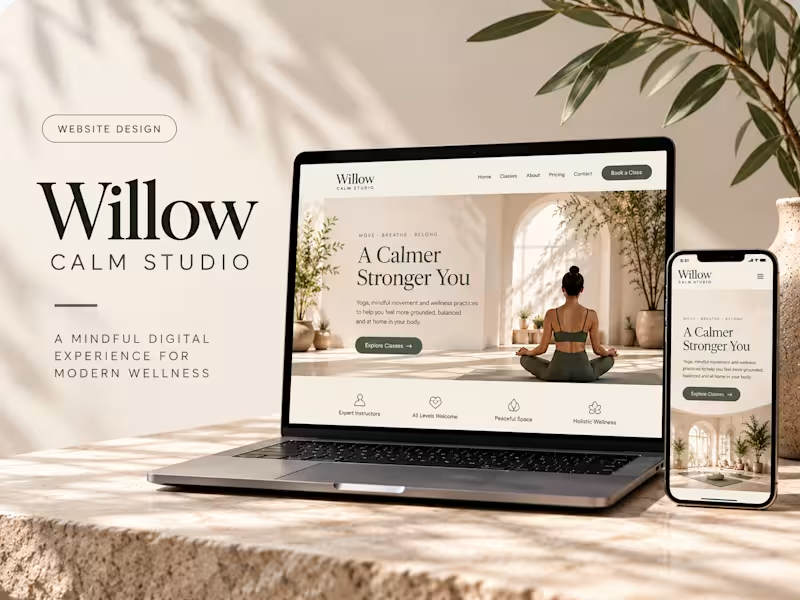
A considered digital experience that connects the visual language of wellness with the practical needs of a modern studio website.
Willow Calm Studio reflects my approach to designing thoughtful digital experiences for service-based brands: combining visual storytelling, usability, and purposeful design.
Project (https://willow-calm-studio.lovable.app/)
0
84

Through the Lens: Conceptual Photography Brand Mark
A concept-driven logo identity for a photographer, designed by merging the letter “N” with core camera elements to create a mark that feels both minimal and meaningful. Built on a 3:2 aspect ratio grid, the logo draws directly from the visual language of photography, resulting in a refined, editorial identity with a strong conceptual foundation.
This project presents a refined brand identity for a photographer, built around a smart conceptual fusion of the letter “N” and a camera form.
The logo seamlessly integrates the subject’s initial with key photographic elements — the camera frame, lens, and flash/viewfinder — resulting in a mark that feels both minimal and conceptually rich. Its construction is grounded in a 3:2 aspect-ratio grid, a subtle yet intentional reference to the native proportions of photography, giving the identity greater relevance and precision.
The visual presentation highlights the thoughtful build process, revealing how each component contributes to the final symbol. Shown in application against a dark, atmospheric photographic backdrop, the identity takes on a distinctly premium, editorial, and artist-led character.
0
233