Motion Designer | SaaS Explainers | UI & Visual Design
- $1k+
- Earned
- 2x
- Hired
- 5.0
- Rating
- 17
- Followers
Motion Designer | SaaS Explainers | UI & Visual Design

Zimmer – Luxury Restaurant Website Design
Designed an elegant and immersive website for Zimmer, a fine dining restaurant. The design focuses on creating a sophisticated digital experience through rich imagery, refined typography, and a deep, atmospheric color palette. Structured layouts guide visitors through the restaurant’s story, chef profile, menu highlights, and reservation details while maintaining a premium visual tone. The result is a modern and visually captivating website that reflects the restaurant’s luxury dining experience and brand identity.
1
171

Biologica – Website Design
Designed a modern e commerce website for Biologica, a health and wellness supplement brand. The website focuses on clean product presentation, strong visual hierarchy, and a premium digital experience. The layout highlights product benefits, ingredients, and customer trust through structured sections, lifestyle imagery, and clear calls to action. The result is a visually engaging and conversion focused website that communicates the brand’s credibility while making it easy for customers to explore and purchase products.
1
172

Mack Landscapes – Brand Identity, Branded Collateral & Website Design
Developed a complete brand identity and digital presence for Mack Landscapes, a luxury landscaping company. The project included designing a modern logo system, defining typography and brand colors, and applying the identity across branded collateral such as business cards, stationery, apparel, and print materials. In addition, a clean and elegant website was designed to showcase services and reinforce the brand’s premium positioning. The result is a cohesive visual identity that communicates professionalism, craftsmanship, and trust.
1
200

BLCK – Creative Studio Website Design
Designed a bold and minimal website for BLCK, a creative intelligence studio focused on branding, UX, and digital marketing. The design embraces a monochromatic aesthetic with strong typography, high contrast layouts, and immersive imagery to create a striking visual identity. Clean grid structures and large typographic elements guide users through the studio’s philosophy, services, and work while maintaining a modern and editorial feel. The result is a sleek, high impact digital experience that reflects the studio’s confident and cutting edge creative approach.
1
260


Revolutionizing Brands With Cutting-Edge Design
Revolutionizing Brands With Cutting-Edge Design


Brand Identity & Visual Systems Designer

Brand Identity & Visual Systems Designer


Full stack designer-dev — pixel-perfect UI, production code
- 5.0
- Rating
- 6
- Followers
Full stack designer-dev — pixel-perfect UI, production code


Simplicity. Clarity. Empathy


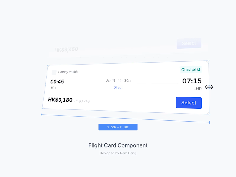
Sr Product Designer that helped scaled AI & SaaS startups.


This was one of the early concepts I explored for the driver app sign-up flow at The Routing Company (https://theroutingcompany.com) when I first joined over 5 years ago.
Since then, I’ve helped launch the rider app, driver app, and operational dashboard across 6 countries.
See more of my work at nam-dang.com (http://nam-dang.com)
12
216


Creative Operations | Marketing, UX & Content


Design systems & product designer · Firefox, Rocket · ~10 hr
Design systems & product designer · Firefox, Rocket · ~10 hr