Apprie, is an application for health professionals and patients.
Aster Jarolimova
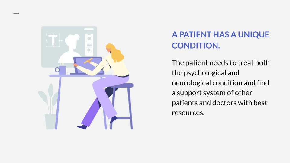
I collaborated with participants in the 2021 humanitarian hackathon to design a scientific tool that combines sensory information and metrics from the user with available medical knowledge to facilitate accurate diagnostics and informed decisions about personalized treatments and adjustments.
The project evolved into a startup idea. An AI tool is to provide information through networking, research, and data that users can track to save money and time when dealing with unique conditions where symptoms may be overlapping. It would give access to more types of treatments and options to choose from, and a transparent communication with their doctors.
My role as a lead UX designer was to manage design, design strategy, branding, and research.
Tools Used:
Sketching Board, Photoshop, Figma
Mission
Our mission is to provide tools and support that enable individuals to take control of their care and potentially alter the course of their conditions.
Vission
To revolutionize healthcare by bridging gaps in care and empowering patients to transform their health outcomes through seamless documentation and personalized support
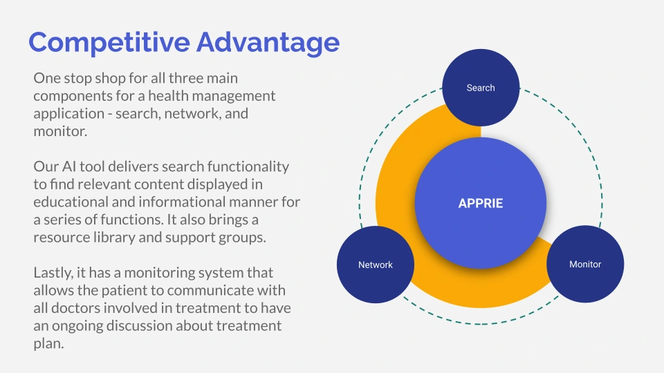
Key Features
AI-powered Assistant for seamless communication between patients and doctors, improving care coordination.
Health Discovery Platform connects patients to clinical trials, pharmaceutical innovations, and behavioral interventions.
Streamlined Electronic Medical Records (EMR) to simplify billing processes and reduce administrative burdens, allowing doctors to focus more on patient care.
Secure, Decentralized Record-Keeping, ensuring the safety and privacy of medical data
Personas
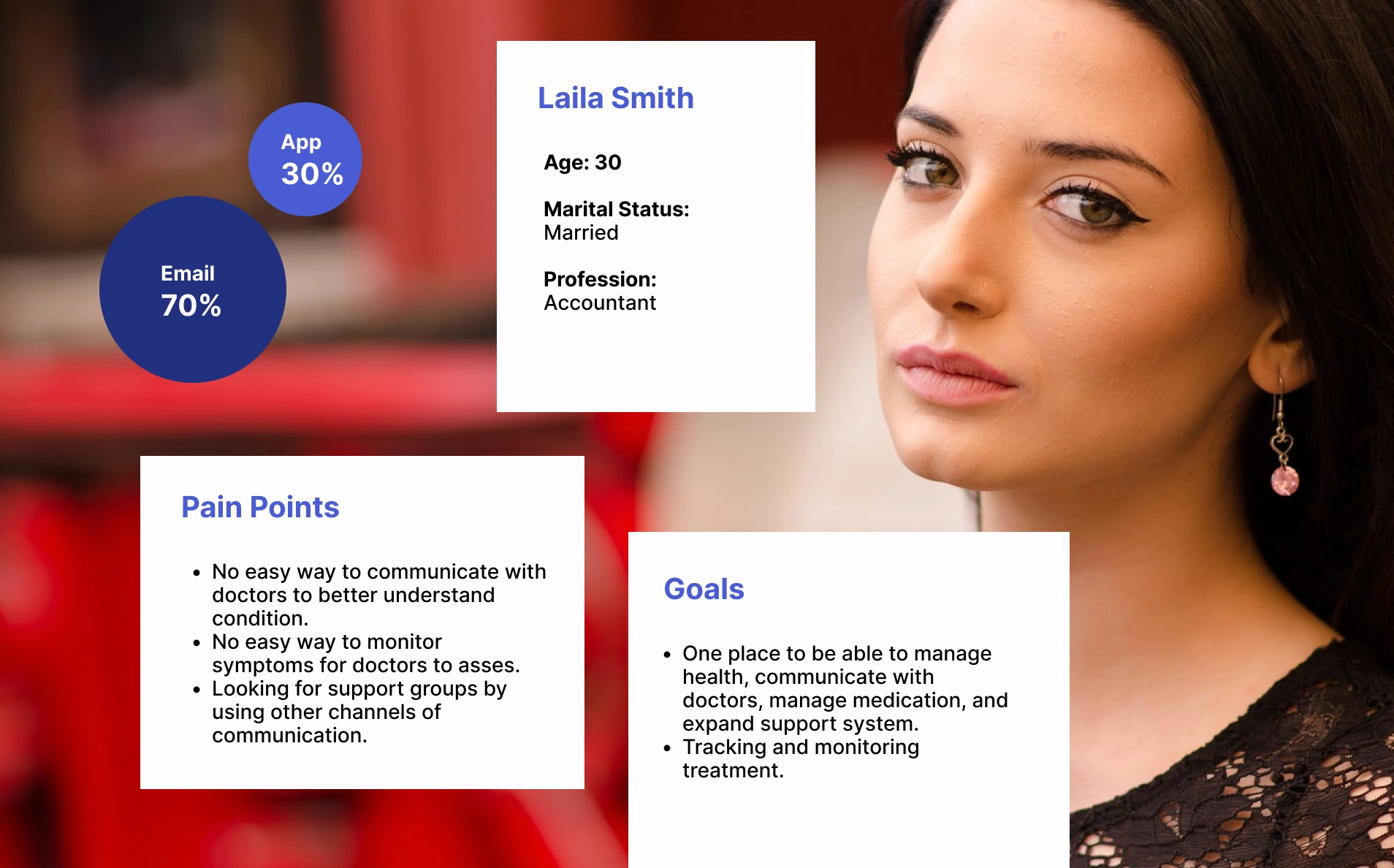
Personas played a role in helping the team better understand patients and their unique needs when tracking symptoms and treatments. One of the first personas the team looked into was the persona of a patient, analyzing their specific scenario when looking for relevant information about their condition and wanting to track their unique conditions and symptoms. This approach illuminated the challenges patients face, such as managing complex treatment regimens or tracking fluctuating symptoms, and highlighted the emotional and practical considerations that influence their behaviors.
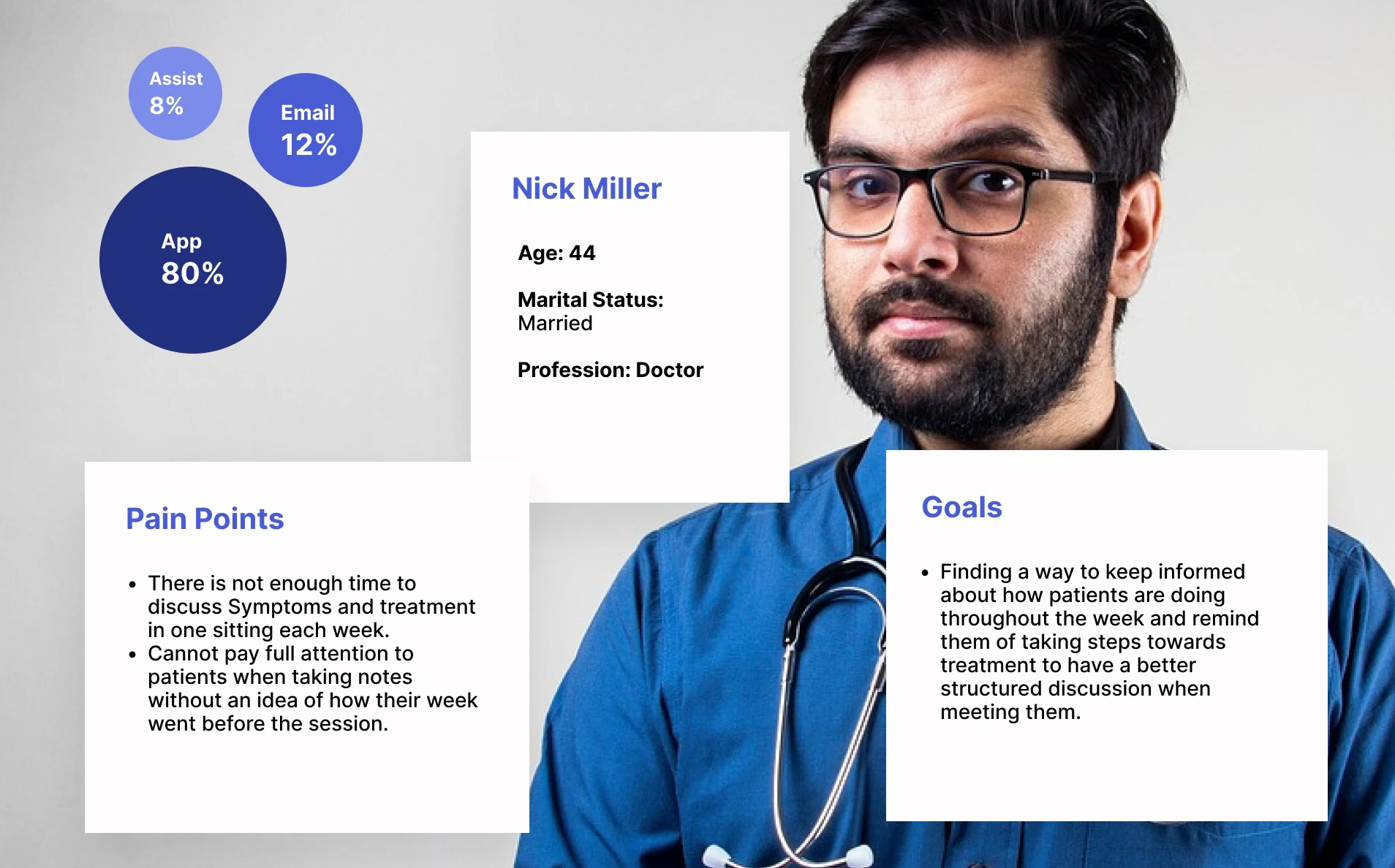
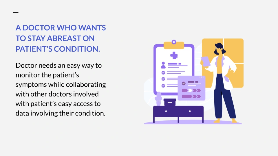
Another type of persona was that of a doctor when treating a patient and wanting to keep track of their progress and treatment plan. This persona highlighted factors like time constraints, the need for accurate and efficient data entry, and the importance of clear, actionable insights. By understanding these needs, the team could design solutions that would enable doctors to have a better insight into the progress patients make and how their symptoms change throughout their treatment. Ultimately, this approach ensured that the tools developed were tailored to support doctors in providing transparent communication with patients.
User Stories
User stories helped to brainstorm technical solutions that would truly benefit users. By framing each requirement from the perspective of the user—such as "As a doctor, I need to quickly access patient histories so I can make informed decisions," the team was able to stay focused on real-world needs and scenarios.
This approach encouraged collaboration and creativity, allowing the team to generate solutions that were not only technically feasible but also meaningful and practical for users. User stories inspired more intuitive ideas by allowing the team to put themselves in the user's shoes and view their scenario from different angles. Our team brainstormed some of the most common user stories to set a context for the Apprie application and the pain points we wanted to address. Here are some user stories we brainstormed and solutions we came up with, and their possible solutions:
Monitoring Symptoms
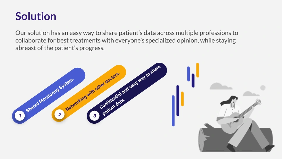
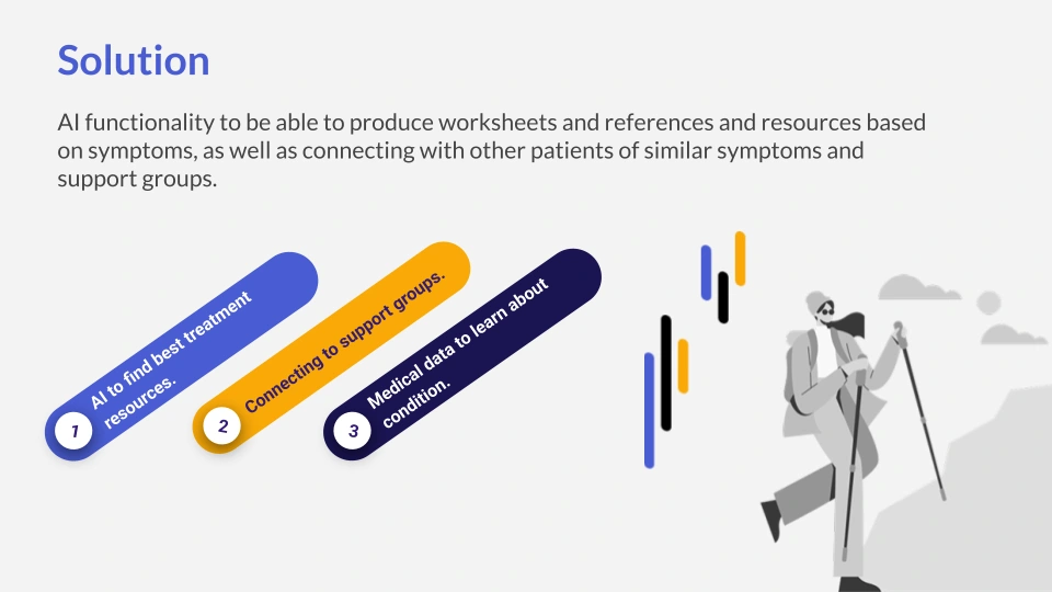
Monitoring symptoms with doctor access to evaluate progress and make suggestions for treatment. This is also a way to educate patients about their symptoms using AI resources and symptom analysis with visuals of the anatomy and systems affected.
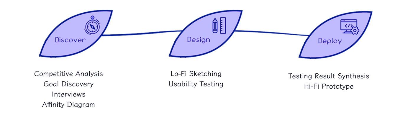
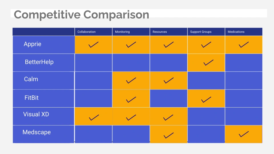
Competitive Analysis
The goal of the competitive analysis was to evaluate the impact of existing apps in the industry to decide and determine if they meet users' expectations for finding information relevant to this topic.
Ideation
For ideation, we did several studies.
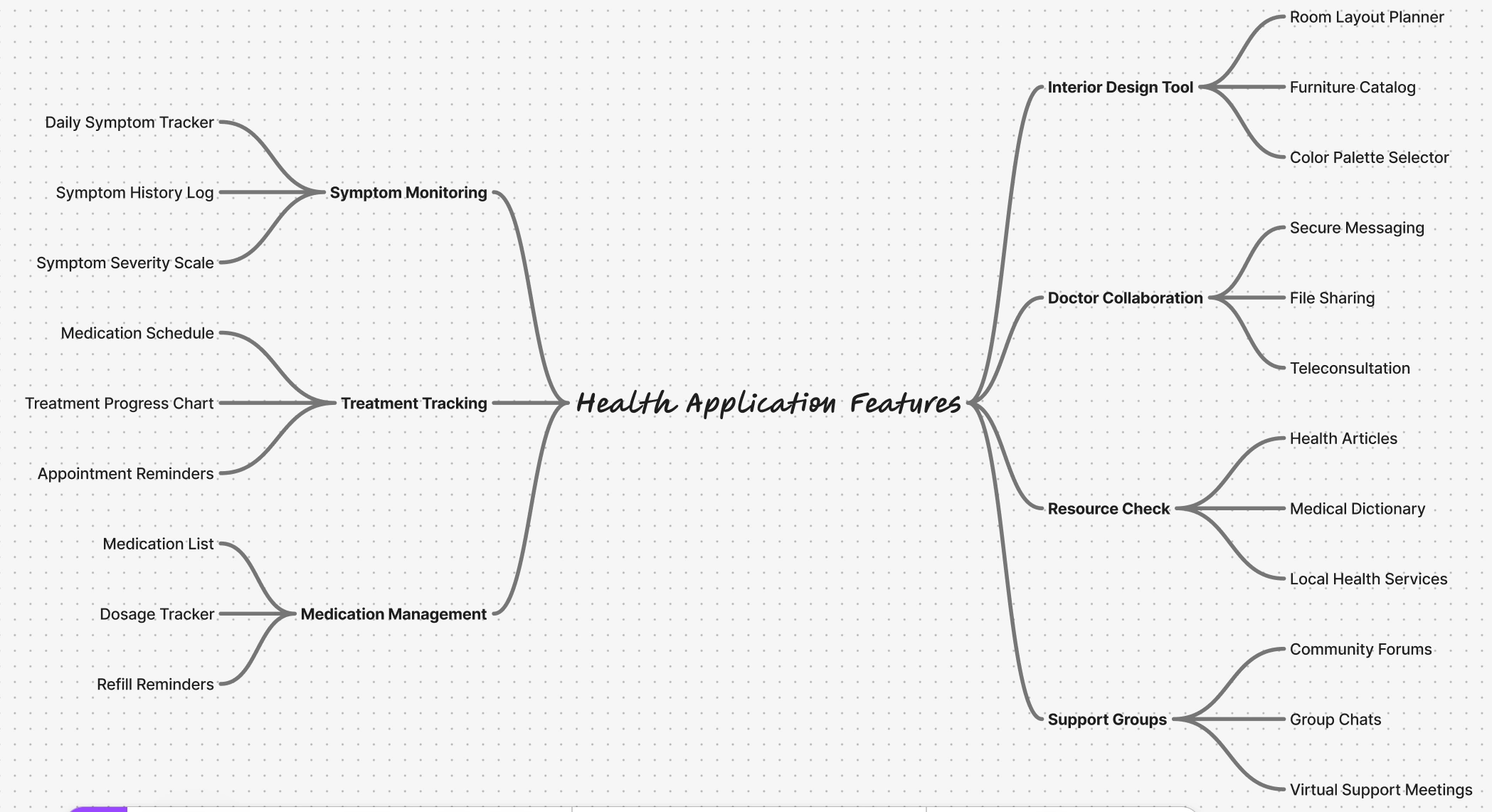
We started with mind mapping to understand the thinking process when using the four main features of the app - treatment monitoring, symptom monitoring, designing their space, medication management, looking for resources, and support groups. It gave us a good idea of the user's mindset and questions they may have.
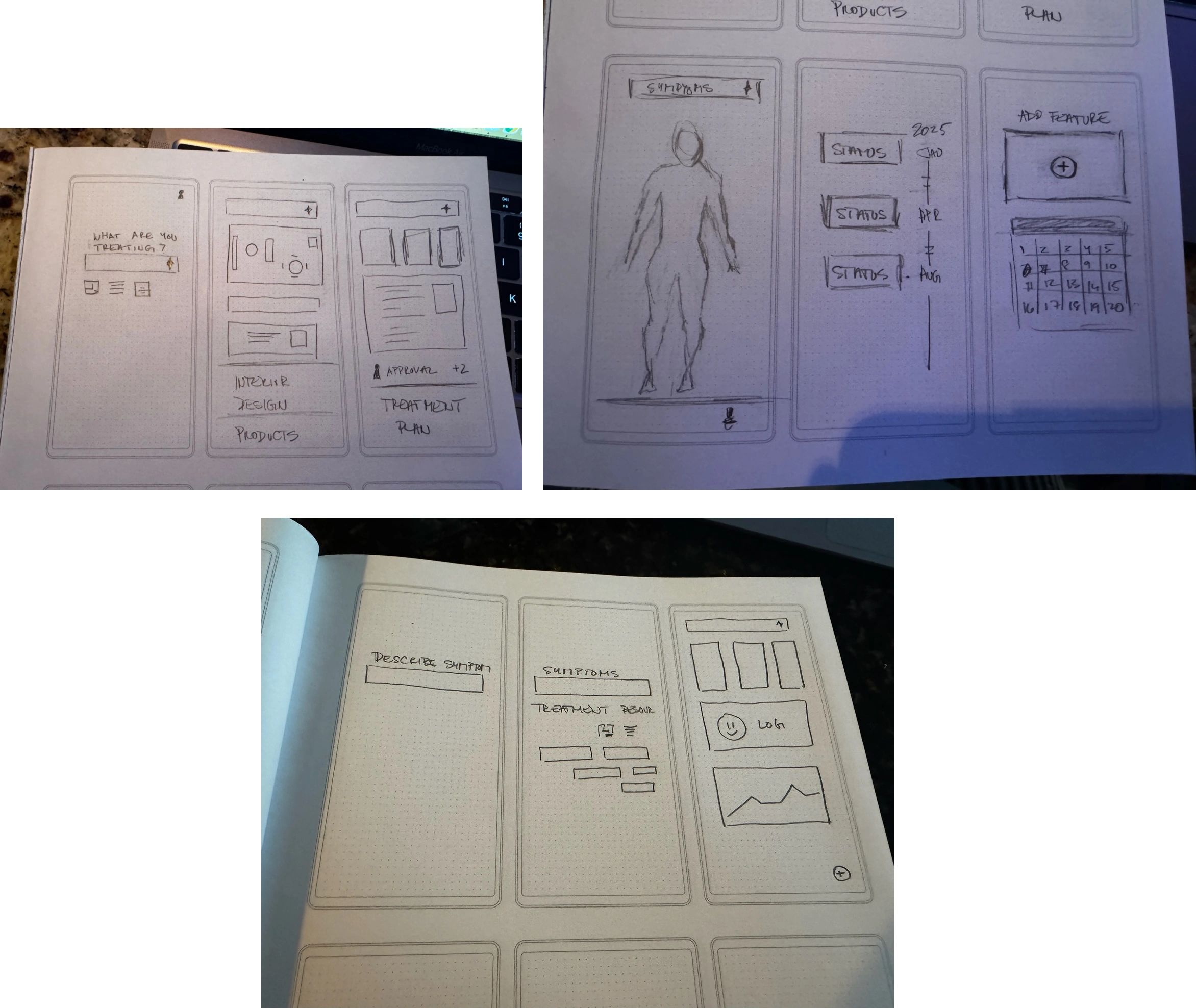
Next was sketching up ideas. I used sketching as a dynamic tool to ideate and produce layouts for the main mobile components of the app. By using sketches as a starting point, we were able to align on key design elements early in the process, ensuring that the final components were user-friendly and met the app’s core objectives.
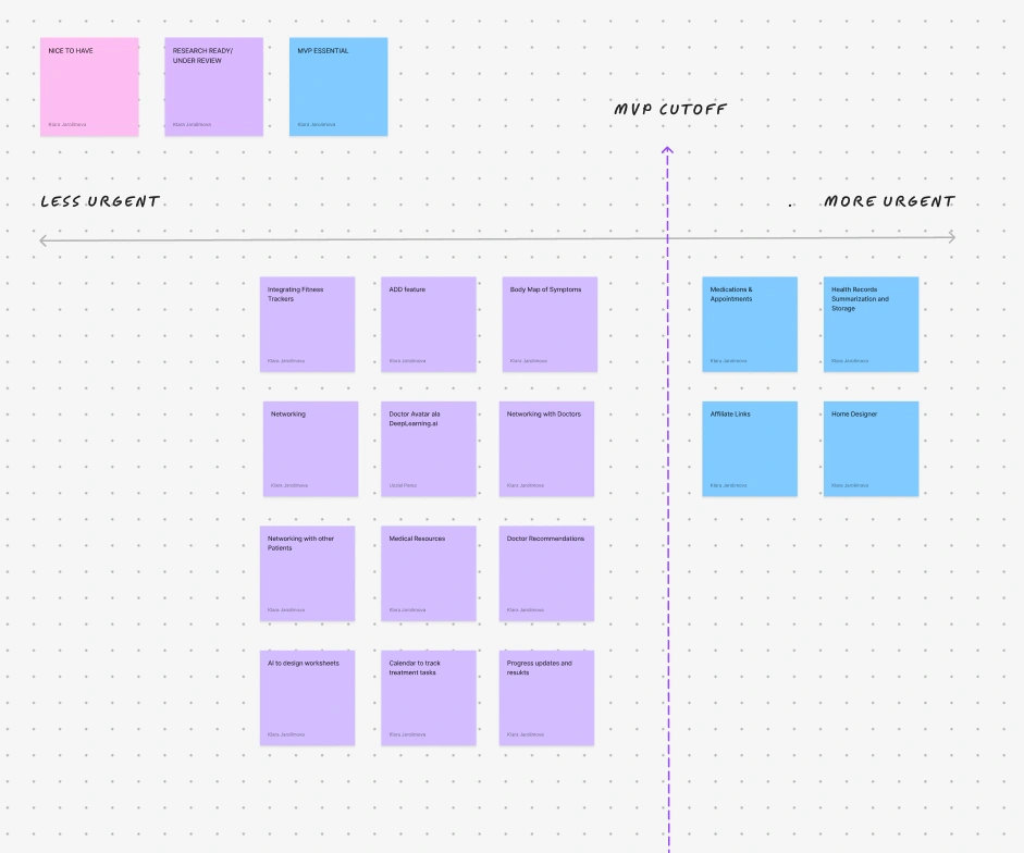
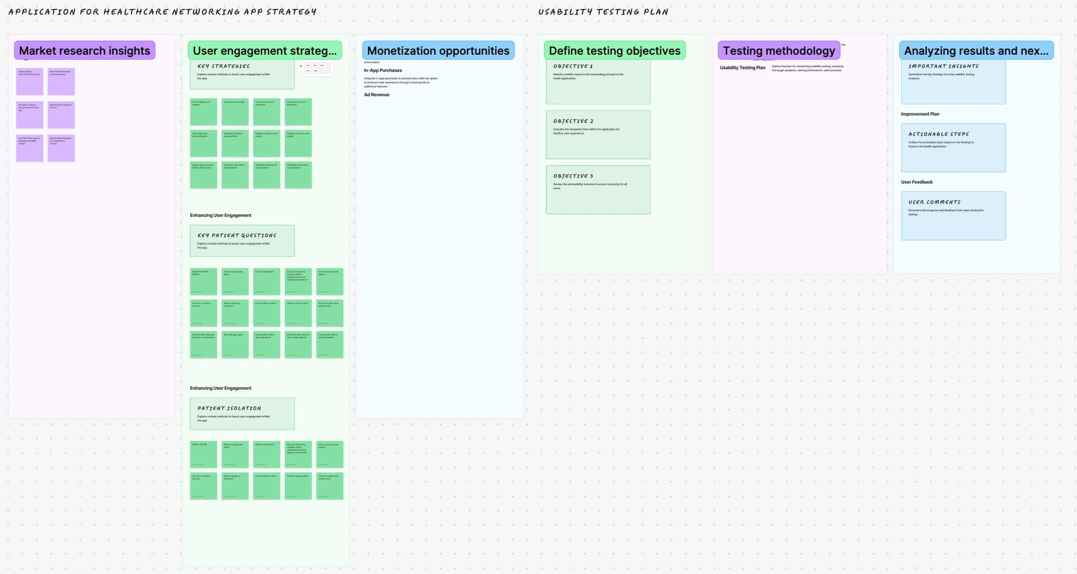
The affinity diagram was a valuable tool for categorizing and prioritizing features by organizing ideas and insights into a scale of most to least important based on user stories and feedback on the personas, and categorizing the most important into an MVP group. This process helped highlight which features were most important, based on user needs and the overall goals of the project. By grouping related features and understanding their interdependencies, the team could prioritize those that would have the greatest impact, ensuring that the most critical aspects of the solution were addressed first. The affinity diagram provided clarity and alignment, helping the team make informed decisions about which features to develop and implement.
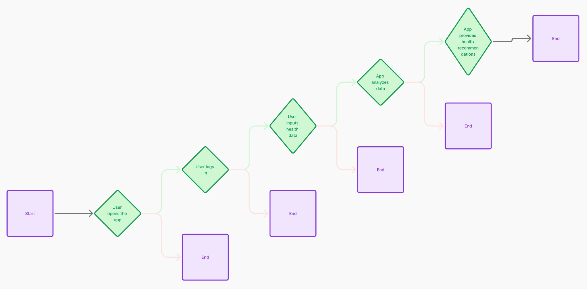
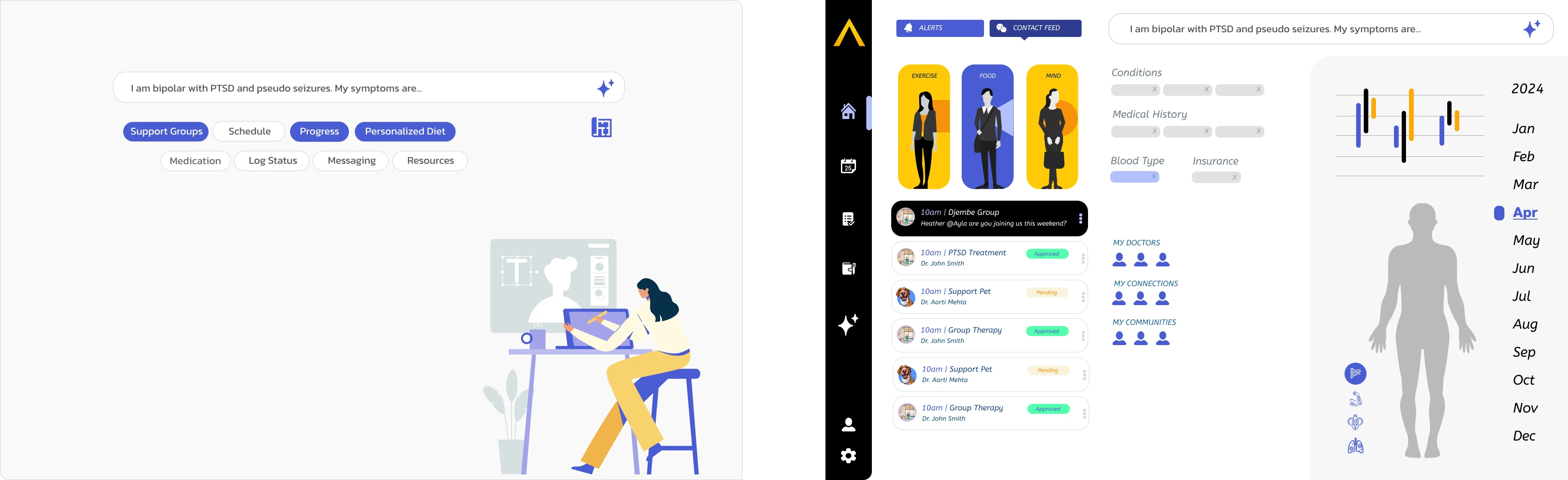
User flow gave us an idea of how the app would work and how the users would complete tasks using the steps.
Usability Testing and Interviews
Usability testing provided invaluable insight into what worked, what didn’t, and why. By observing real users interact with the solution, the team was able to pinpoint specific areas where users struggled or found features unintuitive. This hands-on feedback revealed which solutions were well-received and which ones fell short, shedding light on the underlying reasons behind user preferences or challenges. Whether it was a confusing interface, a feature that was hard to access, or a workflow that didn’t align with user expectations.
Back to Sketching and Ideating
Through usability testing, we discovered that simplifying complex data was crucial for designing an effective experience for patients who want to be informed about their condition and manage their treatments.
During testing, we observed that patients were often feeling overwhelmed or confused by the volume of data presented. However, when we streamlined and simplified the information—highlighting key metrics, using clear visuals, and breaking down content into digestible sections—patients were more confident and better able to understand their health status. This approach not only made it easier for them to track their condition but also empowered them to take a more active role in managing their treatments. Usability testing reinforced that clarity and simplicity were key to creating a user-friendly, patient-centered design.
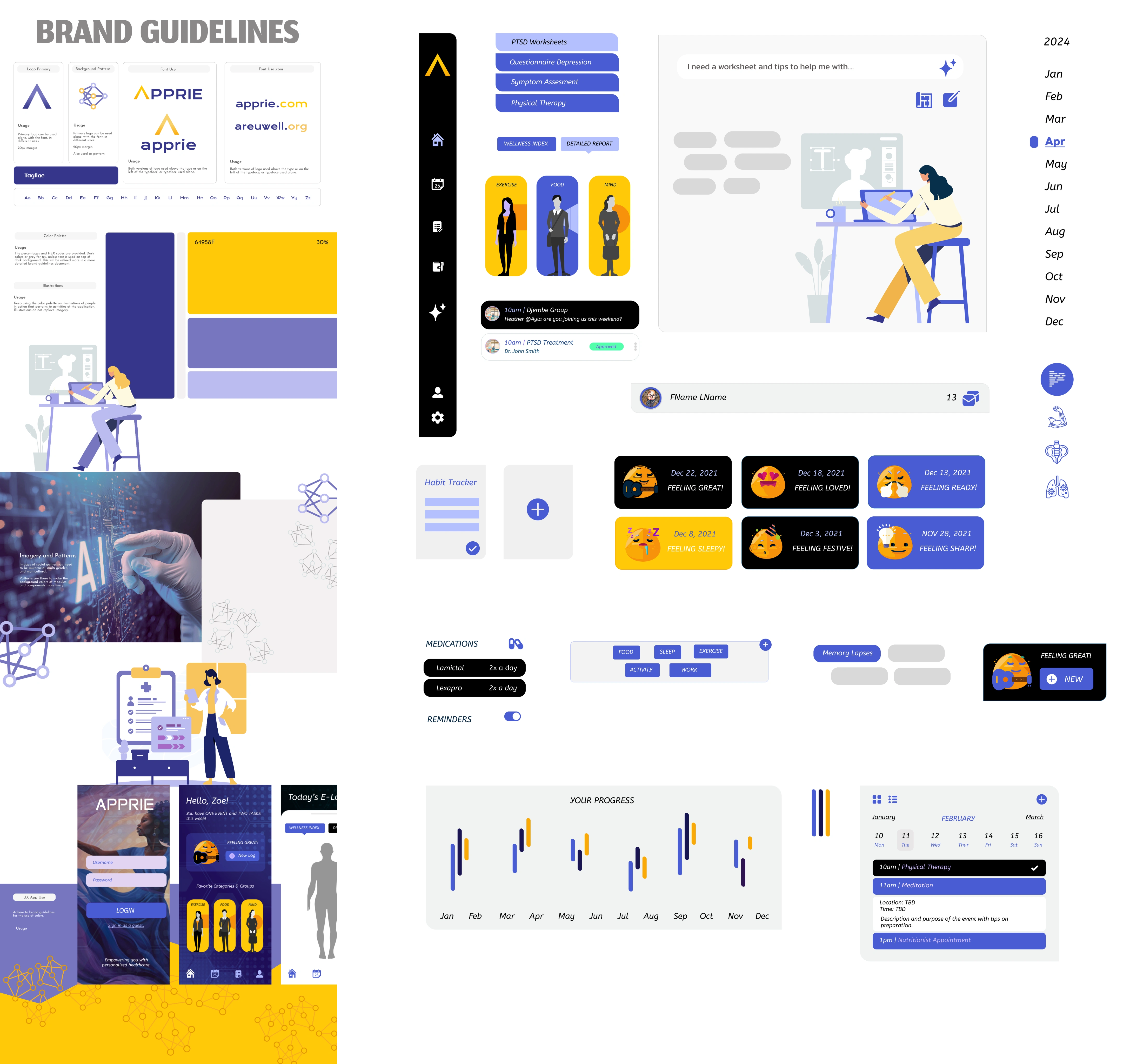
Branding
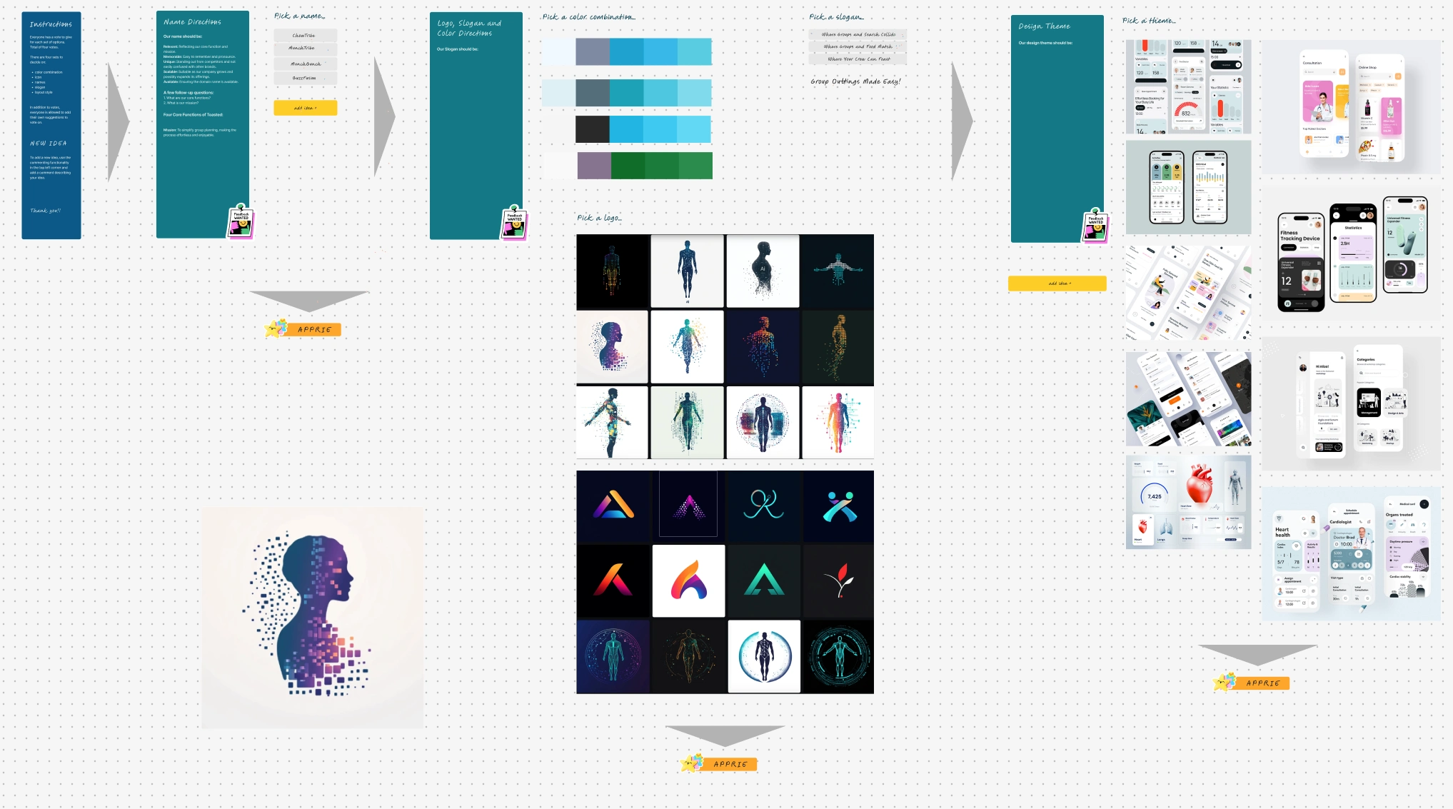
For branding guidelines, we brainstormed and ideated on several options for logo, typography, aesthetic patterns and brand story, and language.
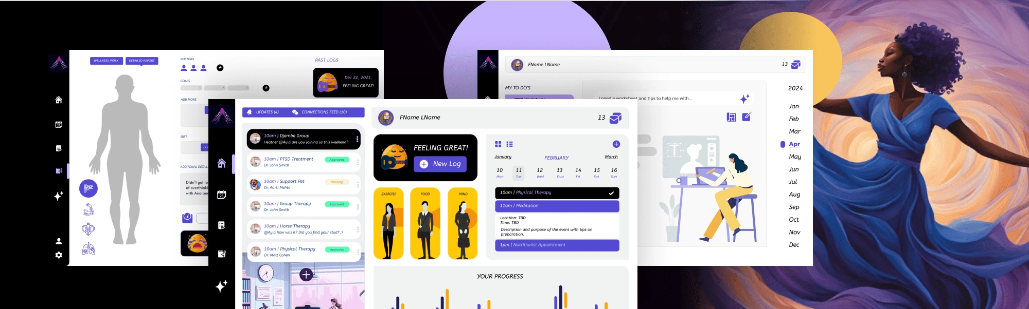
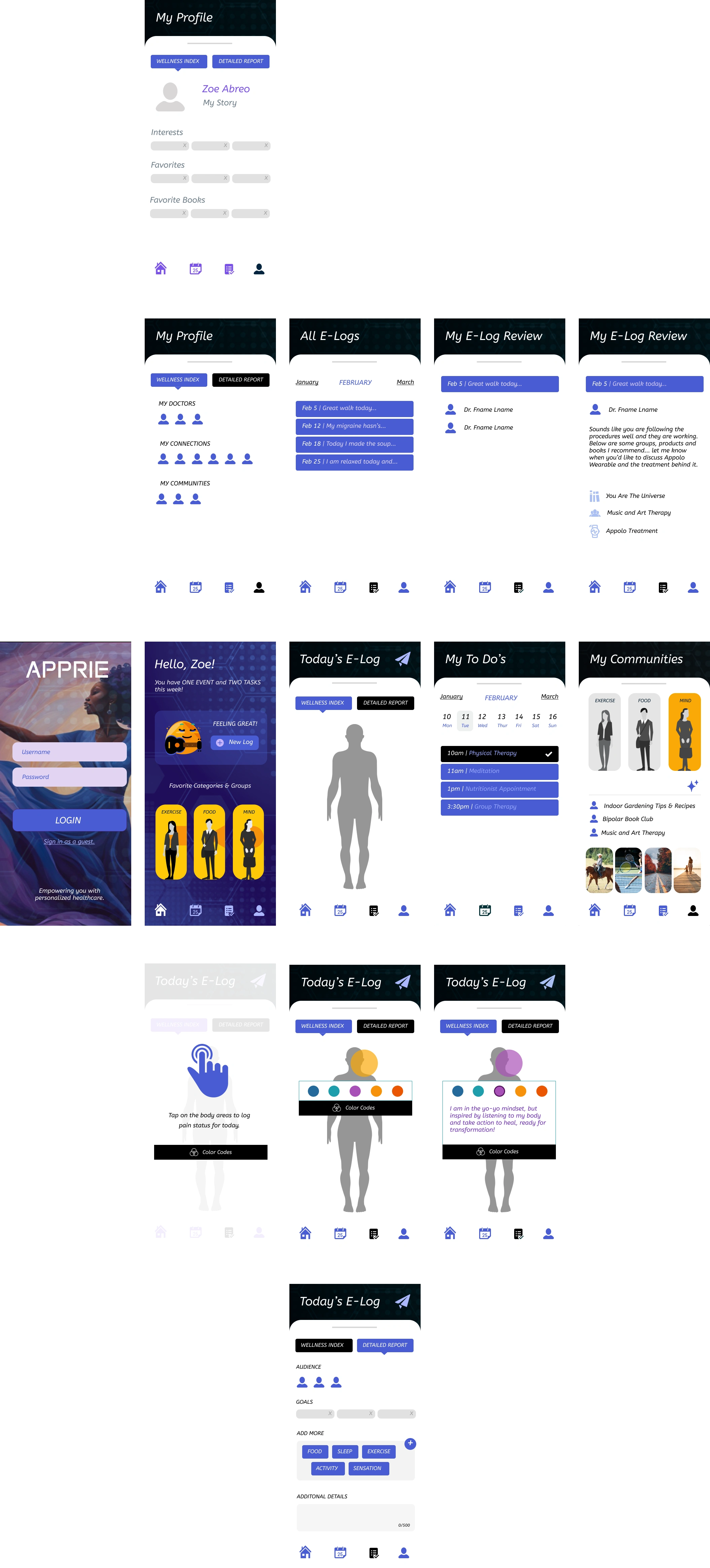
Hi Fidelity Prototype
Hi-fidelity prototype testing plays a crucial role in the UX design process by providing designers with a clear and interactive representation of the final product. During our testing, we revisited the user flow and layout based on feedback. Below id the first version of the hi-fi prototype, followed by the edited version.
Hi Fidelity Prototype before testing
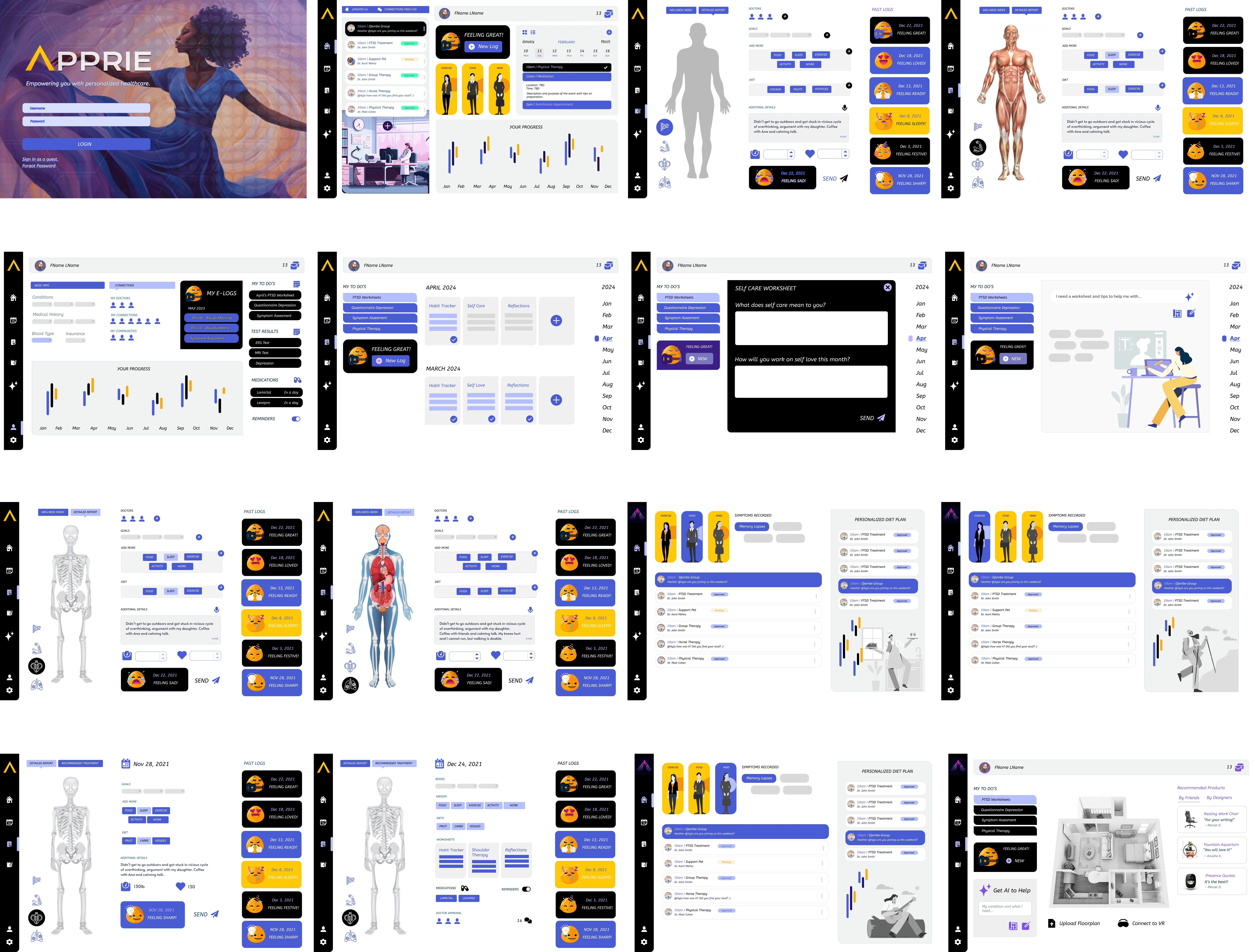
Simplifying the Dashboard Design
Usability testing revealed key insights into the user experience challenges faced with the original dashboard design. Users struggled with navigating a cluttered interface and expressed frustration over unnecessary complexity in features that were not essential to their daily tasks. This feedback highlighted the need to simplify the dashboard, making it more intuitive and user-friendly. Additionally, a functionality to give them control over its layout, wishing to tailor the interface to suit their individual needs and preferences, became a sought-after feature. By incorporating these findings, we aim to create a more streamlined, customizable dashboard that empowers users to personalize their experience, ultimately improving both usability and satisfaction.
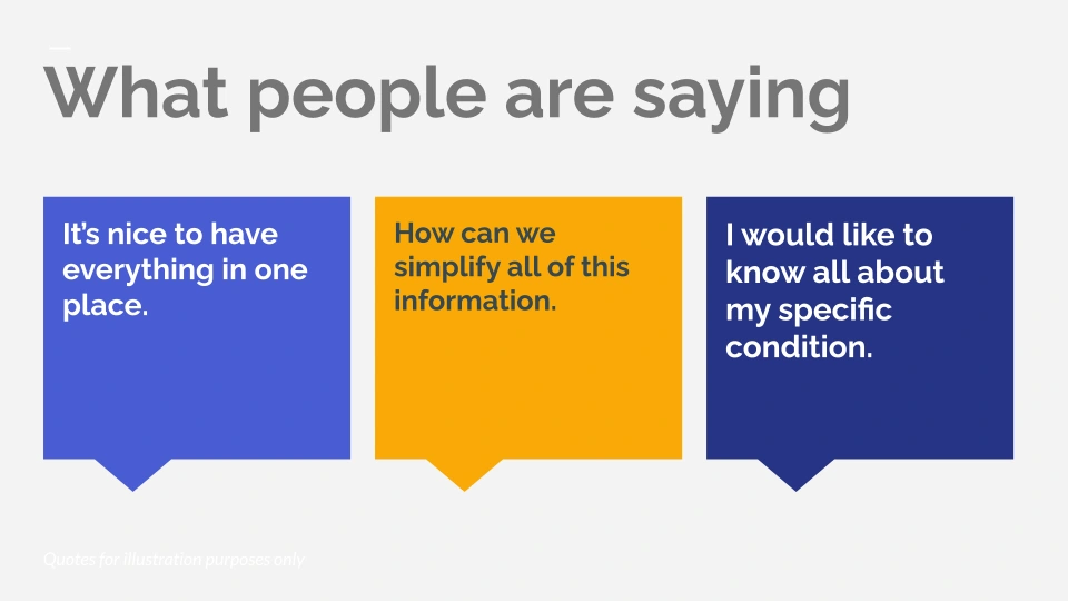
Key Takeaways
“If I am dealing with a chronic illness or a condition that is unique to me, I want to know as much as I can, but not get overwhelmed.”
“I could see this as a good tool for parents as well, in managing a child's health while getting connected to and consulting their physician regularly.”
“It's a nice way to consolidate discussion about health into a visual template of a dashboard with the information the patient wants to regularly check, including support groups, resources, nutrition, medication, and doctors.”
Simplifying medical terms is crucial when managing a user’s health, as it increases understanding, engagement, and trust.
Patients find the application more trustworthy if they can customize their dashboards, reducing anxiety and saving time.
Like this project
Posted Jan 15, 2025
I worked with participants in the 2021 humanitarian hackathon to design a tool with a scientific approach to combining sensory information and metrics.
Likes
0
Views
12