Freelance UX Designers in Hyderabad
Sign Up
Post a job
Sign Up
Log In
Filters
2
Projects
People
Sai Satvik
pro
Hyderabad, India
Framer Expert, Crafting Standout Webdesigns.
$25k+
Earned
16x
Hired
4.5
Rating
62
Followers
expert
Follow
Message
Framer Expert, Crafting Standout Webdesigns.
0
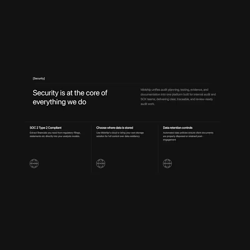
Redesign and framer development of Midship.ai
0
182
0
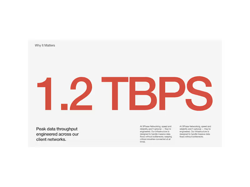
Redesign and framer development of 3phasenetworking
0
22
1
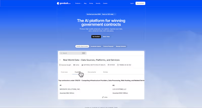
GovDash – Streamlining Governance Through Seamless Development
1
46
2
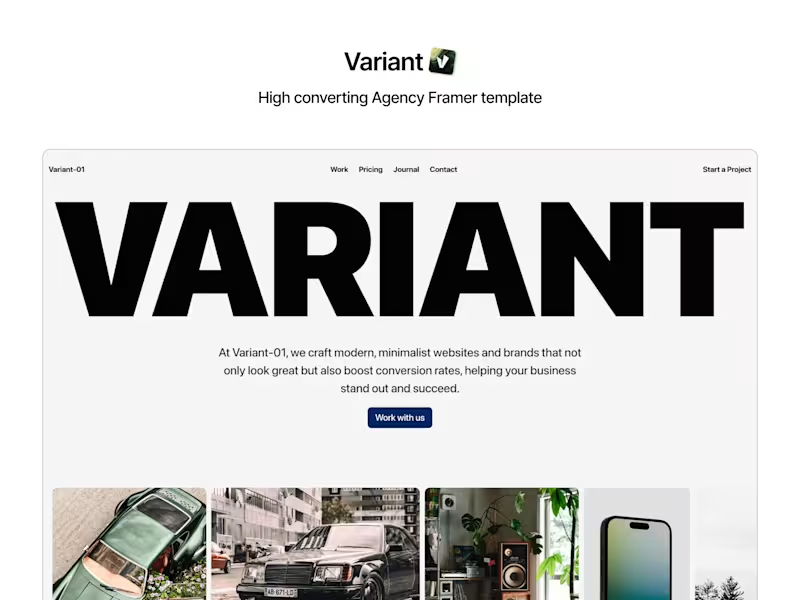
VARIANT - Web Design Agency
2
20
UX Designer
(2)
Follow
Message
Abid Majid
Hyderabad, India
Solving problems through Design
$10k+
Earned
8x
Hired
5.0
Rating
7
Followers
Follow
Message
Solving problems through Design
0
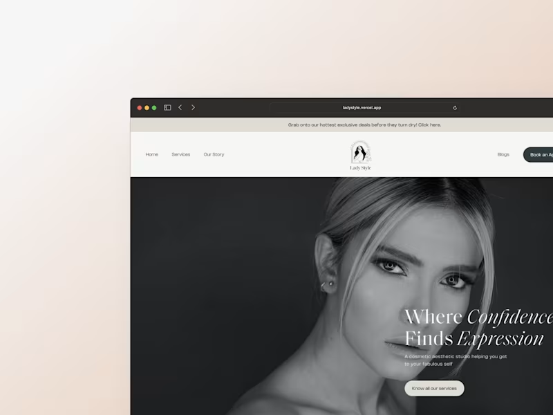
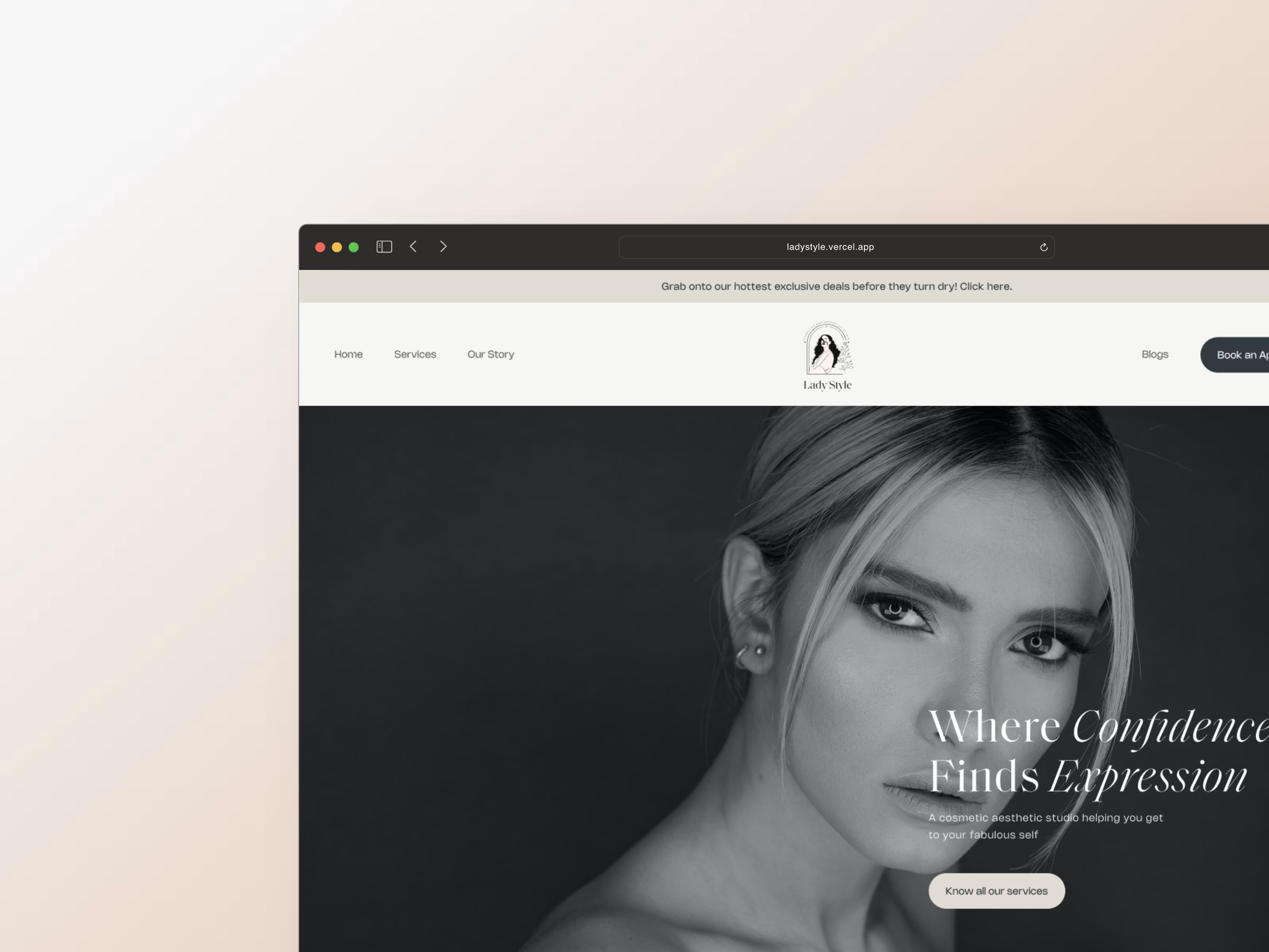
LadyStyle - A Cosmetic and Aesthetic Studio
0
14
0
Suprlance- Future of work
0
13
0
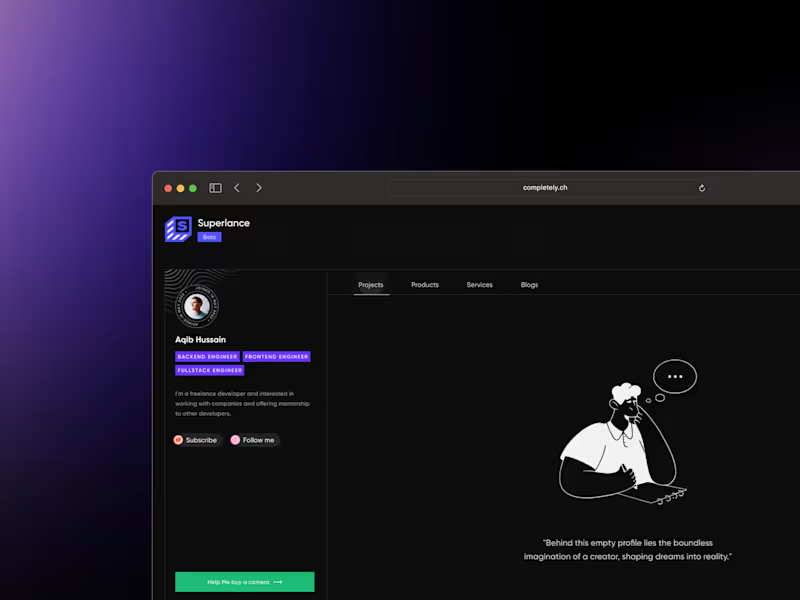
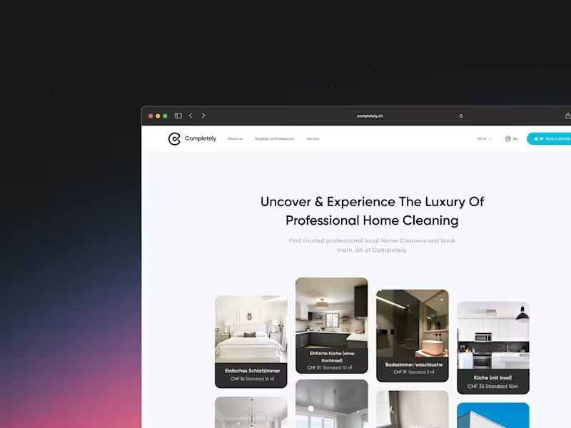
Completely - A Home Services Platform
0
13
View more →
UX Designer
(3)
Follow
Message
Shubham Sharma
Hyderabad, India
Branding, Motion & Product Design For Startups & Brands
139
Followers
expert
Expert
Follow
Message
Branding, Motion & Product Design For Startups & Brands
2
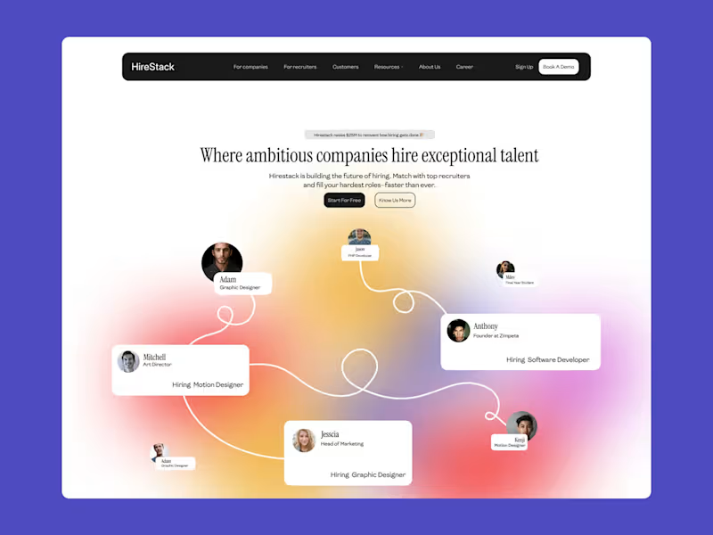
HireStack - Hiring SaaS Startup Website Design
2
4
0
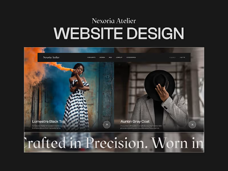
Nexoria Atelier : Brand Store Experience Design
0
4
2
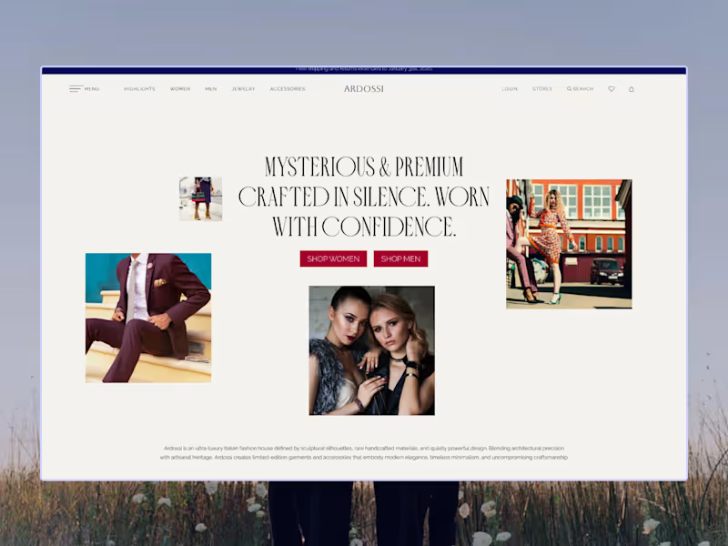
UX Design for ARDOSSI : Luxury Fashion Brand
2
8
1
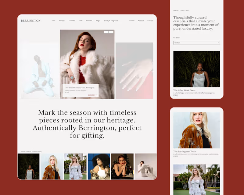
Berrington - UX Design (Website) For Luxury Brand
1
6
UX Designer
(6)
Follow
Message
Pooja Junnuri
Hyderabad, India
UX Designer with 9+ YOE
5.0
Rating
2
Followers
Follow
Message
UX Designer with 9+ YOE
0
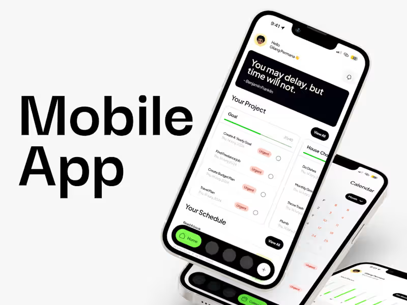
Mobile App Design
0
30
0
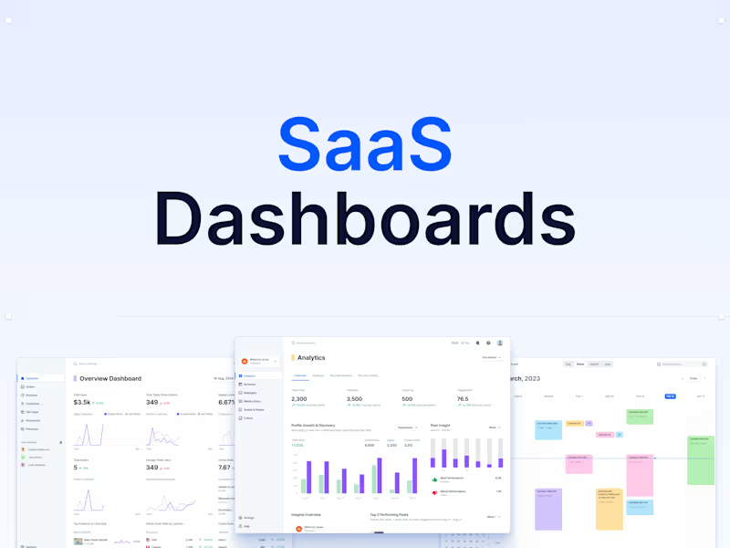
Dashboard UI & UX
0
25
0
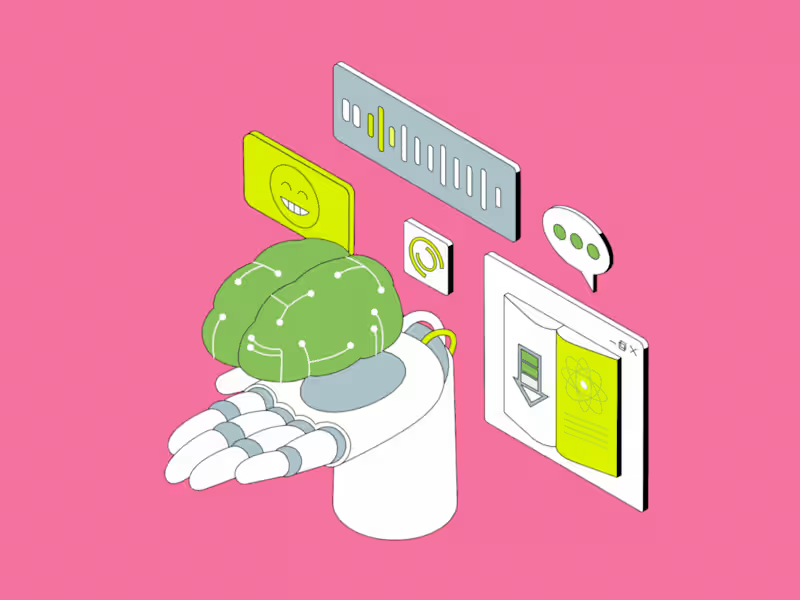
AI Coaching Simulator
0
39
0
Unifying Forms Ecosystem
0
31
UX Designer
(4)
Follow
Message
Upslide Design Studio
pro
Hyderabad, India
Increase revenue, sales & savings by improving UX Design
5.0
Rating
31
Followers
Follow
Message
Increase revenue, sales & savings by improving UX Design
2
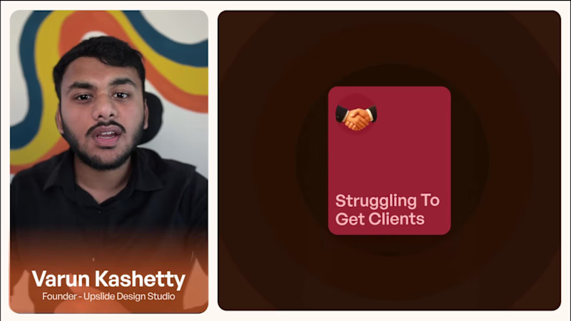
We made a video explaining how we optimise UI UX of legacy SaaS and enterprise softwares Check it out (https://contra.com/p/XkXQQsQm-indie-living-brand-identity-and-logo-design)
2
70
0
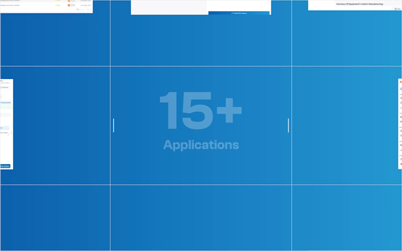
In 1.5 years, we redesigned 19 enterprise pharma apps for Audree Infotech. It began with EBRMS 1600+ screens simplified to 400, faster and easier to use. Today, adoption has grown from 4 facilities in 1 country to 36 across 7 countries. Not a facelift a full UX transformation. That’s what we mean by leading change with design. check out full case study : https://upslidedesignstudio.com/audree
0
110
2
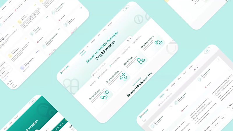
Drug Detail - Website Redesign
2
8
6
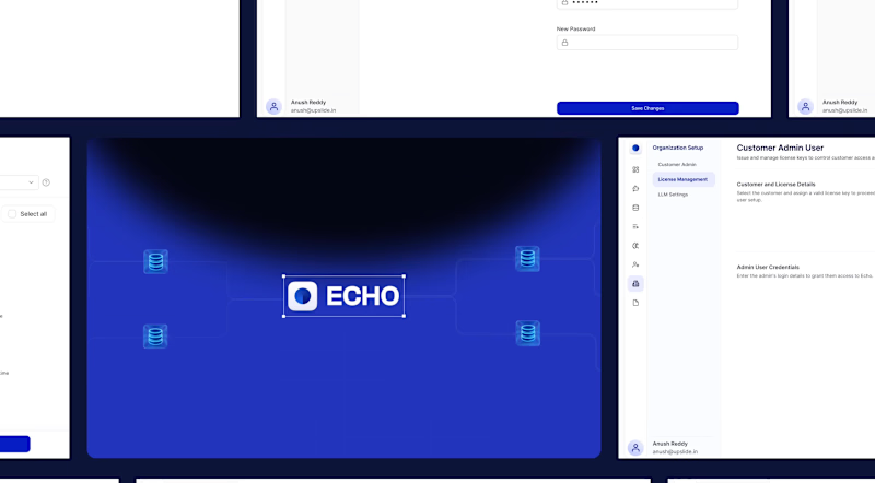
ECHO - AI Chatbot for Database.
6
21
UX Designer
(6)
Follow
Message
Zywra Studio
Hyderabad, India
Crafting premium UI/UX and web experiences for brands.
6
Followers
Follow
Message
Crafting premium UI/UX and web experiences for brands.
1
Modern CRM Dashboard UI Design in Figma | Sales Management | SaaS Dashboard by Zywra Studio (https://zywra.com/) Designed a clean, modern, and intuitive CRM Dashboard UI in Figma focused on helping sales teams manage leads, track customer interactions, monitor campaign performance, and improve conversion rates from a single dashboard. ✨ Project Highlights: Modern CRM Dashboard UI, Sales Pipeline Management, Lead Tracking & Customer Profiles, Campaign Analytics, SaaS Web Application, Dashboard Design, Minimal & Clean UI, Auto Layout & Components, Responsive Dashboard Concept, Designed in Figma Designed by Zywra Studio (https://zywra.com/).
1
8
1
Modern Invoice Dashboard UI Design | Finora Finance Dashboard | SaaS Web App UI by Zywra Studio (https://zywra.com/) A modern Finance Dashboard UI designed in Figma for managing invoices, customer accounts, subscriptions, payments, and financial reports in one intuitive workspace. Designed by Zywra Studio. (https://zywra.com/) ✨ Features: Invoice Management Dashboard, Customer Profile & Account Overview, Payment Tracking, Subscription Management, Finance Analytics, Clean Dashboard UI, Modern SaaS Design,Figma UI Design, UX-Focused Layout, Responsive Dashboard Concept Follow Zywra Studio (https://zywra.com/) for more UI/UX design inspiration, dashboard concepts, mobile apps, landing pages, and web application designs.
1
84
2
Modern Finance Dashboard UI Design | Personal Finance & Fintech Dashboard | Zywra Studio (https://zywra.com/) Designed a clean, modern, and intuitive Finance Dashboard UI focused on helping users manage personal finances, monitor income and expenses, track budgets, analyze spending, and access banking insights from one centralized interface. by Zywra Studio (https://zywra.com/) Services: UI/UX Design, Finance Dashboard Design, Fintech Product Design, SaaS Dashboard Design, Admin Panel Design, Personal Finance App Design, Data Visualization, Responsive Web Application Design Tools Used: Figma, Adobe Illustrator Category: Fintech • Personal Finance • Banking • SaaS • Dashboard • Admin Panel
2
94
2
AI Call Center Dashboard UI Design | Customer Support Analytics Dashboard | Zywra Studio Designed a clean, modern, and data-driven AI Call Center Dashboard UI focused on helping businesses monitor customer support performance, call analytics, agent productivity, response times, AI insights, and customer satisfaction from one centralized interface. Built with intuitive data visualization, real-time analytics, and a scalable dashboard system to improve operational efficiency and customer service performance. Designed by Zywra Studio. Services: UI/UX Design, AI Dashboard Design, Call Center Dashboard, SaaS Dashboard Design, Admin Panel Design, Data Visualization, Dashboard UX, Responsive Web App Design Tools Used: Figma, Adobe Illustrator Category: AI • Call Center • Customer Support • SaaS • Dashboard • Admin Panel
2
86
UX Designer
(16)
Follow
Message
kota Manoj Kumar
Hyderabad, India
I build @framer templates ,websites and responsive sites
New to Contra
Follow
Message
I build @framer templates ,websites and responsive sites
1
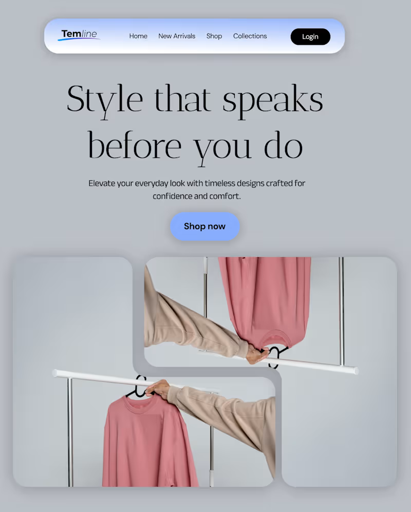
Temline brings timeless style and modern comfort together. Discover everyday essentials designed to elevate your look with effortless confidence and clean, refined aesthetics.
1
128
1
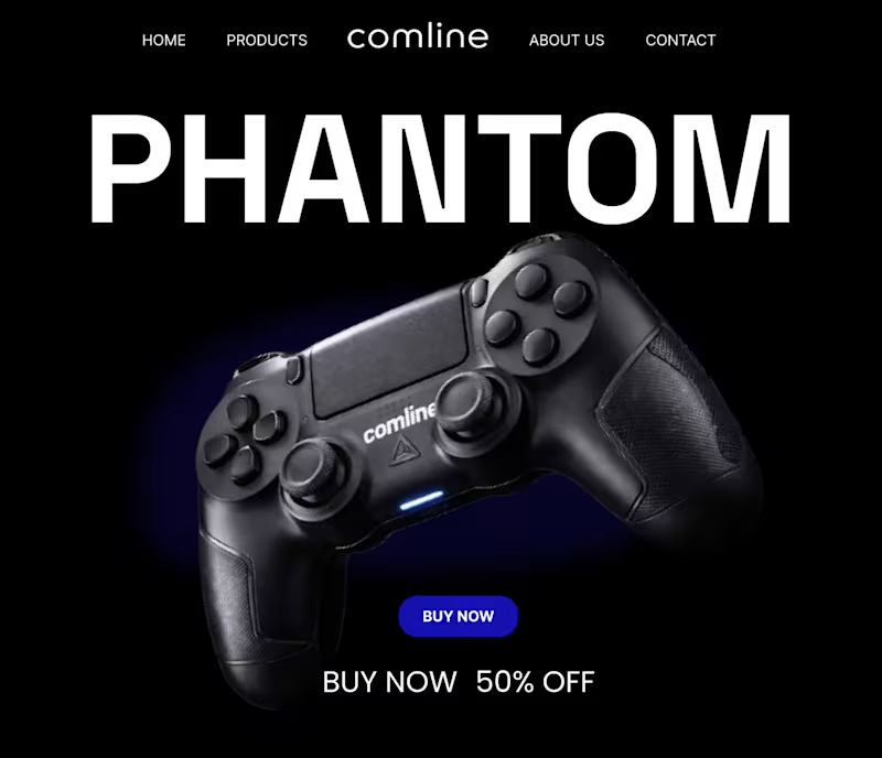
A dark, minimal hero section concept designed for a modern gaming brand. The layout focuses on bold typography, strong product presence, and a sleek black aesthetic to highlight the Comline Phantom controller.
1
138
3
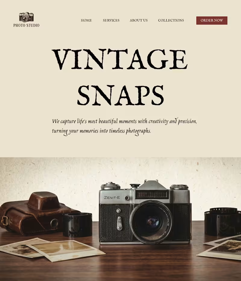
It’s all in the details. A design isn’t finished when there’s nothing left to add, but when there’s nothing left to take away. I’ve been refining this landing page for a vintage photo studio, moving from a cluttered layout to a cleaner, more intentional UI. By simplifying the logo and introducing a ghosted hero overlay, I’ve created a sense of depth without sacrificing that "premium" feel. The Goal: Minimalist, sophisticated, and timeless. 🎞️✨
2
3
229
1
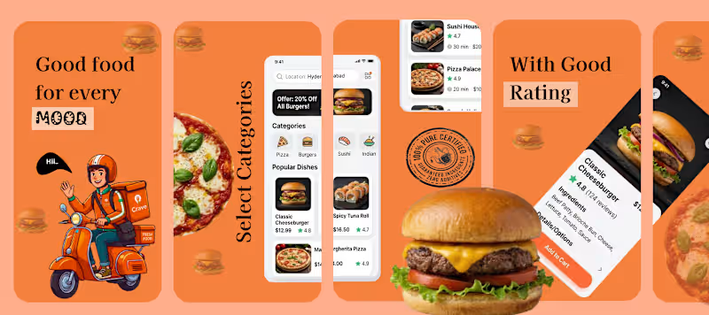
🍔 Food Delivery App UI Design Concept Excited to share a recent UI/UX design concept for a modern food delivery mobile application. The goal of this project was to create a clean, engaging, and user-friendly experience that helps users quickly discover and order their favorite meals. The design focuses on: • Simple and intuitive navigation • Clear food categories for easy browsing • Visually appealing food cards with ratings and pricing • A vibrant colour palette to create an energetic food ordering experience This concept highlights how thoughtful UI design can make food ordering faster, easier, and more enjoyable for users. Tools used: Figma Focus: Mobile UI Design | Food Delivery Experience | User-Friendly Interface
1
171
UX Designer
(7)
Follow
Message
Siraj Dhanani
pro
Hyderabad, India
Product Designer & Framer developer for SaaS & AI companies
91
Followers
Follow
Message
Product Designer & Framer developer for SaaS & AI companies
2
We designed the ViewMetrics “Data Sources” screen to make analytics setup feel effortless. The goal was to simplify a typically complex process: connecting, visualizing, and activating data. A clean layout, calm whitespace, and guided hierarchy help users focus on the main action: “Add Data Source.” The playful illustration reduces friction, making the experience approachable for first-time users. Key states like “Free Plan Limit” and “Upgrade” are placed intuitively for visibility without distraction. The result is an onboarding view that feels light, friendly, and functionally clear helping teams connect data faster and unlock insights sooner.
2
2
114
3
We designed Zocket’s landing page to make AI feel empowering, not overwhelming. The goal was simple: clarity, credibility, and conversion. The hero section instantly communicates the promise: “Design, Launch, and Optimise Google Ads,” supported by Product Hunt ratings and trusted brand logos. The flow guides users through value, proof, and action from the AI Creative Studio section to testimonials and integrations with Meta, Google, and Amazon. The clean layout, calming gradients, and standout CTAs like “Try for Free” make the experience effortless. A landing page built to convert by speaking to marketers who want results not explanations.
1
3
93
0
Bento Cards
0
93
0
Campaigns Page Design
0
82
UX Designer
(10)
Follow
Message
Explore people