Unifying Forms Ecosystem
Pooja Junnuri
About ACTO
ACTO is a SaaS application tailored for Life Sciences learning platforms. Its goal is to assist biopharmaceutical and medical device companies by providing a comprehensive, multi-channel learning experience for their sales representatives.
Project Deliverables
Stakeholder interviews
User flows
Audit report
Wireframes: Low & Mid-fi
Executive Presentations
Prototypes
Handoff documents
Team involved
UI Designer
UX Writer
UX Researcher
Product Manager
Core Experiences
Gif: Before after pictures of core experiences
Final Testing Results
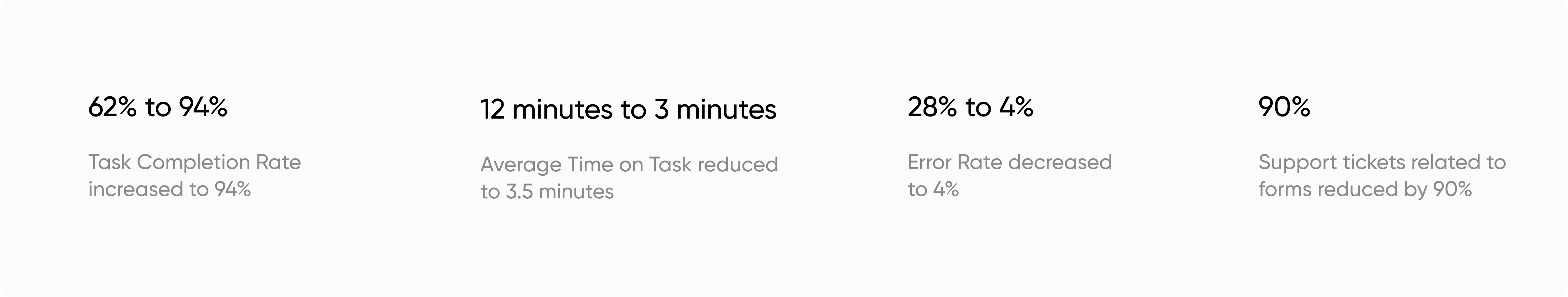
Fig: Final testing results acquired from Pendo analytics & NPS survey
Feature request
In Q2 2023, form submission support tickets surged by 215%, prompting upper management to prioritize form redesign.
⚠️ The Challenge: Unify entire forms ecosystem without hurting existing architecture of the platform.
Target Metrics
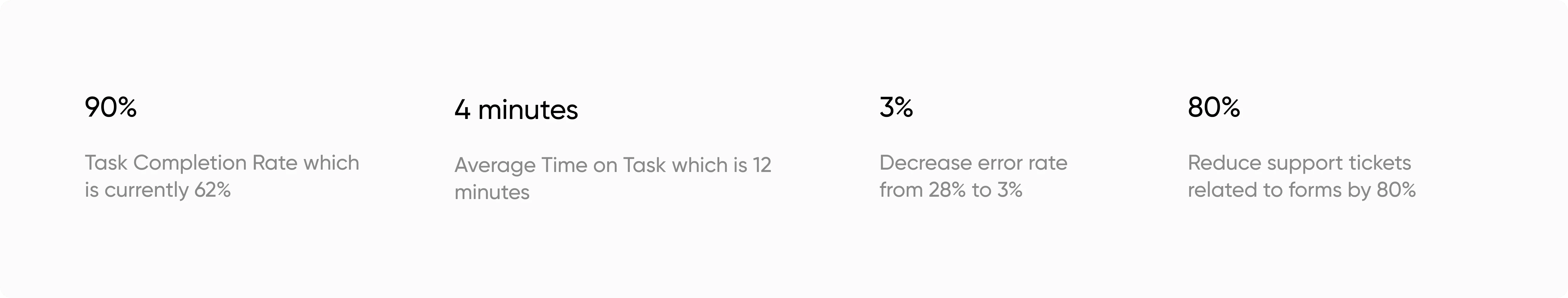
Fig: Goals set by stakeholders
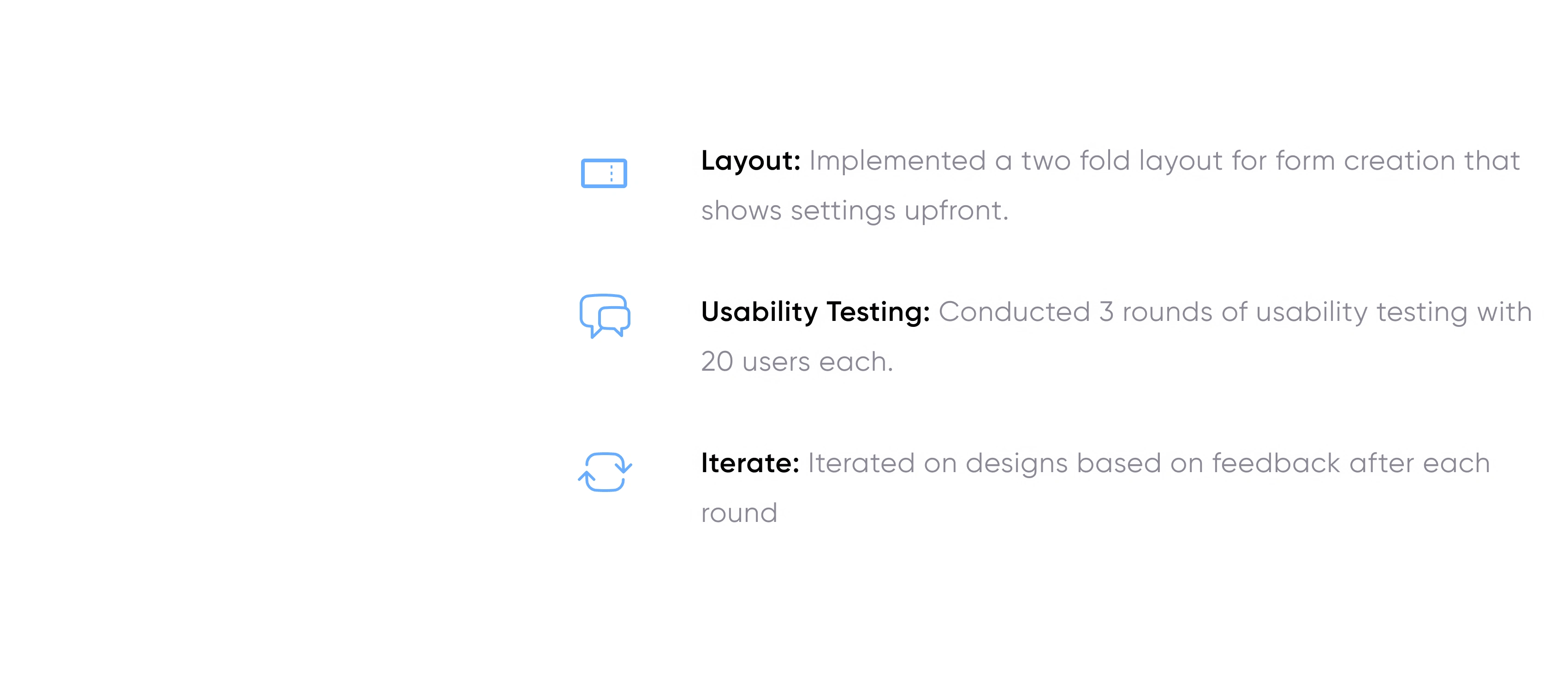
Research Plan
Our research combined quantitative analytics with qualitative insights, revealing specific issues and unexpected patterns. By including stakeholder input and competitive analysis, we ensured alignment with business goals and industry standards.
Primary Research
User Interviews: Conducted 20 in-depth interviews with users across different roles
Usability Testing: Ran 20 moderated sessions on existing forms
Stakeholder Interviews: 15 interviews with internal teams (Sales, Customer Support, Product)
Secondary Research
Competitive Analysis: Evaluated form designs of 10 leading platforms
Literature Review: Analyzed 25 academic papers on form design and user psychology
Pendo Analytics
Feature stickiness was low at 15% (Daily Active Users / Monthly Active Users)
Drop-off rate was high at 68% for forms with more than 10 fields
Average time spent on forms was 8.5 minutes, 70% higher than industry benchmark
Form error rate peaked at 35% for complex, multi-page forms
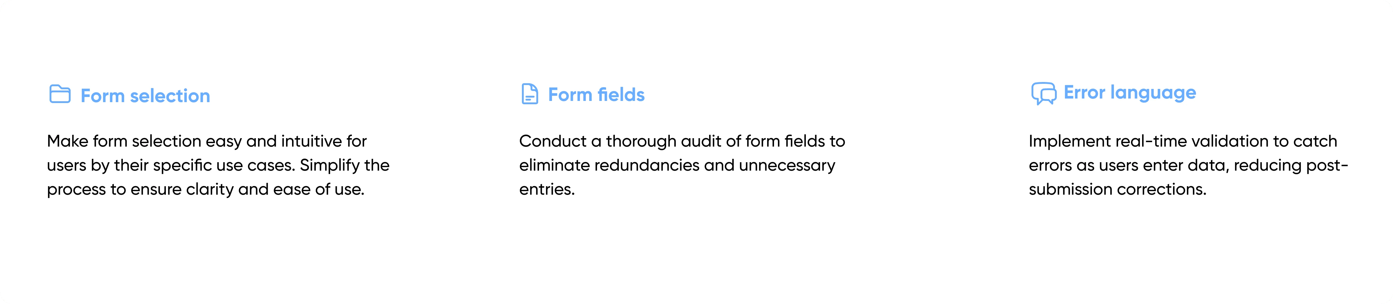
Key Findings
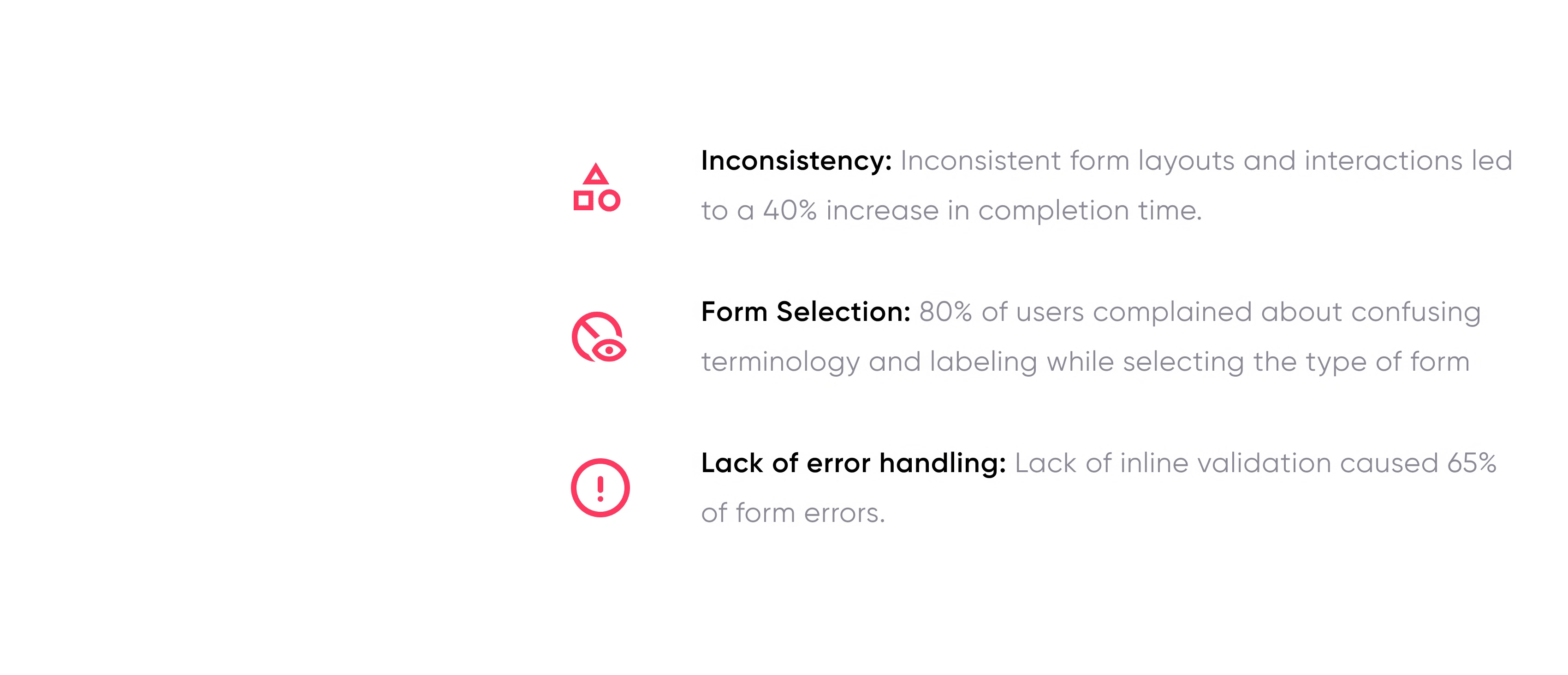
Insights to actionable steps
Design
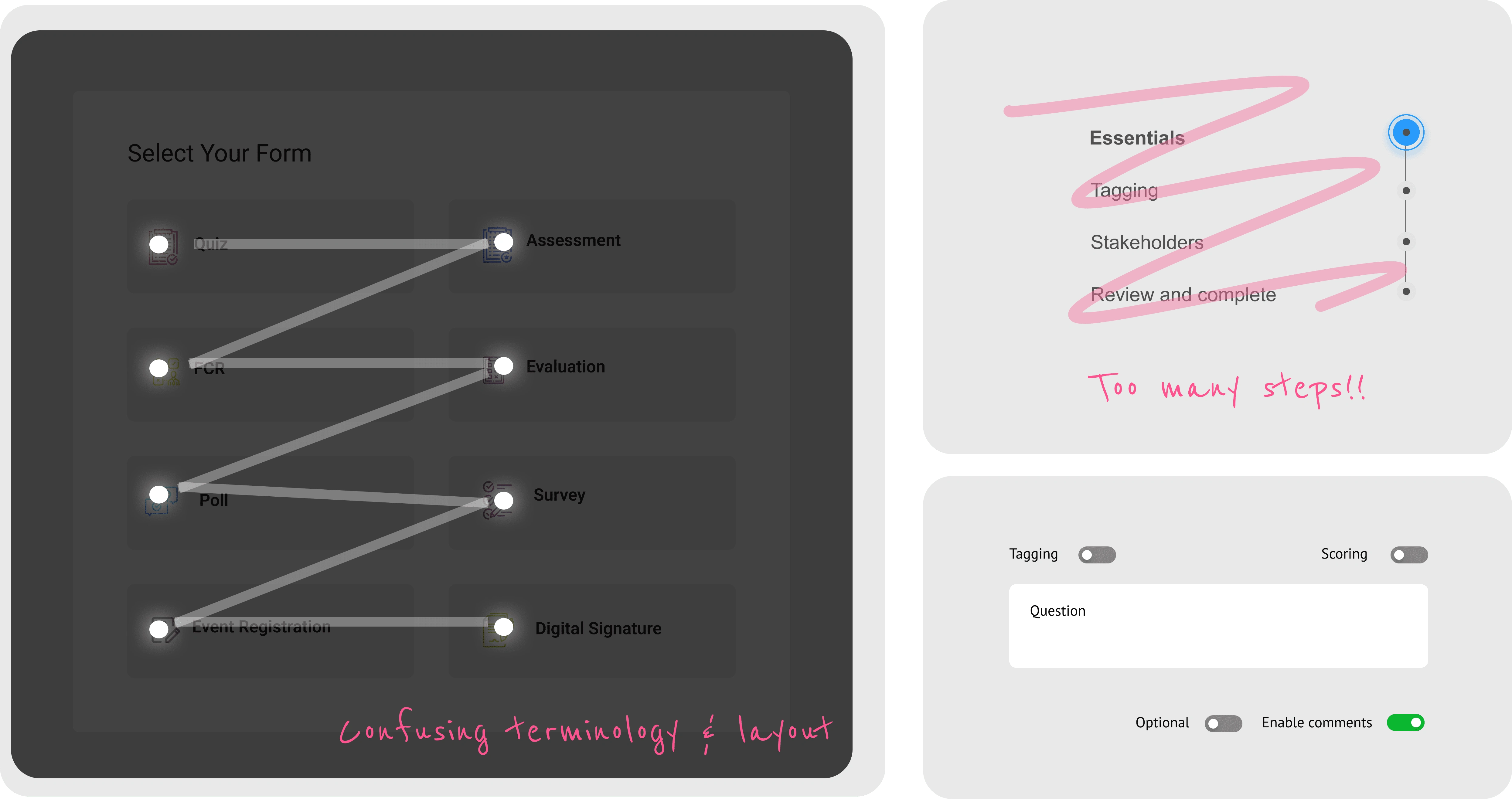
Form Selection
From gathered insights, it was evident that the users have been frustrated with the form selection for two main reasons, confused terminology as per the usecase and the number of fields and clicks where too many considering the initial steps.
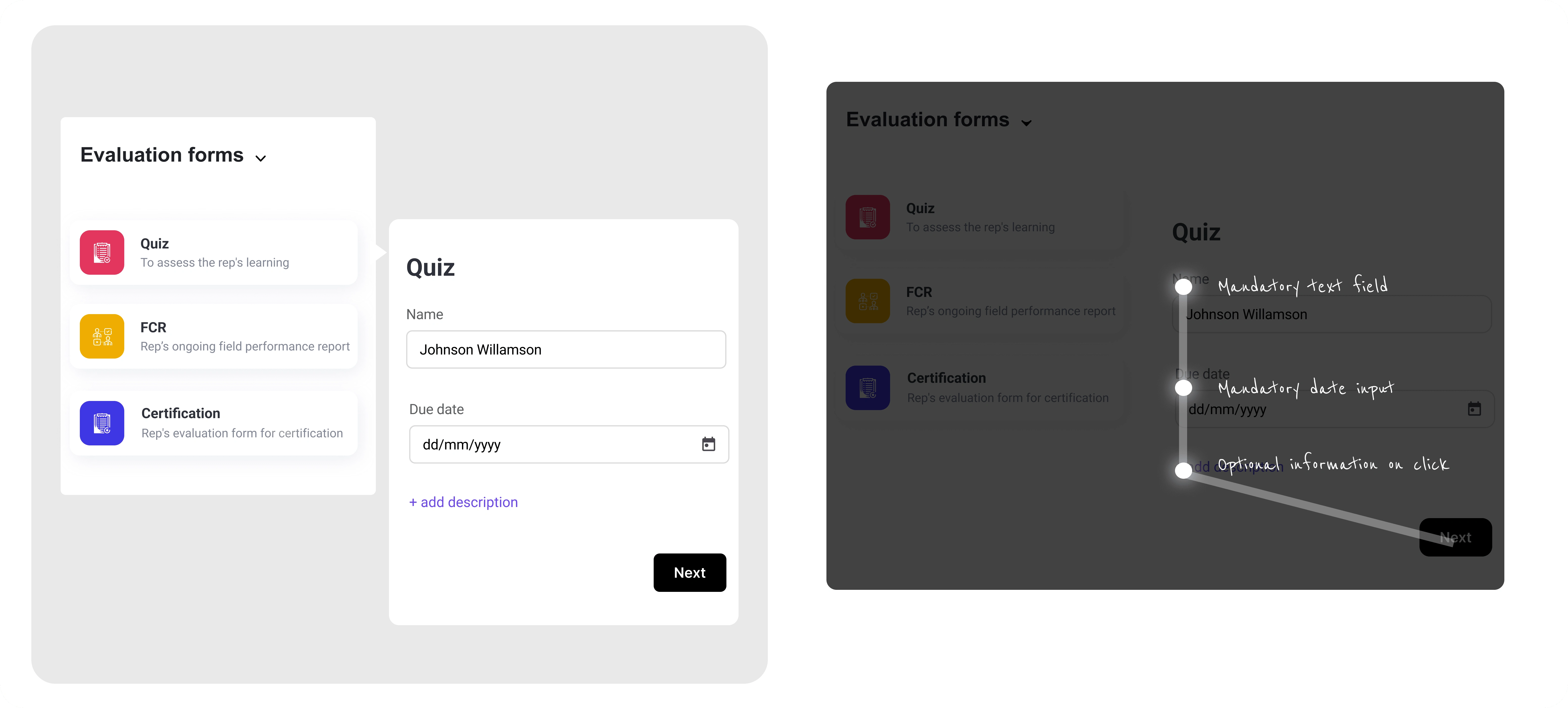
Fig: Finalized after form selection after 4 iterations & user testing
Questions creation
Optimized question level actions by prioritization from research insights that has resulted in actions placement that are high priority has been displayed upfront and the actions that are scondary have been placed in the question level menu.
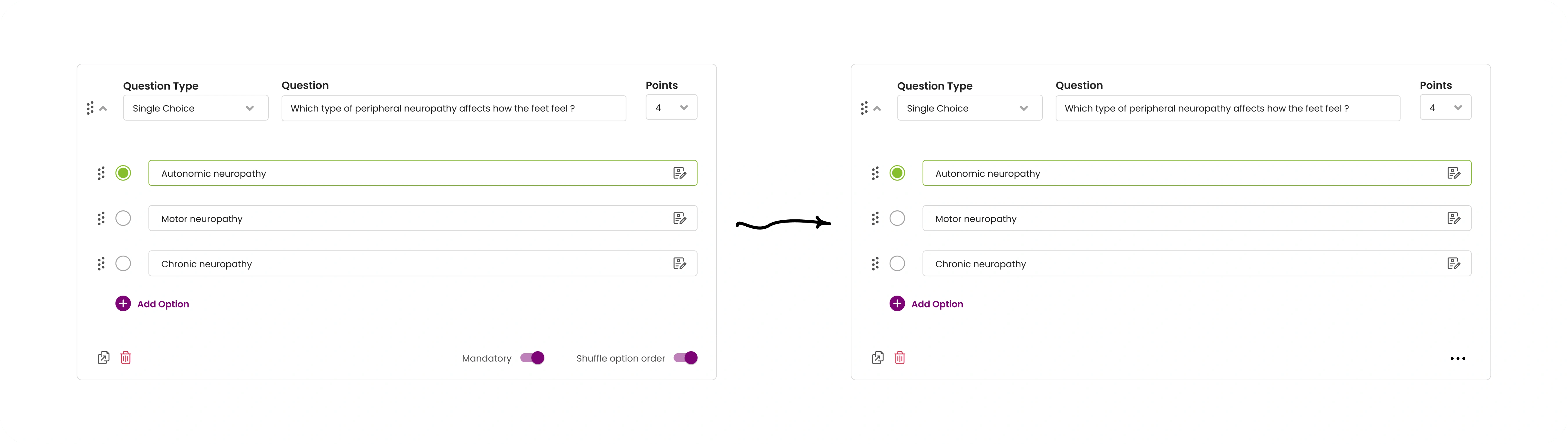
Fig: Question level layout optimization
Form layout
Form layout and the entire questions creation in the form has been done keeping users form fitgue in mind by disclosing necessary fields upfront and keeping the rest of them as progressive disclosure.
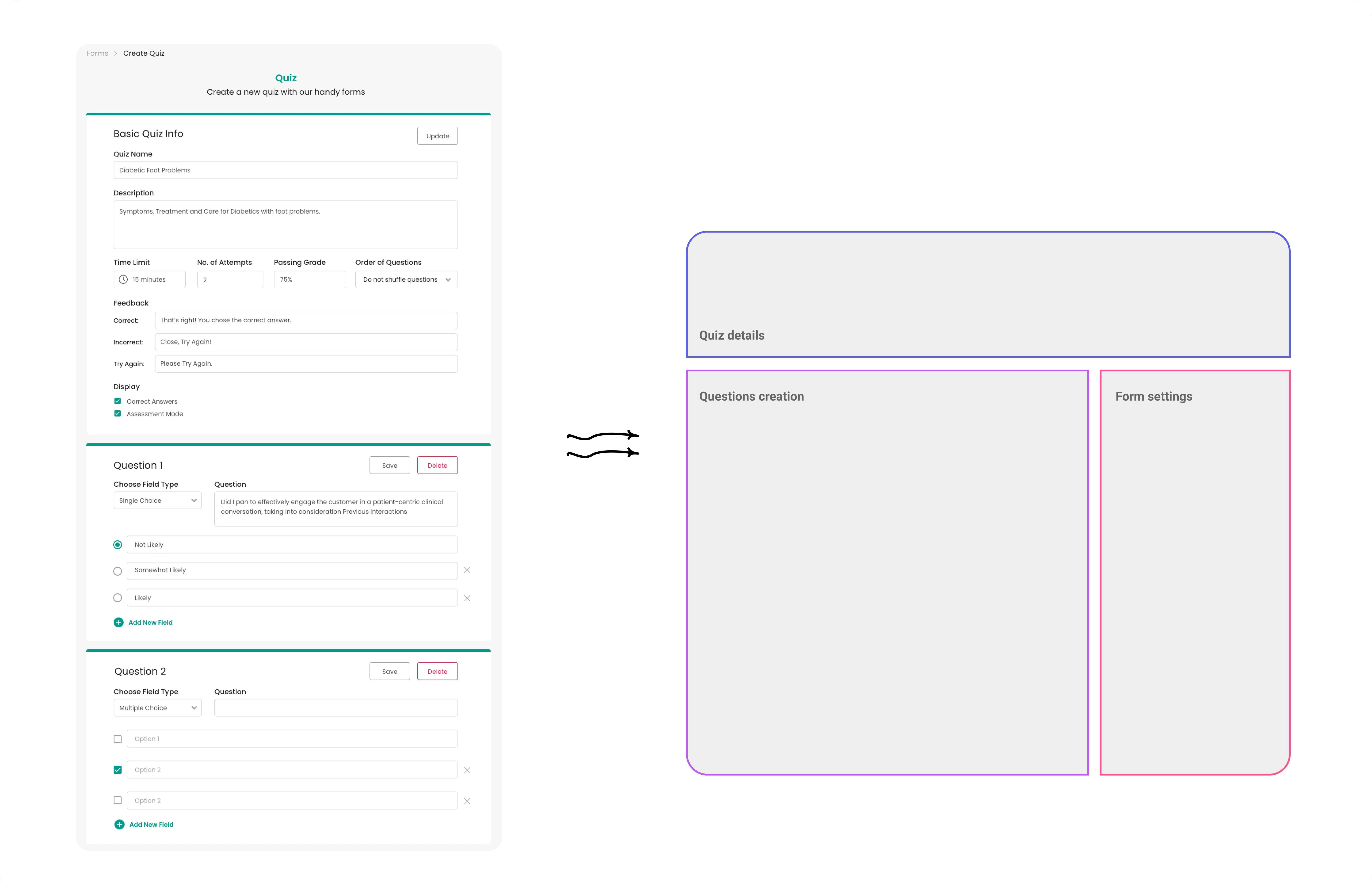
Fig: Form level changes made to lessen form fatigue
Design Delivery
For seamless design delivery, I conduct demo meeting, Q&A connect, and slack channel dedicated to the feature implementation with loom recording of the entire feature and handoff documents of userflows and flowcharts.
Failures & Iterations
Initial prototype increased completion time by 2 minutes
Solution: Redesigned form layout to group related fields
New error messaging confused 40% of users
Solution: Rewrote error messages using plain language
Users found modal popup not as helpful as we thought, it only made them feel like an extra step
Solution: Taking down popup and replacing it with inline details while selection
Final Testing Results
Fig: Final testing results acquired from Pendo analytics & NPS survey
Key Learnings
Like this project
Posted Aug 3, 2024
Redesigned forms, boosting task completion from 62% to 94%, cutting support tickets by 90%, and raising user satisfaction from 4.2 to 8.7/10.
Likes
0
Views
29
Clients
ACTO