EV Station Partner Dashboard Design

Rajaraman Arumugam


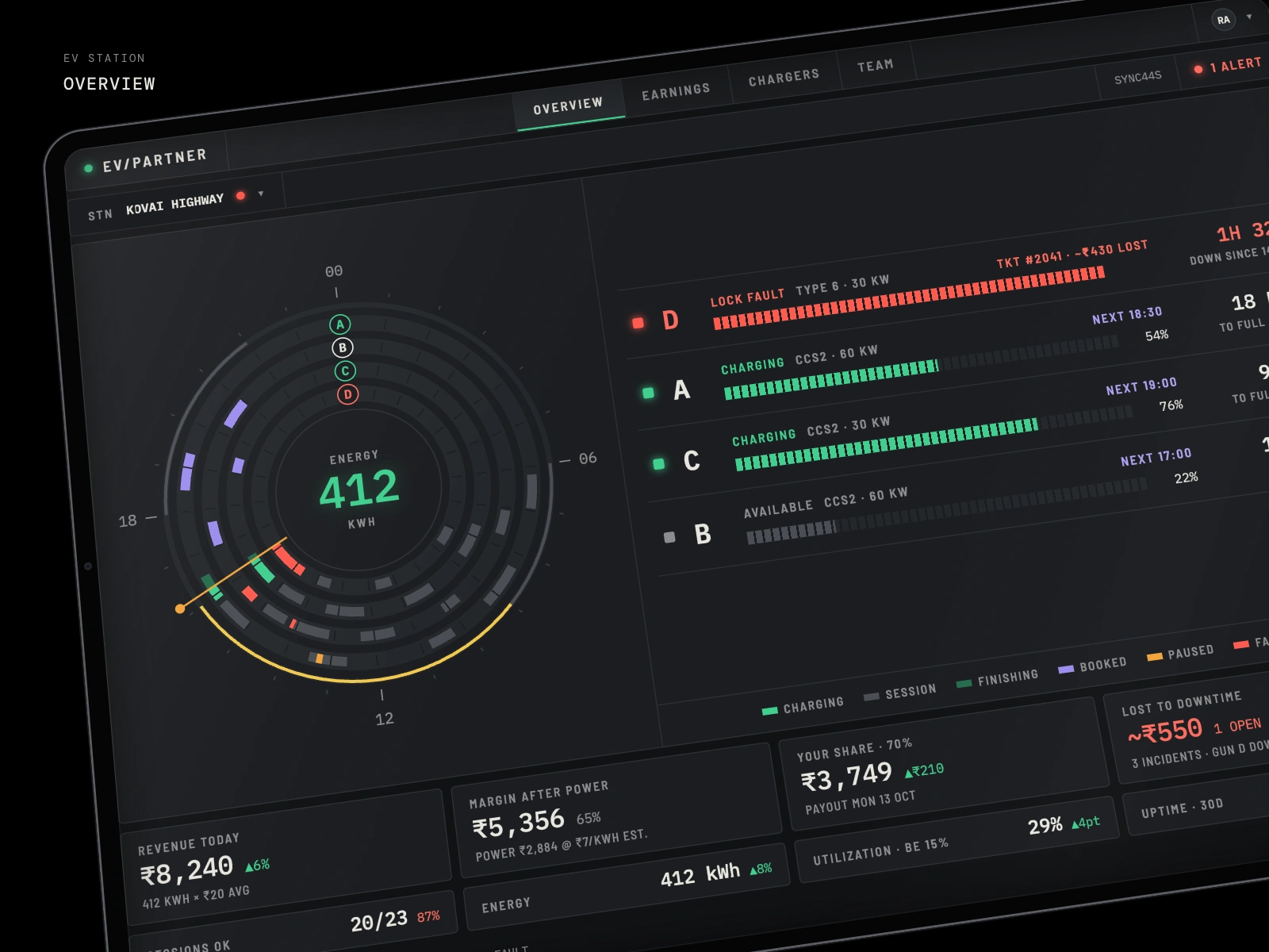
EV Station Overview
A partner dashboard for EV charging stations
A station partner's day on one screen: every gun, every session and every rupee, with the fault that's costing money right at the top.
Role UX Design · Timeline 1 week · Platform iPad, iPhone · Scope Research, UX/UI, design handover
Context
Station partners own the site and the chargers; an operator runs the network. The partner earns a share of the margin, 70% of revenue after power cost. A partner might run two stations, like Kovai Highway on NH 544 and Avinashi Road in Peelamedu, with 2–4 guns each.
Their questions are simple. Is everything working? What did I earn today? What's costing me money right now?
The problem
The data existed, but it was spread across operator portals, ticket emails and the DISCOM bill. A gun could sit faulted for hours before anyone noticed, and nobody could put a rupee figure on that time. Utilization, tariff bands and payout were all on different screens, or on none.
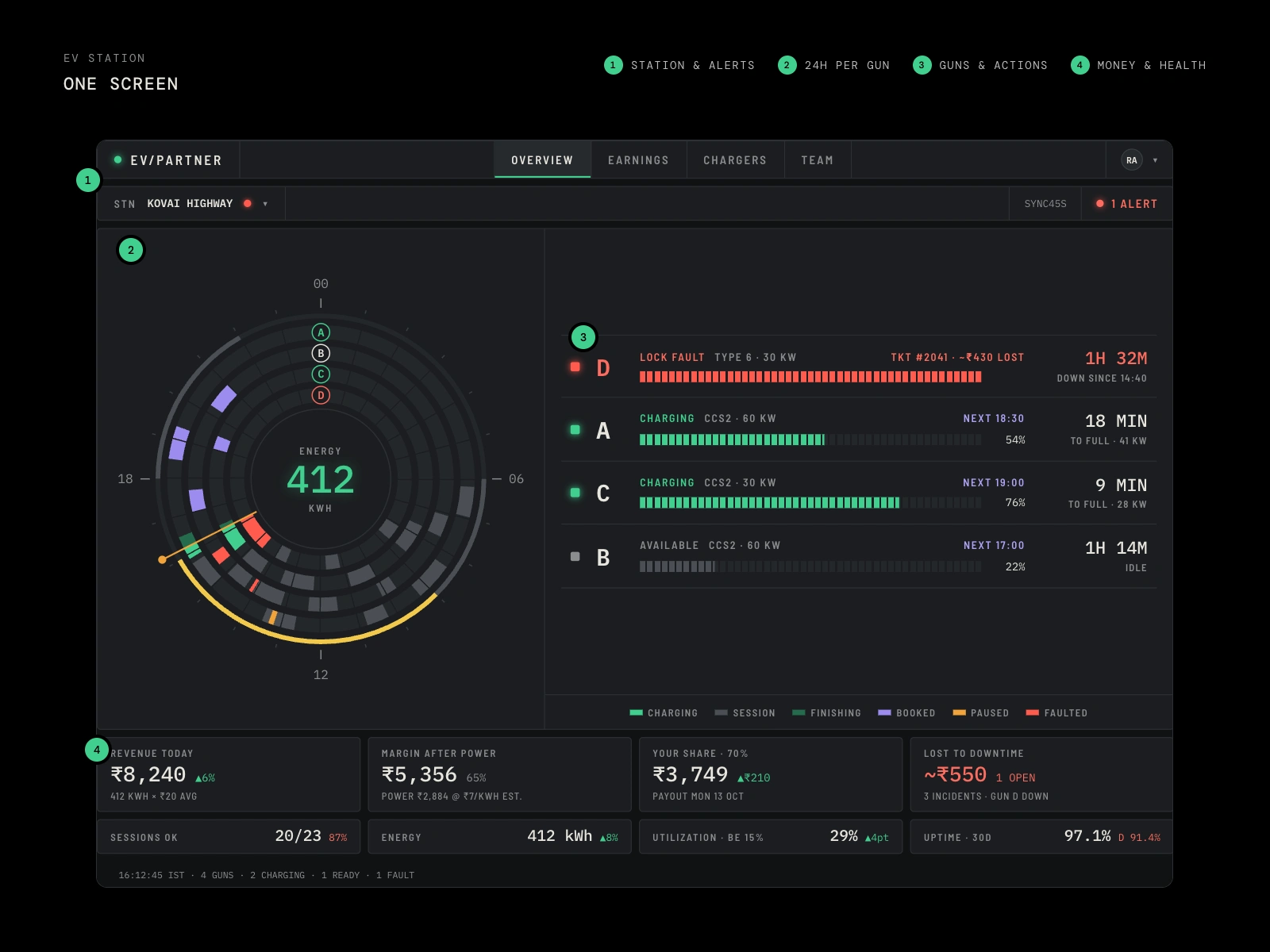
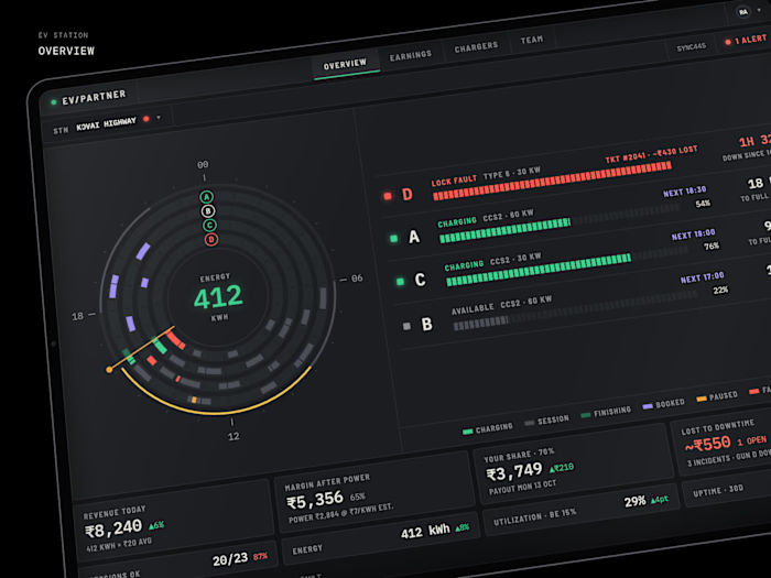
1 Station and alerts · 2 A 24-hour ring per gun · 3 Guns sorted by urgency · 4 Money and health
The approach
One screen per station
Everything a partner checks in a day sits on a single iPad view, with no menus to dig through.
A 24-hour ring per gun
Each gun gets a ring. Sessions, live charging, pauses, faults and upcoming bookings are drawn on a 24-hour clock, and the outer track marks the solar and peak tariff bands. One glance shows how the whole day went.
Faults first, priced
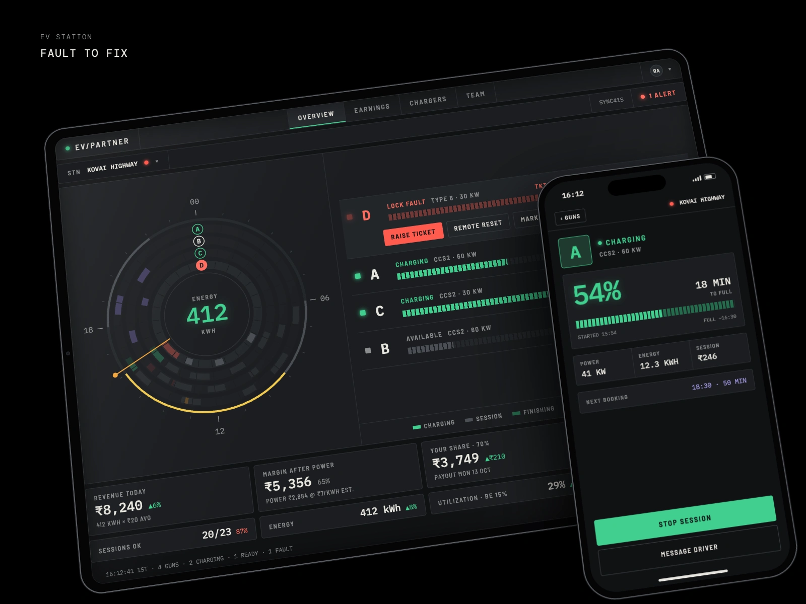
Guns are sorted fault → charging → available. A faulted gun shows how long it has been down, its ticket number and an estimate of revenue lost. Tapping it opens the actions the partner actually needs: raise a ticket, run a remote reset, or mark it out of service.
Money in rupees
Revenue, margin after power, the partner's 70% share and money lost to downtime sit in four tiles. Each tile drills into a per-gun or per-tariff breakdown.
Health against breakeven
Utilization is shown against the 15% breakeven, next to session success and 30-day uptime, so a weak gun stands out.
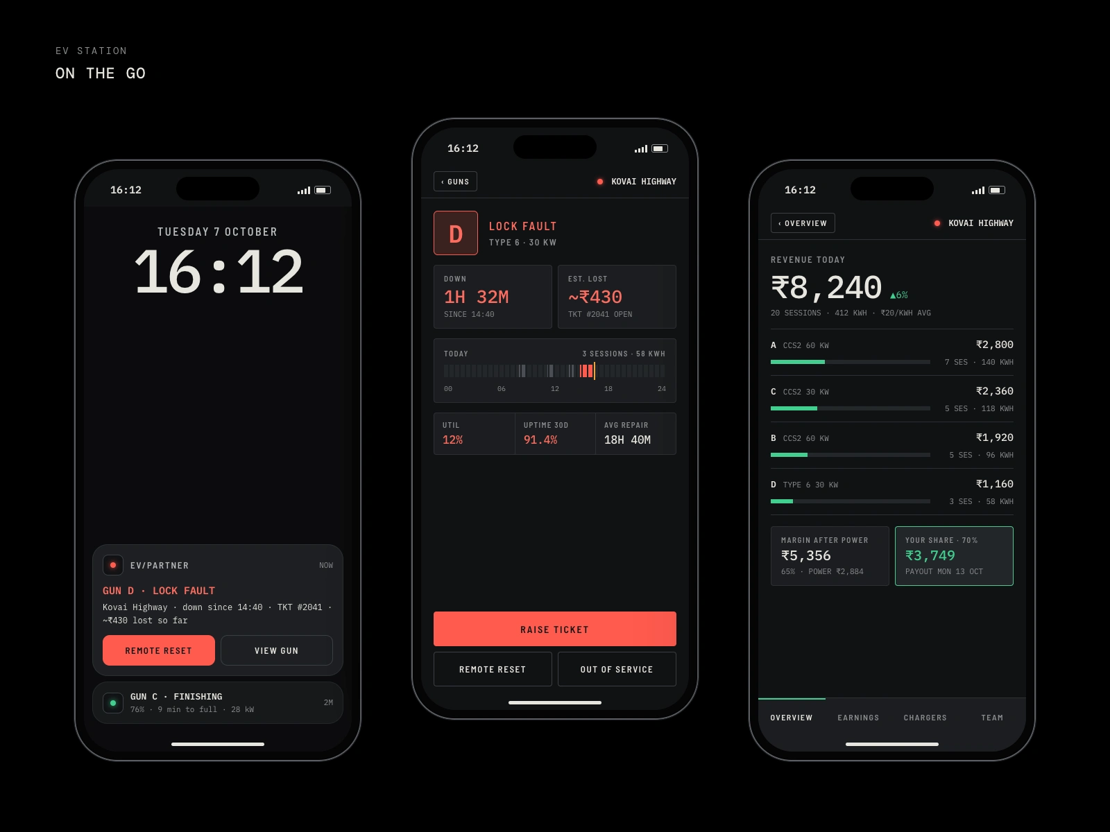
On the go
The phone app picks up where the iPad leaves off. A lock-screen alert for Gun D's lock fault includes Remote Reset, so the partner can fix it without unlocking the app. From there they get gun detail with downtime, money lost and today's timeline, a live session view for Gun A, and the revenue drill-down.
Like this project
Posted Oct 7, 2026
Designed an iPad dashboard and companion phone app that puts every gun, every session and every earning on one screen.
Likes
0
Views
3