Custom websites - For boutique business
Custom websites - For boutique business
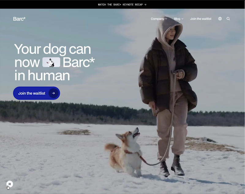
This website is a playful, high-concept landing page for Barc* – a fictional wearable that translates your dog’s barks into human language. The whole experience leans into humor and satire, treating the product like a serious tech launch while constantly undercutting it with jokes, from lines like “Barc* to the future” to questions about whether your dog’s 2am barks are for a man in the house or just existential dread.
The page is structured like a polished SaaS or hardware startup site: a bold hero section, clear value propositions, a simple three-step “how it works” flow, feature highlights, specs, and tiered membership pricing. Microcopy does most of the storytelling—benefits such as understanding your dog better, enhancing your bond, increasing safety, and extending your dog’s life are all delivered with a wink. Elements like 250+ celebrity voices, “no support for small dogs” on cheaper tiers, and tongue-in-cheek FAQs reinforce the comedic tone.
Visually and structurally, it feels like a real brand: multiple CTAs to join the waitlist, repeated sections for emphasis, and a clean layout that reads quickly. Only near the end does the site reveal that Barc* isn’t a real product but a concept from a Framer course, making the whole experience a smart parody of modern product marketing while still showcasing strong UX, copy, and visual design skills.
0
258

This website presents the portfolio of Justin Forrest, a driller-turned-documentary photographer who has spent twenty years working offshore. The core idea is simple and powerful: the oilfield, by one of its own. Instead of an outside eye flying in for a day, this work is made by someone who lives the life, knows the people, and understands what never usually gets photographed.
The design is stripped back and direct, letting the copy and images do the heavy lifting. Clear, punchy lines like “I’m not a photographer who found the oilfield. I’m a driller who found a camera.” establish credibility and a distinctive voice immediately. Sections are organized around WORK, ABOUT, COMMISSIONS, and CONTACT, making it easy for visitors to explore long-term documentary projects, learn who Justin is, and reach out for commissioned assignments.
Throughout the site, the focus stays on the people who do the work: drill floors, engine rooms, night shifts, and crews that rarely see themselves represented. The overall experience feels honest, grounded, and purposeful—built to attract clients who need authentic, inside-the-fence storytelling from someone who has actually been there.
0
250
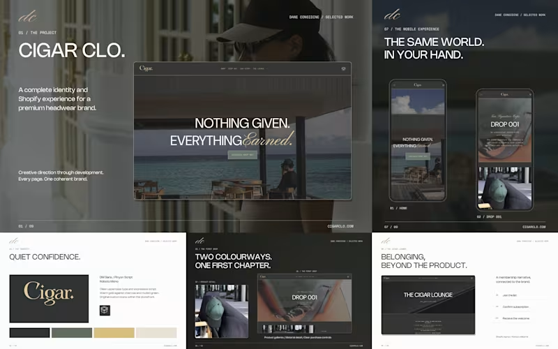
A closer look at my work for CIGAR CLO.
I handled the brand identity, art direction, website design and Shopify development, including custom Liquid.
The aim was to carry the brand’s story through the whole experience, from the typography and editorial layouts to the product pages and CIGAR Lounge.
View the case study at daneconsidine.com (http://daneconsidine.com).
#Shopify #WebDesign #BrandIdentity #ArtDirection
0
41

Just wrapped another Framer build — this time for a bespoke kitchen and cabinetry client.
The goal with this one was to make the site feel as crafted as their work: clean lines, rich materials, and a layout that puts detail front and center. I focused on big, editorial imagery, simple typography, and a smooth browsing flow so potential clients can move from inspiration to enquiry without friction.
Built in Framer with responsive layouts, subtle motion, and space to grow as they add new case studies and collections.
If you’re a cabinet maker, interior designer, or home renovation brand looking for a high-converting, design-led website, I’d love to chat.
0
216

UX|UI designer focused on High-converting experiences
UX|UI designer focused on High-converting experiences


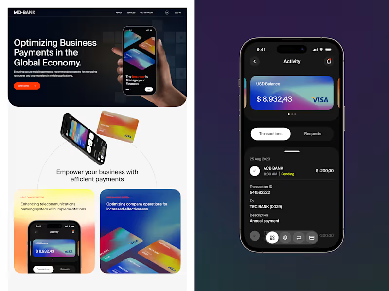

Design that solves problems 💡
Design that solves problems 💡
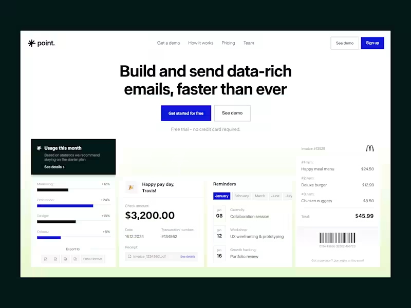
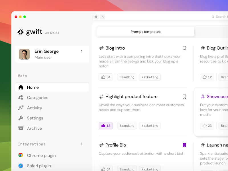


Passionate Visual Designer . UX/UI . Graphic


I design websites for businesses
A while back, I designed a website for an architecture studio.
The studio was fictional. The thinking behind it wasn't.
I started with one question.
What does someone need to see
before they trust a studio with their home?
Not just the finished rooms.
The decisions behind them.
So every project became a short story.
The site. The challenge. The solution. The result.
A team page, so you know who does the work.
A process page, so the first call doesn't feel like a leap.
That's how I like to work.
Start with what the client needs to feel.
Then let the layout follow.
If your studio needs a site that shows how you think,
I'd love to help.
1
2
63
If your business has grown, but your website still describes the one you started with,
you already feel it.
The right clients hesitate.
The wrong ones get in touch.
And you end up explaining on calls what the site should have said.
That's the work I do.
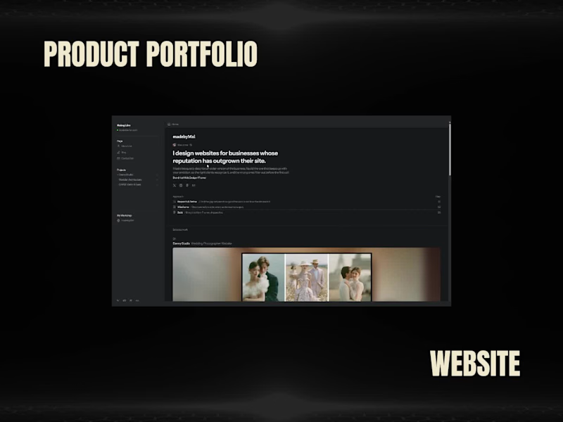
I design websites for businesses whose reputation has outgrown their site.
This is my portfolio.
Three projects, three very different worlds:
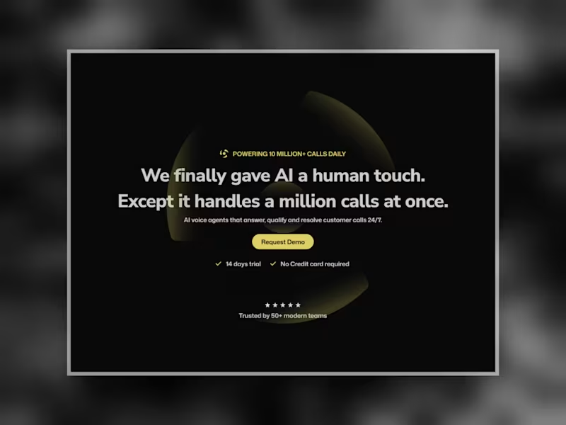
a wedding studio, an architecture practice, an AI voice product.
Each project page shows the problem, the decision I made, and the tradeoff behind it.
Not just the final screens.
So you can see how I'd think about your business before we ever talk.
If your site hasn't caught up to your business, I'd like to hear about it.
Preview Site Here (https://hoang-lam.framer.website/)
0
90

UI/UX Design | Web/App Design | Graphic Design
UI/UX Design | Web/App Design | Graphic Design


Product Designer
Product Designer


UX-UI designer, brand designer
UX-UI designer, brand designer