Web design - Unified Computing
Initial Insights 💠
My client asked me to revamp UI/UX the company website. Achieve responsive conversion rates of 2-5%

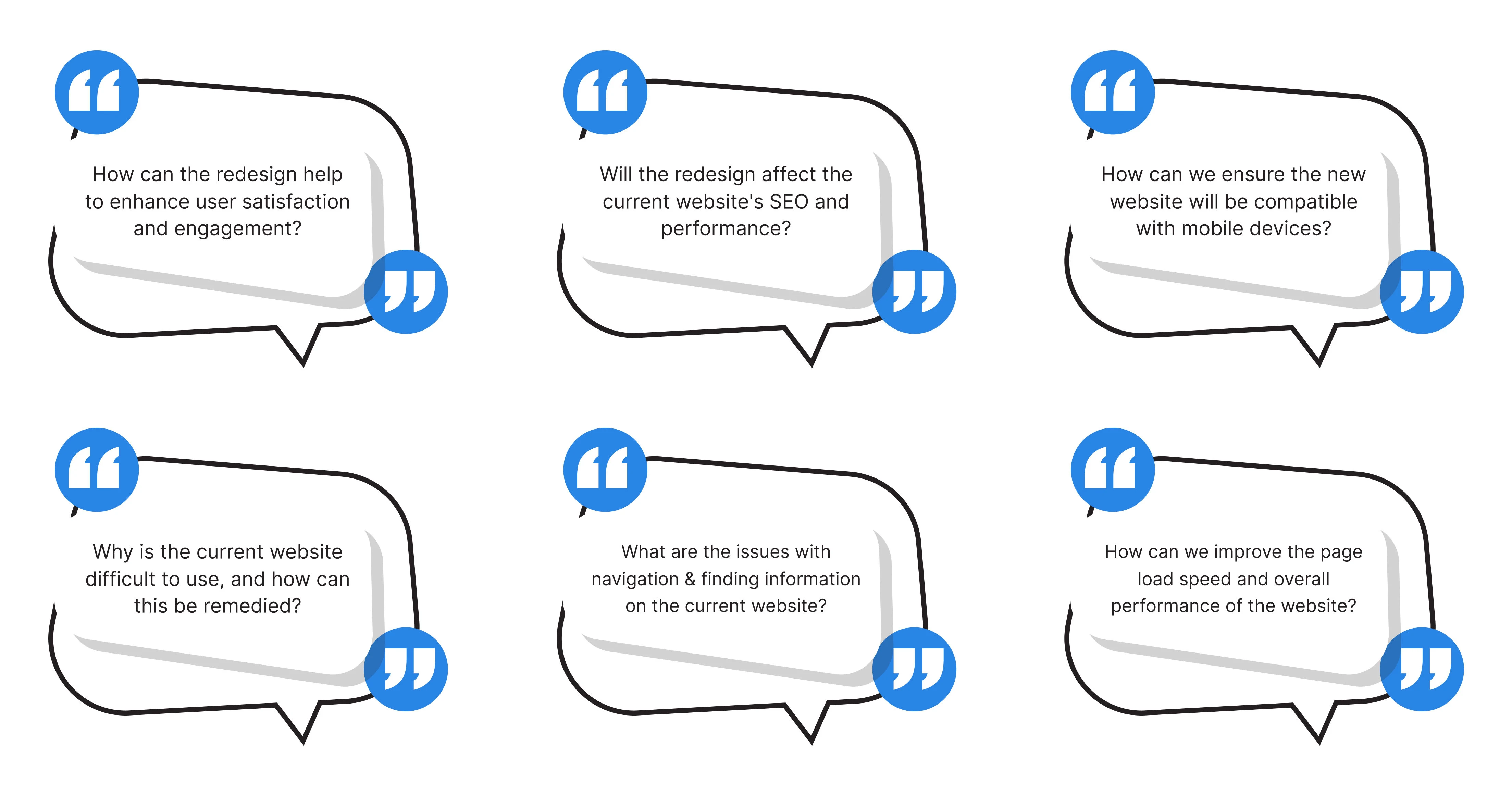
Problem and Challenges 🫥
In our project to redesign the company's website UI/UX, I identified five key issues: outdated user interface, confusing navigation, slow page load speeds, a lack of interactive features, and a lack of mobile optimization.
To address these challenges, I focused on balancing aesthetics with functionality, ensuring usability for all user demographics, optimizing page load speed, developing engaging content, and integrating new technologies without complicating the interface.

Lo-fi Wireframe 🖊️
After comprehending the client's problems and challenges regarding the revamp of the UI/UX design for their business website, I proceeded to develop low-fidelity wireframes.
These wireframes serve as the initial visual representation, laying out the basic structure and components of the website, focusing on functionality, and usability, and addressing the identified issues.
The wireframes were then presented to the client for feedback, ensuring that the proposed design solutions align with their expectations and the project goals.


Goal and Hypothesis Statement 🎯
My goals were to create an attractive and modern user interface and improve the overall user experience on the website. I hypothesized that improving the user interface would increase user satisfaction and retention on the site, and optimizing the site for mobile would increase mobile user traffic and engagement.
After understanding the project's goals, I review and analyze points that need improvement:
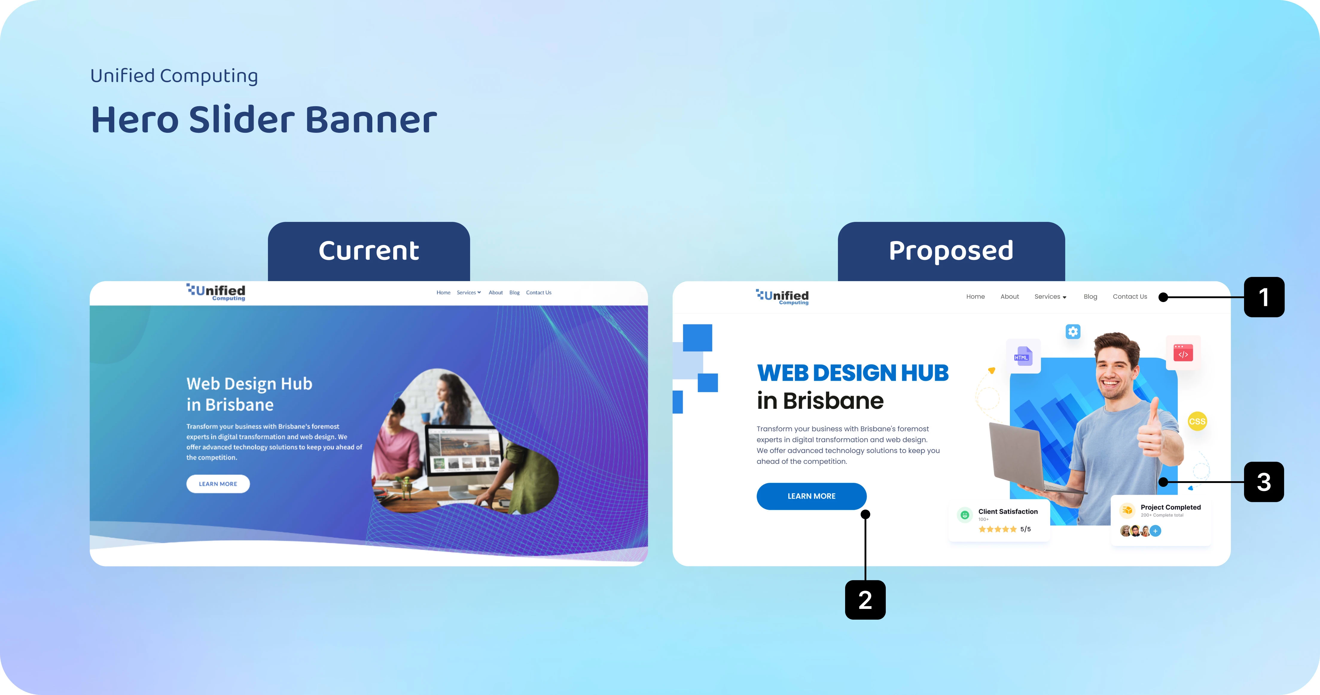
① Header menu navigation with large, clear typography, evenly spaced based on the length of each word group. Set states: Default - Hover - Selected for each component.
② Emphasize title and paragraph clusters, clearly delineate hierarchy, and highlight the CTA button.
③ Use .GIF (.json) images for eye-catching users. Components/Icons around it should represent the services offered by the website, clearly state completed projects and client satisfaction, building trust with new clients.
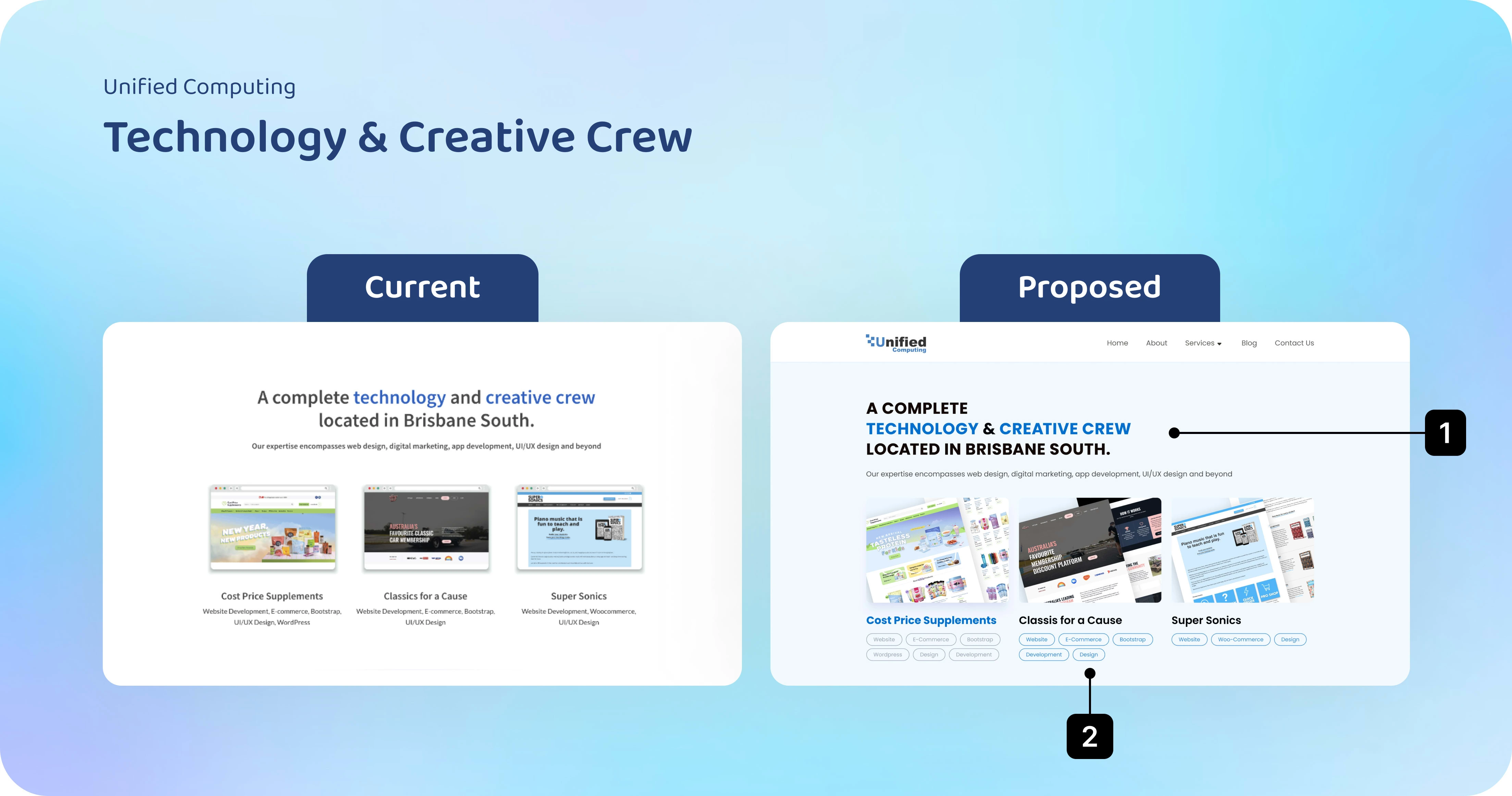
① Apply the Z-Pattern visual direction: Use Caplock for titles and left-align text lines for easy user navigation towards desired content.
② Improve and revamp the visuals of completed projects to be more eye-catching, add tags so users can understand the details, skills, and techniques applied in the projects. Set states: Default - Hover - Selected for each component.
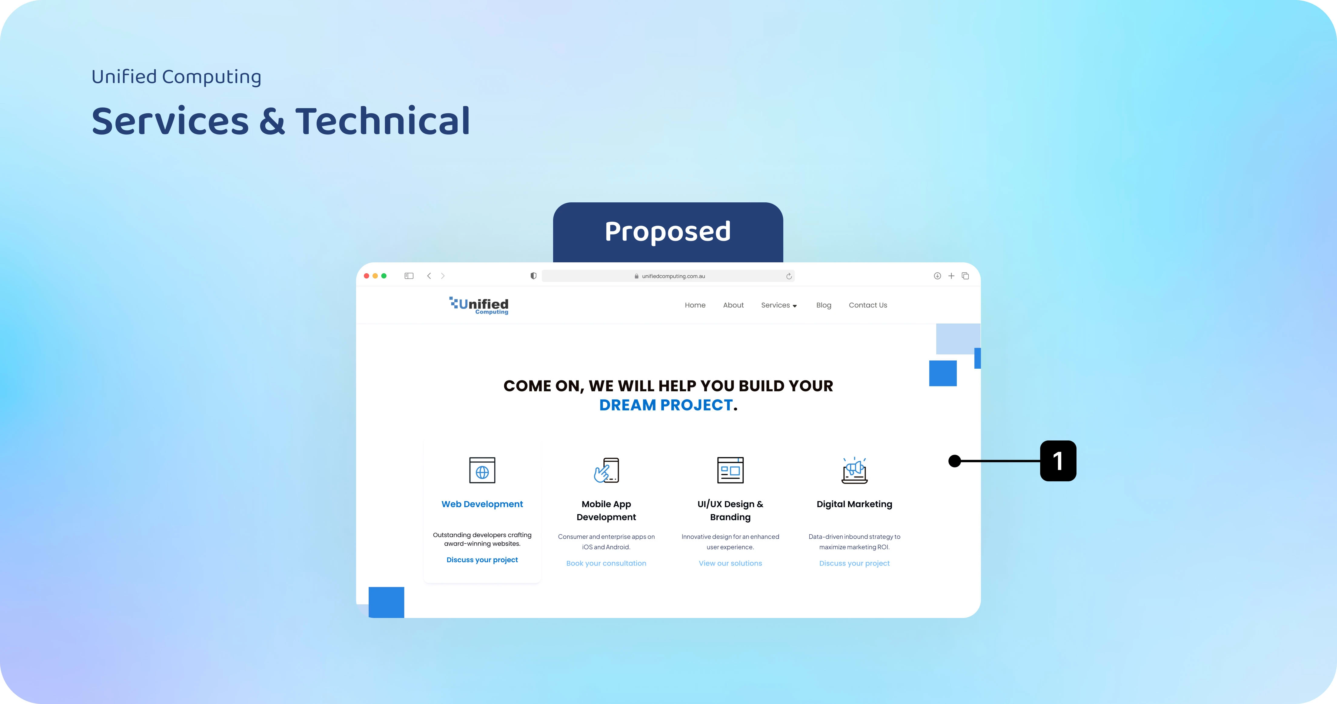
① This is the SERVICES page of the website, an essential section to showcase the range of services offered by the website, not displayed on the Homepage but within a subpage.
I use icon animations because Icon animations make the user interface more dynamic and engaging.
They help users easily recognize and understand the functions of an app or website.
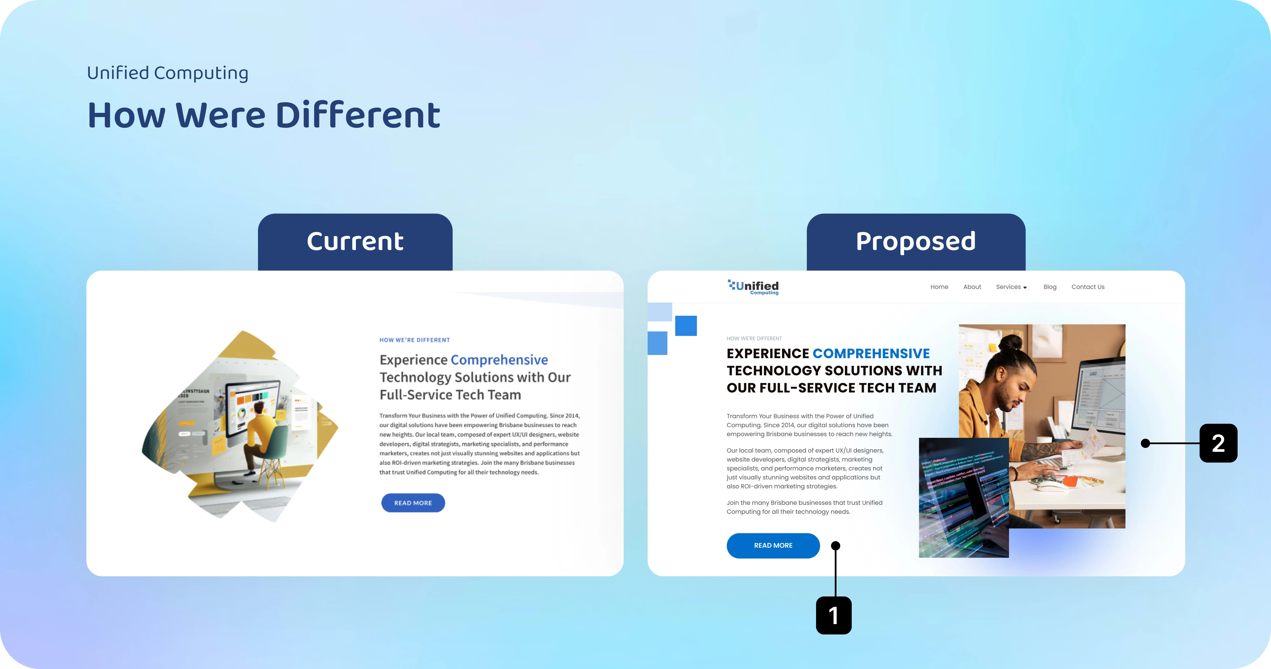
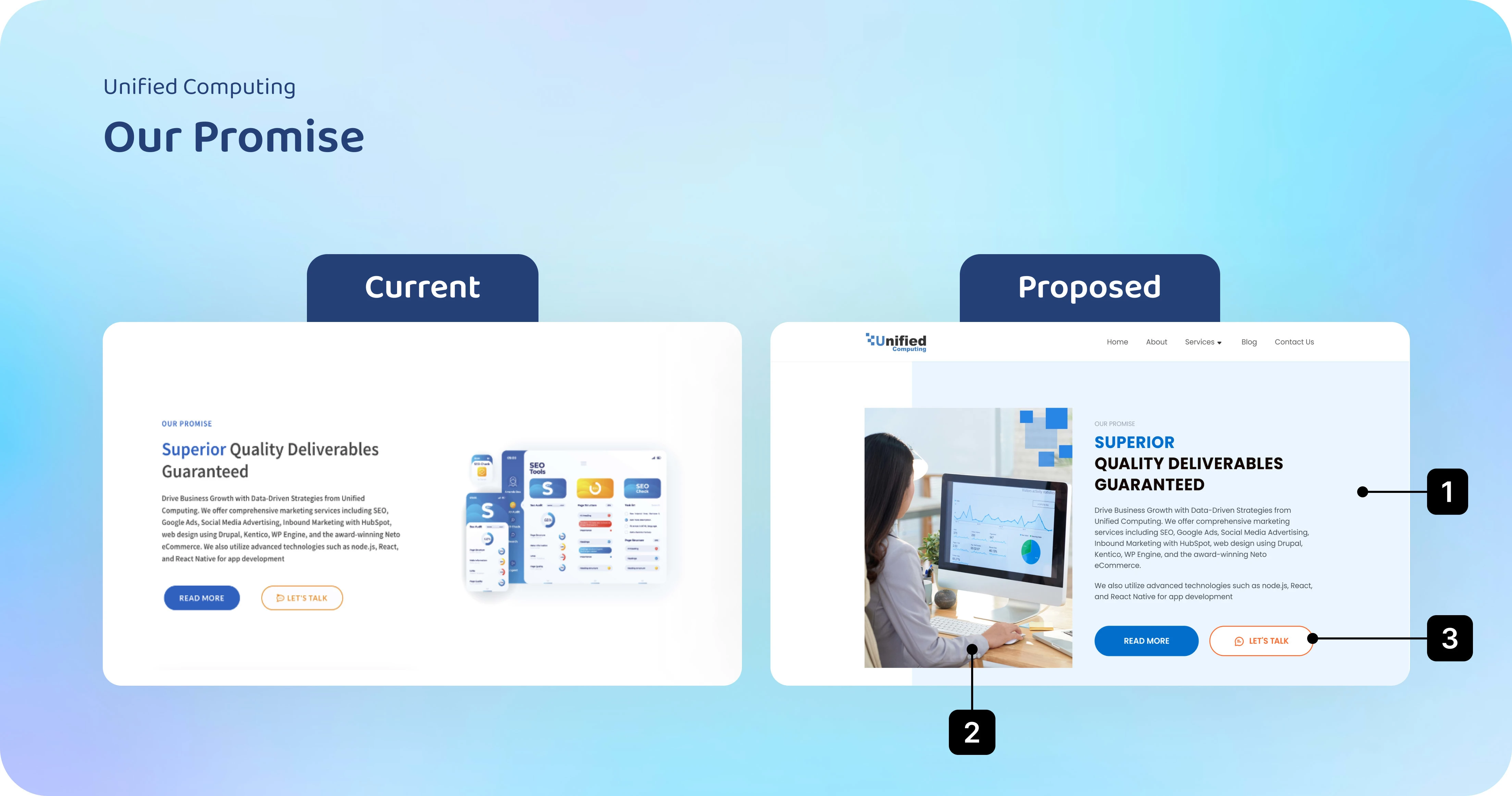
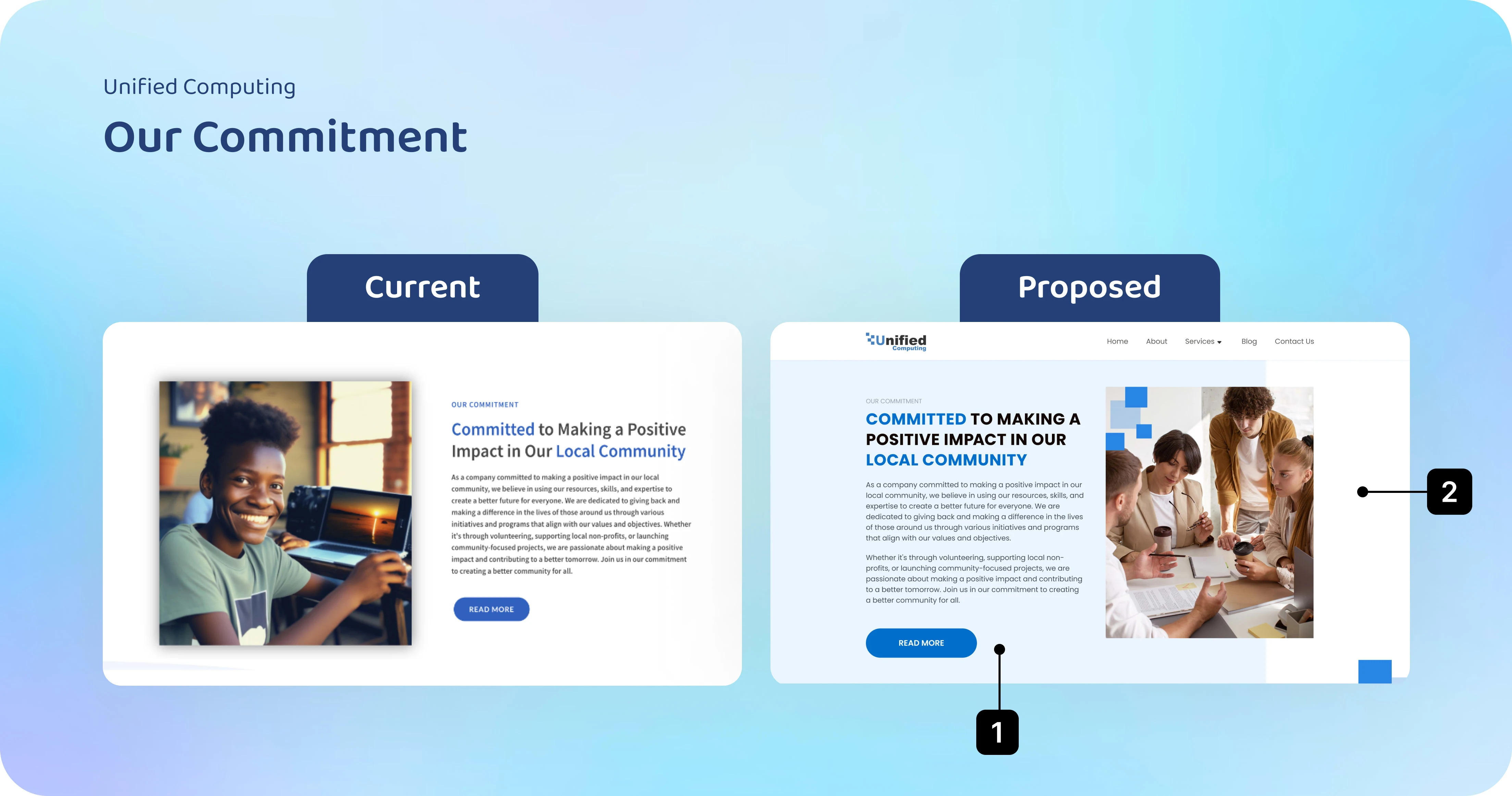
① The text content is clearly segmented and line-divided, allowing users to read and understand the website's message. This helps users to quickly understand why this service is right for them.
② High-quality, clear images with themes that accurately reflect the service theme.
③ Arrange buttons of uniform size, categorize between Primary and Secondary buttons.
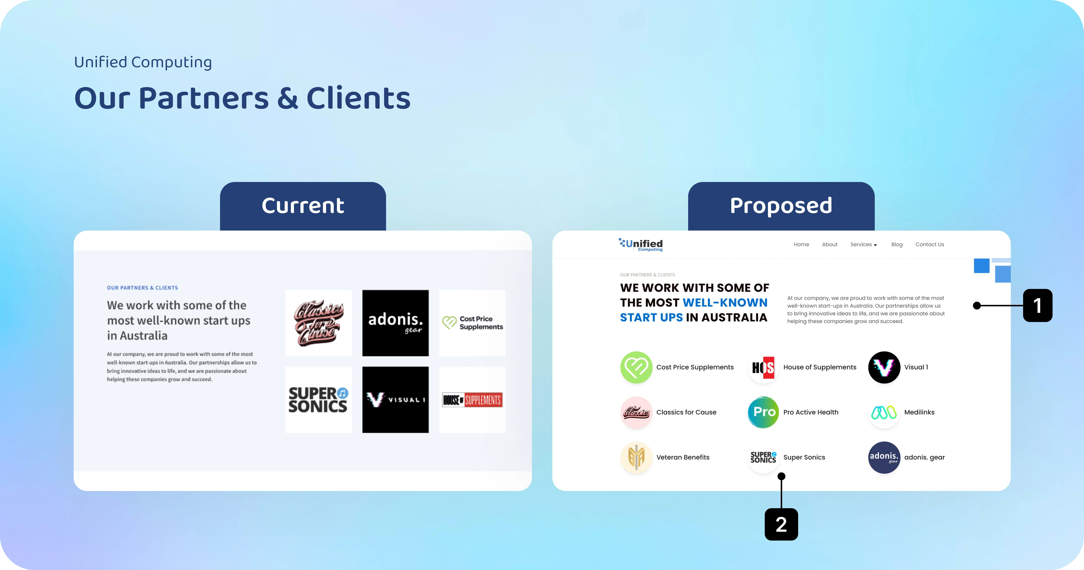
① Apply the Z-Pattern visual direction principle so users can always navigate towards what they want to see from left to right.
② Arrange Partner and Client brands in order of priority from largest to smallest, clearly display logos and full names of each brand. Set hyperlinks in each brand for users to reference actual completed projects.
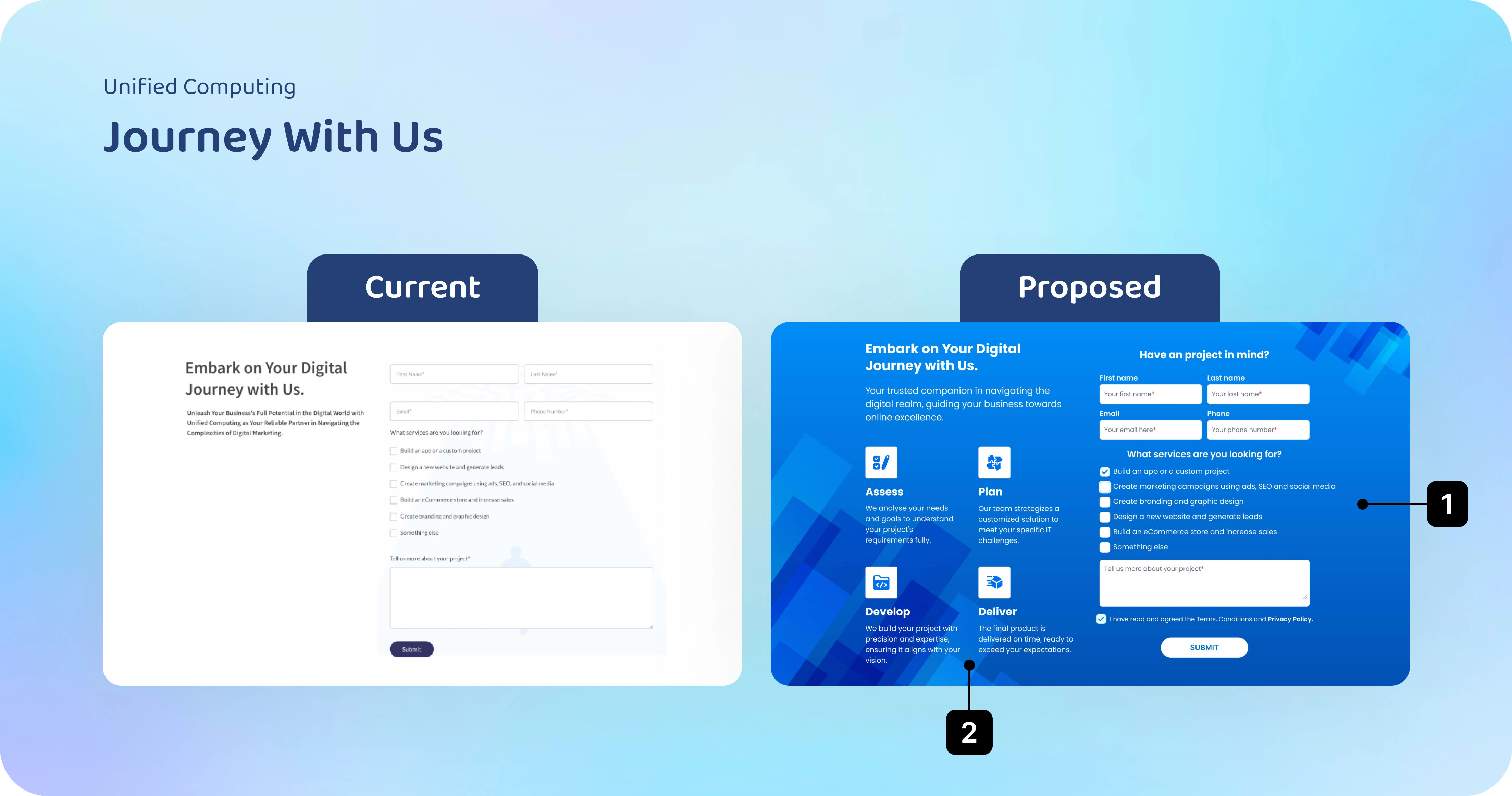
① Show the input form clearly and navigate users most understandably so that users can express their wishes about the product they want to build.
② Show the strategies that the website can provide most professionally, and add a brief description of the benefits below the strategies.

Final Design 🪄

Live Website 🎉
Reflection ⚡️
Other key things to note:
Ensure a user-friendly, spacious design
Align websiteiste fonts with branding (with the logo or ...)
Truly understand your TG and write content that assures them you genuinely solve a problem they have
Throughout the design process, I endeavored to address the identified issues and challenges, hoping that these improvements would lead to positive results reflected in user growth and satisfaction.


Like this project
Posted Dec 7, 2023
Transform your business with Unified Computing’s advanced solutions. Data-driven marketing and Web design to empower your Brisbane business.

