Full-stack developer building high-impact web products.
- $25k+
- Earned
- 3x
- Hired
- 5.0
- Rating
- 51
- Followers
Full-stack developer building high-impact web products.


Web Developer | Motion developer | full stack engineer
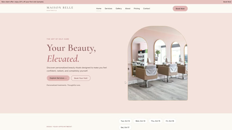
Maison Belle — Elegant Salon & Beauty Website Design 🌸
An elegant, modern salon website concept created to showcase how a beauty business can present its services and brand through a polished online experience.
Designed by Ubaid Web Studio, this project features a soft, luxurious color palette, refined typography, and a stylish layout inspired by the beauty and aesthetics industry.
✨ Key Features
Elegant UI Design: A sophisticated visual style with soft colors and modern typography.
Beauty Services: Sections for presenting salon treatments and services.
Service Pricing: A clear layout for showcasing sample service prices.
Team Profiles: Space to introduce beauty professionals.
Contact & Booking Sections: Convenient ways for visitors to explore contact and booking information.
Responsive Design: Designed for browsing on desktop and mobile devices.
🎯 Project Goal
To demonstrate how thoughtful web design can help salons present their services, communicate their brand identity, and create a welcoming first impression for potential customers.
Project Type: Salon Website Design & Development Demo
Demo Website: https://masionbelleastheticbyubaidwebstudio.netlify.app/
Note: Maison Belle is a demonstration project created to showcase my web design and development skills. It is not a commissioned client project.
1
407
Iron Core Fitness — Modern Gym Website Design 💪
A bold, modern gym website concept designed to showcase how a fitness business can build a strong and professional online presence.
Created by Ubaid Web Studio, this project combines a powerful dark theme, vibrant lime-green accents, and bold typography to deliver a fitness-focused visual experience.
Key Features
Bold Visual Design: A striking gym-inspired look with modern typography and colors.
Membership Plans: Clear presentation of membership options and pricing.
Fitness Programs: Dedicated sections to showcase training programs and services.
Trainer Profiles: Sections introducing trainers and their expertise.
Class Schedule: A structured view of fitness classes and timings.
Responsive Layout: Designed for a smooth browsing experience on desktop and mobile.
Contact & Join Sections: Clear pathways for visitors to explore membership and contact the gym.
Project Goal
To demonstrate how a well-designed website can help gyms present their services, communicate their brand, and make important information easier for potential members to find.
Project Type: Gym Website Design & Development Demo
Demo Website: https://ironcorefitness2.netlify.app/
Note: Iron Core Fitness is a demonstration project created to showcase my web design and development skills. It is not a commissioned client project.
1
274

BrightSmile Dental — Modern Dental Clinic Website Design 🦷
I designed this modern dental clinic website concept to demonstrate how a professional online presence can help dental clinics showcase their services and build trust with potential patients.
The design combines a clean, professional layout with a calming teal-and-white color palette to create a welcoming experience. It features dental services, dentist profiles, testimonials, frequently asked questions, and an appointment enquiry section.
Key Features
Modern UI/UX: Clean layout with a professional dental-care aesthetic.
Responsive Design: Designed to provide a smooth experience across desktop and mobile screens.
Service Showcase: Helps visitors explore dental treatments and services.
Trust-Focused Sections: Dentist profiles and testimonial sections create space for clinic information.
Appointment Enquiry: A clear section for visitors interested in contacting the clinic.
My Goal
To demonstrate how thoughtful web design can make a dental clinic's information easier to explore and help potential patients take the next step toward contacting the clinic.
Project Type: Dental Website Concept / Portfolio Demo
Note: BrightSmile Dental is a demonstration project created to showcase my web design and development skills. It is not a commissioned client project.
1
203
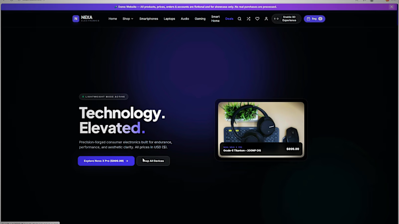
Title: Nexa Electronics: Premium E-Commerce Website with Interactive 3D Exploded Views
Description:
Nexa Electronics is a demo e-commerce website I designed and built to show my skills in modern web design, front-end development and interactive 3D experiences. This video is a walkthrough of the site.
What’s in the vedio.
The home page, with a cinematic hero section and a 3D device showcase
Browsing by category: Smartphones, Laptops, Audio, Gaming, Smartwatches, Smart Home and Accessories
Product pages with configuration and colour options, a zoom inspection view, pricing, stock status and customer reviews
The interactive 3D exploded view (“Explore Inside in 3D”), where you can take products apart layer by layer to see their internal components
Quick View, the device comparison matrix, the shopping bag and a full checkout flow (shipping details, payment, order review and confirmation)
Customer sign-in and an admin dashboard for managing the store
Website features
Interactive 3D exploded views of products, with labelled internal parts and an explode slider
A mega-menu navigation and fast category browsing
Product configuration (storage and colour variants) with live pricing
Wishlist, compare and shopping bag functionality
Device comparison matrix
A simulated checkout with order confirmation
Customer accounts (sign-in)
An admin dashboard with store stats and inventory and price management
A newsletter signup section
A toggle to turn the 3D experience on or off
A responsive, dark and light themed premium UI
Note: I made this video with the help of AI, and it is just a demo to show my skills. To see my work properly, I recommend visiting live website.
4
848

Branding | Brand Identity | Website
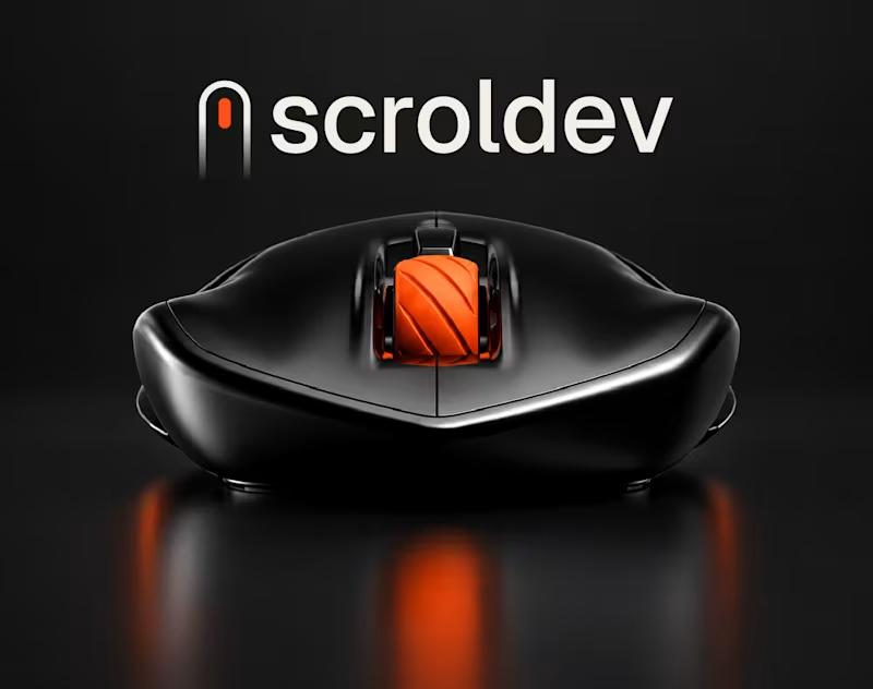
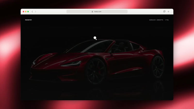
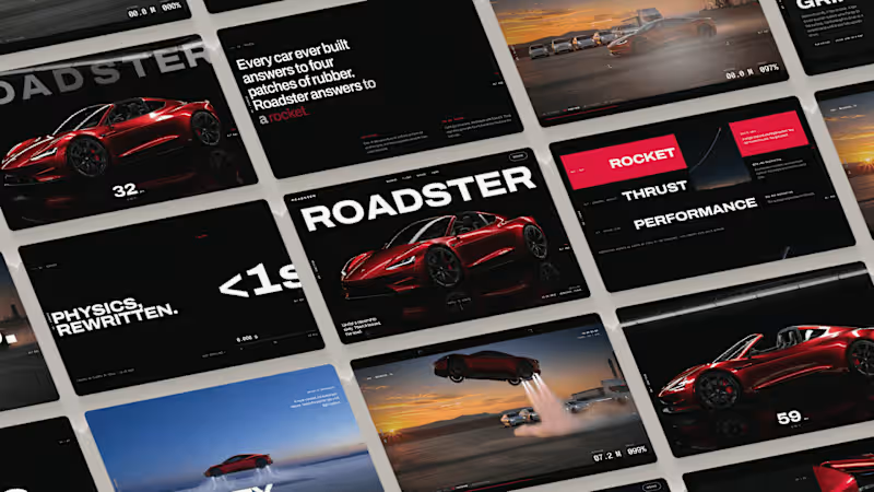
Tesla Roadster website design and development concept by Scroldev. A responsive automotive landing page built around speed, clarity, and scroll. Unofficial portfolio project, not affiliated with Tesla, Inc.
1
302
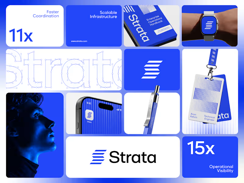
Strata’s brand runs on one colour, one shape and one rule. Restraint was the strategy.
I designed the brand identity for Strata, an enterprise SaaS platform that connects fragmented systems, data, workflows and teams. A product that removes chaos can’t have a chaotic brand, so every element earns its place: “Every layer, working as one.”
One shape: Five horizontal layers forming a subtle S. It works as the logo, a pattern and a rhythm for layouts.
One colour: Strata Blue #2447F9, carried by near-black and white. Solid only, never a gradient.
One rule: Complexity, organized into movement. If a layout feels busy, it’s wrong.
Structure: Modular grids, strong alignment and architectural spacing across every surface.
Imagery: Single-colour portraits in Strata Blue, so even the photography follows the system.
Fewer elements, used with discipline, scale further than more elements used loosely.
If your enterprise SaaS company needs a brand that stays consistent as it grows, let’s talk.
#VisualIdentity #SaaSBranding #B2BBranding #BrandDesign
1
97

Expert Custom Website Developer

Web Developer | UI/UX| 3D Product Animation |
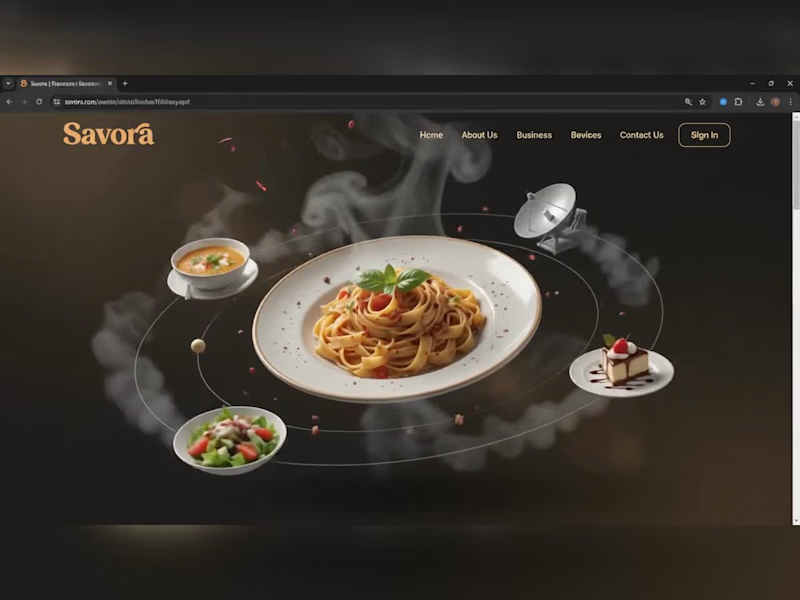
Savora — Food Delivery Landing Page
Designed and developed "Savora," a modern food-delivery landing page concept, built with HTML, CSS, and JavaScript, using GSAP for scroll-triggered and interactive animations.
Key features:
Animated hero section — a 3D-style orbiting animation where signature dishes (pasta, soup, salad, dessert) circle a central hero plate, complete with layered steam/smoke effects and floating particles for a premium, cinematic feel
Scroll-triggered reveal animations throughout the page using GSAP, giving each section a smooth fade/slide-in effect as the user scrolls
Interactive Sign In / Sign Up modal with tabbed switching between forms, styled input fields (name, email, password with show/hide toggle, address, phone), a consent checkbox, and smooth open/close transitions
Horizontal Menu Grid carousel — food item cards with images, titles, descriptions, and cart icons, complete with hover states and pagination dots
Promotional "Stats & Download" section with a call-to-action button, styled to match the overall dark/gold brand palette
Fully responsive layout with a cohesive dark-brown and gold color scheme designed to feel premium and appetite-appealing
Got a project in mind? Let's build it — message me anytime.
0
137
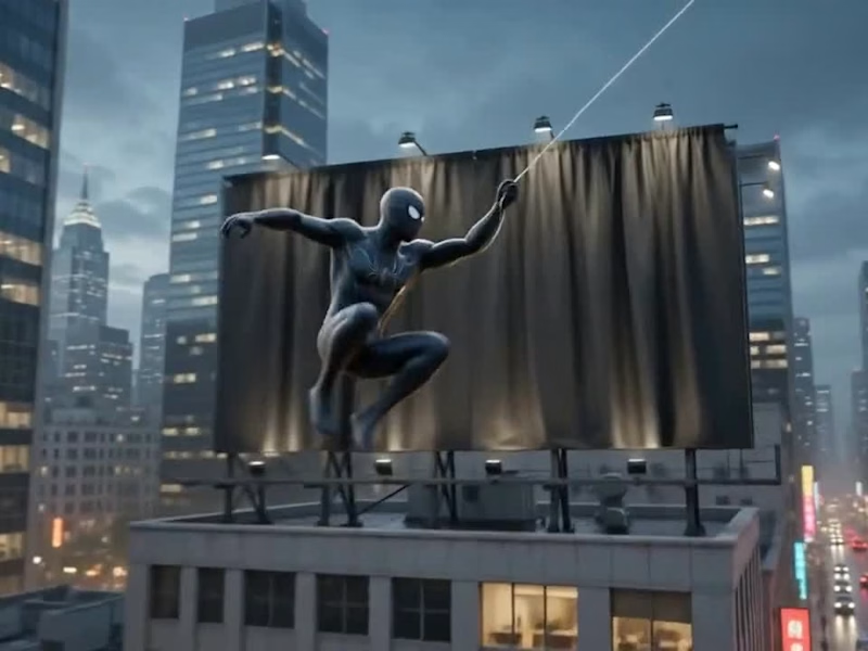
🚨 Big reveal on the skyline! 🚨
I build custom, animated, and fully responsive portfolio websites — no templates, no shortcuts, 100% built from scratch.
✅ Custom design tailored to you
✅ Fully responsive (Mobile / Tablet / PC)
✅ Modern UI/UX with smooth animations
Ready to unveil your own standout portfolio? Let's work together 👇
https://fiverr.com/createdbysaif
0
87
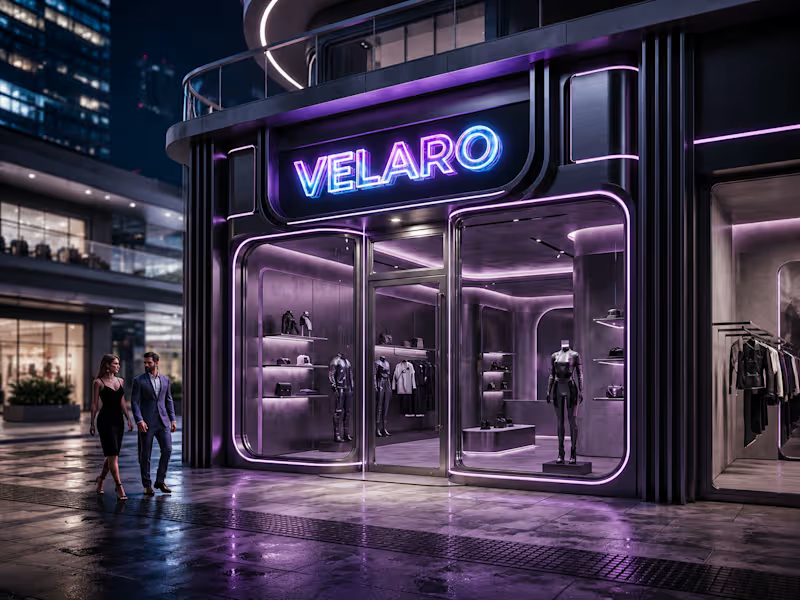
🖤 Velaro — Technical Architecture
🔗 Live Website
https://saif-velaro-clothing-brand.netlify.app
📌 Overview
Velaro is a single-page application (SPA) for a fashion/clothing brand, built with React + TypeScript, bundled by Vite, and styled with Tailwind CSS. The entire UI renders on one HTML page and updates dynamically as the user scrolls, searches, or interacts with the cart — no full page reloads.
The architecture follows a standard modern frontend pattern: a single entry point boots the app, a root App component composes independent section components, and a global context manages shared state (the shopping cart) across all of them.
⚙️ Build & Tooling Layer
These files configure how the project compiles, lints, and runs — they aren't part of the visible website, but control everything behind it.
vite.config.ts — Configures Vite, the build tool/dev server. Defines how .tsx/.ts files are compiled, how the dev server runs (npm run dev), and how the production bundle is generated (npm run build).
tsconfig.json — Root TypeScript config — points to the two more specific configs below via project references.
tsconfig.app (http://tsconfig.app).json — TypeScript rules specifically for the application code in src/ (JSX handling, module resolution, strictness, the @/ path alias).
tsconfig.node.json — TypeScript rules for Node-context files (like vite.config.ts itself), since those run outside the browser.
tailwind.config.js — Configures Tailwind CSS — defines the design system (colors, spacing, fonts) and which files Tailwind scans to generate only the CSS classes actually used.
postcss.config.js — Configures PostCSS, the tool that processes Tailwind's output and applies vendor prefixing/optimization during build.
eslint.config.js — Defines linting rules — catches code-quality issues, unused variables, and React/TypeScript best-practice violations during development.
package.json — Lists all dependencies (React, Vite, Tailwind, etc.) and defines the npm scripts (dev, build, preview).
package-lock.json — Locks exact dependency versions so the build is reproducible across machines.
.gitignore — Tells Git which files/folders to exclude from version control (e.g. node_modules, dist).
index.html — The single real HTML file. Contains a root <div> that React mounts into — everything else is injected by JavaScript.
dist/ — Auto-generated production build output (plain HTML/CSS/JS) created by npm run build. This is the folder actually deployed to Netlify.
node_modules/ — Auto-generated folder holding all installed dependencies (created by npm install, never edited manually).
🚪 Application Entry & Root
src/main.tsx — The true entry point of the app. Imports React, imports App.tsx, and mounts it into the <div> inside index.html. This is the first application code that runs.
src/App.tsx — The root component. Doesn't contain page content itself — instead it imports and arranges every section component (Navbar, Hero, About, etc.) in order, and wraps everything in the CartProvider so cart state is available app-wide.
src/index.css — Global stylesheet — imports Tailwind's base/utility layers, applied once at the root so every component can use Tailwind classes.
src/vite-env.d.ts — TypeScript type declarations for Vite-specific features (like importing images/CSS as modules) — lets TypeScript understand syntax that isn't standard JavaScript.
🛒 State Management
src/cart.tsx — Implements the CartProvider, a React Context that holds global cart state (items, quantities, totals) and exposes functions to add/remove items. Any component wrapped inside it (via App.tsx) can read or update the cart without prop-drilling.
src/data.ts — Static data module — likely product listings, collection info, or other content consumed by components like FeaturedCollection and Showcase, kept separate from UI logic.
🧱 Component Layer (src/components/)
Each file is a self-contained, single-responsibility UI section. App.tsx stacks them vertically to form the full page.
Navbar.tsx — Persistent top navigation — branding, menu links, and likely triggers for search/cart.
Hero.tsx — The primary landing banner — headline, tagline, and call-to-action (e.g. "Shop Collection").
HeroCanvas.tsx — A visual/animated layer paired with Hero.tsx — likely a canvas-based or decorative background effect behind the hero text.
FeaturedCollection.tsx — Renders a curated set of products, pulling structured data from data.ts.
About.tsx — Brand-story section — static content describing the label's identity.
Lookbook.tsx — A style/editorial gallery — visually presents outfits or campaign imagery.
Showcase.tsx — An additional highlight section, likely for a specific collection, drop, or promotional content.
Testimonials.tsx — Displays customer reviews/social proof.
Newsletter.tsx — Email capture form/section for marketing signups.
SearchOverlay.tsx — A modal/overlay component for in-site product search, toggled from the Navbar.
CartDrawer.tsx — A slide-out panel UI that reads from the CartProvider (cart.tsx) to display current cart items and totals.
Footer.tsx — Bottom-of-page section — links, contact details, social icons.
🔄 How It All Connects (Data Flow)
The browser loads index.html, which pulls in the compiled JS bundle.
main.tsx runs first and mounts App.tsx into the page.
App.tsx wraps all sections in CartProvider, so cart state is shared without passing props down manually through every component.
Each section component renders independently — some are purely static/presentational (About, Footer), while others are interactive and tied into shared state (CartDrawer, SearchOverlay).
Tailwind classes used throughout every component are compiled once into index.css based on what's scanned via tailwind.config.js.
On npm run build, Vite compiles and bundles all of this into optimized static files inside dist/ — which is what gets deployed to Netlify and served to visitors.
🧠 Why This Structure Works
Separation of concerns — each component owns one visual section; layout composition happens only in App.tsx.
Centralized state — cart logic lives in one file (cart.tsx) instead of being duplicated across components.
Data/UI separation — data.ts keeps content separate from rendering logic, making it easy to update products without touching component code.
Type safety — TypeScript configs enforce consistent typing across the whole src/ folder, catching errors before runtime.
Optimized output — the dev-only tooling (Vite, Tailwind, ESLint, TS configs) never ships to production; only the final compiled dist/ bundle is deployed.
0
89

StreamPro — Brand Website for a Live Event Broadcasting Studio
Live Website: saif-stream-pro-website.netlify.app (http://saif-stream-pro-website.netlify.app)
What I built😍
A fully responsive, mobile and web based single-page marketing website for StreamPro, a Brisbane-based live-streaming production studio that broadcasts memorial services, weddings, sports events, and community occasions. The site was designed and developed from scratch to establish a premium, trustworthy brand presence and convert visitors into booking inquiries — working seamlessly whether accessed from a phone, tablet, or desktop.
What it does🙌
The website guides visitors through a structured narrative — introducing the brand, building credibility, showcasing services, explaining the booking process, displaying social proof, and closing with a direct contact/quote form. It's built to load fast, adapt fluidly across mobile and web based environments, and feel as polished and reliable as the broadcast service it's selling.
Core concepts & techniques applied💯
Semantic document structure — content organized into meaningful, accessible sections rather than generic divs, improving both SEO and screen-reader usability.
Design system / design tokens — a centralized set of reusable variables (colors, gradients, typography, spacing) so the entire visual identity stays consistent and can be updated globally from one place.
Responsive, mobile-first layout design — fluid grids and breakpoints so the layout adapts smoothly across mobile and web based screens without needing separate versions.
Scroll-based interactivity — dynamic navbar states, scrollspy navigation (highlighting the active section as the user scrolls), and progressive scroll-reveal animations for content.
DOM manipulation & event handling — mobile menu toggling, animated statistic counters, and form interaction logic, all built with vanilla JavaScript (no frameworks).
Accessibility considerations — visible focus states, reduced-motion support for users sensitive to animation, and descriptive alt text on all imagery.
Brand identity integration — a custom 3D gradient logo mark and supporting visual graphics applied consistently across the navigation, hero section, and footer to reinforce brand recognition.
Conversion-focused UX — strategic placement of trust signals (stats, testimonials, direct phone contact) and a structured lead-capture form to turn visitors into inquiries.
Outcome🚀
A performant, framework-free static website that's lightweight, cheap to host, easy to maintain, fully mobile and web based responsive, and built entirely around fundamental web development principles — structure, styling systems, interactivity, accessibility, and conversion design.
0
216

Webflow Expertise: Figma to Custom Code Solutions

Webflow Expertise: Figma to Custom Code Solutions
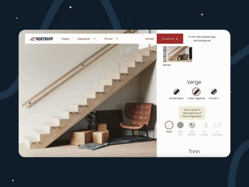

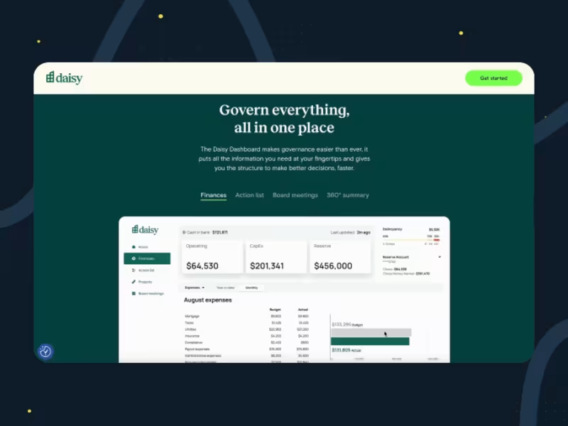
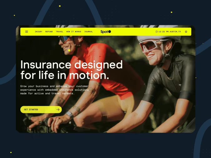
View more →

Brand & Web Designer | Identity, Motion & Webflow
Brand & Web Designer | Identity, Motion & Webflow
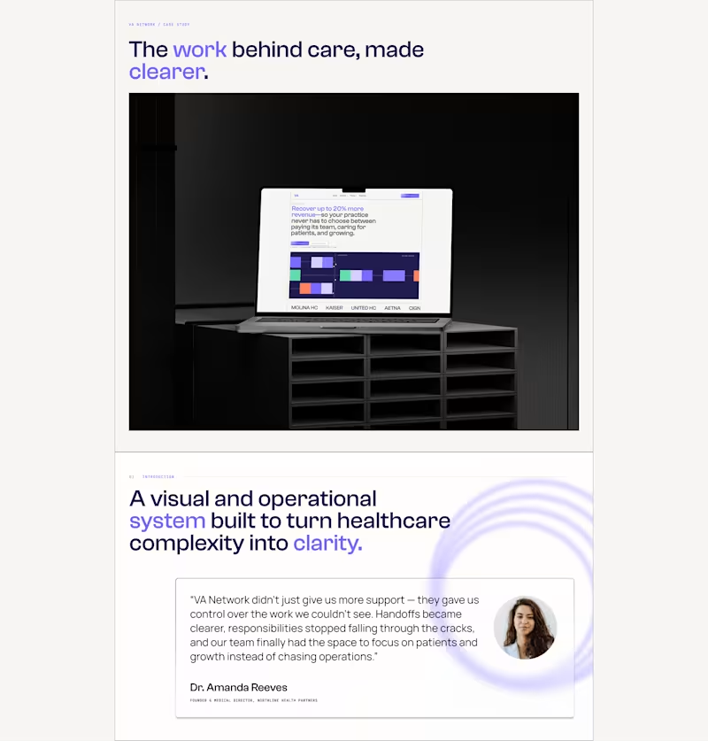

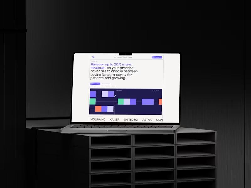
Took the VA Network visual system into motion.
I developed and directed the concept, pacing, interactions, visual language and sound around one idea:
how do you make all the work behind a healthcare practice feel visible, structured and easier to manage?
a few iterations later, this is where it landed.
2
1
193

Mobile | Web Developer
Mobile | Web Developer