Scroldev Brand Identity & Website Design

Muhammad Abdullah


Logo and Brand Identity
SCROLDEV Brand Identity & Website Design | Web Design Agency Branding
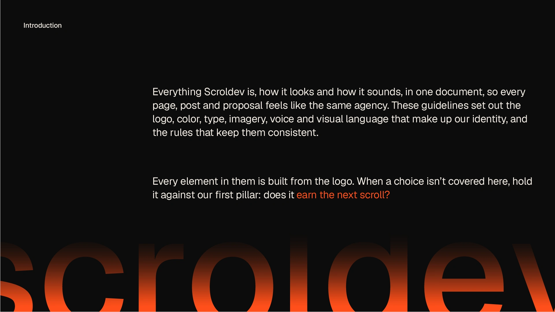
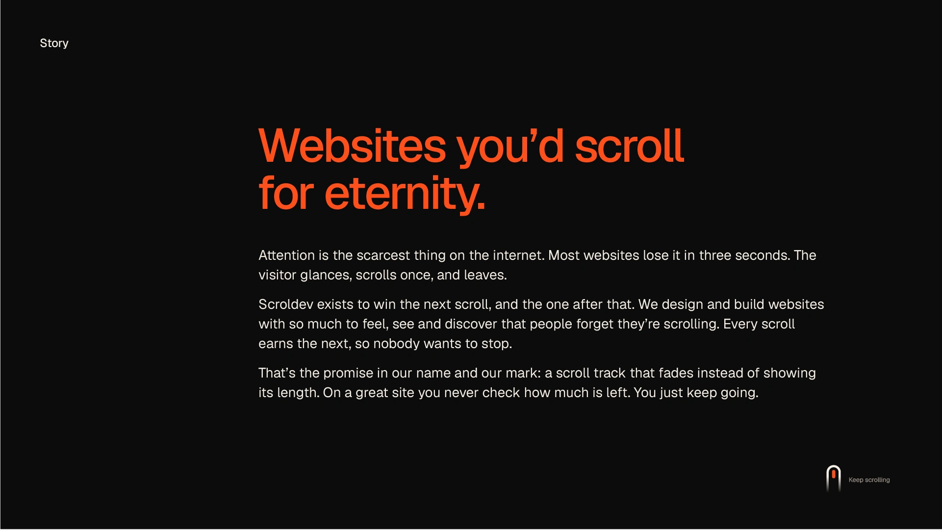
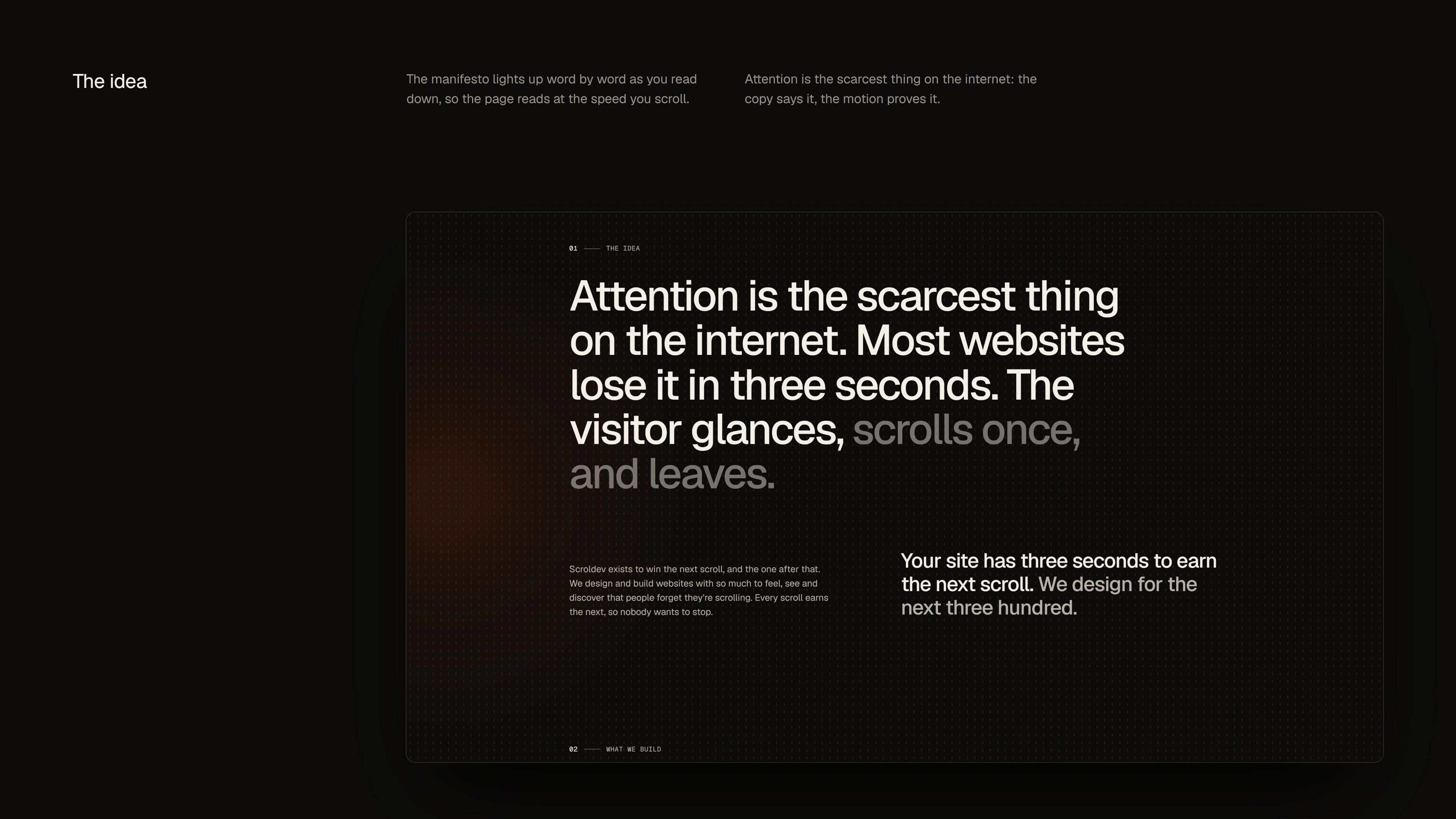
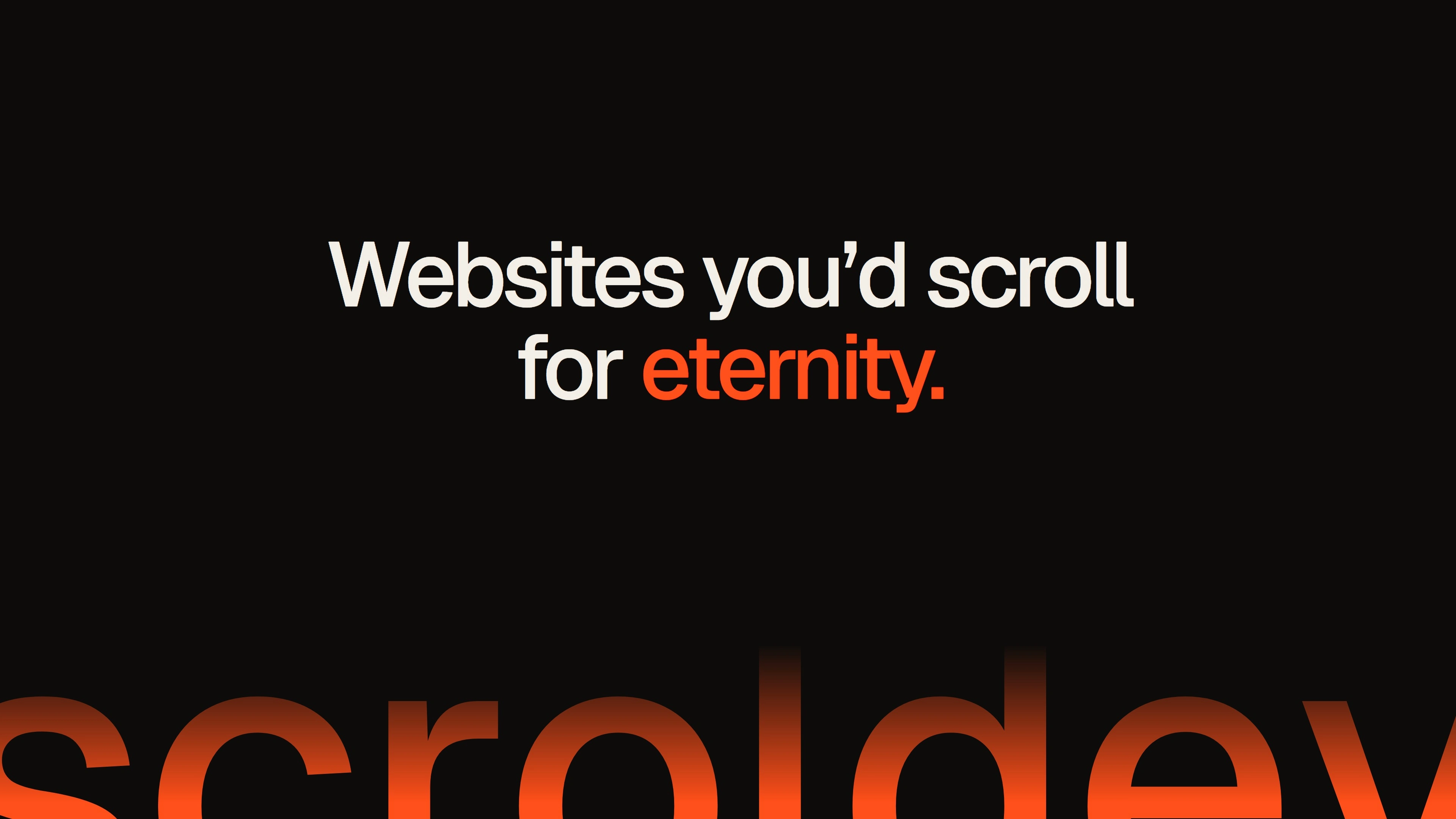
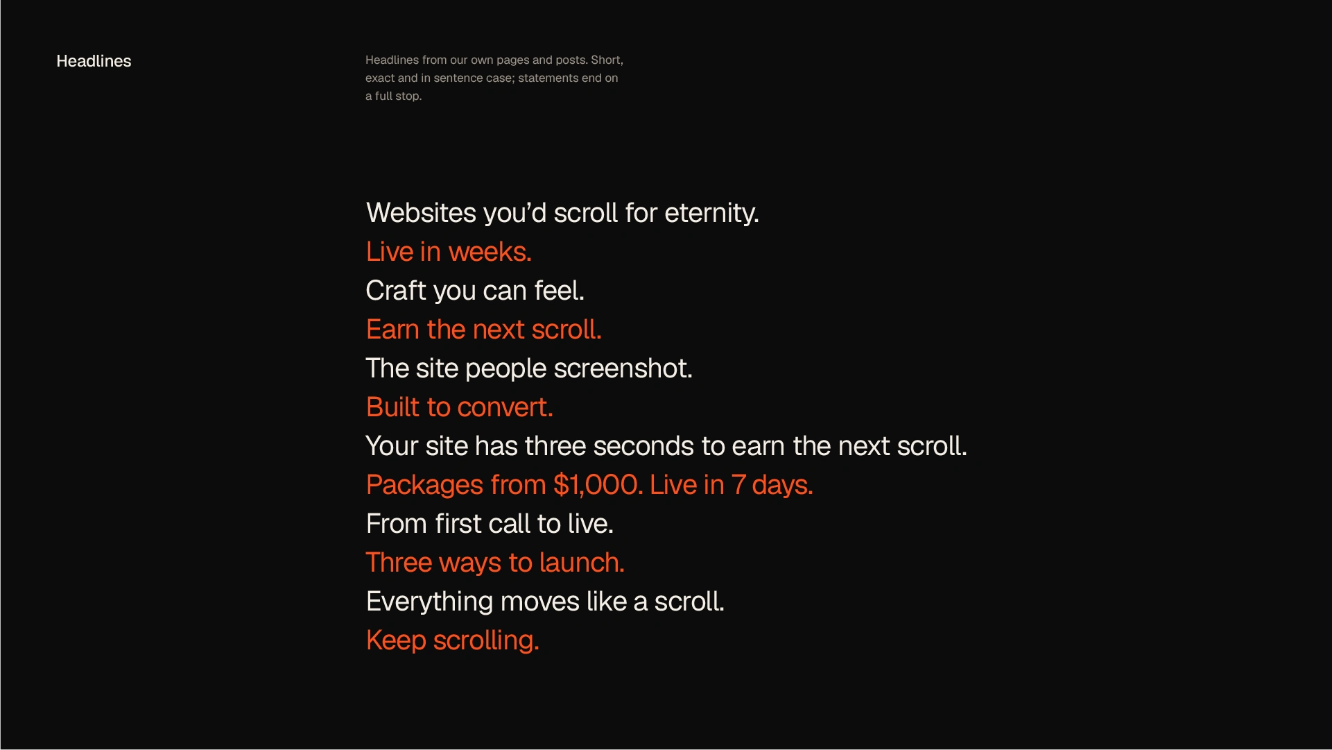
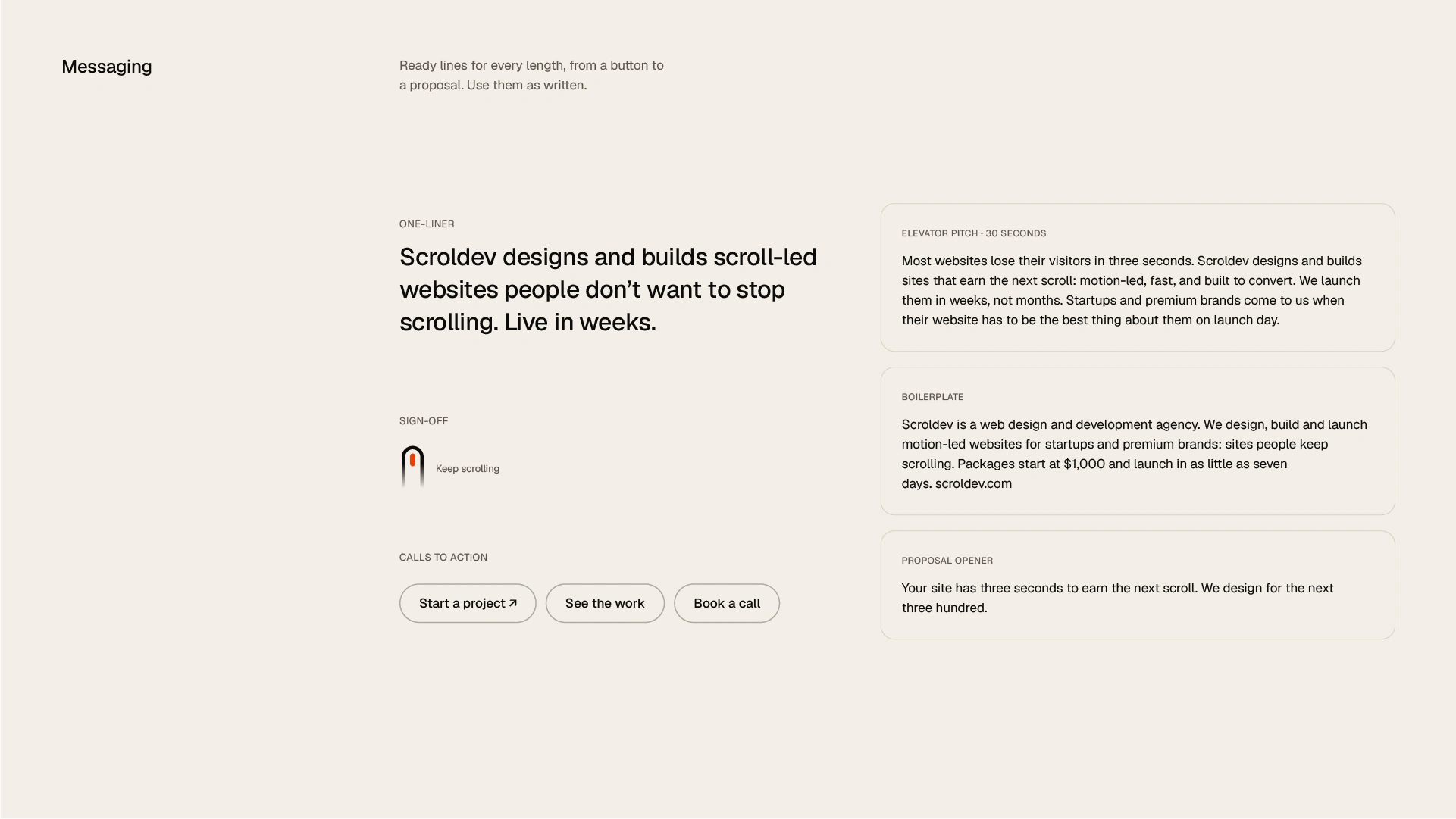
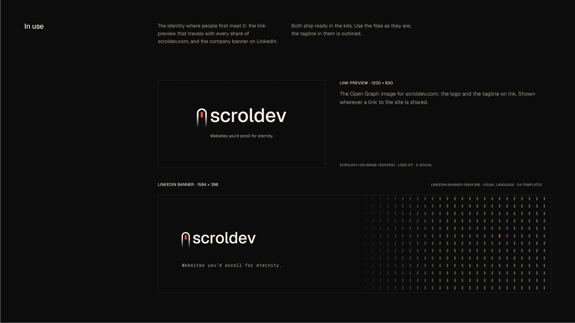
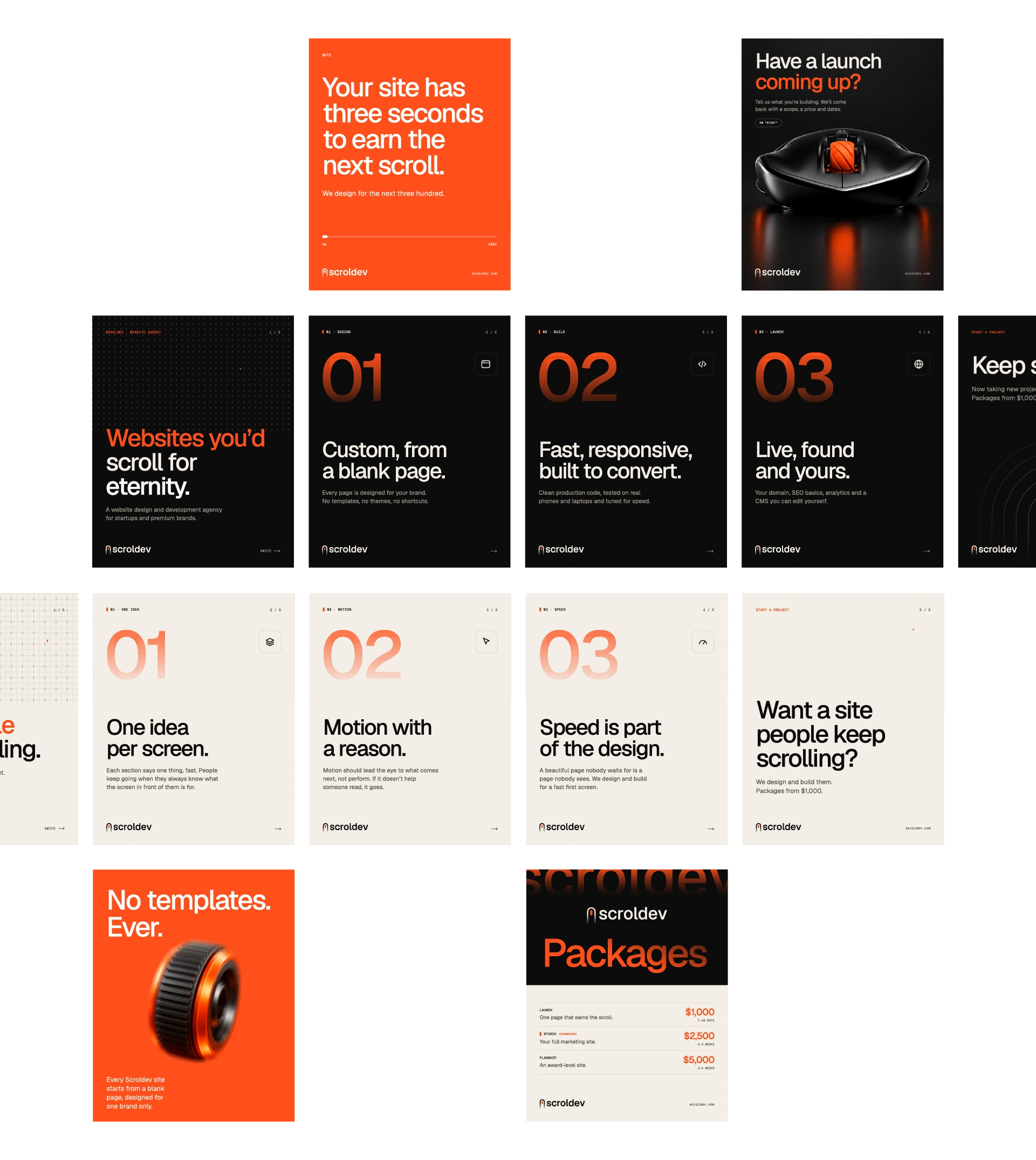
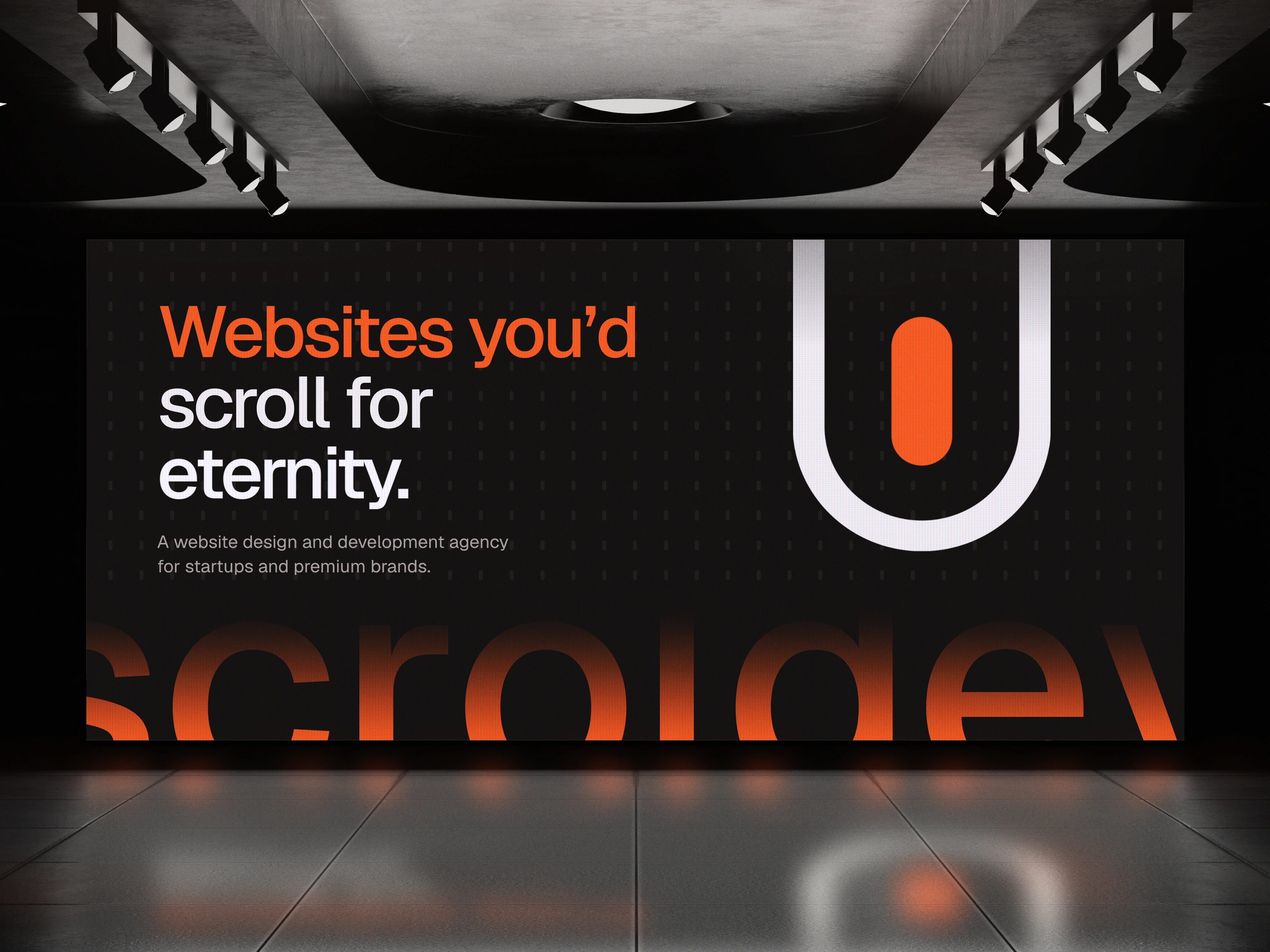
Scroldev is a web design and development agency creating motion-led websites for startups and premium brands. The brand identity, visual system and website were built around one strategic idea: Websites you’d scroll for eternity. On today’s internet, attention is the scarcest resource and most websites lose it in seconds. Scroldev exists to win the next scroll, and the one after that.
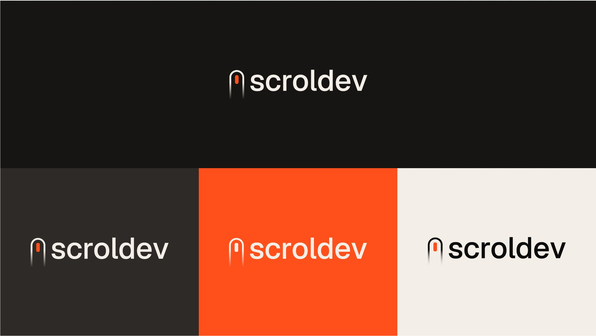
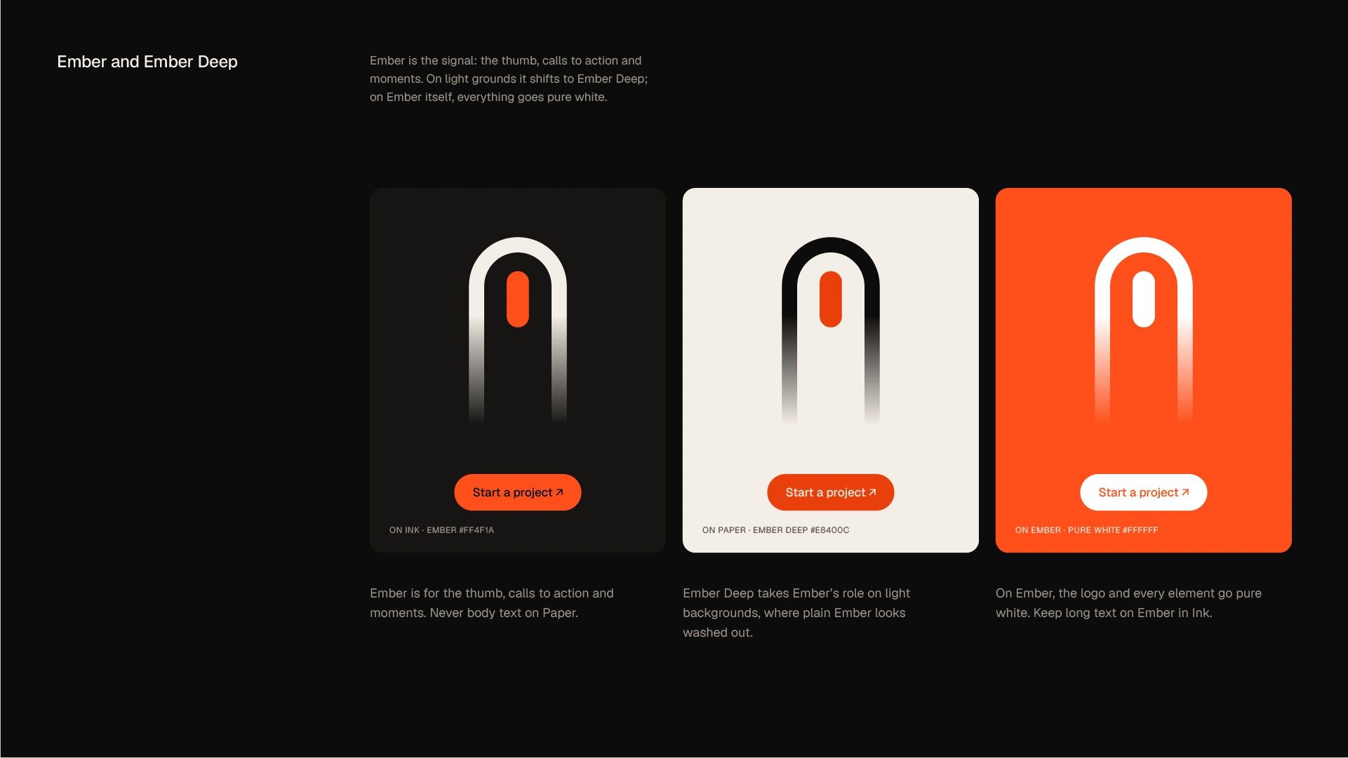
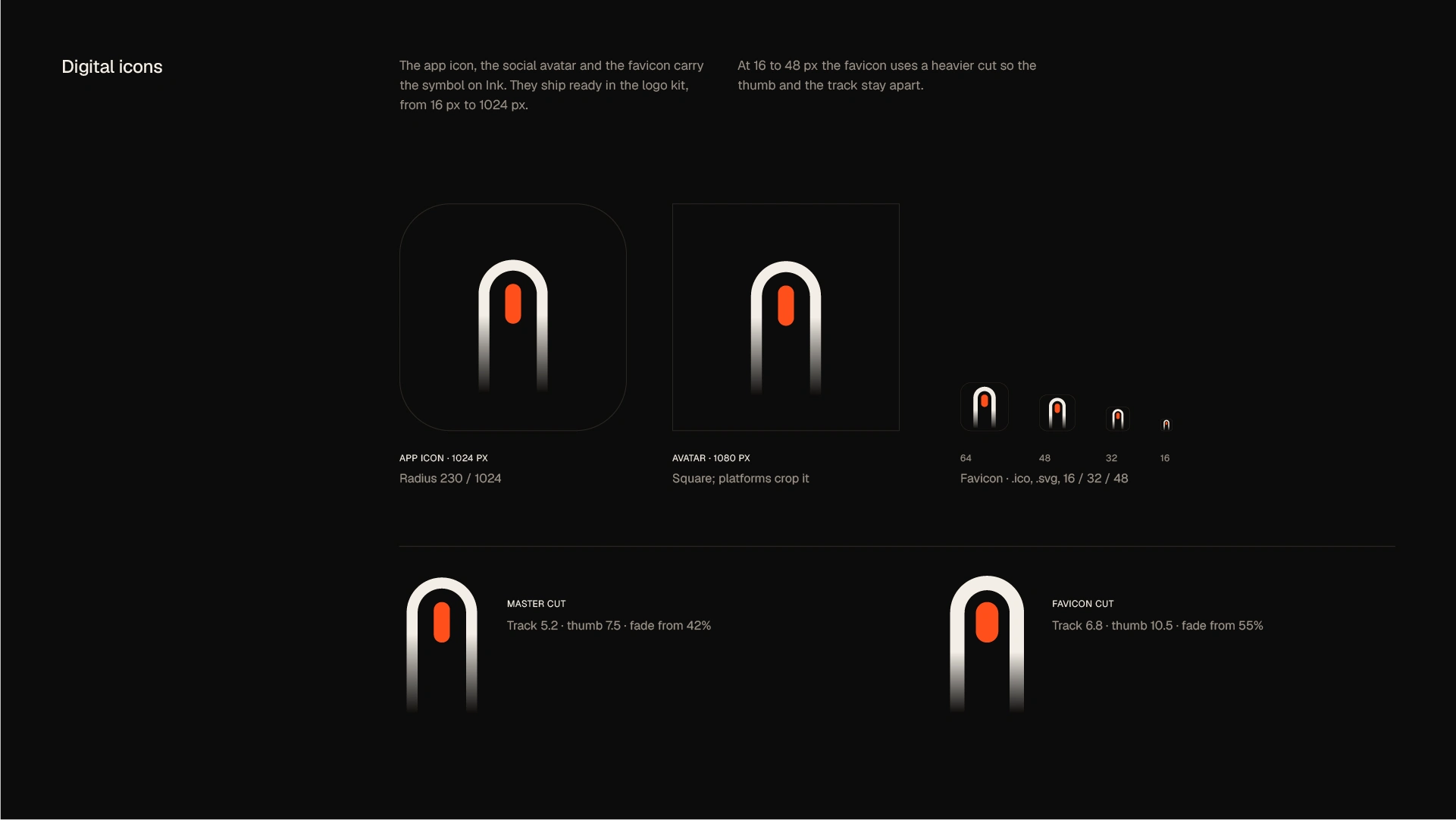
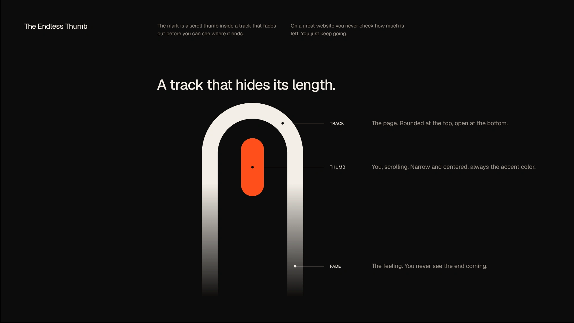
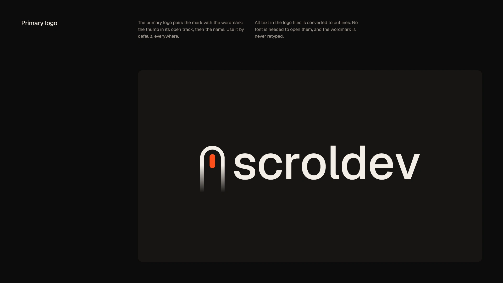
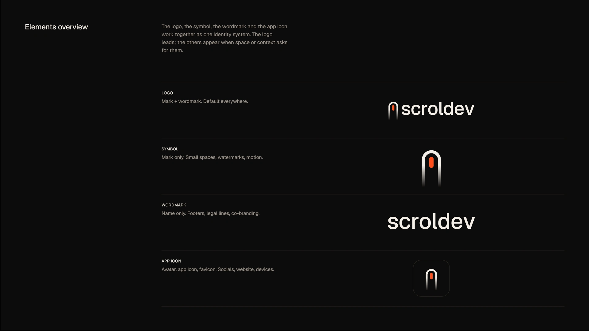
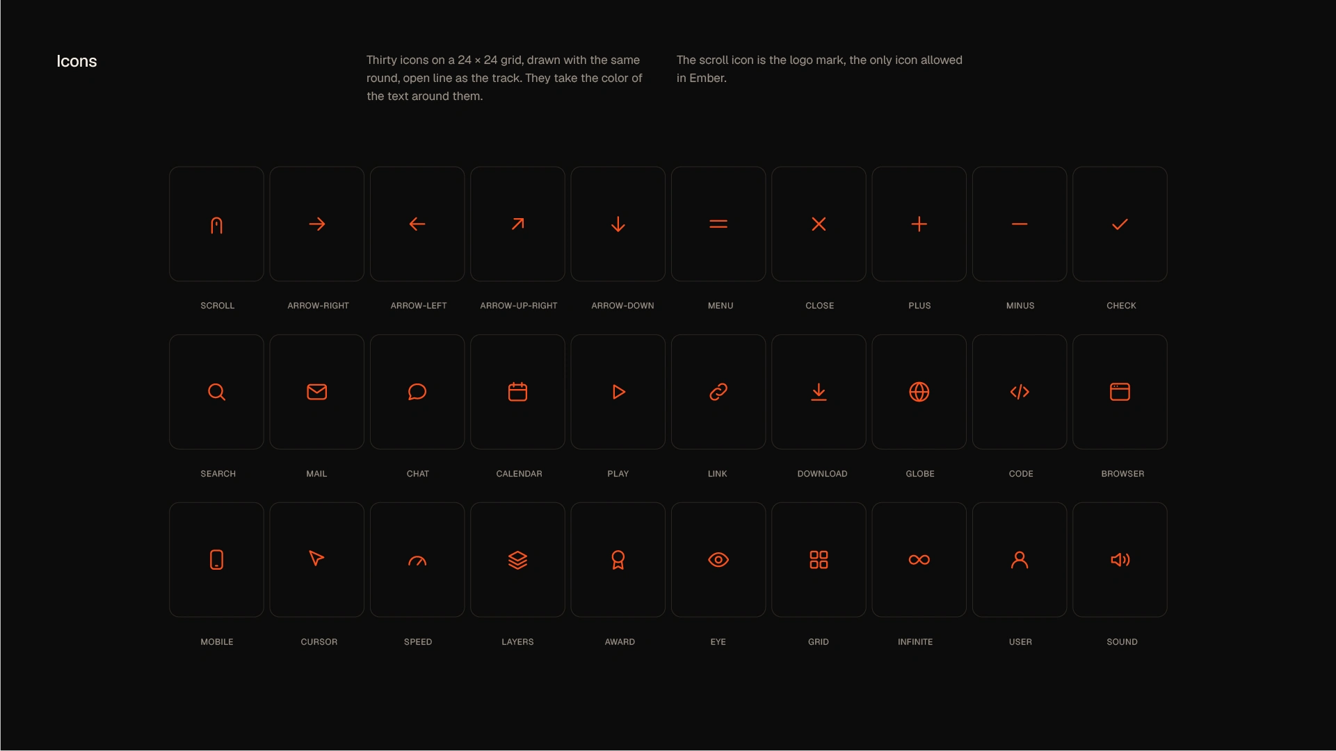
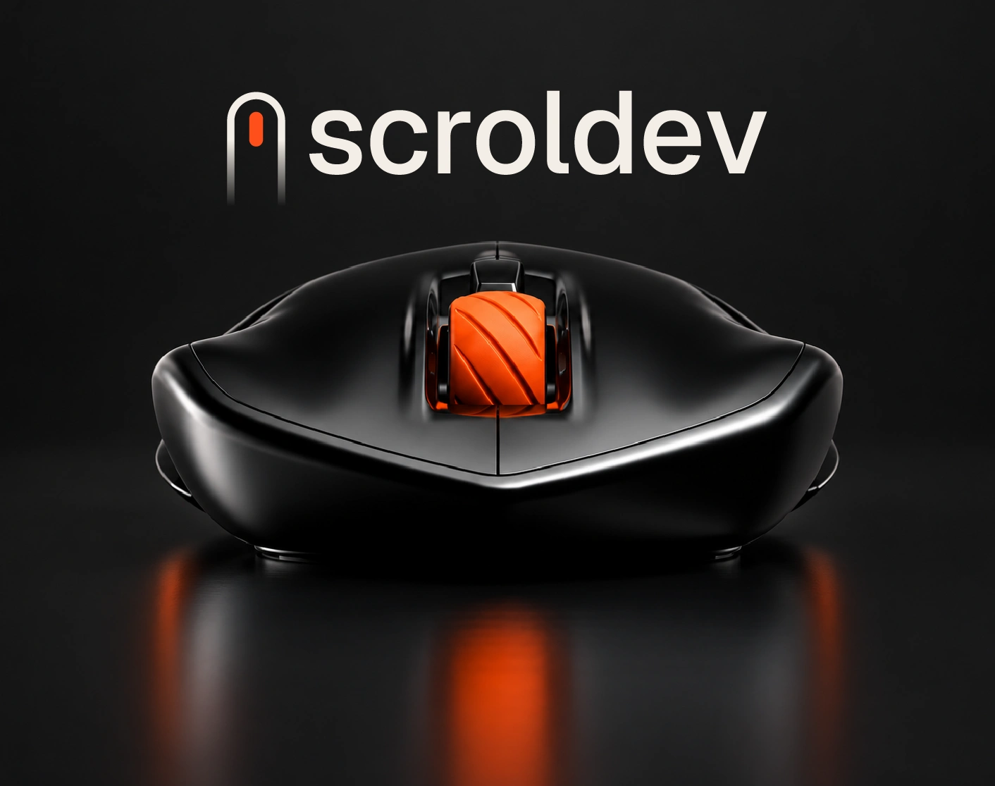
At the centre of the logo is the Endless Thumb, a symbol drawn from the most familiar element of the web: the scrollbar. An Ember scroll thumb sits inside an arched track that fades away instead of showing its length. You never see where the page ends, so you keep going. Built on a precise 40 × 64 grid and paired with a clean lowercase wordmark, the logo turns a universal interface detail into a distinctive, ownable brand mark that scales from a 16 px favicon to large-format brand applications.
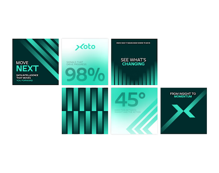
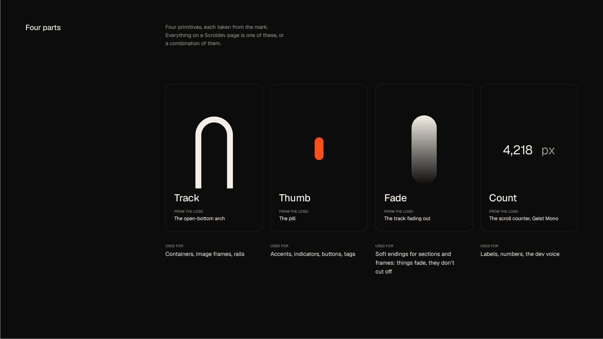
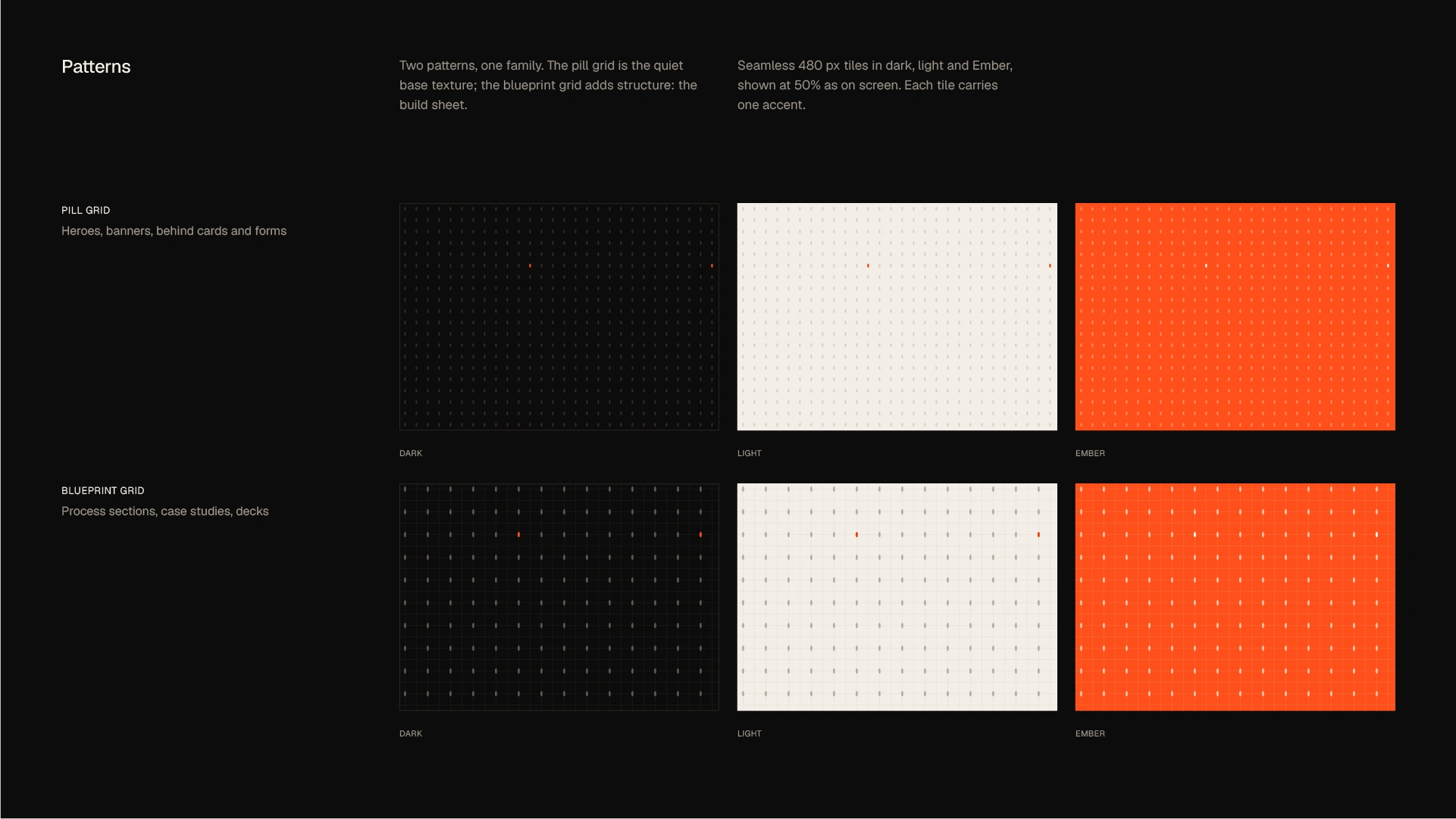
The wider visual identity grows from four parts of the scroll: Track, Thumb, Fade and Count. Together they become a flexible brand language:
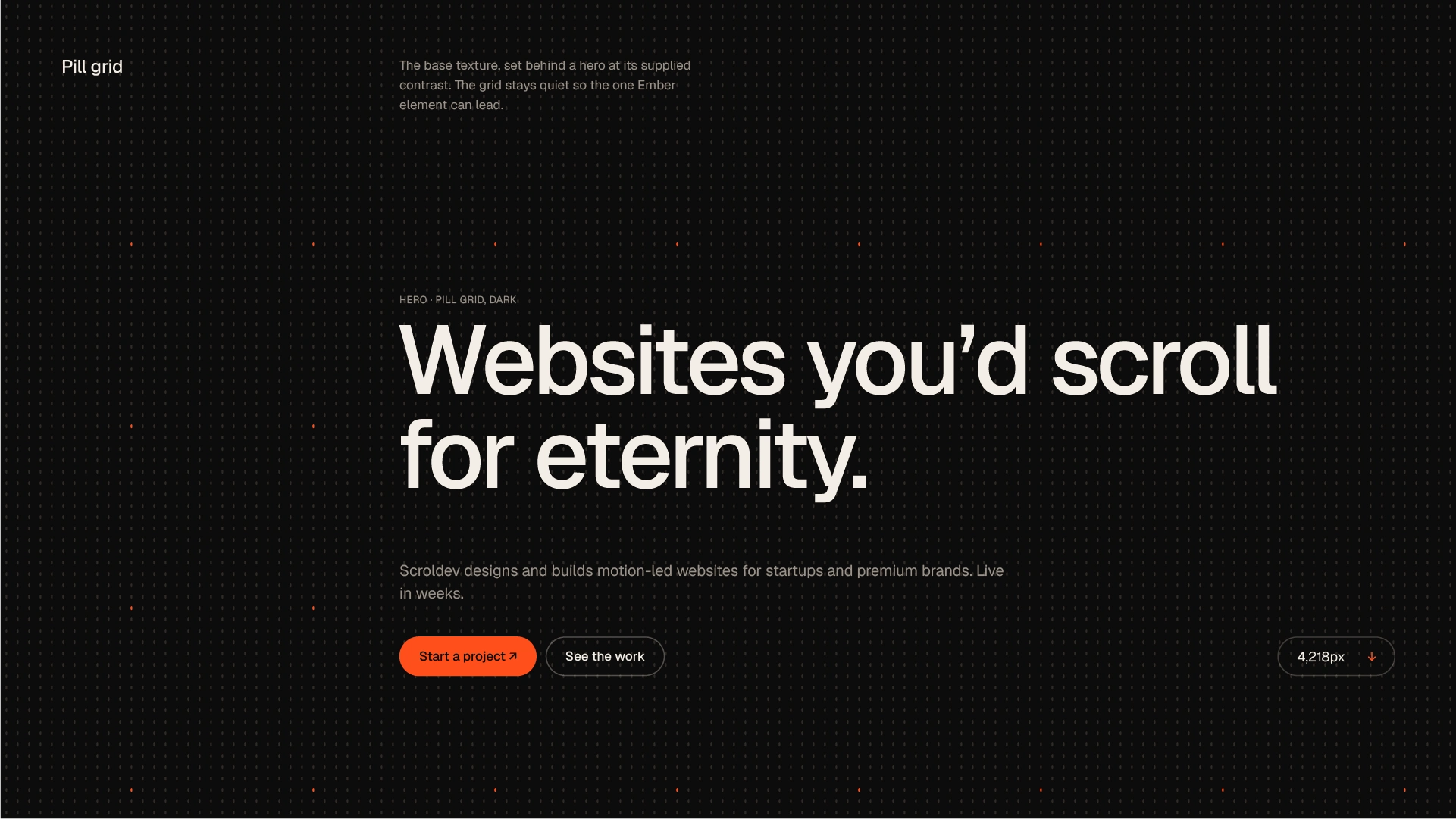
a modular pill grid in which every pill is a tiny scroll thumb
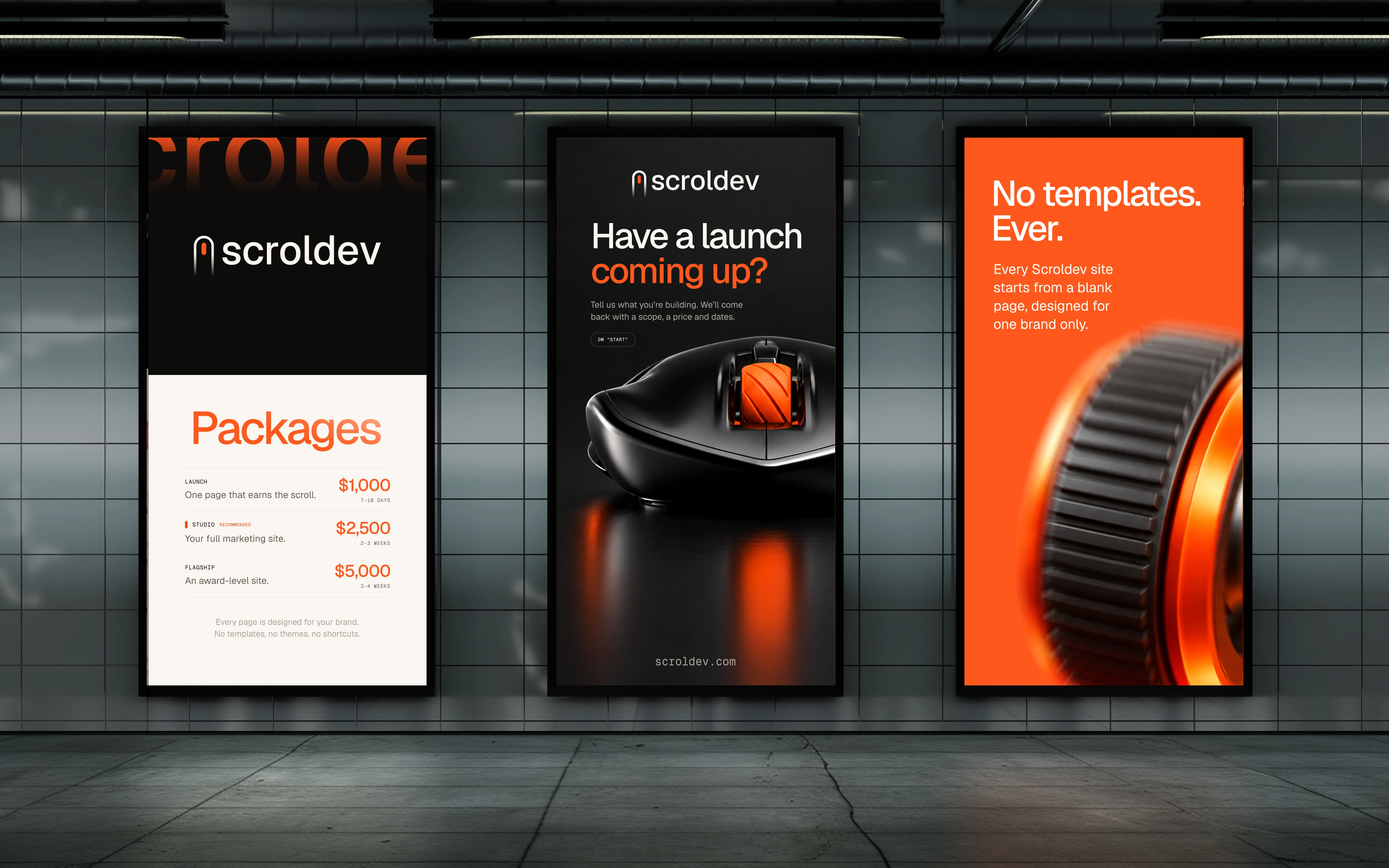
arch echo supergraphics
cropped-mark compositions
fade stripes
a live scroll counter
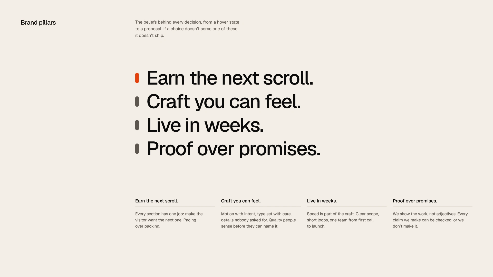
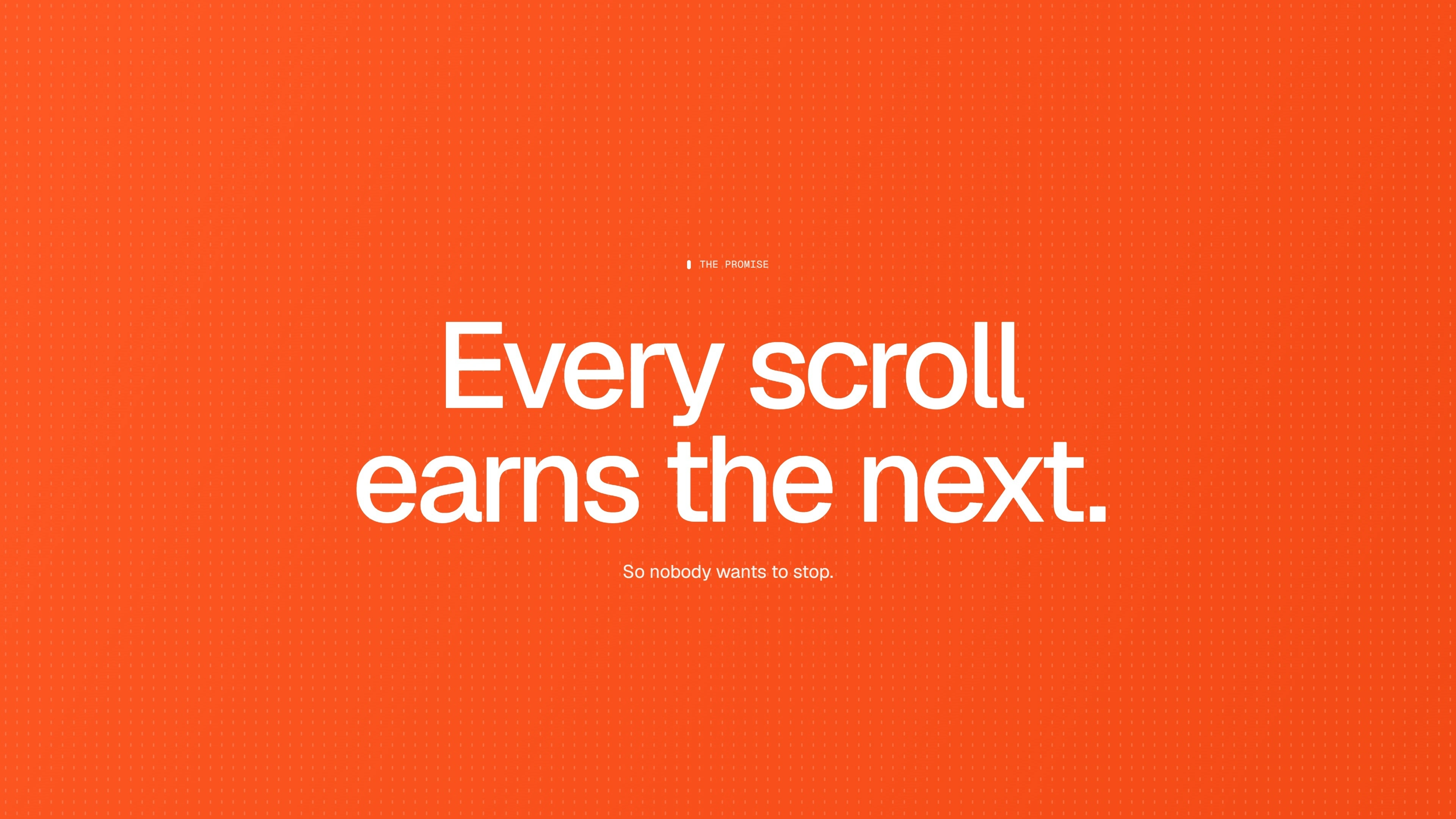
Guided by the principle “Every scroll earns the next,” the system turns scrolling, the most everyday action online, into a recognisable visual signature.
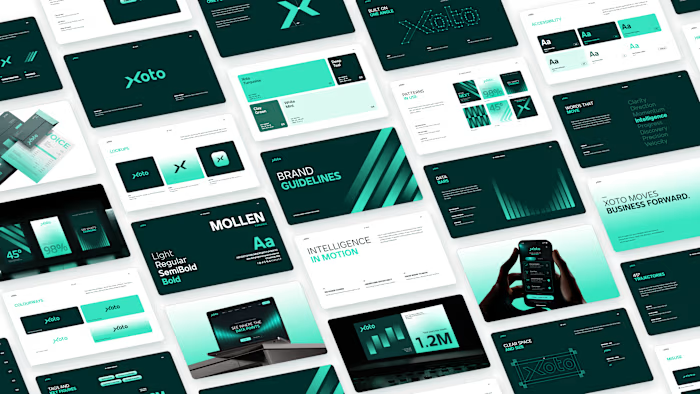
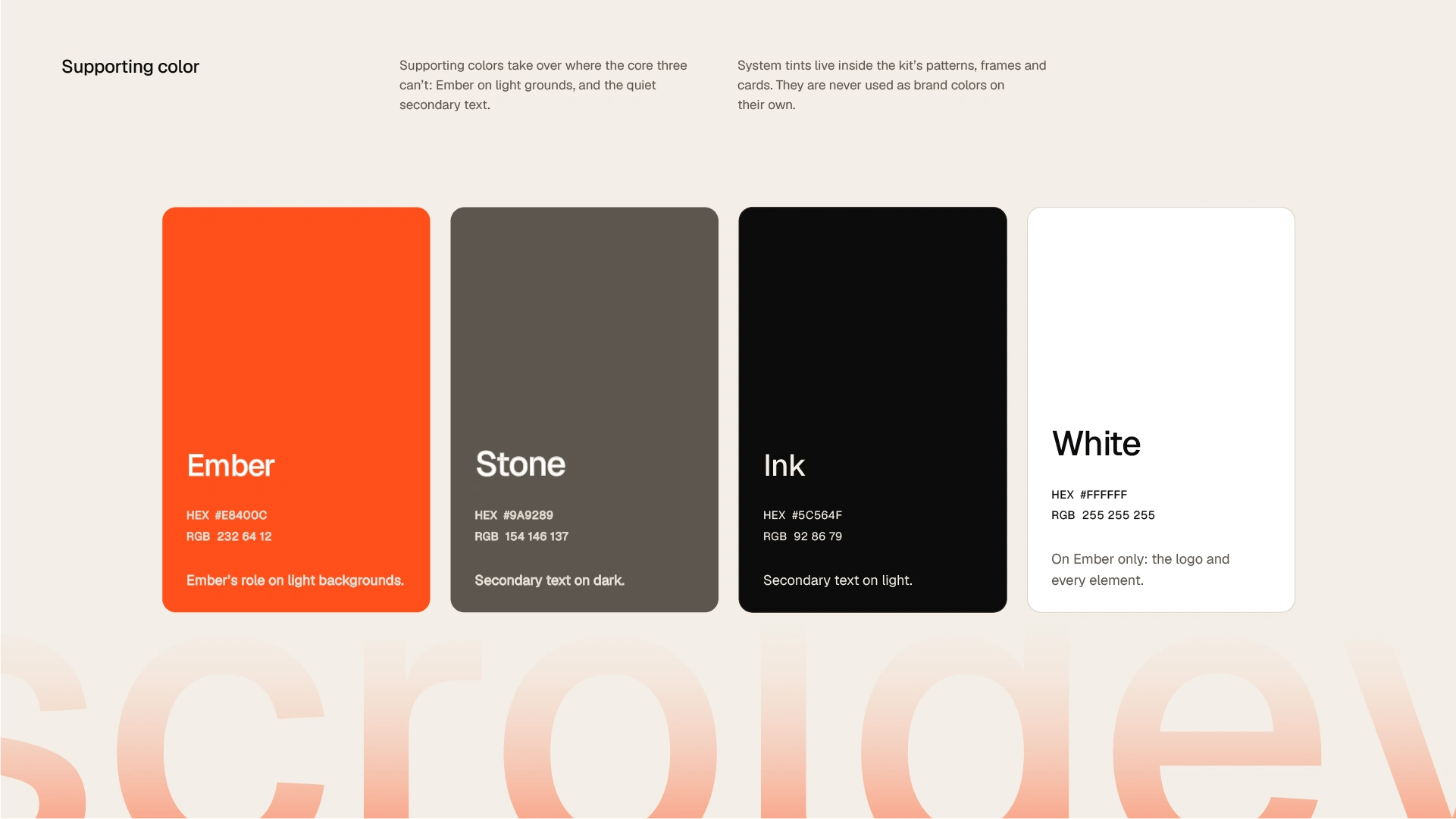
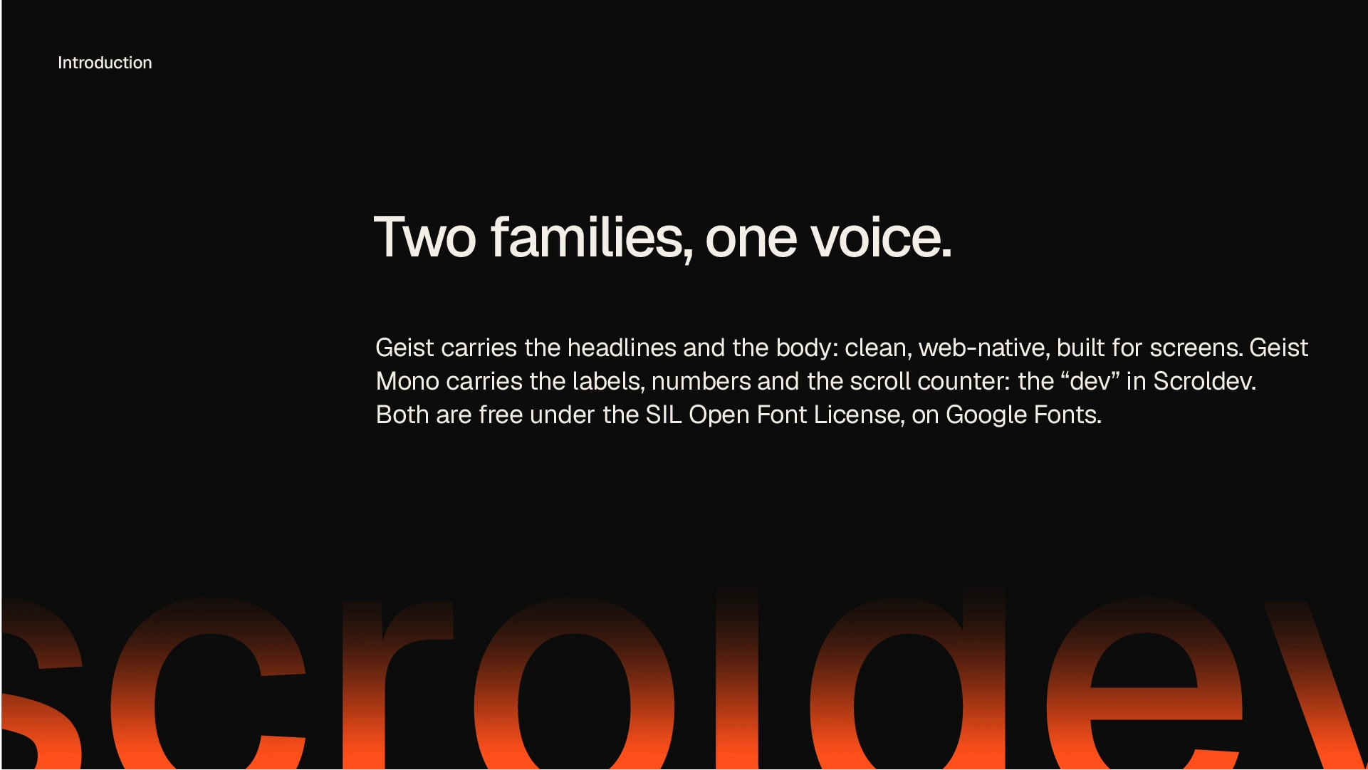
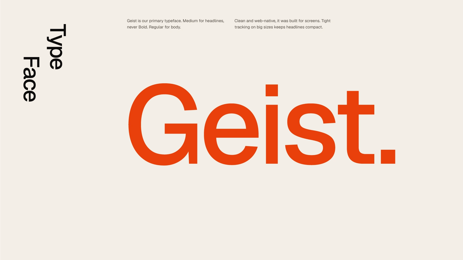
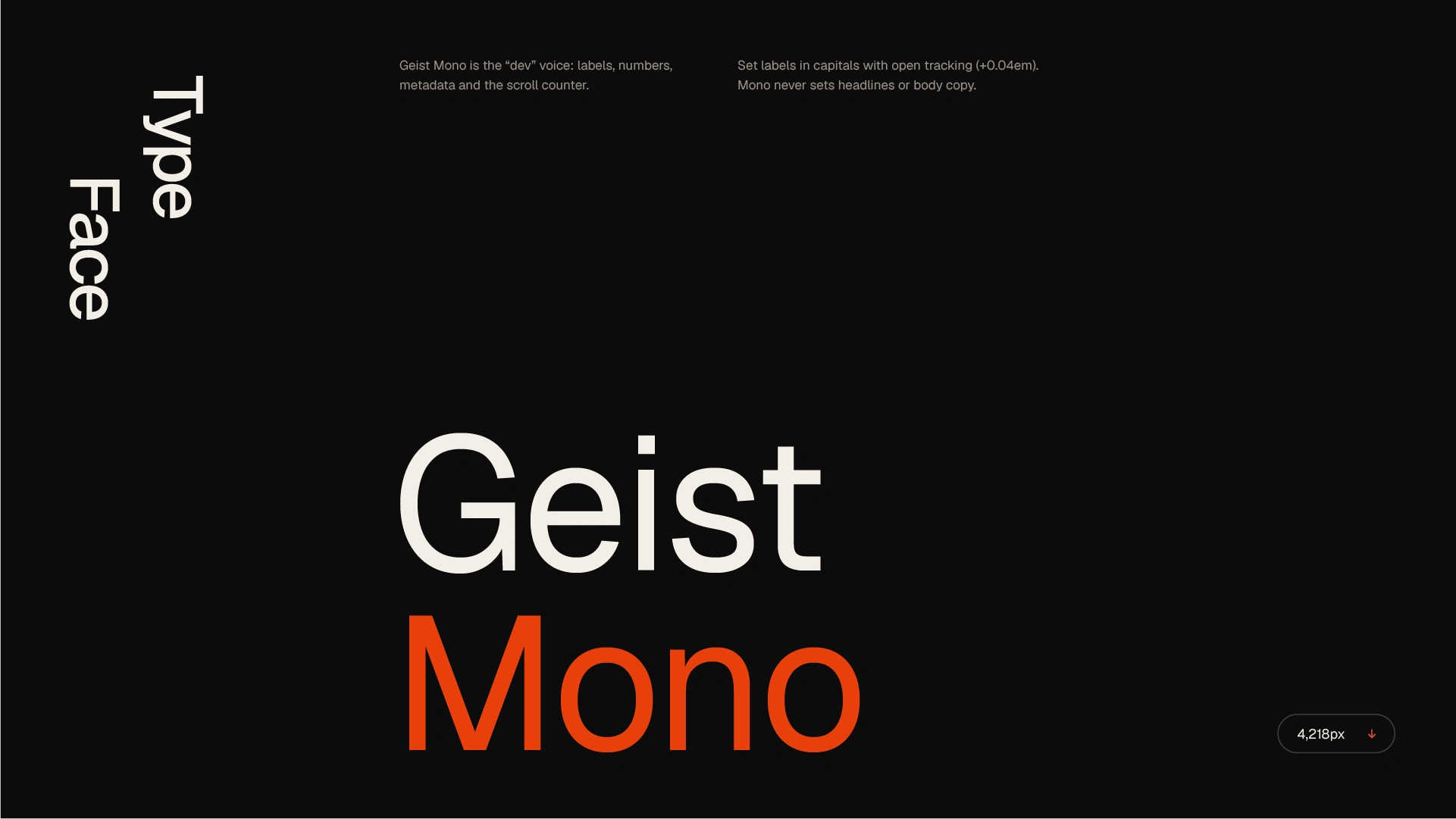
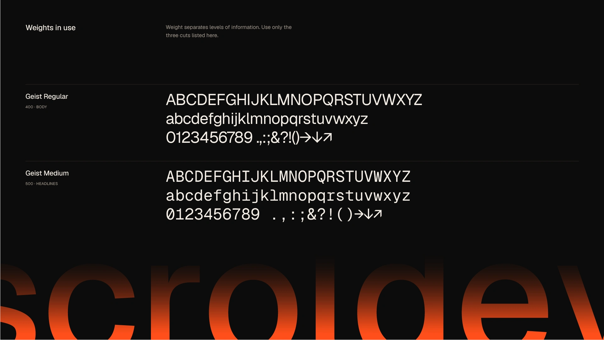
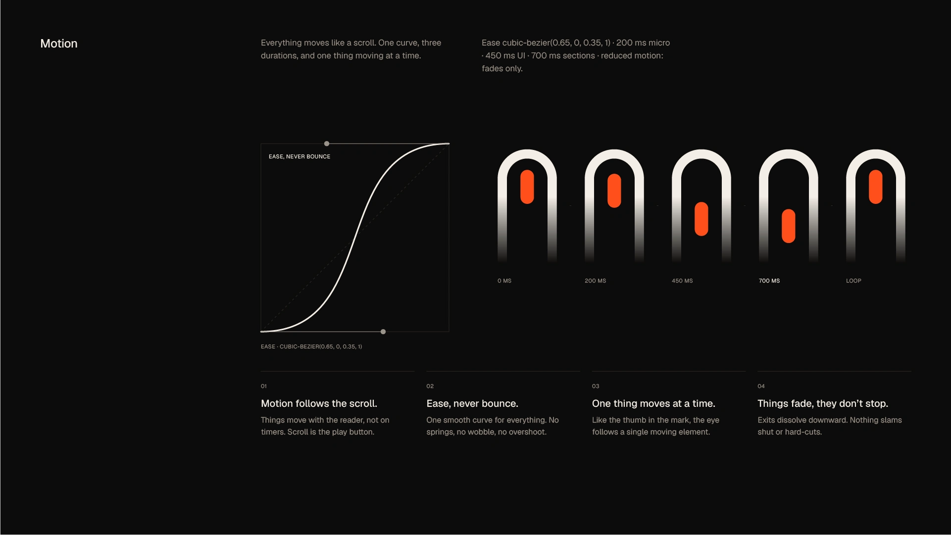
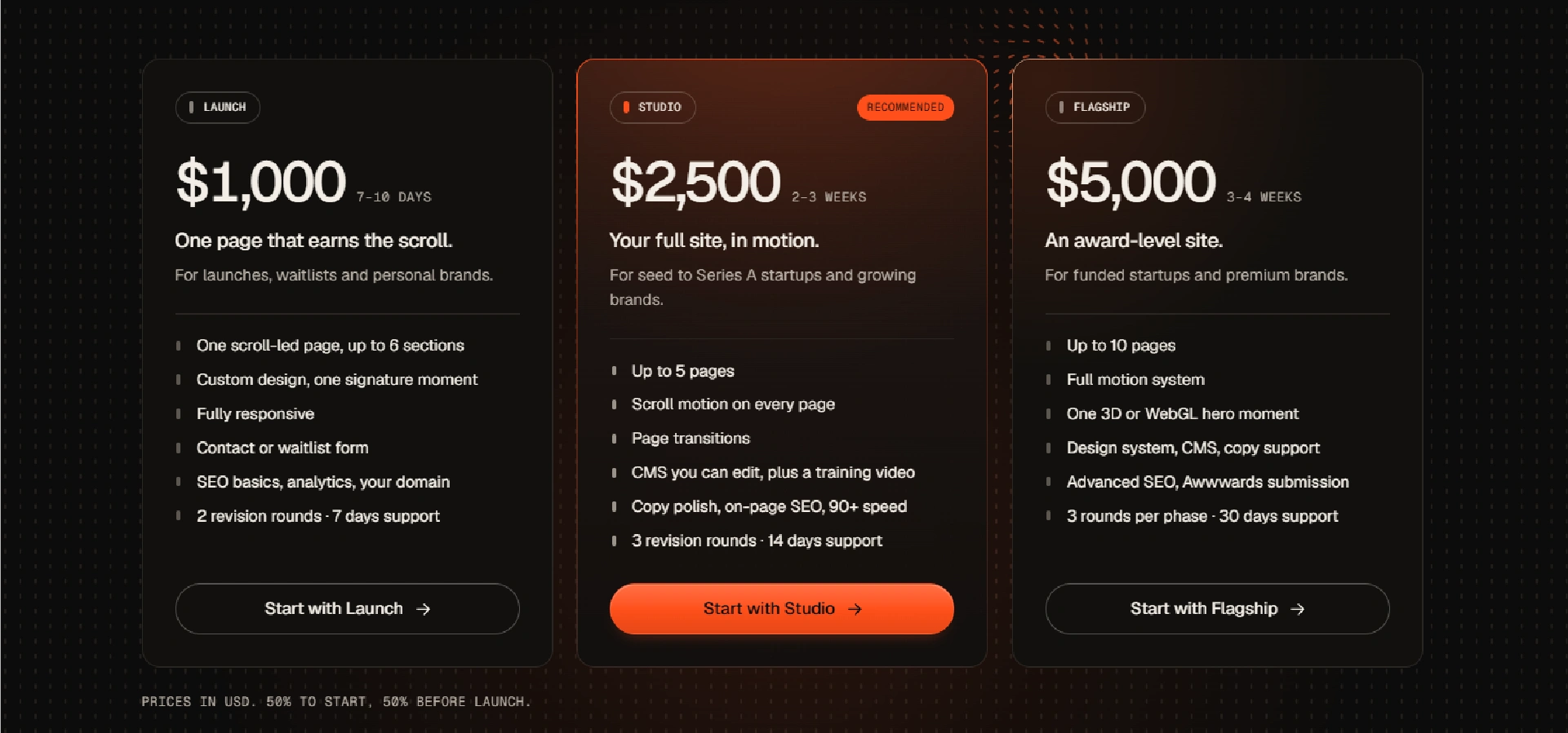
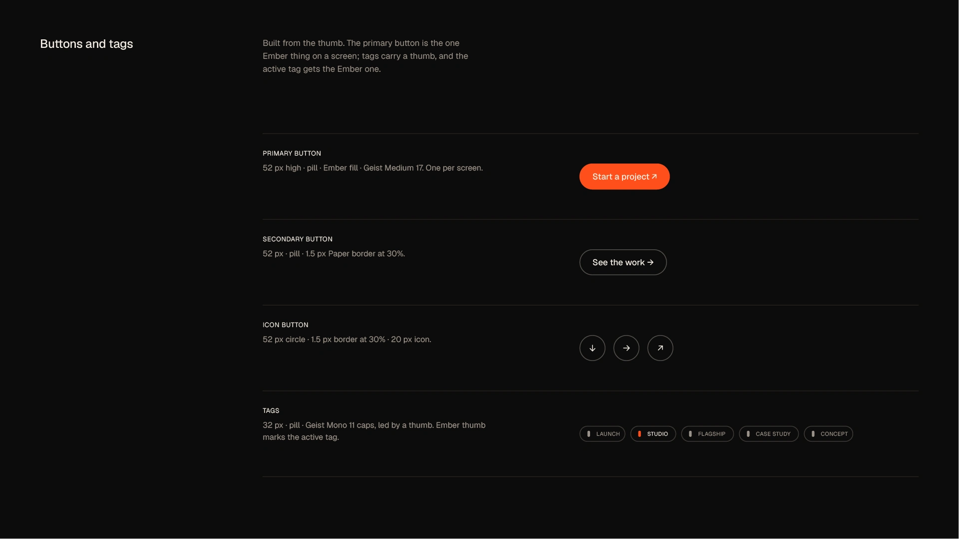
The colour palette pairs warm Ember orange with deep Ink black and soft Paper white, under a strict rule of one: a single Ember accent per layout. Ember signals energy, momentum and attention; Ink brings depth and authority; Paper gives the system room to breathe. Typography uses Geist for headlines and Geist Mono for labels and data, creating a precise, modern hierarchy rooted in the language of code. A single motion curve governs every animation, so the brand moves with one consistent rhythm across screens.
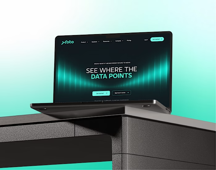
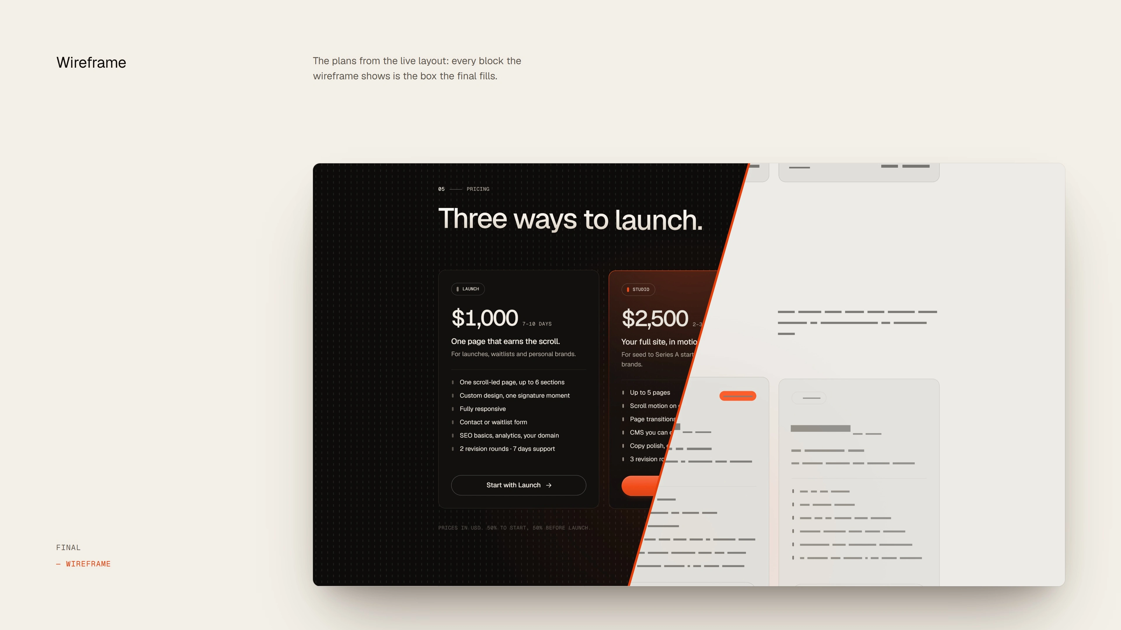
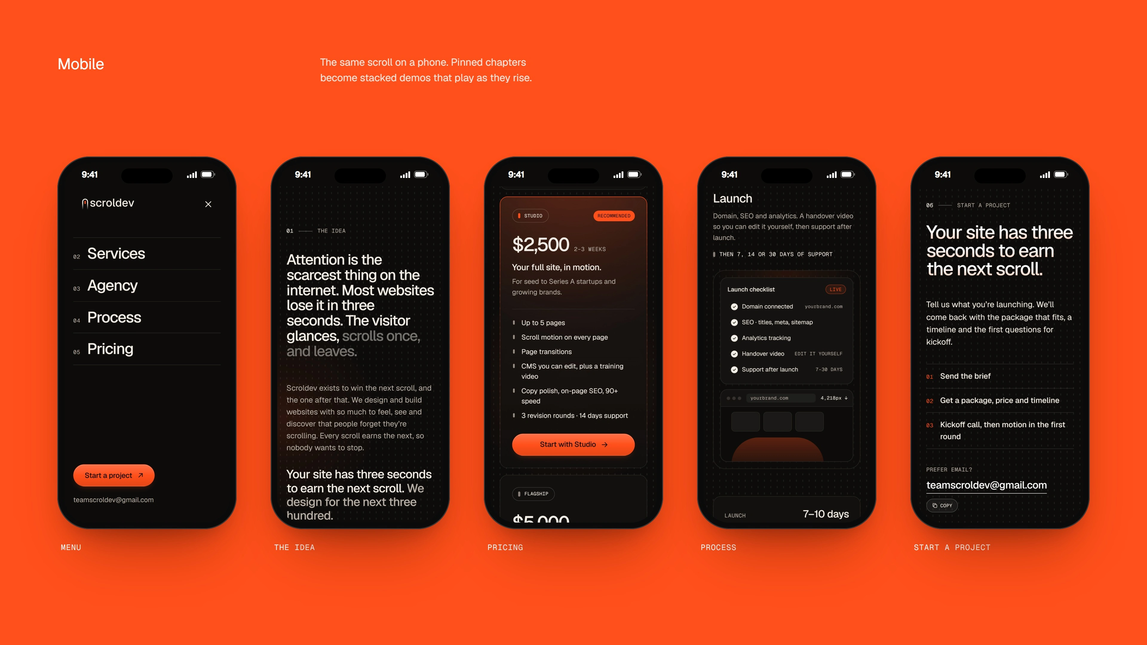
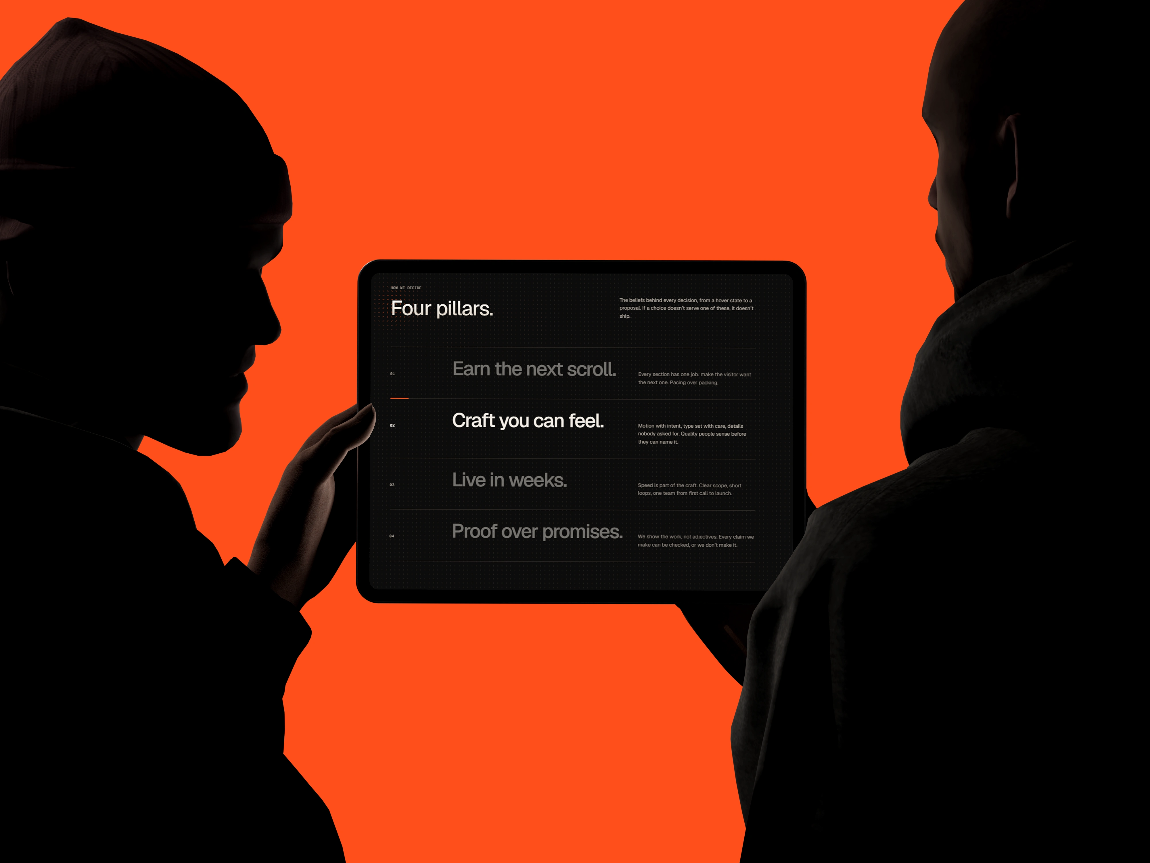
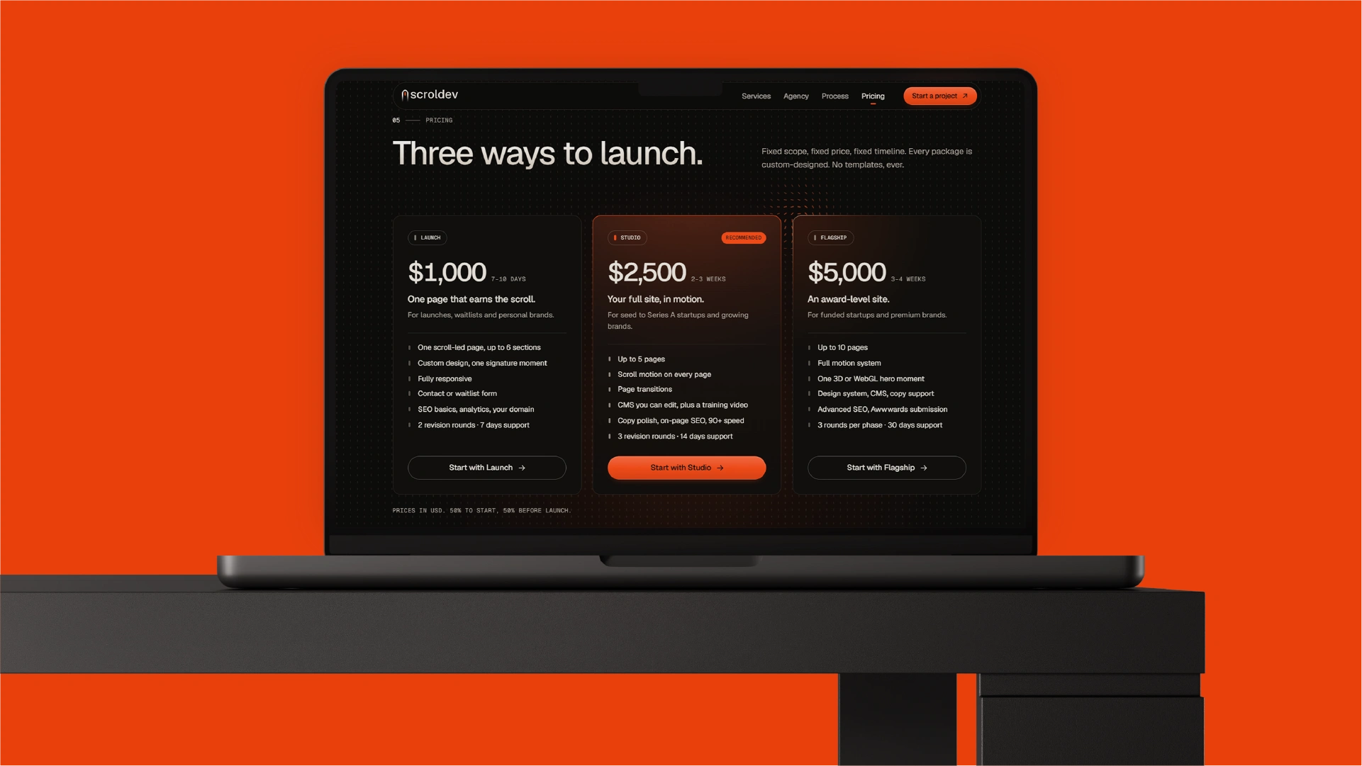
The identity comes to life in the Scroldev website, designed and built as a living expression of the brand:
Interactive pill grid: the grid responds to the cursor, its pills warming to Ember and turning to circle the pointer.
Hero scroll thumb: the hero animates the scroll thumb itself.
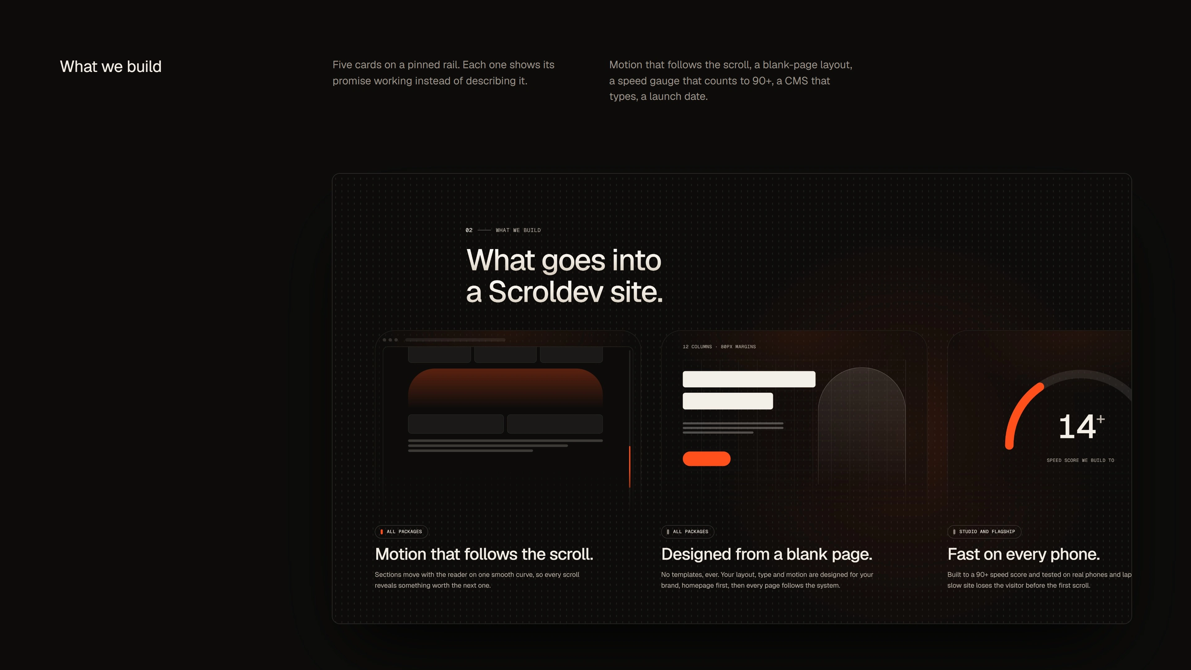
Pinned services: service panels slide past horizontally as you scroll.
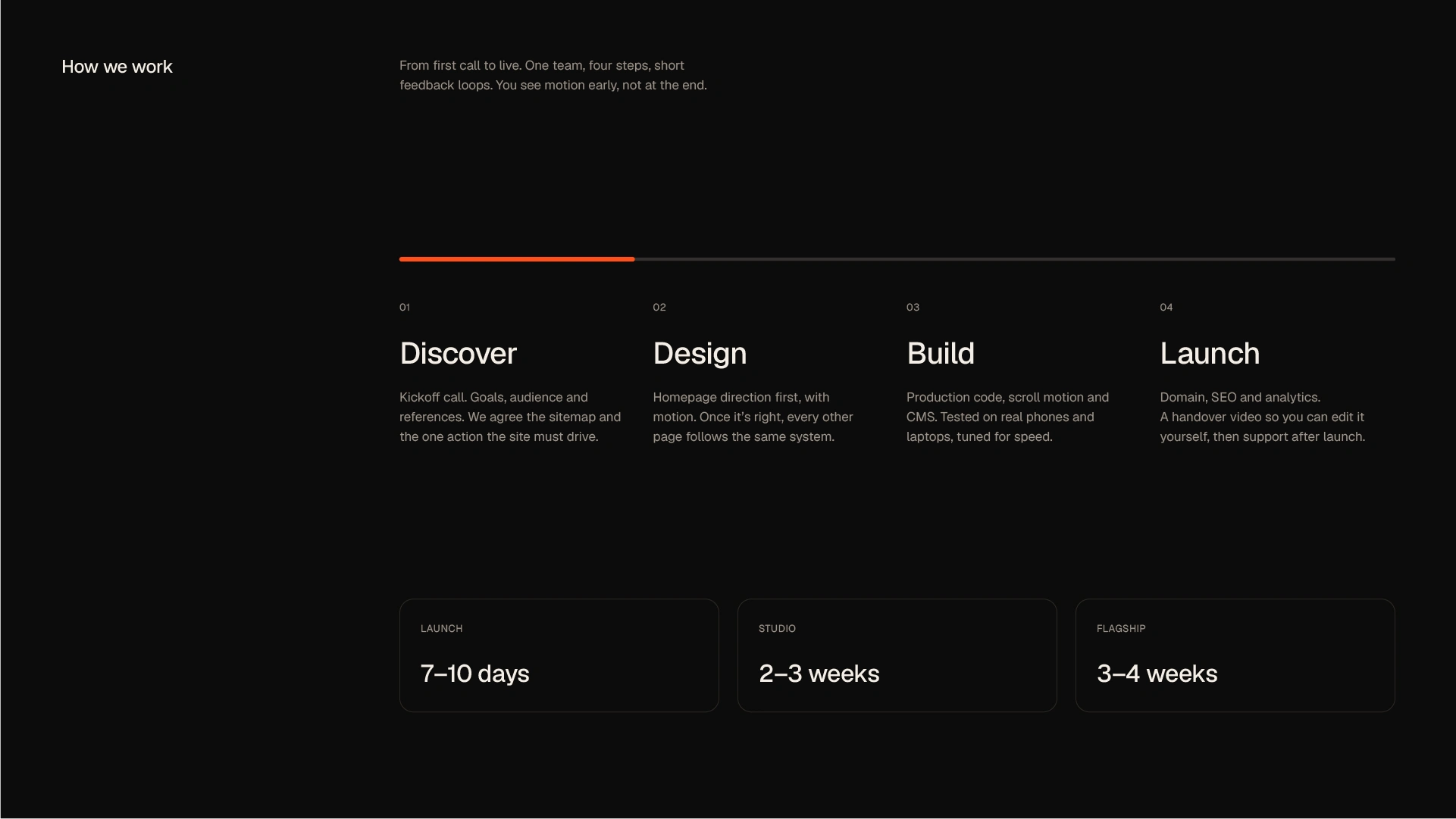
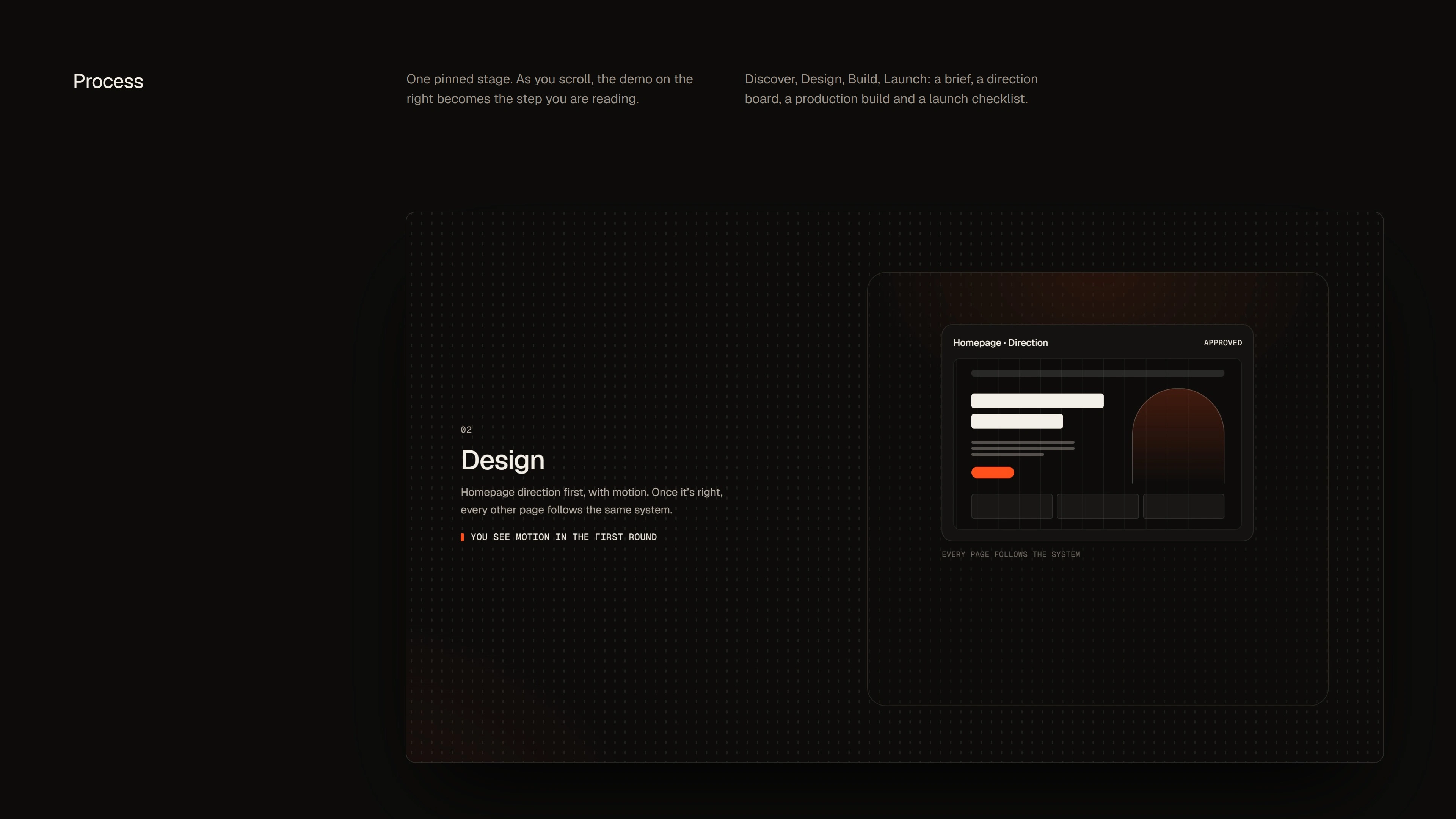
“How Scroldev works”: animated product-style demos walk through the agency’s process: Discover, Design, Build and Launch.
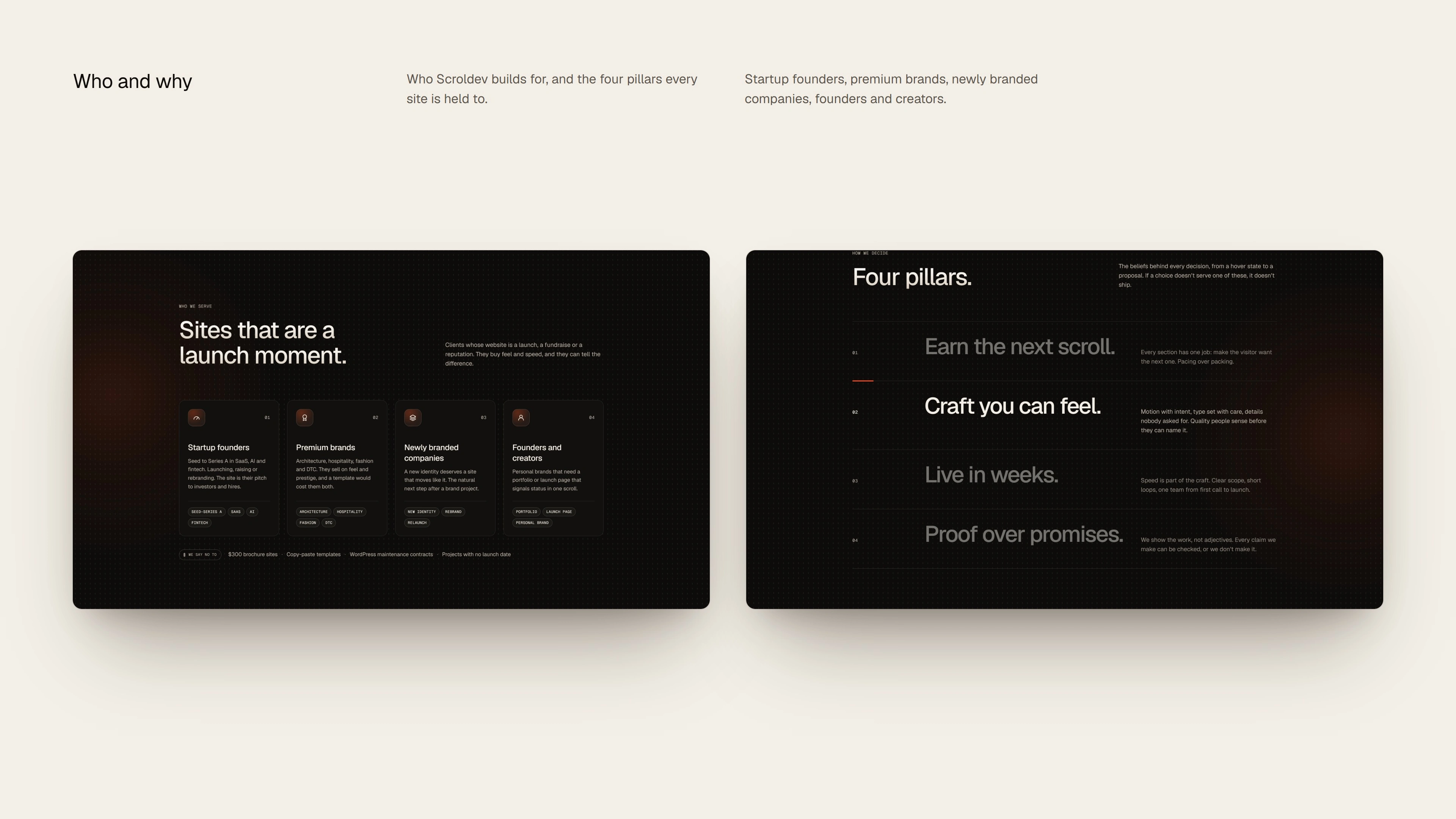
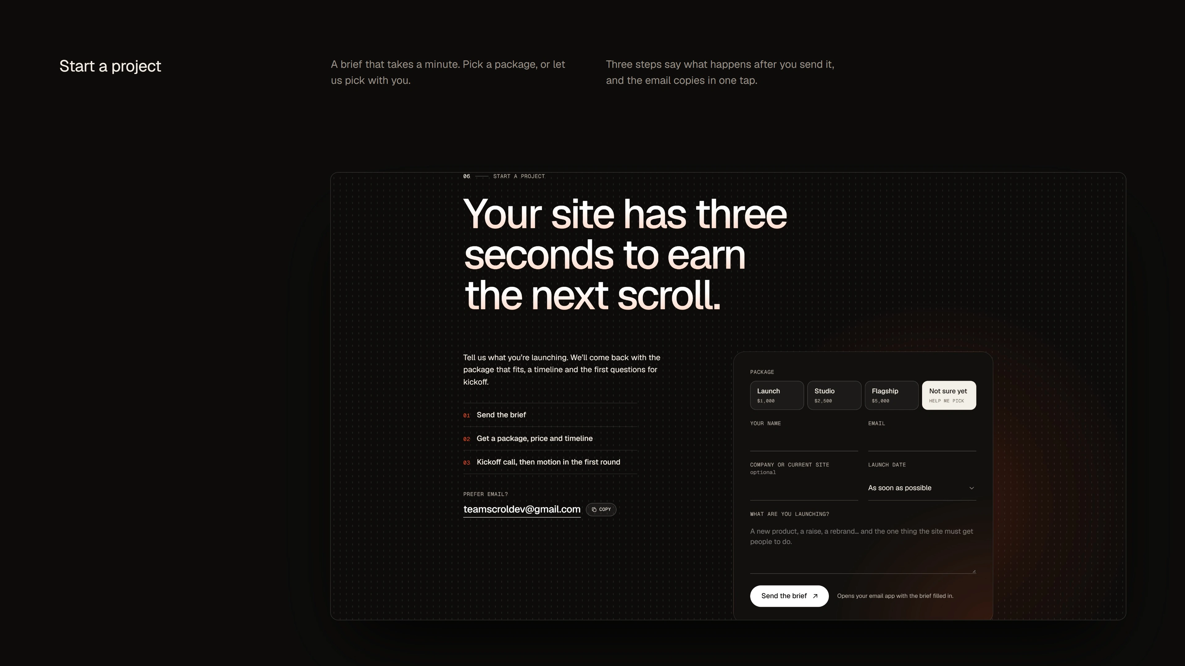
Built for speed, accessibility and SEO, the website shows Scroldev’s promise in practice rather than describing it.
The result is a complete brand identity, design system and website for a modern digital agency. It communicates motion design, user experience, craft and fast delivery through one clear, memorable idea.
Do you like what you see?
Let’s work together!
Feel free to reach out via Behance DM
E-mail:
hi@arvonn.com
All Rights Reserved 2026 ©
Like this project
Posted Oct 25, 2026
Developed Scroldev's brand identity and website focusing on motion-led design.
Likes
2
Views
5
Clients
Scroldev