VA Network — RCM Branding & Web Design

Muhammad .


VA Network
Healthcare branding, web design, and development for a growing operations partner.
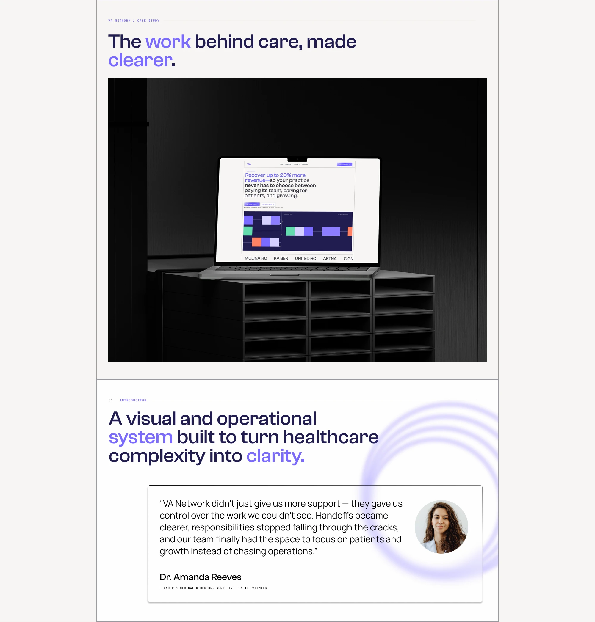
A new visual system for a business moving beyond virtual assistance.
The work behind care, made clearer.
VA Network expanded beyond virtual assistance. The brand had to expand with it.
New services. New positioning. One clearer system.
Wordmark
Built from structure.
A modular mark built from repeated forms — separate pieces resolving into one identity.
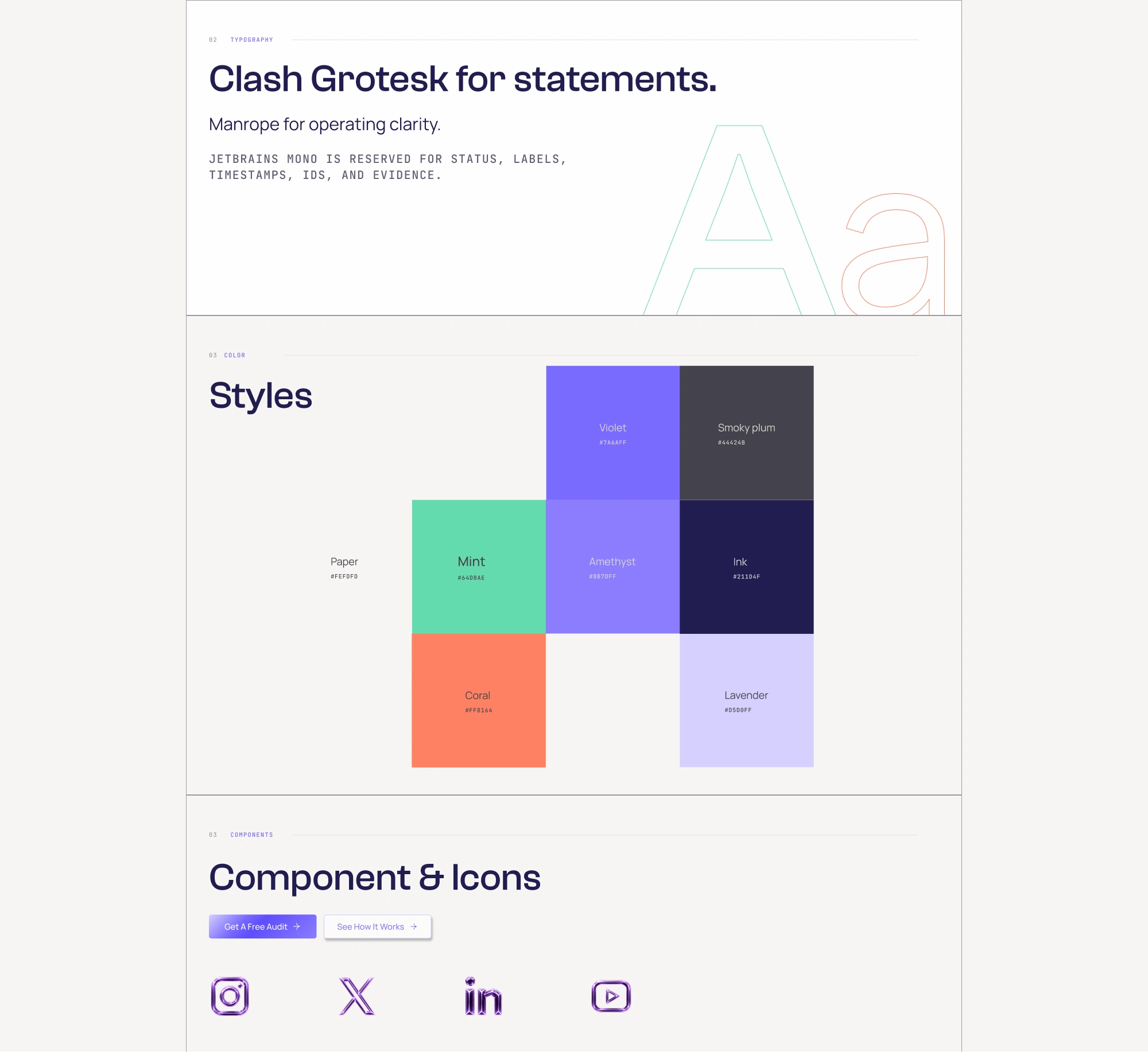
Typography
A system, not a style.
Typography, color, components, and motion all follow the same visual logic.
RCM brands often default to blue palettes, familiar SaaS layouts, and smiling healthcare imagery. VA Network took a different route — closer to fintech than traditional healthcare.
The modular tile language came from pixel-based systems, games, and modern tech interfaces — giving the brand a sharper, more ownable visual identity.
What starts as scattered operational tasks becomes a clearer, more manageable system.
Different inputs. One clear flow.
Separate parts move into one structured system.
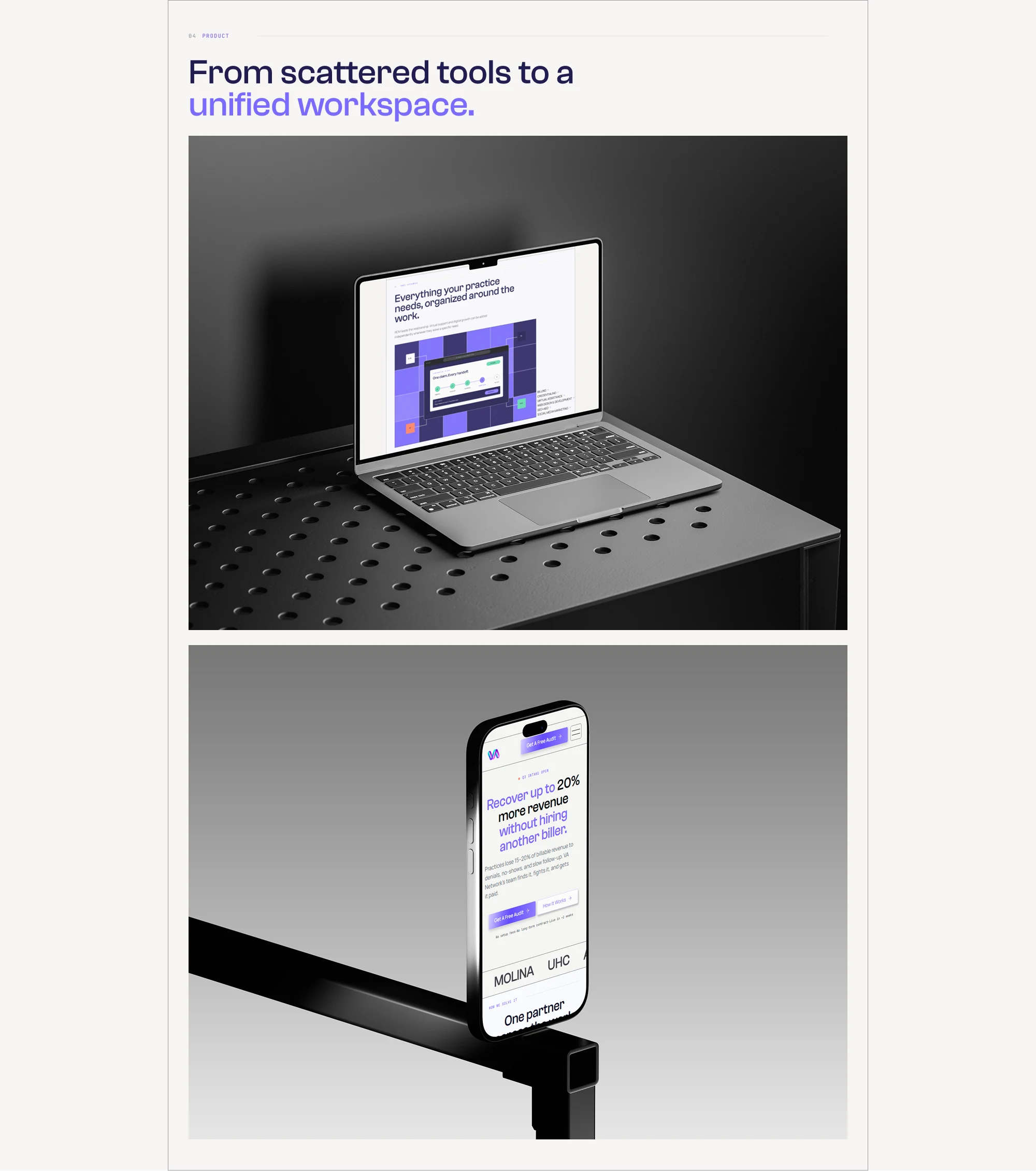
Product Mockups
From identity to product.
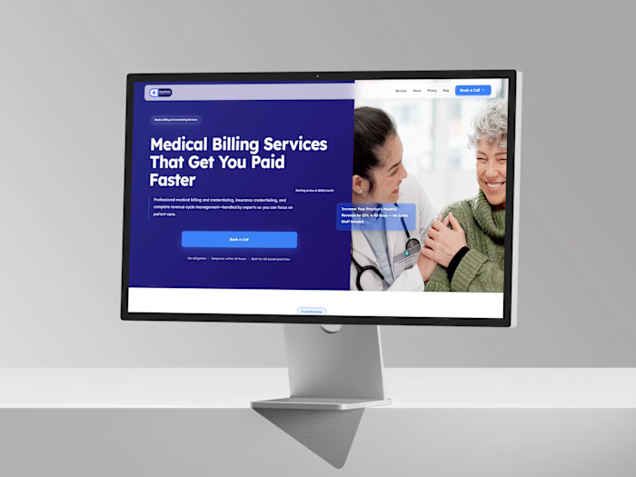
The visual language carries directly into the website — clear hierarchy, clear services, clear action.
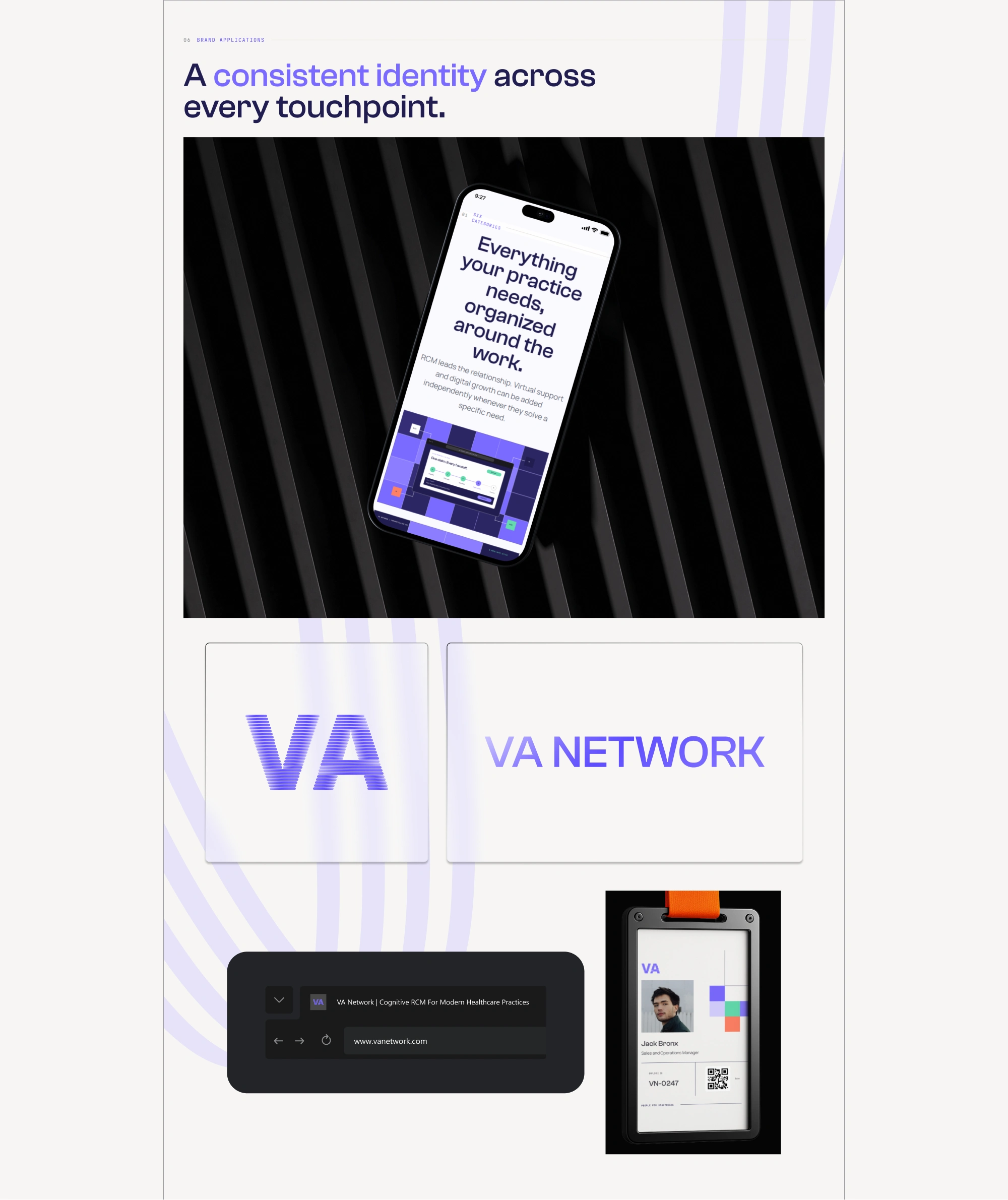
Brand applications
One identity across every touchpoint.
Digital, physical, internal — the system stays consistent.
Complexity in. Clarity out.
Ownership. Clarity. Capacity. Structure. Momentum.
Closing
Clarity for the work behind care.
A clearer way to run a practice.
Like this project
Posted Sep 22, 2026
Brand identity, web design, development, and motion for VA Network — rethinking healthcare operations with a sharper, finance-led visual system.
Likes
0
Views
5
Timeline
Aug 30, 2026 - Sep 30, 2026