I make founder brands premium, trusted & story-led


I make founder brands premium, trusted & story-led



Art Director and Brand Identity Designer
- $5k+
- Earned
- 11x
- Hired
- 5.0
- Rating
- 124
- Followers
Art Director and Brand Identity Designer


UX/UI, Content & Graphic Designer and Marketing Specialist
New to Contra
UX/UI, Content & Graphic Designer and Marketing Specialist

I make decent logos



Senior Graphic designer | Brand Specialist | Web Designer
- 8
- Followers
Senior Graphic designer | Brand Specialist | Web Designer



Graphic / Web Designer
Graphic / Web Designer


View more →

Go-to-Market Product Designer


Brand Designer | Brand Strategy & Visual Identity | Branding
- 24
- Followers
Brand Designer | Brand Strategy & Visual Identity | Branding
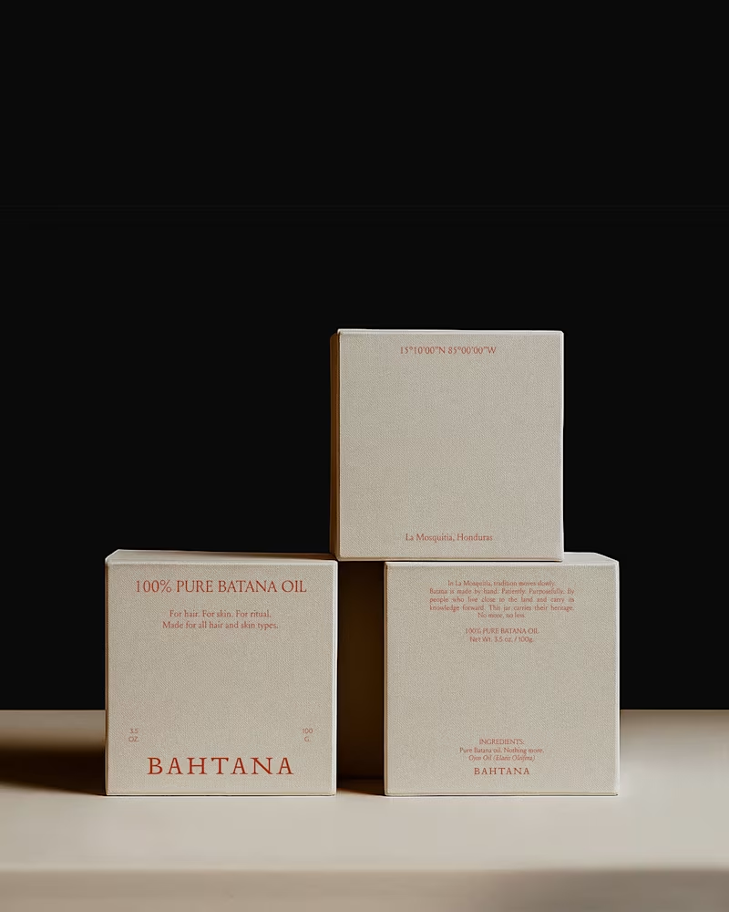
You all showed so much love to the Bahtana project, so I wanted to share a deeper look.
Here are more moments from the case study — the typography details, the earth-led palette in context, the packaging decisions, the quiet structure behind it all.
Bahtana was built around one idea: luxury is reverence. Every element had to feel rooted, not decorative.
Let me know which detail stands out to you the most.
1
116