

Award-winning Framer Designer & Developer
- $1k+
- Earned
- 6x
- Hired
- 5.0
- Rating
- 49
- Followers
Award-winning Framer Designer & Developer


View more →

Valuable UX/UI for your Business


Framer Expert & Partner


I design and build performant UIs and websites
- $5k+
- Earned
- 4x
- Hired
- 5.0
- Rating
- 16
- Followers
I design and build performant UIs and websites


Crafting brand-focused experiences through Framer

I built a brand universe inspired by the vastness of space.
This is the branding for BUSINESS CANVAS, a Korean B2B SaaS startup — also known as BCU (BUSINESS CANVAS Universe).
If you’re interested in cosmic concepts, you’ll enjoy uncovering the hidden meanings and Easter eggs woven into the design.
For the full version, check out the project on my profile (https://contra.com/_7ecfzm2p?referralExperimentNid=DEFAULT_REFERRAL_PROGRAM&referrerUsername=_7ecfzm2p)! 🌌
1
120

The Studio PLASTIC BAG website was inspired by an airport —
a place where every journey begins.
My identity, a plastic bag drifting in the wind, is about freedom, weightlessness, and not forcing direction.
An airport felt like the right metaphor — a space of waiting, excitement, and possibility before taking off.
I wanted the site to capture that feeling.
Not just to show what I’ve made, but to tell why I make things —
to remind myself that design isn’t just about form,
but about meaning, timing, and the moments before something begins.
2
117


Brand designer shaping identities felt before they are read
- 22
- Followers
Brand designer shaping identities felt before they are read
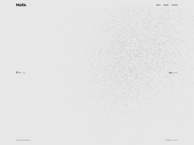
The new home for Nūfik, a brand design practice working between Singapore and Seoul.
The site opens with one line, From a single pixel, we build a world. An angel sculpt gathers out of scattered dots, turns, and scatters again as the line becomes the studio's statement: Branding, Defined by Sensibility. The figure is rendered live in the browser from tens of thousands of points and responds to scroll.
Below the intro, the work sits on a single glass sheet that viewers can browse one by one, as a grid or as an index. Each case study opens into its own page.
nu-fik.com
0
10

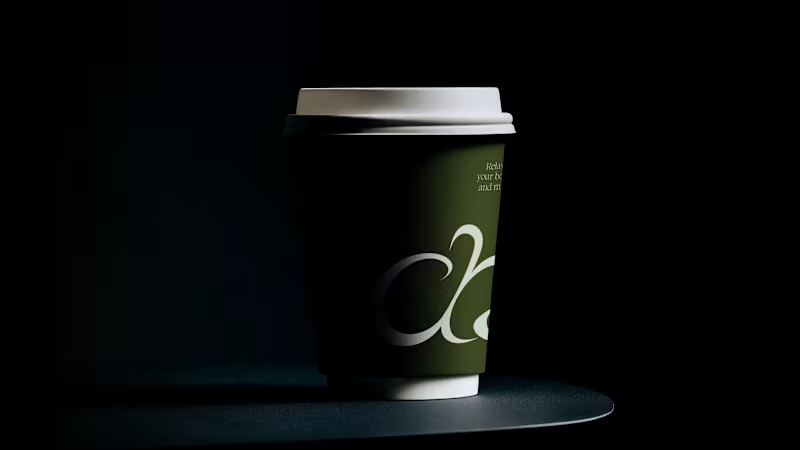
More than tea,
it is a moment to turn inward and reflect.
We chose dark tones to express the awakening that comes from looking within, capturing the deep and meditative essence of matcha.
What do you think about eerie concept of match brand?
View full work (https://nu-fik.com/chachacha)
2
3
181
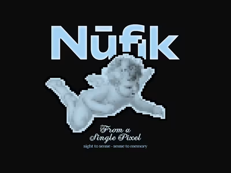
For a memorable brand,
it can’t be just a look.
Nūfik: from “Nū” (light) and “fik” (to create), turning emotions into visual identities that linger in memory.
So I built a tiny game to show that Nūfik is all about experience.
It seems easy, but it’s not. Enjoy!
(https://nu-fik.com/special)game link: https://nu-fik.com/special
2
1
181


Motion Designer & 2D/3D Artist at azma.lab

Brand design lead building identity systems at scale.
- 2x
- Hired
- 5.0
- Rating
- 2
- Followers
Brand design lead building identity systems at scale.


