Senior Product Designer & Full-Stack Partner
Senior Product Designer & Full-Stack Partner
UX & Service Designer crafting human-centered systems

UI/UX Designer • No-code Builder • AI Architect
- $1k+
- Earned
- 59
- Followers
UI/UX Designer • No-code Builder • AI Architect

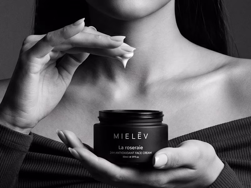
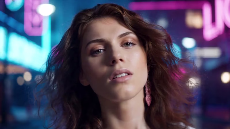
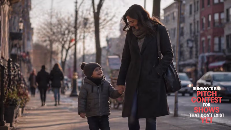
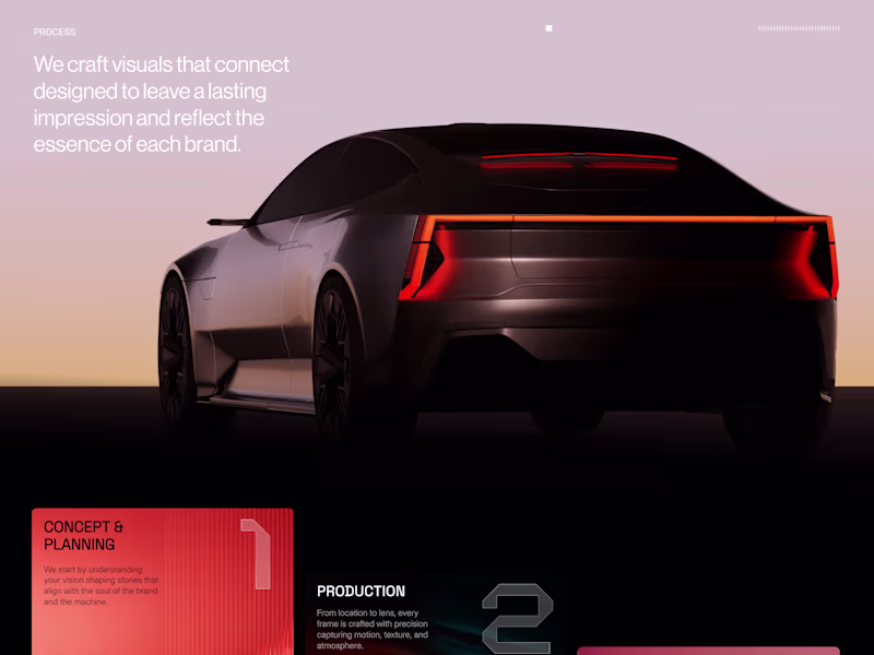
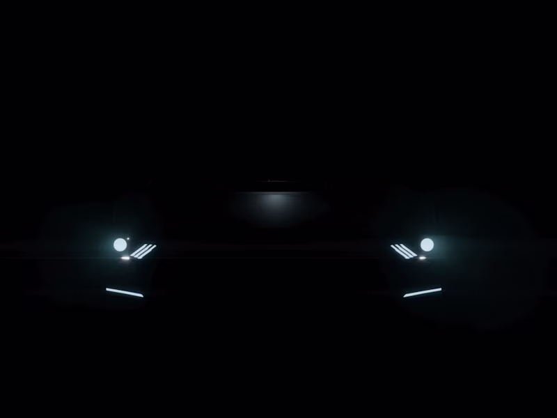
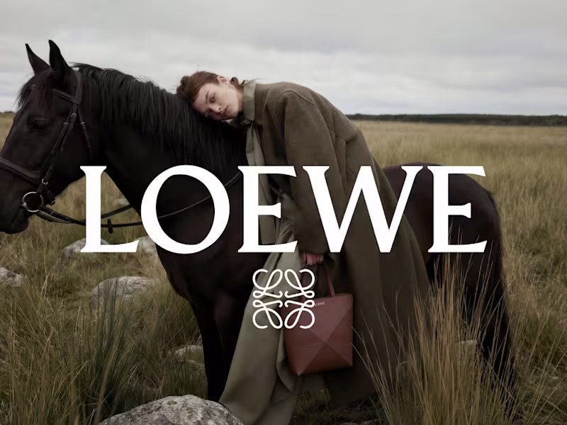
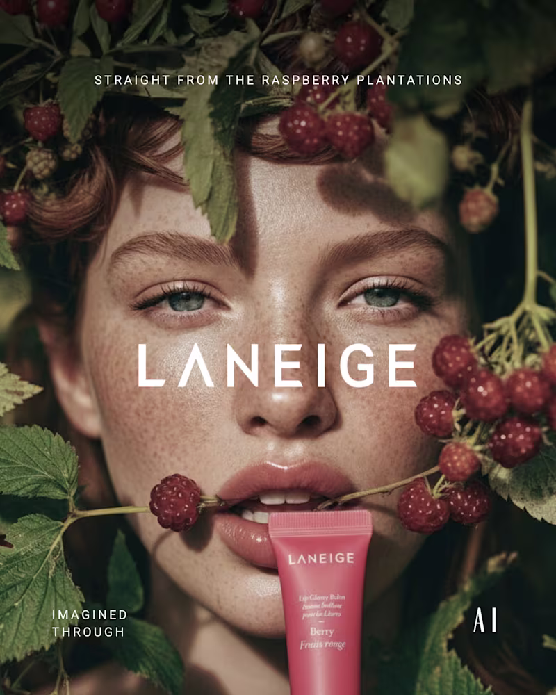
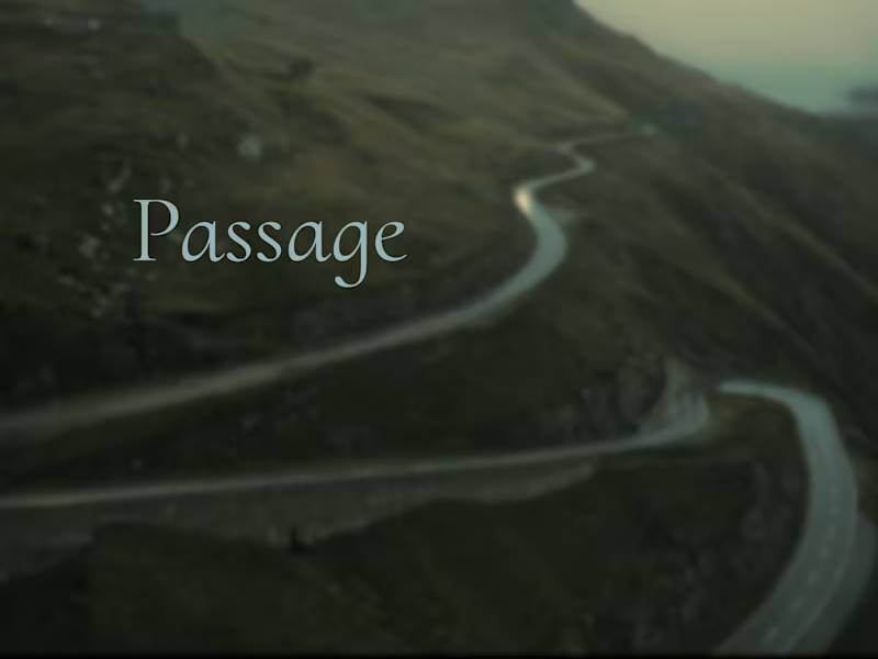
"AI Brand Commercial Creator"
"AI Brand Commercial Creator"
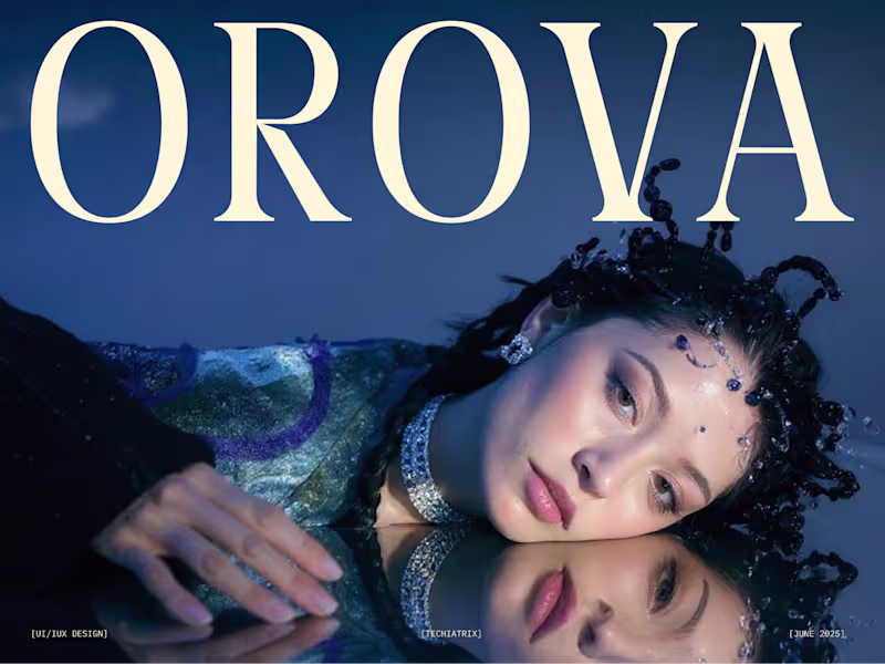
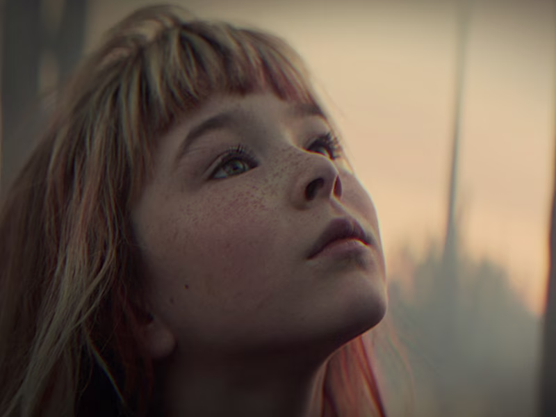
AI creator and designer shaping fashion content.
developer
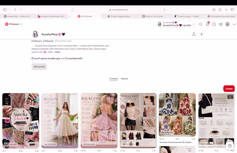
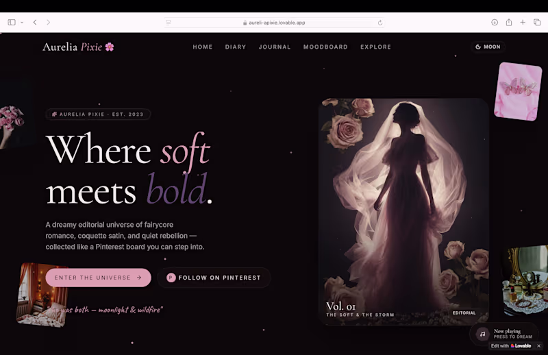
Cinematic video editing with custom music
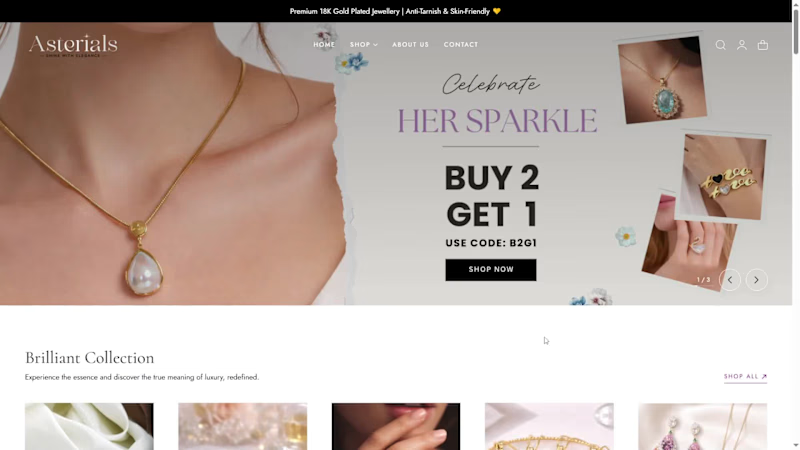
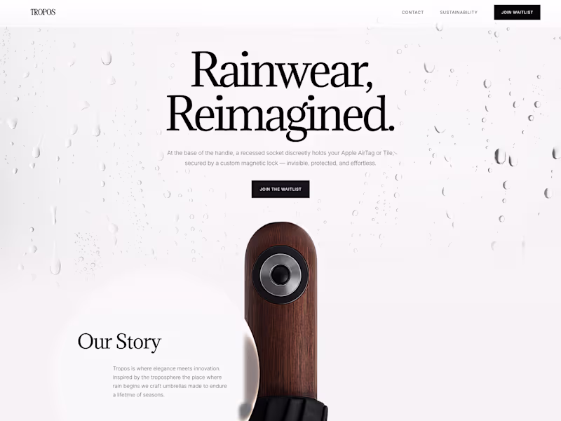
High-converting landing pages with visual storytelling
- 5.0
- Rating
- 3
- Followers
High-converting landing pages with visual storytelling