
Interactive Rive UI/UX Motion Design for SaaS & Apps.

Interactive Rive UI/UX Motion Design for SaaS & Apps.

Unmasked,
An imposter-themed party game that tests trust between friends. Unmasked uses the smartphone as a central part of the game, with no downloads required: just scan, log in, and start to be suspicious.
Local winner of the Global Game Jam 2026 and made from idea to playable multiplayer game under a 48 hrs window.
The game was built using Unity, Rive and the backend was made in Node.js with Socket.io Leveraging heavily on Rive and its useful tools like data-binding, state machines and scripting, for a rich animation experience in which the user can see they avatars changing in real time.
Still not done with the game, currently working on using Rive for all of the UI, plan to release it publicly once it’s all done.
Hope You all like my entry for the Games with Rive Challenge.
✌️
Dave
4
24
1.2K


Creative Developer & Designer — Creative Director
- 2x
- Hired
- 5.0
- Rating
- 64
- Followers
Creative Developer & Designer — Creative Director
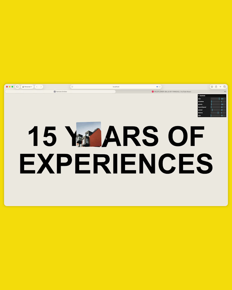
I created something again. This time, a particle emitter when hovering a text. I think it turned out great! 🙌
Each "particle" is a three.js Sprite. Made with Three.js and GLSL.
Check it out live here: https://particle-emitter-exp.vercel.app
2
18
457
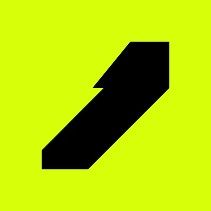
I'm working on the brand identity of a learning & development brand and came up with this logo, then I did a cool animation 💫.
12
30
824
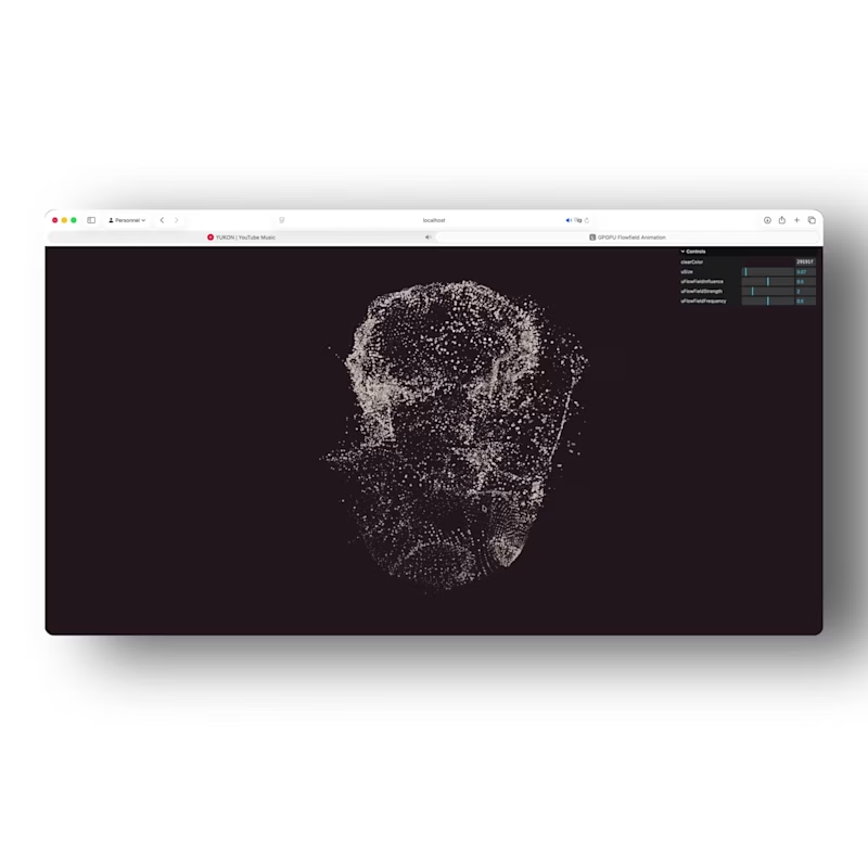


You Dream It, I Write It


Branding, Photography and 2D Animation


Framer Partner for Web Design
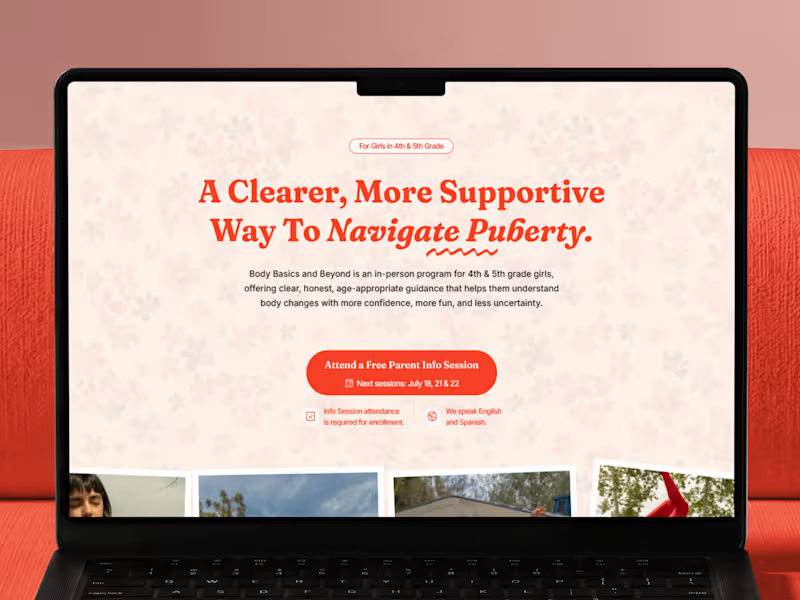
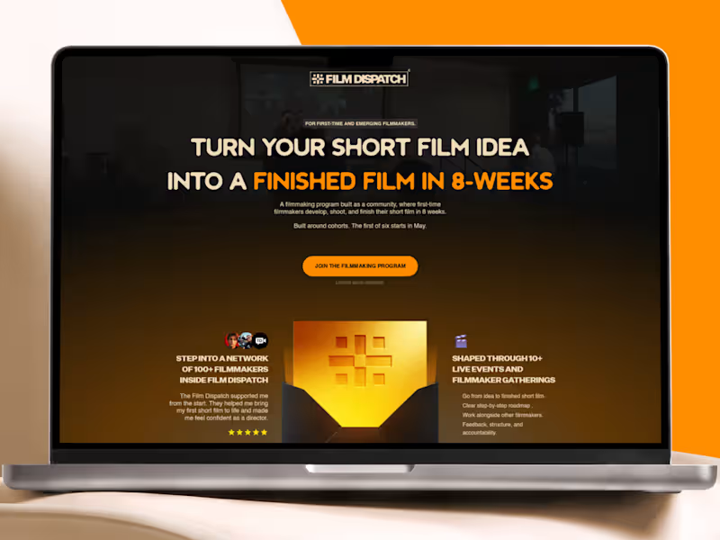


Video Editor & Illustrator | Startups


Ulta is a mexican beauty brand. I search for their web page and found out it was kinda heavy in terms of visual information.
With the redesign, I made every section has blank spaces so the images and texts can breathe, also, stablishing a clear color palette and making it more visual kind. The use of blue color makes the accent parts more highlighted (also, its complementary color). I preserve the original webpage images so it stays the same fundamental information.🙌
What you think? How does it look?
0
116

With a video mixed with music, the concept brand GIBOUS debuts on social media. Flashing typographies and hyped music want to get your attention. Keeping the details on the colors that had been used, such as monochromatic and dark green, as a signal of power and confidence.
GIBOUS is a men’s skincare and grooming brand inspired by nocturnal aesthetics, dark minimalism, and contemporary design. The brand seeks to move away from traditional aggressive or sporty masculine branding. The target audience is: Men aged 20–35 and interested in fashion, fragrances, and grooming. Premium lifestyle consumers. Users who appreciate minimal and modern design.
Do you have suggestions?
1
204


3D CGI Artist & Art Director
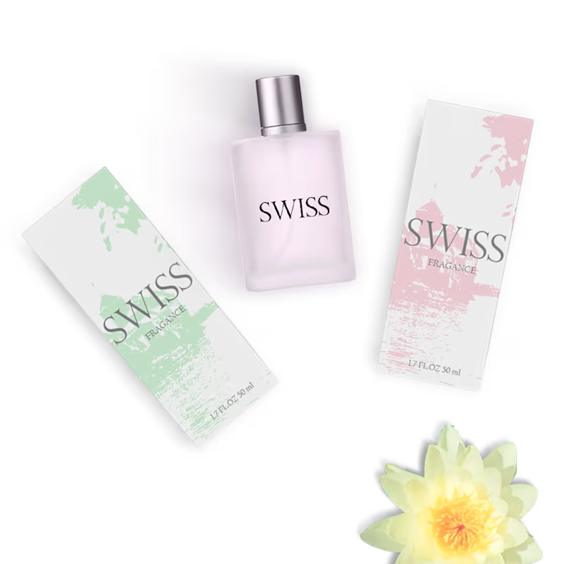
This has been one of the most complex and time-consuming projects I’ve undertaken—largely due to the packaging composition, the fine-tuning of details, and the final arrangement, which alone required nearly four hours of work to achieve the end result. While it is, in essence, a fragrance brand, in practice it proved to be a new and complex challenge.
1
756
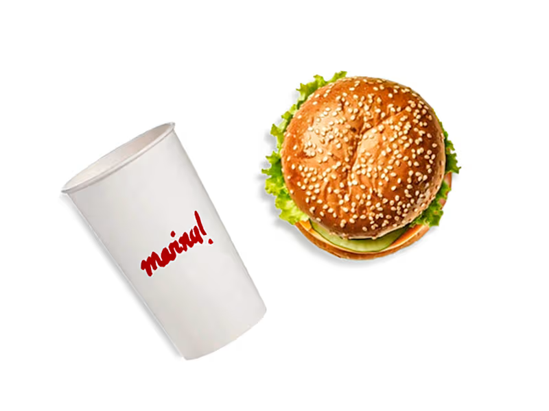
This has been one of my most recent projects, spanning from approximately March to mid-April. The client requested a brand identity for their burger restaurant that would be both urban and elegant, while avoiding the clichés typical of today’s burger joints. I spent time sketching—creating up to 30 different versions of the logo, typography, background patterns, and imagery—until I arrived at a final result that captures an elegant, urban aesthetic without falling into cliché.
1
607
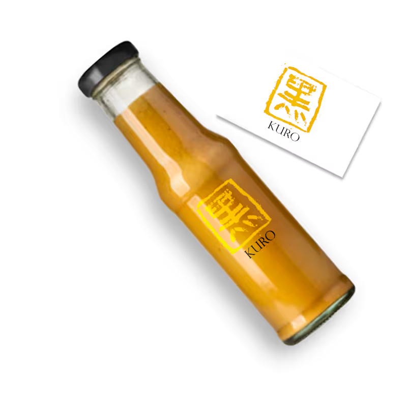
This particular project presented a new challenge for me at the time because, due to circumstances, I didn't have a Chinese ink stamp. Therefore, I had to improvise and follow a series of steps, from sketching the logo on paper to tracing it with a marker on toilet paper, and then digitizing it in Illustrator. I still remember this project very well because of the stress it caused me.👍
1
612
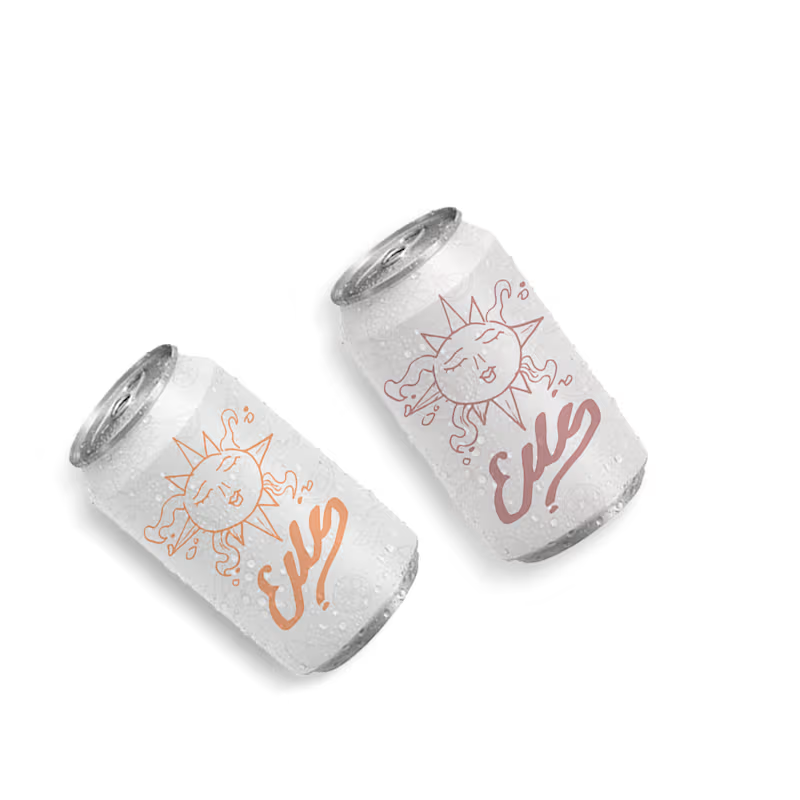
This project evokes a particular sense of nostalgia for me, as it was one of my first commissioned projects after graduating from design school. Following my hybrid approach—combining traditional paper-based art with digital techniques—I first created the logo on paper, then digitized it in Illustrator, adjusted the color using a gradient map, and finally exported it to Photoshop for the final composition.
1
476

Creative Strategist, Content & Ad Designer
Creative Strategist, Content & Ad Designer

Captivating Creatures is a project I worked on for a client whose zoo focuses exclusively on reptiles. This particular concept was ultimately rejected, but it was an exciting opportunity to explore bold visuals and creative storytelling inspired by the fascinating world of reptiles.
Even though it didn’t make it to the final stage, it pushed me to experiment with composition, textures, and color in a really fun way.
2
21
183

Designing this poster using the new tools I’ve learned was really fun! Continuously exploring new styles, tools, and ways to approach design makes the creative process so much more exciting and fulfilling.
2
2
75

Last year, I had the opportunity to design a Halloween party poster with complete creative freedom, including directing the video team for the invitation. It was such a fun project! I even visited the venue myself to photograph the building, so that people could recognize the location just by looking at the invite (the client's only requirement), and that idea guided the whole creative direction.
1
66
