Ulta is a mexican beauty
Dannae Moreno
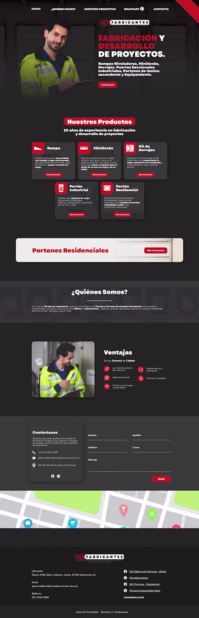
Ulta is a mexican beauty brand. I search for their web page and found out it was kinda heavy in terms of visual information.
With the redesign, I made every section has blank spaces so the images and texts can breathe, also, stablishing a clear color palette and making it more visual kind. The use of blue color makes the accent parts more highlighted (also, its complementary color). I preserve the original webpage images so it stays the same fundamental information.🙌
What you think? How does it look?
Like this project
Posted Jun 11, 2026
Ulta is a mexican beauty brand. I search for their web page and found out it was kinda heavy in terms of visual information. With the redesign, I made every...