Freelancers using Figma in Dublin
Freelancers using Figma in Dublin
Sign Up
Post a job
Sign Up
Log In
Filters
2
Projects
People
Message
39
Liz Girdwood
pro
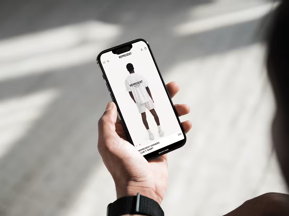
Ecommerce UI/UX Web Design for Luxury Fashion Brand – REPRESENT
39
1K
Message
14
Grace Isabelle
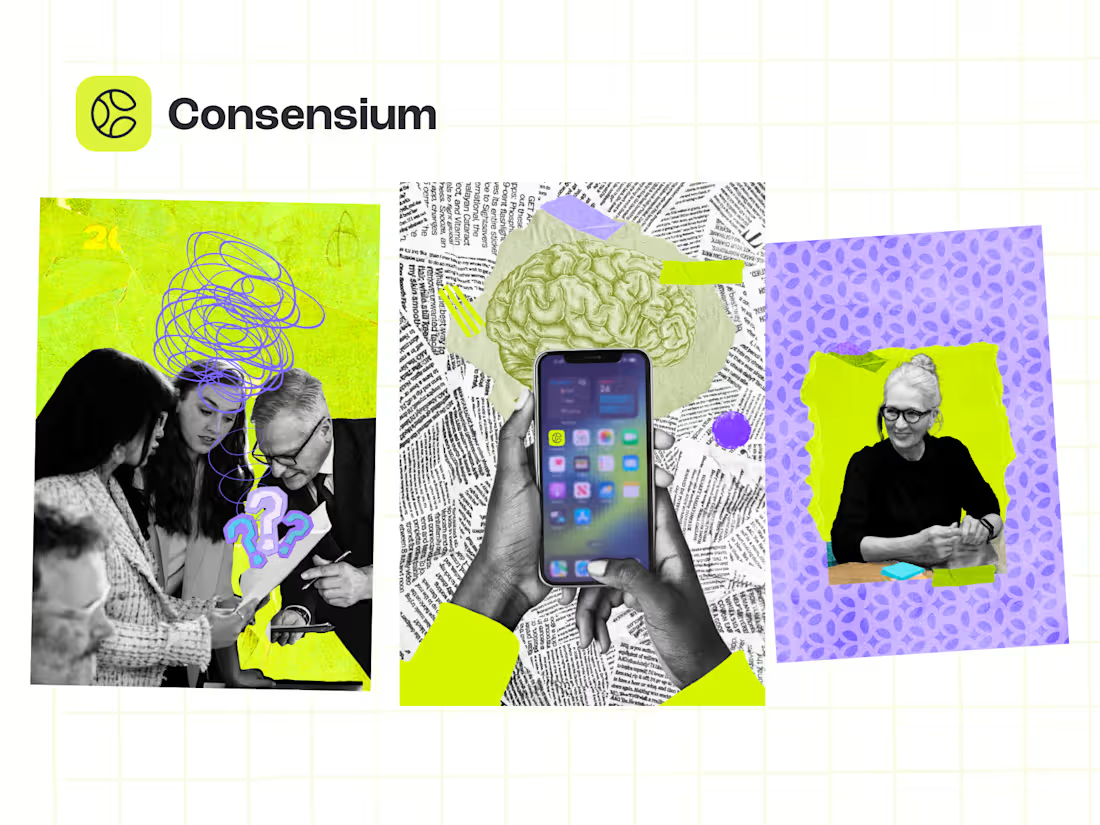
Consensium Global Art Direction and Brand Development
14
103
Message
5
Michael McCoole
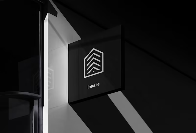
Brand Identity & Website Design for IEAA
5
51
Message
15
Tom Campion
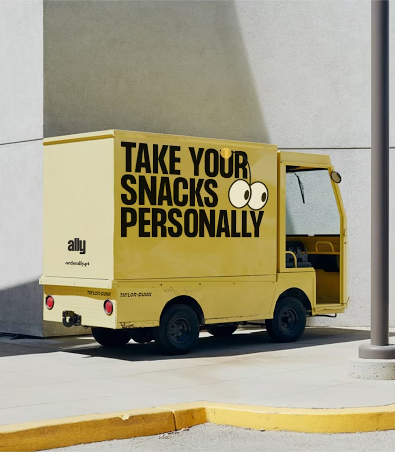
Ally
15
69
Message
1
Josiah Bhanghoyer
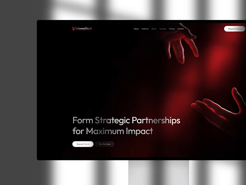
Landing Page CrimsonStark
1
94
Message
2
Iam EnergyI
pro
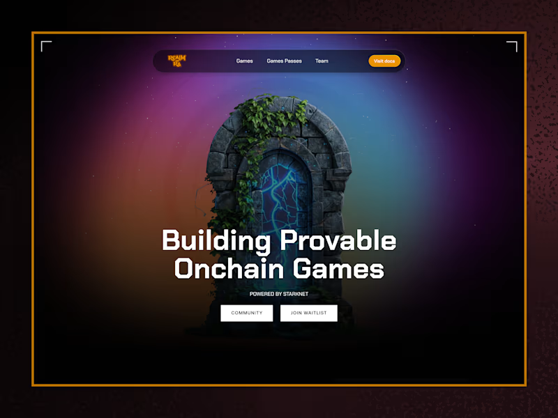
Realm of Ra Landing Page | Figma to Framer
2
13
$1K+ earned
Message
2
Joey Tr.
Koso, award-winning reflection app
2
24
Message
1
Ellen Malone
pro
Digital Platform Transformation: Launch to 200K+ Users
1
47
Message
0
Gonzalo Ruiz
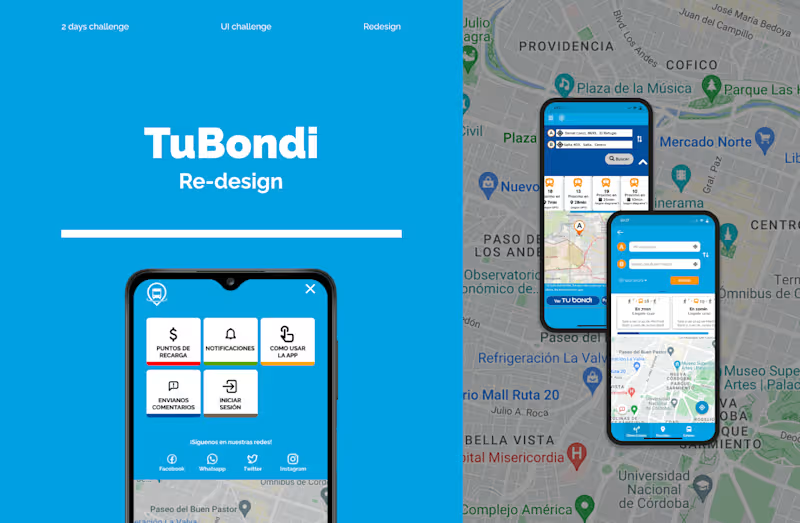
TuBondi - Redeseign
0
6
Message
2
Max Ivory
pro
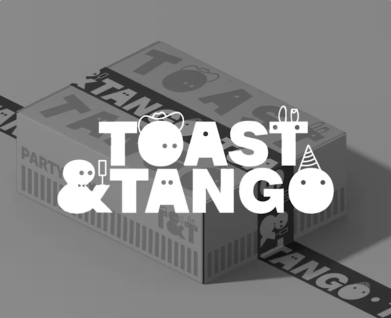
TOAST & TANGO
2
34
Message
0
Laura Kate Deveney
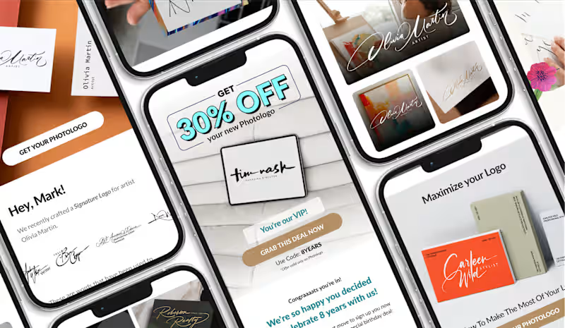
High-Converting Email Campaigns
0
9
Message
0
David Dooley
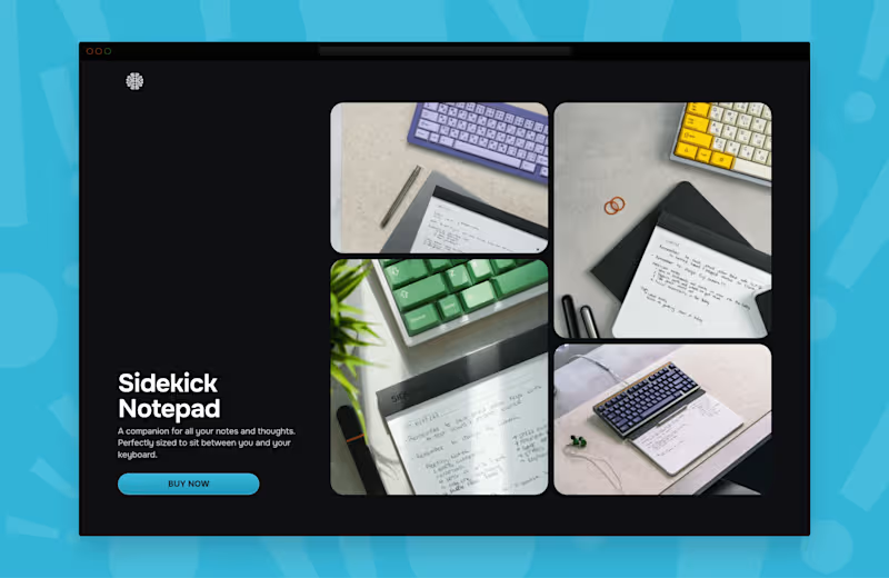
Cortex Sidekick — Website Design & Development
0
66
Message
0
Abdul Saboor
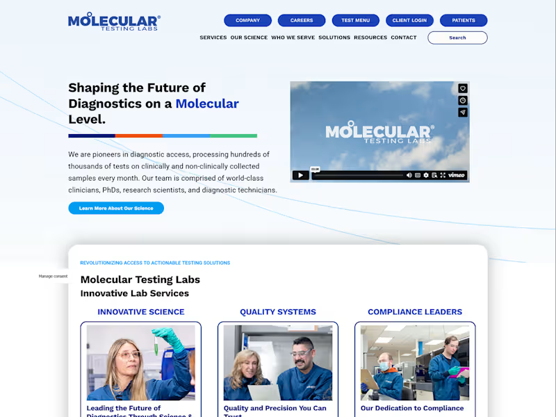
Molecular Testing Labs Website Design, Development & Management
0
6
Message
26
Althea Nguyen
EARTHTURN is a ceramics brand I hope to open one day. I'm not a potter. So I used FLORA to help me build the whole branding, from physical product to brand identity mockup around the idea. FLORA was where I pushed the ideas and a strategy I already had in my head, and tested it until it held. So I'd have more time for the part that actually matters: the brand strategy. Here's what I kept reminding myself while making the visuals. You create images to sell a product, not just to look good. So every image should have a job. It might be a logo evolving: a turning wheel, then fire, then a vessel, resolving into the mark. I wanted the logo to show where it comes from, not just sit there finished. It might be the slow rotation effect for poster or social media posts, you can realise this effect when someone throws on a wheel, the movement the brand is named after. Not a trending effect that looks cool but says nothing about EARTHTURN. It might be the close-ups images: the material, the pattern, the piece from different angles. A customer buys what they can see clearly. Pretty from a distance doesn't sell, texture you can almost feel does. It might be the packaging shots that show the foam and wrapping: the piece protected, not a bare pot sitting alone in a cardboard box. You're not just selling a vase. You're selling care, and a product that arrives whole and unchipped. That's what making images for a brand really means, not grabbing whatever composition looks nice and calling it done. If you can't say why a visual serves the brand, it's decoration, not design.
13
26
920
Message
0
Antonia Josephine Wittorf
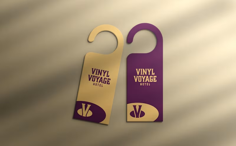
Vinyl Voyage Hotel
0
33
Message
0
Matt Evans
Viva Tuition
0
11
Explore projects