Built with Framer

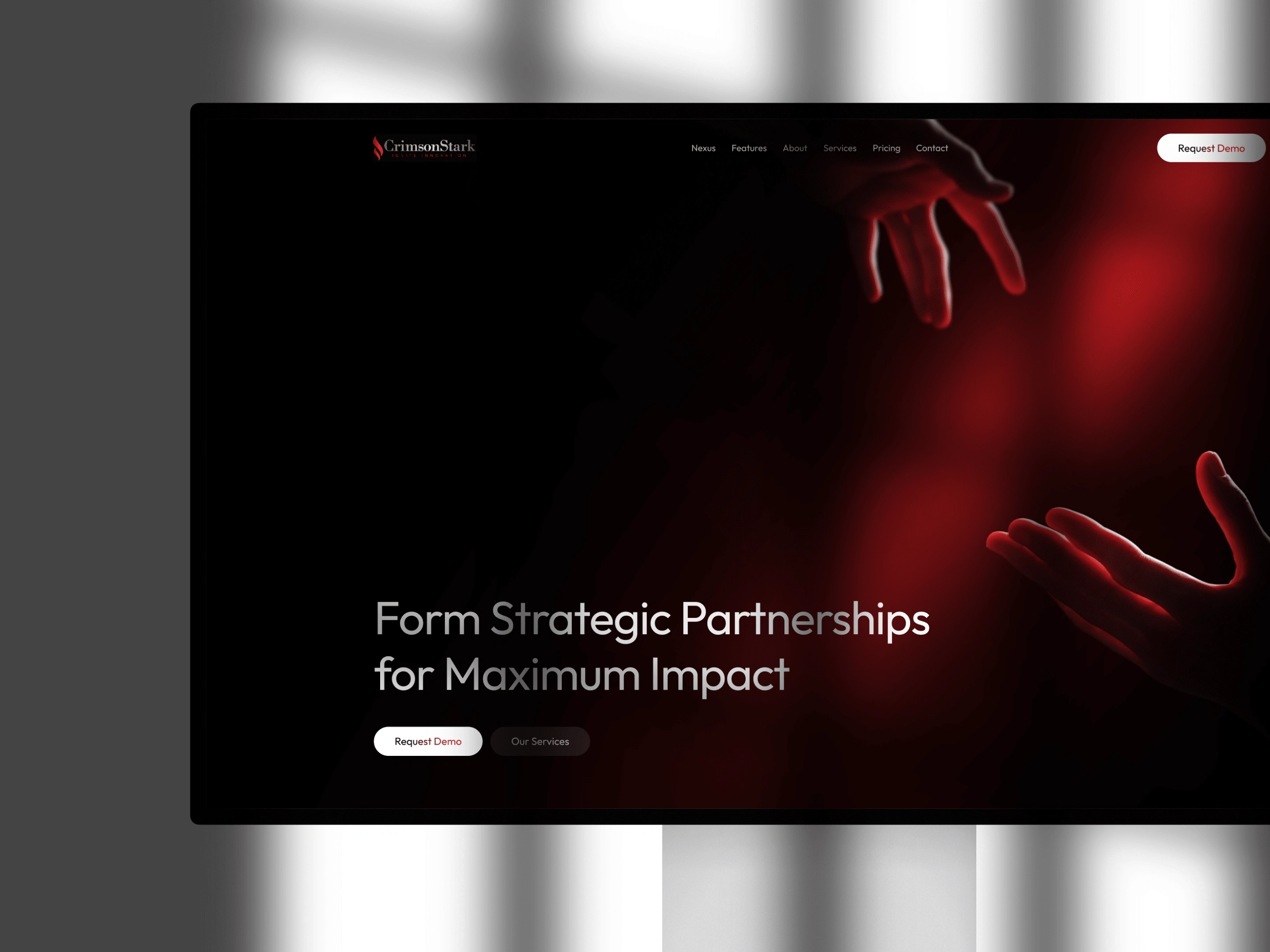
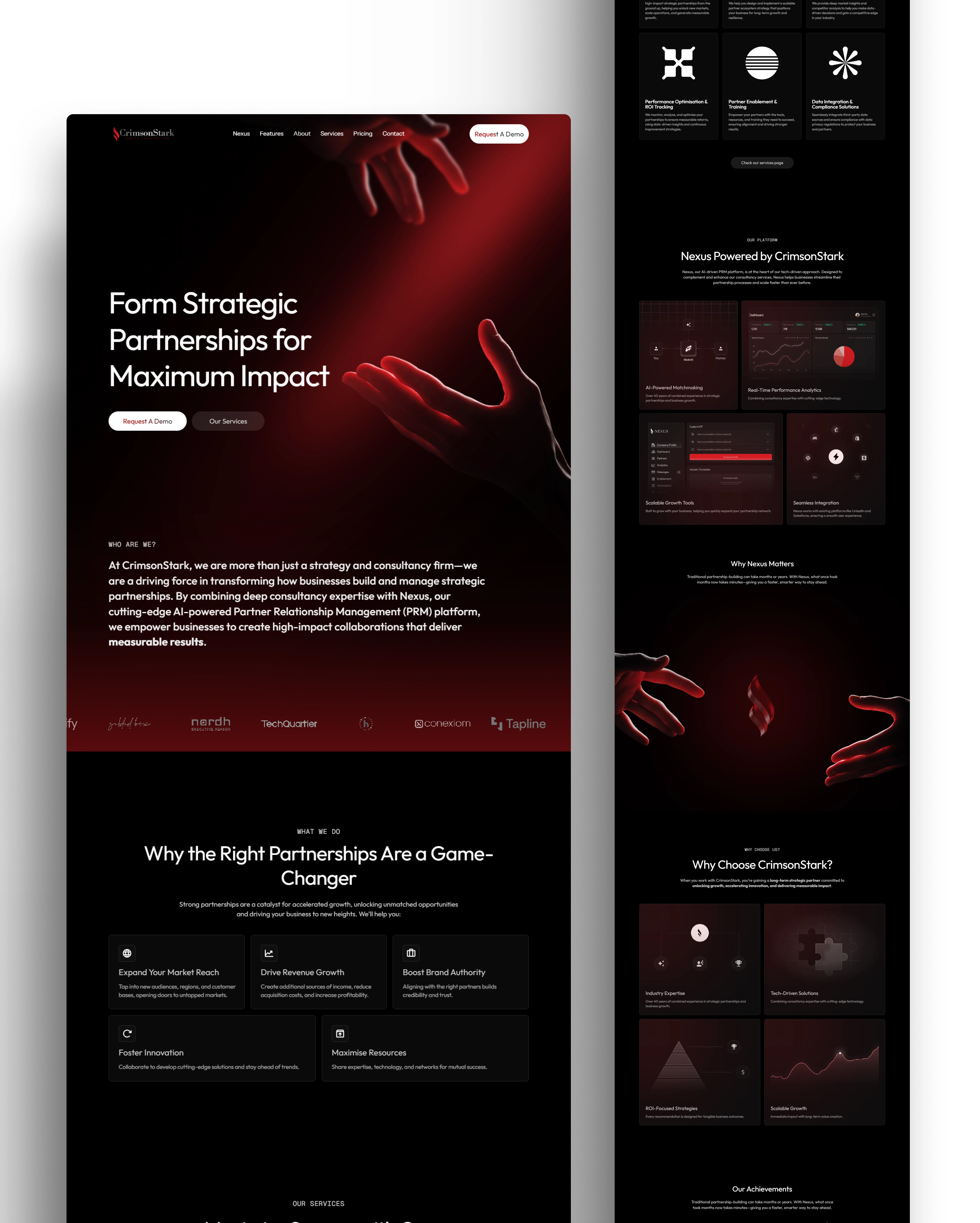
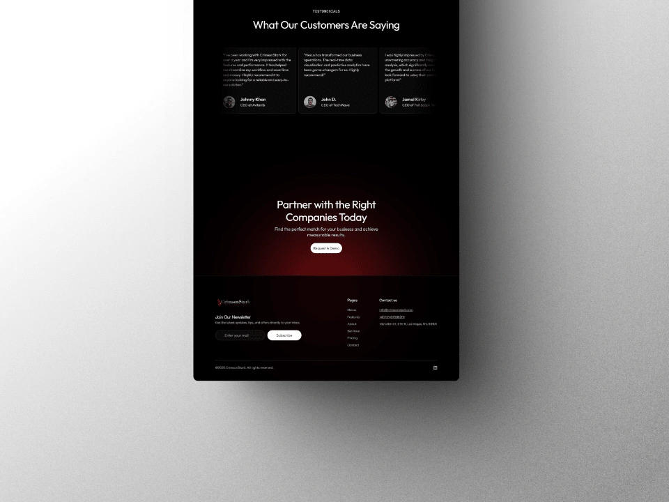
CrimsonStark’s landing page was built with a focus on real results. The layout is simple on purpose so visitors never feel lost or overwhelmed. Each section leads into the next in a smooth way that keeps attention and builds interest.
Nothing on the page is random. The typography is clear, spacing gives room to breathe, and every section has a job. Visitors see the value fast, understand what CrimsonStark offers, and know what to do next.
The tone is honest and confident. No noise. No clutter. Just a strong message that shows why CrimsonStark is a trusted partner for serious businesses. The call to action is easy to follow, and the whole experience feels natural from top to bottom.
Design and development time: 1.5 weeks
🔗 Live Project: crimsonstark.com
1 like · 97 views · Mar 20, 2025
CrimsonStark’s landing page is designed for clarity and conversion, guiding visitors seamlessly from interest to action while reinforcing trust and credibility.
Timeline
Mar 2, 2025 - Mar 10, 2025
Tags


What the client had to say
Working with Josiah on our landing page was an absolute pleasure. His skillset is top-notch, blending sleek, modern design with seamless functionality. I recommend Josiah and will use him again, if necessary.


Sean Whitener, CimsonStark
Mar 10, 2025, Client